Skip to content
Material Design 3
Main Navigation
v3
v2
v1

English

简体中文
繁體中文
Español
Français
Русский
Português – Brasil
Deutsch
日本語
한국어
Italiano
Polski
Türkçe
čeština
magyar

English

简体中文
繁體中文
Español
Français
Русский
Português – Brasil
Deutsch
日本語
한국어
Italiano
Polski
Türkçe
čeština
magyar

Appearance

Sidebar Navigation

Foundations

Accessibility

Overview: Principles

Overview: Assistive technology

Designing: Overview

Designing: Color contrast

Designing: Structure

Designing: Flow

Designing: Elements

Writing and text: Best practices

Writing and text: Text truncation

Writing and text: Text resizing

Building for all: User needs

Building for all: Co-design

Content design

Overview

Alt text

Global writing: Overview

Global writing: Word choice

Notifications

Style guide: UX writing best practices

Style guide: Word choice

Style guide: Grammar and punctuation

Customizing Material

Devices

Watches: Overview

Watches: Foundations

Watches: Styles

Watches: Layout

XR

Design: Overview

Design: Interaction

Design: Layout

Design: Accessibility

Components: Overview

Components: App bars

Components: Dialogs

Components: Nav bar

Components: Nav rail

Components: Toolbars

Design tokens: Overview

Design tokens: How to use tokens

Interaction

Gestures

Inputs

Selection

States: Overview

States: State layers

States: Applying states

Layout

Overview: Overview

Overview: Parts of layout

Overview: Adaptive design

Scaffold: Overview

Scaffold: Bars

Scaffold: Rails

Scaffold: Panes

Grids & spacing: Overview

Grids & spacing: Grids

Grids & spacing: Spacing

Grids & spacing: Density

Breakpoints: Overview

Breakpoints: Compact

Breakpoints: Medium

Breakpoints: Expanded

Breakpoints: Large & extra-large

Bidirectionality & RTL

Canonical examples: Overview

Canonical examples: Feed

Canonical examples: List-detail

Canonical examples: Supporting pane

Usability: Overview

Usability: Applying M3 Expressive

Material A-Z

Styles

Color

Color system: Overview

Color system: How the system works

Color roles

Color schemes

Choosing a scheme

Static: Baseline

Static: Custom brand

Dynamic: Choosing a source

Dynamic: User-generated source

Dynamic: Content-based source

Advanced: Overview

Advanced: Apply colors

Advanced: Define new colors

Advanced: Adjust existing colors

Color resources

Elevation: Overview

Elevation: Applying elevation

Elevation: Tokens

Icons: Overview

Icons: Designing icons

Icons: Applying icons

Motion

Motion physics system: How it works

Motion physics system: Specs

Easing and duration: Applying easing and duration

Easing and duration: Tokens & specs

Transitions: Transition patterns

Transitions: Applying transitions

Shape: Overview & principles

Shape: Corner radius scale

Shape: Shape morph

Spacing: Overview

Spacing: Applying spacing

Spacing: Tokens

Typography: Overview

Typography: Fonts

Typography: Type scale & tokens

Typography: Applying type

Typography: Editorial treatments

Components

App bars: Overview

App bars: Specs

App bars: Guidelines

App bars: Accessibility

Badges: Overview

Badges: Specs

Badges: Guidelines

Badges: Accessibility

Buttons

All buttons

Button groups: Overview

Button groups: Specs

Button groups: Guidelines

Button groups: Accessibility

Buttons: Overview

Buttons: Specs

Buttons: Guidelines

Buttons: Accessibility

Extended FABs: Overview

Extended FABs: Specs

Extended FABs: Guidelines

Extended FABs: Accessibility

FAB menu: Overview

FAB menu: Specs

FAB menu: Guidelines

FAB menu: Accessibility

FABs: Overview

FABs: Specs

FABs: Guidelines

FABs: Accessibility

Icon buttons: Overview

Icon buttons: Specs

Icon buttons: Guidelines

Icon buttons: Accessibility

Segmented buttons: Overview

Segmented buttons: Specs

Segmented buttons: Guidelines

Segmented buttons: Accessibility

Split button: Overview

Split button: Specs

Split button: Guidelines

Split button: Accessibility

Cards: Overview

Cards: Specs

Cards: Guidelines

Cards: Accessibility

Carousel: Overview

Carousel: Specs

Carousel: Guidelines

Carousel: Accessibility

Checkbox: Overview

Checkbox: Specs

Checkbox: Guidelines

Checkbox: Accessibility

Chips: Overview

Chips: Specs

Chips: Guidelines

Chips: Accessibility

Date & time pickers

Date pickers: Overview

Date pickers: Specs

Date pickers: Guidelines

Date pickers: Accessibility

Time pickers: Overview

Time pickers: Specs

Time pickers: Guidelines

Time pickers: Accessibility

Dialogs: Overview

Dialogs: Specs

Dialogs: Guidelines

Dialogs: Accessibility

Divider: Overview

Divider: Specs

Divider: Guidelines

Divider: Accessibility

Lists: Overview

Lists: Specs

Lists: Guidelines

Lists: Accessibility

Loading & progress

Loading indicator: Overview

Loading indicator: Specs

Loading indicator: Guidelines

Loading indicator: Accessibility

Progress indicators: Overview

Progress indicators: Specs

Progress indicators: Guidelines

Progress indicators: Accessibility

Menus: Overview

Menus: Specs

Menus: Guidelines

Menus: Accessibility

Navigation

Navigation bar: Overview

Navigation bar: Specs

Navigation bar: Guidelines

Navigation bar: Accessibility

Navigation drawer: Overview

Navigation drawer: Specs

Navigation drawer: Guidelines

Navigation drawer: Accessibility

Navigation rail: Overview

Navigation rail: Specs

Navigation rail: Guidelines

Navigation rail: Accessibility

Radio button: Overview

Radio button: Specs

Radio button: Guidelines

Radio button: Accessibility

Search: Overview

Search: Specs

Search: Guidelines

Search: Accessibility

Sheets

Bottom sheets: Overview

Bottom sheets: Specs

Bottom sheets: Guidelines

Bottom sheets: Accessibility

Side sheets: Overview

Side sheets: Specs

Side sheets: Guidelines

Side sheets: Accessibility

Sliders: Overview

Sliders: Specs

Sliders: Guidelines

Sliders: Accessibility

Snackbar: Overview

Snackbar: Specs

Snackbar: Guidelines

Snackbar: Accessibility

Switch: Overview

Switch: Specs

Switch: Guidelines

Switch: Accessibility

Tabs: Overview

Tabs: Specs

Tabs: Guidelines

Tabs: Accessibility

Text fields: Overview

Text fields: Specs

Text fields: Guidelines

Text fields: Accessibility

Toolbars: Overview

Toolbars: Specs

Toolbars: Guidelines

Toolbars: Accessibility

Tooltips: Overview

Tooltips: Specs

Tooltips: Guidelines

Tooltips: Accessibility

On this page

Layout overview: Adaptive design ​

Layout is the visual and strategic arrangement of elements on a screen

What’s adaptive design? ​

Adaptive design is a set of techniques to change an interface to fit different contexts. While responsive design scales a single layout to fit any screen, adaptive design customizes a product to optimize the experience on each device.

Designing adaptive experiences goes beyond customizable properties like color, typography, and shape. The structure, individual components, and entire layouts can adapt based on:

  • People: Individual preferences and settings
  • Devices: Watch, phone, foldable, tablet, desktop, or XR device
  • Usage: Screens dynamically change as a person resizes windows, changes orientation, or switches device

Designing adaptive experiences ​

Layouts must be versatile, designed to adapt fluidly across three primary experience types: mobile, desktop, and spatial. Start with mobile and make sure your product's layout and components can scale and adapt seamlessly all the way up to spatial environments.

While each experience has different primary input methods, designs should be built with all inputs in mind—touch, pointer, and physical keyboard—since users may use your product in a desktop environment regardless of their device type.

Mobile

Mobile experiences include phones, foldables, and tablets.

On mobile, an app can be shown in several window modes:

  • Full-screen: The app takes up the entire screen, the default for mobile
  • Split-screen: Two or more apps share the screen simultaneously, common on tablets and foldables
  • Bubbles: Floating windows that let people multitask without leaving their current context
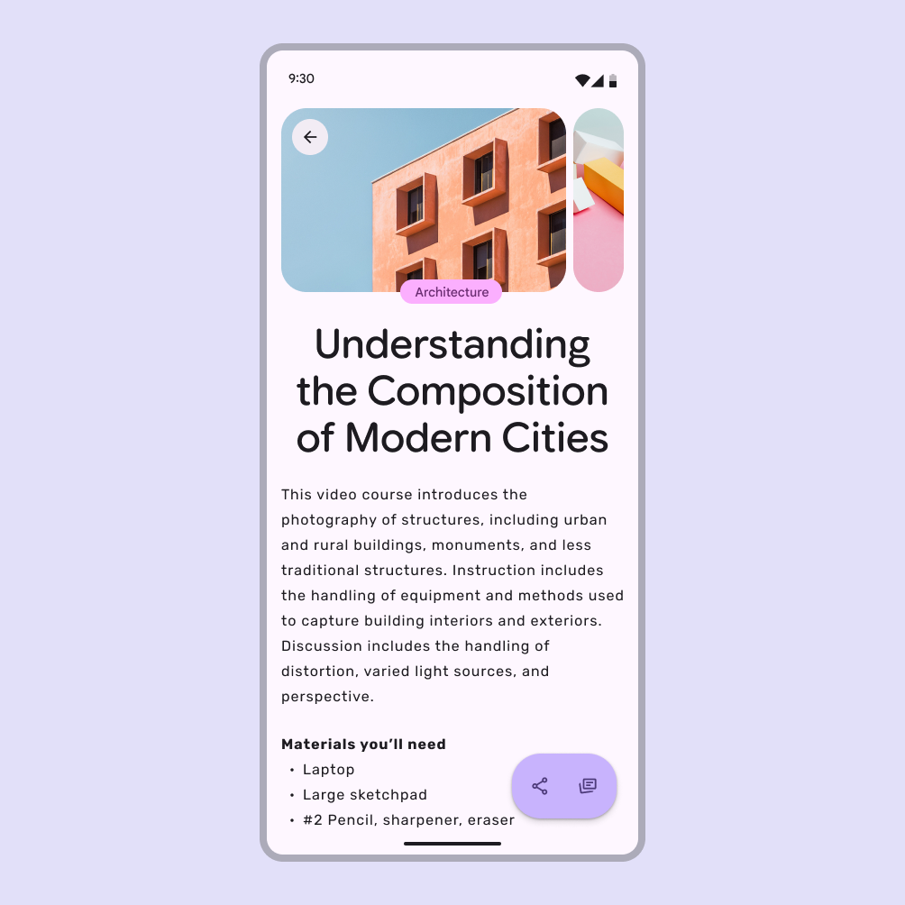
A mobile app in full screen mode.
Mobile layouts default to a full-screen window

Desktop

Desktop experiences use free-form windows that adapt across breakpointsBreakpoints are opinionated window sizes where a layout changes to match available space, device conventions, and ergonomics (previously window size classes).More on breakpoints.

People can use split screens, floating windows, and free-form windows for multi-tasking.

A tablet can convert to a desktop experience when a physical keyboard and mouse are connected. Similarly, Android mobile devices can transition into a desktop-like environment when connected to an external monitor.
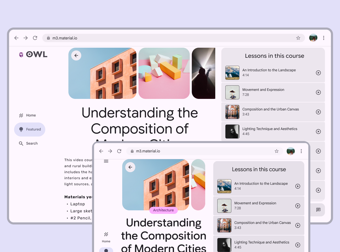
2 desktop layouts adapted to large and medium breakpoints.
A desktop layout can adjust from three to two columns to fit a medium breakpoint

Spatial

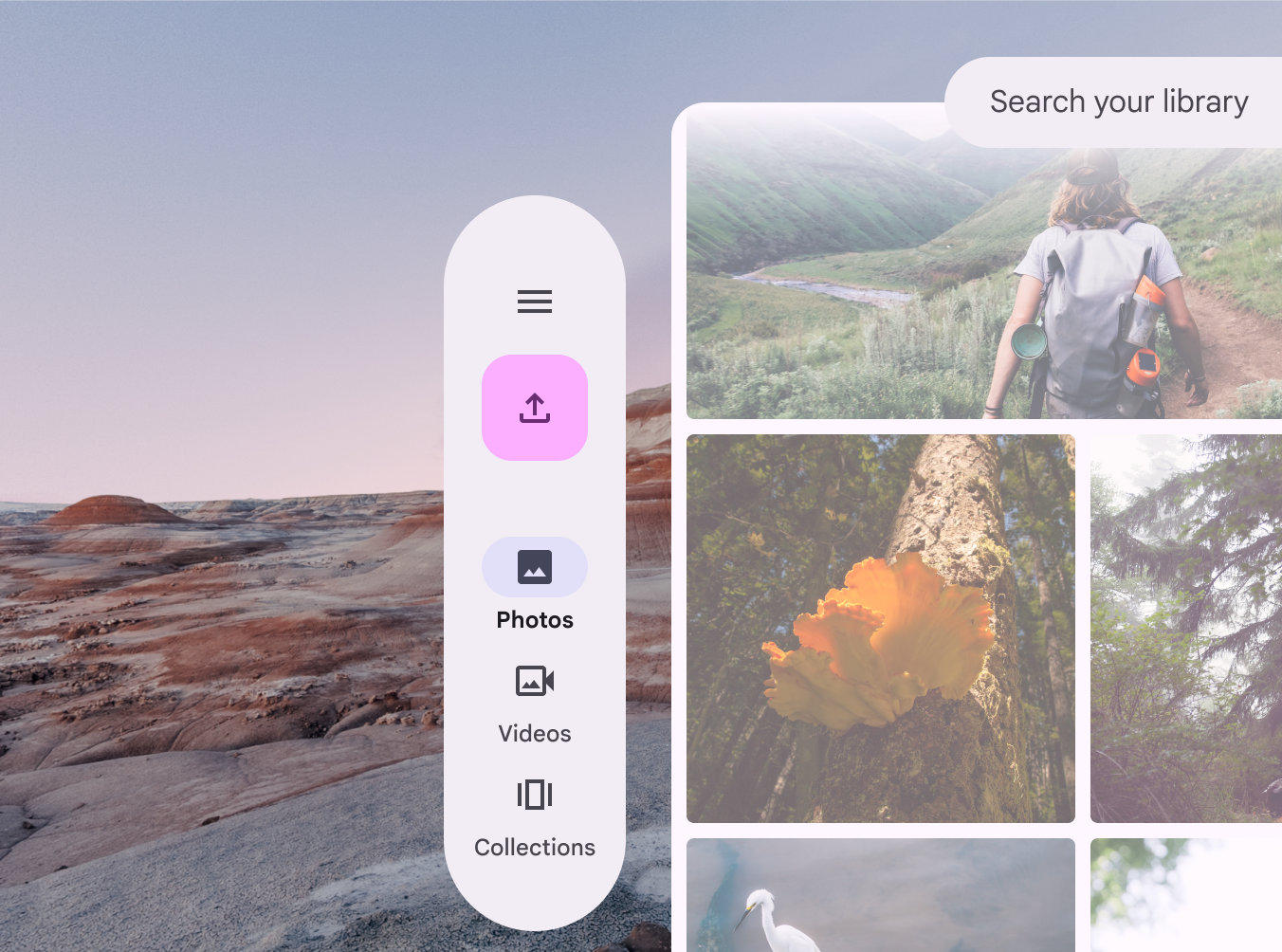
Extended reality (XR) experiences use multiple free-form windows within virtually limitless screens. Immersive modes, such as Android XR’s full space, allow components to be positioned freely in 3D space.
More on XR design

An XR layout in immersive full space mode.
In an XR full space layout, a navigation rail can become an orbiter, and float to the side of the main pane

Adaptive layouts ​

The Material 3 adaptive system uses panesPanes are layout containers that house other components and elements within a single app. A pane can be: fixed, flexible, floating, or semi permanent.More on panes and breakpointsBreakpoints are opinionated window sizes where a layout changes to match available space, device conventions, and ergonomics (previously window size classes).More on breakpoints to organize content into adaptive layouts.

Panes are the building blocks of layout; a pane is a single destination in the product. For example, in a messaging app, the list of messages is one pane, and a specific conversation thread is another.
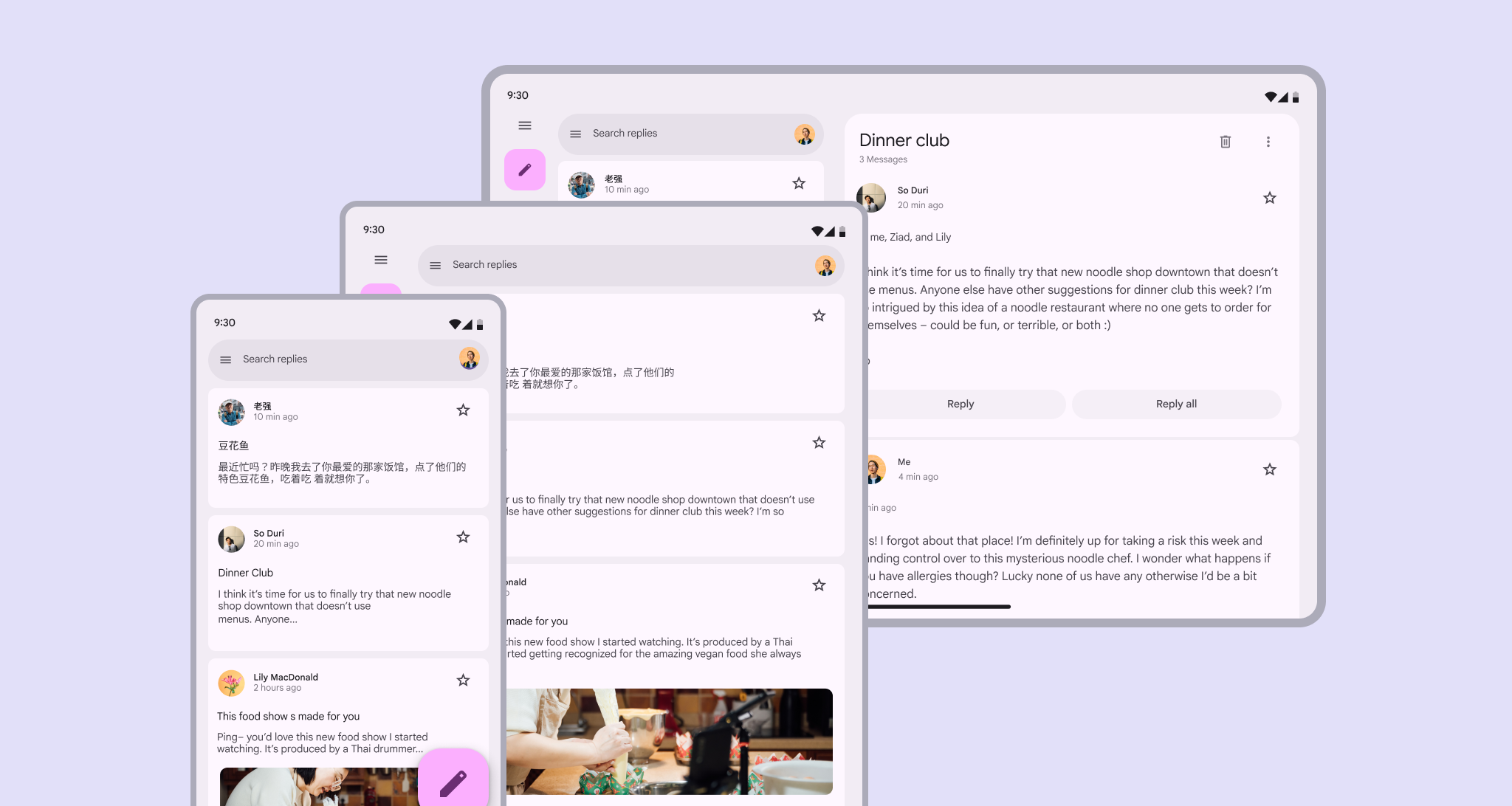

Mobile and tablet in portrait layout with 1 pane. Tablet in landscape layout with 2 panes.
Panes are the primary segments of a layout, and can change based on context

As the pane or window resizes—or as someone navigates a product—panes may change size, enter and exit the screen, and reorganize themselves to make the experience more usable or easier to navigate. These patterns are called adaptive strategies. Material has three adaptive strategies that create a cohesive experience across breakpoints: show and hide, levitate, and reflow.
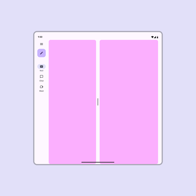
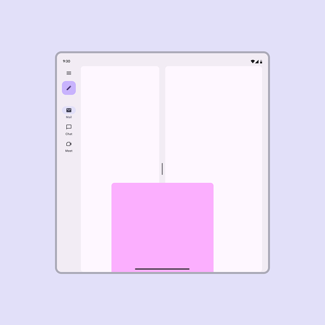
A foldable open screen with 2 co-planar panes displayed side by side.
Co-planar: Panes are displayed side by side
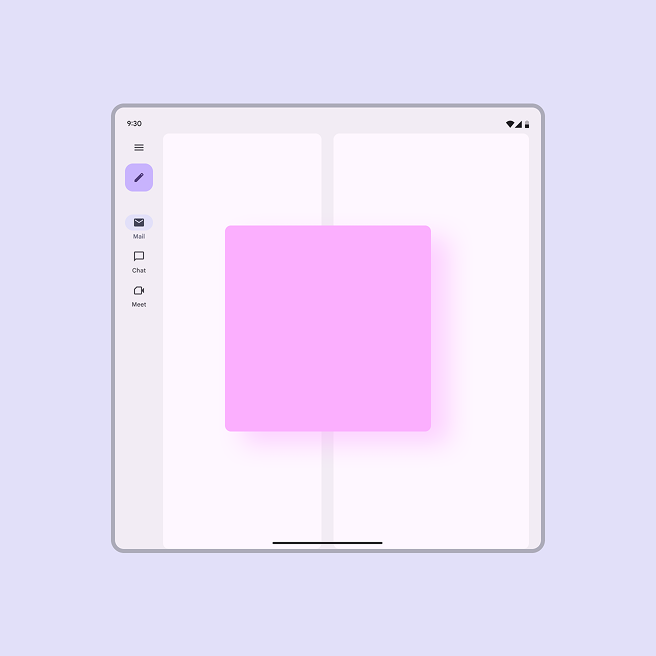
A foldable open screen with a floating pane displayed above other elements.
Floating: A pane is displayed above other panes or content, like a dialog
A foldable open screen with a docked pane to the bottom of the screen displayed above other elements.
Docked: A pane is displayed above other panes and one of its edges extends beyond one side of the screen, like a bottom sheet

In Compose, the Navigation 3 library allows multiple destinations to be shown on screen at the same time, and enables layouts to adapt seamlessly across window sizes and screens.

Navigation destinations remain consistent regardless of screen sizes with Navigation 3

Adapting components ​

Components can adapt in appearance, placement, and behavior based on factors like:

  • Where components are placed in relation to their containers, content, and pane boundaries
  • How components use space
  • How components enable usage across different device and input types

Most Material components respond using three main strategies: resizing, showing and hiding, and presentation changes.

Resizing

Components should resize in response to their content and their placement in a layout.

For example, buttonsButtons let people take action and make choices with one tap.More on buttons may scale along with their parent container, or hug their contents and maintain a left or right alignment.
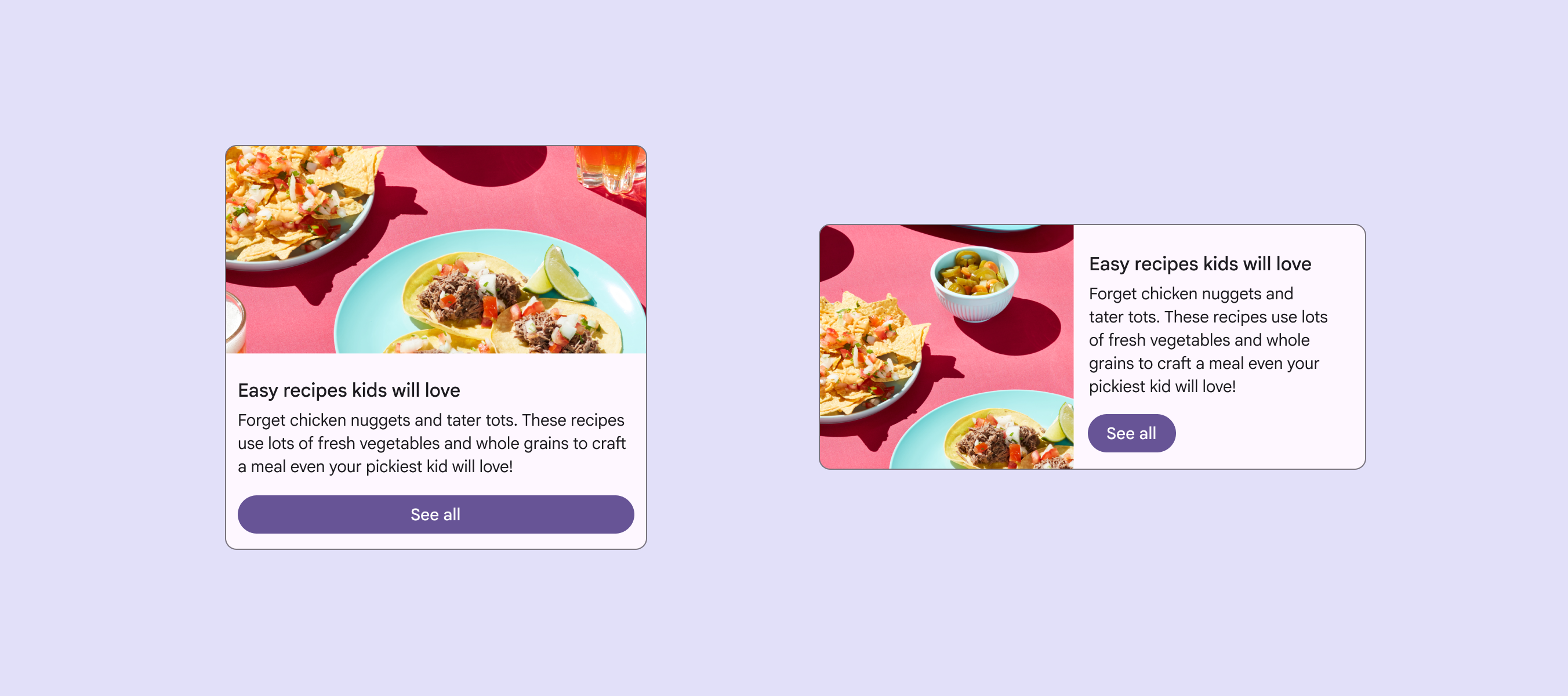
A card with a button that spans the full width, and a card with a button that’s start-aligned and hugs its contents.
Buttons can hug their contents or span their containers based on context

Showing & hiding

Components should show and hide information, or collapse and expand to selectively reveal content that best suits the space.

For example, listLists are continuous, vertical indexes of text and images.More on lists items may reveal descriptions or other additional information as their parent container scales.
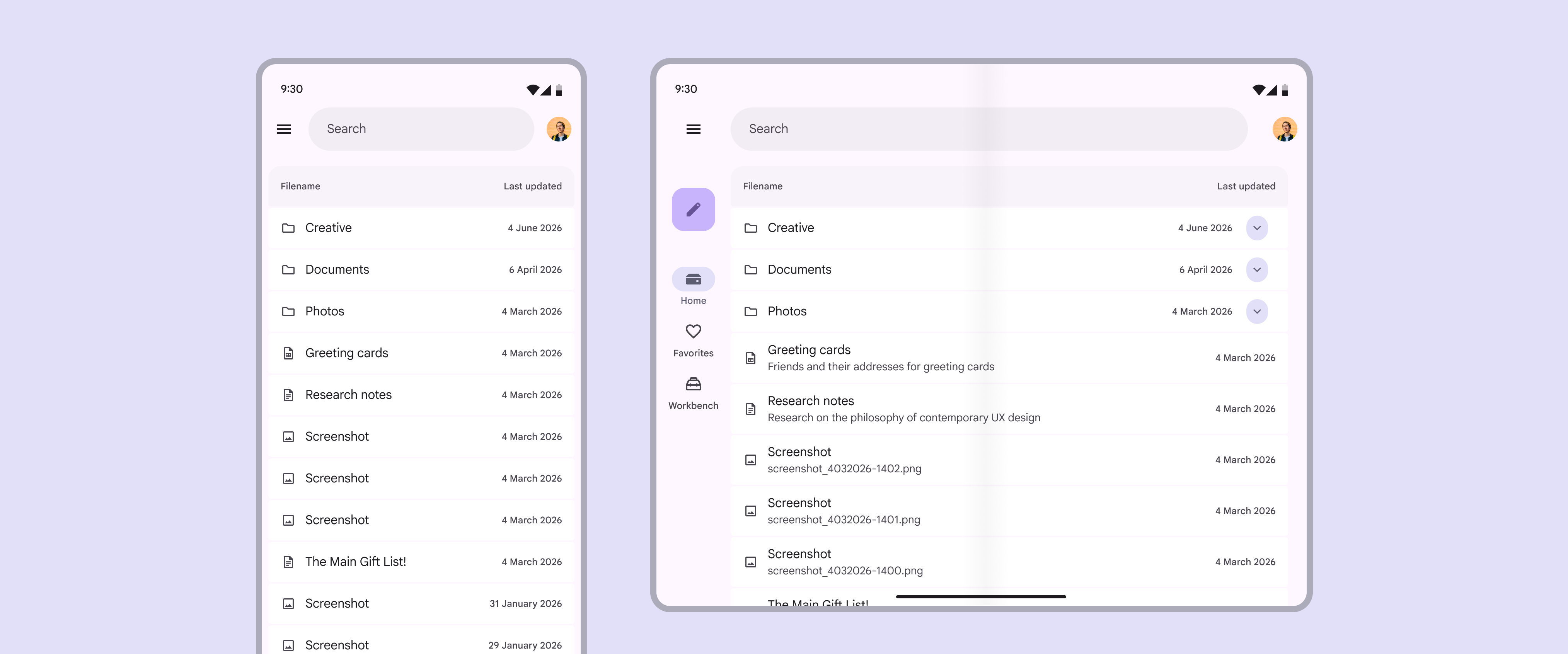
A list on mobile and on tablet. List items show additional text on tablet.
List items can reveal more text on a tablet

Presentation changes

Presentation changes include the orientation of elements and changes to specific properties, like color, type, and shape.

Components can also change configurations. For example, when a window size increases, a FABFloating action buttons (FABs) help people take primary actions.More on FABs can change to an extended FAB, and navigation railsNavigation rails let people switch between UI views on mid-sized devices.More on navigation rails can be automatically expanded.
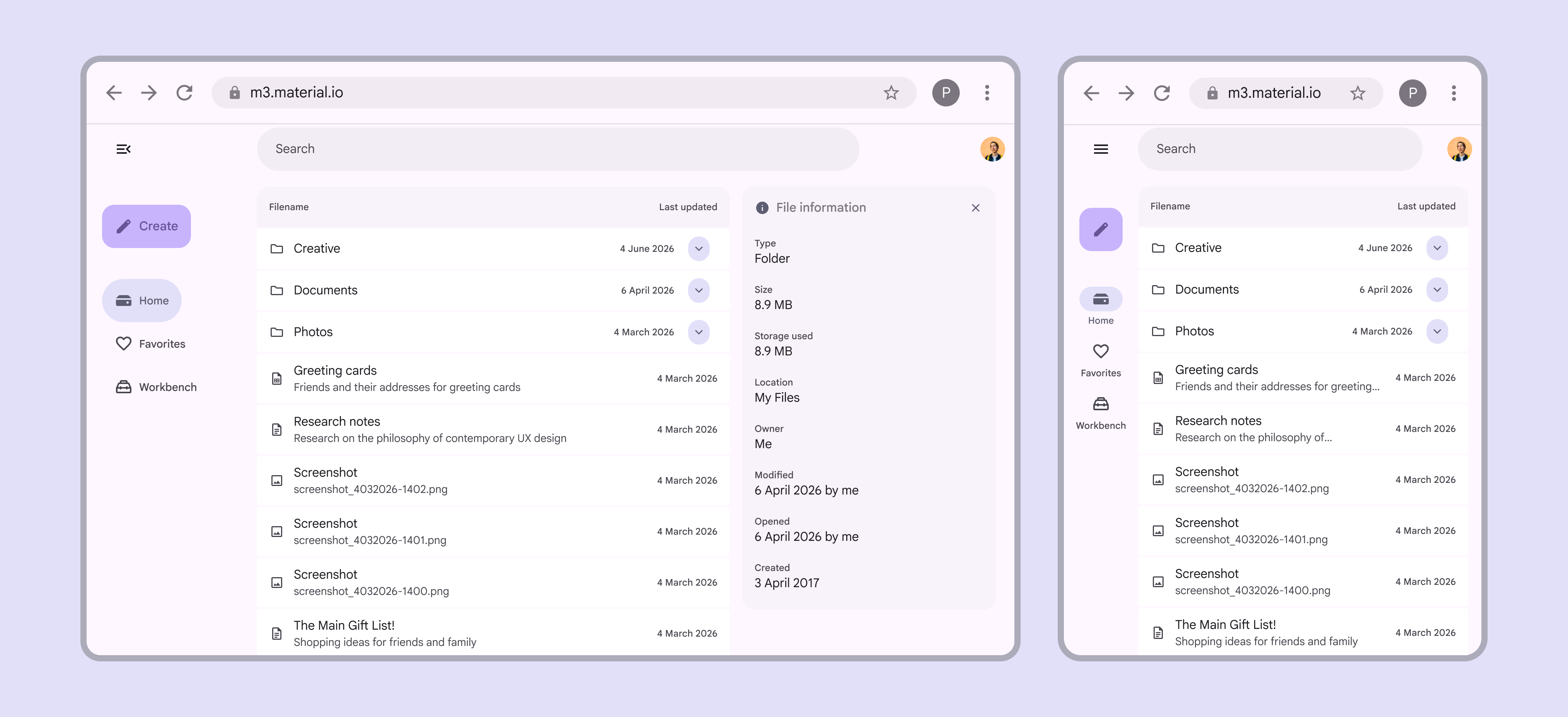
A large desktop window with an extended FAB. A smaller window shows a standard FAB.
The extended FAB can change to a standard FAB when the window is smaller
Pager
Previous pageOverview: Parts of layout
Next pageScaffold: Overview

Released under the Apache 2.0 or CC BY 4.0

Copyright © 2018-Present Google

https://m3.material.io/foundations/layout/layout-overview/adaptive-design

Released under the Apache 2.0 or CC BY 4.0

Copyright © 2018-Present Google