Skip to content
Material Design 3
Main Navigation
v3
v2
v1

English

简体中文
繁體中文
Español
Français
Русский
Português – Brasil
Deutsch
日本語
한국어
Italiano
Polski
Türkçe
čeština
magyar

English

简体中文
繁體中文
Español
Français
Русский
Português – Brasil
Deutsch
日本語
한국어
Italiano
Polski
Türkçe
čeština
magyar

Appearance

Sidebar Navigation

Foundations

Accessibility

Overview: Principles

Overview: Assistive technology

Designing: Overview

Designing: Color contrast

Designing: Structure

Designing: Flow

Designing: Elements

Writing and text: Best practices

Writing and text: Text truncation

Writing and text: Text resizing

Building for all: User needs

Building for all: Co-design

Content design

Overview

Alt text

Global writing: Overview

Global writing: Word choice

Notifications

Style guide: UX writing best practices

Style guide: Word choice

Style guide: Grammar and punctuation

Customizing Material

Devices

Watches: Overview

Watches: Foundations

Watches: Styles

Watches: Layout

XR

Design: Overview

Design: Interaction

Design: Layout

Design: Accessibility

Components: Overview

Components: App bars

Components: Dialogs

Components: Nav bar

Components: Nav rail

Components: Toolbars

Design tokens: Overview

Design tokens: How to use tokens

Interaction

Gestures

Inputs

Selection

States: Overview

States: State layers

States: Applying states

Layout

Overview: Overview

Overview: Parts of layout

Overview: Adaptive design

Scaffold: Overview

Scaffold: Bars

Scaffold: Rails

Scaffold: Panes

Grids & spacing: Overview

Grids & spacing: Grids

Grids & spacing: Spacing

Grids & spacing: Density

Breakpoints: Overview

Breakpoints: Compact

Breakpoints: Medium

Breakpoints: Expanded

Breakpoints: Large & extra-large

Bidirectionality & RTL

Canonical examples: Overview

Canonical examples: Feed

Canonical examples: List-detail

Canonical examples: Supporting pane

Usability: Overview

Usability: Applying M3 Expressive

Material A-Z

Styles

Color

Color system: Overview

Color system: How the system works

Color roles

Color schemes

Choosing a scheme

Static: Baseline

Static: Custom brand

Dynamic: Choosing a source

Dynamic: User-generated source

Dynamic: Content-based source

Advanced: Overview

Advanced: Apply colors

Advanced: Define new colors

Advanced: Adjust existing colors

Color resources

Elevation: Overview

Elevation: Applying elevation

Elevation: Tokens

Icons: Overview

Icons: Designing icons

Icons: Applying icons

Motion

Motion physics system: How it works

Motion physics system: Specs

Easing and duration: Applying easing and duration

Easing and duration: Tokens & specs

Transitions: Transition patterns

Transitions: Applying transitions

Shape: Overview & principles

Shape: Corner radius scale

Shape: Shape morph

Spacing: Overview

Spacing: Applying spacing

Spacing: Tokens

Typography: Overview

Typography: Fonts

Typography: Type scale & tokens

Typography: Applying type

Typography: Editorial treatments

Components

App bars: Overview

App bars: Specs

App bars: Guidelines

App bars: Accessibility

Badges: Overview

Badges: Specs

Badges: Guidelines

Badges: Accessibility

Buttons

All buttons

Button groups: Overview

Button groups: Specs

Button groups: Guidelines

Button groups: Accessibility

Buttons: Overview

Buttons: Specs

Buttons: Guidelines

Buttons: Accessibility

Extended FABs: Overview

Extended FABs: Specs

Extended FABs: Guidelines

Extended FABs: Accessibility

FAB menu: Overview

FAB menu: Specs

FAB menu: Guidelines

FAB menu: Accessibility

FABs: Overview

FABs: Specs

FABs: Guidelines

FABs: Accessibility

Icon buttons: Overview

Icon buttons: Specs

Icon buttons: Guidelines

Icon buttons: Accessibility

Segmented buttons: Overview

Segmented buttons: Specs

Segmented buttons: Guidelines

Segmented buttons: Accessibility

Split button: Overview

Split button: Specs

Split button: Guidelines

Split button: Accessibility

Cards: Overview

Cards: Specs

Cards: Guidelines

Cards: Accessibility

Carousel: Overview

Carousel: Specs

Carousel: Guidelines

Carousel: Accessibility

Checkbox: Overview

Checkbox: Specs

Checkbox: Guidelines

Checkbox: Accessibility

Chips: Overview

Chips: Specs

Chips: Guidelines

Chips: Accessibility

Date & time pickers

Date pickers: Overview

Date pickers: Specs

Date pickers: Guidelines

Date pickers: Accessibility

Time pickers: Overview

Time pickers: Specs

Time pickers: Guidelines

Time pickers: Accessibility

Dialogs: Overview

Dialogs: Specs

Dialogs: Guidelines

Dialogs: Accessibility

Divider: Overview

Divider: Specs

Divider: Guidelines

Divider: Accessibility

Lists: Overview

Lists: Specs

Lists: Guidelines

Lists: Accessibility

Loading & progress

Loading indicator: Overview

Loading indicator: Specs

Loading indicator: Guidelines

Loading indicator: Accessibility

Progress indicators: Overview

Progress indicators: Specs

Progress indicators: Guidelines

Progress indicators: Accessibility

Menus: Overview

Menus: Specs

Menus: Guidelines

Menus: Accessibility

Navigation

Navigation bar: Overview

Navigation bar: Specs

Navigation bar: Guidelines

Navigation bar: Accessibility

Navigation drawer: Overview

Navigation drawer: Specs

Navigation drawer: Guidelines

Navigation drawer: Accessibility

Navigation rail: Overview

Navigation rail: Specs

Navigation rail: Guidelines

Navigation rail: Accessibility

Radio button: Overview

Radio button: Specs

Radio button: Guidelines

Radio button: Accessibility

Search: Overview

Search: Specs

Search: Guidelines

Search: Accessibility

Sheets

Bottom sheets: Overview

Bottom sheets: Specs

Bottom sheets: Guidelines

Bottom sheets: Accessibility

Side sheets: Overview

Side sheets: Specs

Side sheets: Guidelines

Side sheets: Accessibility

Sliders: Overview

Sliders: Specs

Sliders: Guidelines

Sliders: Accessibility

Snackbar: Overview

Snackbar: Specs

Snackbar: Guidelines

Snackbar: Accessibility

Switch: Overview

Switch: Specs

Switch: Guidelines

Switch: Accessibility

Tabs: Overview

Tabs: Specs

Tabs: Guidelines

Tabs: Accessibility

Text fields: Overview

Text fields: Specs

Text fields: Guidelines

Text fields: Accessibility

Toolbars: Overview

Toolbars: Specs

Toolbars: Guidelines

Toolbars: Accessibility

Tooltips: Overview

Tooltips: Specs

Tooltips: Guidelines

Tooltips: Accessibility

On this page

Motion physics system: How it works ​

The motion physics system makes a UI expressive and easy to use


A motion system designed for expression ​

May 2025

Material introduced the motion physics system with M3 Expressive. This new physics-based system makes interactions and transitions feel more alive, fluid, and natural. It represents a new motion language for Google products, and is easier to implement and customize than ever before.

The physics system is replacing the previous system based on easing and duration.

More on M3 Expressive

Availability & resources ​

TypeLinkStatus
ImplementationAndroid Views (MDC-Android)Available. Not added to components. See specs
FlutterUnavailable
Jetpack ComposeAvailable
WebCompatible with Compose springs. See specs

The basics: Motion schemes ​

The physics system has two preset motion schemes: expressive and standard. The motion scheme you choose defines how your product feels. While most motion in a product should use the same scheme, products can make advanced customizations to swap the scheme to emphasize key moments.

Expressive is Material’s opinionated motion scheme, and should be used for most situations, particularly hero moments and key interactions.

The expressive motion scheme overshoots the final values to add bounce

Standard feels more functional with minimal bounce, and should be used for utilitarian products.

The standard motion scheme eases into the final values

Need something other than the preset schemes? Create your own! The physics system makes it easy to create custom motion schemes beyond expressive and standard, while still leveraging theming. Schemes can be easily switched between expressive, standard, or custom as needed.

How it works: Springs ​

Motion schemes use springs. A spring is a combination of three attributes which control all motion behavior: stiffnessStiffness defines the hardness of the spring. Higher stiffness resolves the motion faster., dampingDamping defines how fast the bounce wears out. Higher damping stops the bounce faster. A damping value of 1 completely removes spring bounce., and initial velocityInitial velocity defines the initial speed of the spring, which influences the total spring duration in combination with stiffness and damping..

Springs are versatile. One spring can apply to many situations, such as transitions, button effects, or gestures. This makes the motion and expression feel consistent throughout the product.

Springs feel natural. Springs are designed to be predictable, like how objects move and bounce. They handle gestures, interruptions, and retargeting animations seamlessly.

All component motion is driven by two tokens: expressive fast spatial and expressive fast effects

Spring tokens ​

On Jetpack Compose and Android Views (MDC-Android), these springs are available as spring tokens. Use tokens to easily apply motion to any element, making all motion feel predictable and consistent across multiple platforms. See specs for how to convert springs to other platforms like Web.

There are tokens for spatial movement and effects, with three durations each: default, fast, and slow.

For example, to apply fast, spatial, expressive motion, call the "expressive" motion scheme, then use the token: md.sys.motion.spring.fast.spatial.

Notice that the "expressive" scheme isn't part of the token itself. Rather, it's called at the product level and applied to all tokens. This makes it easier to swap schemes without changing assigned tokens.
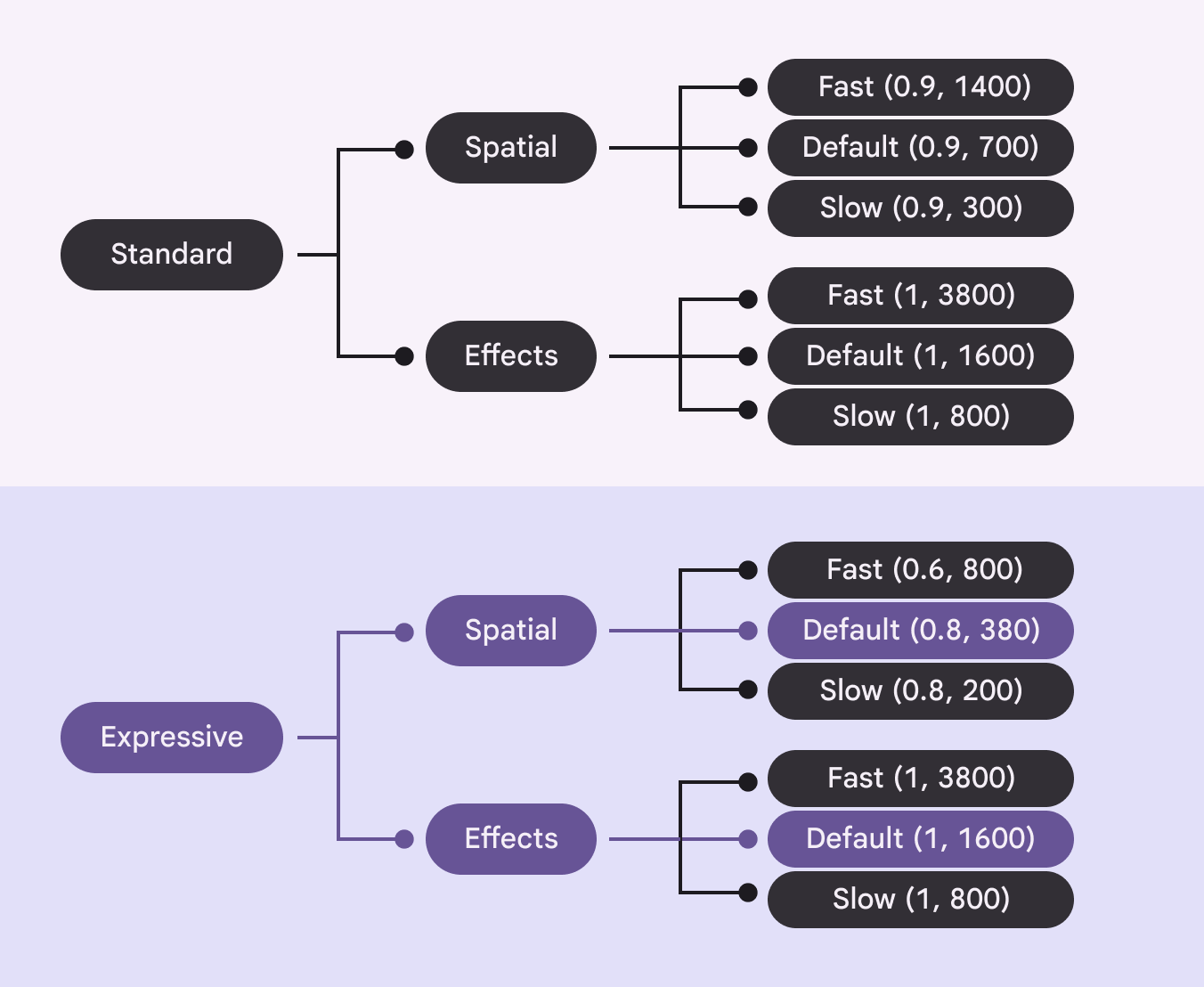
A chart of the token structure. A scheme has 3 speeds. Each speed has a spatial token and an effects token.
Each scheme (expressive, standard) has three speeds (fast, default, slow) for two types of movement (spatial, effects)

Style

Spatial spring tokens are used for animations that move something on screen, for example the x and y position, rotation, size, rounded corners. This spring overshoots the final value and bounces into place.

Spatial springs apply to movement
Spatial springs apply to rotation

Effects spring tokens are used to animate properties such as color and opacity animations, where there shouldn’t be any overshoot.

Effects springs applied to opacity
Effects springs applied to color

Speed ​

Spatial and effect spring tokens come in three speeds: default, fast, and slow. Most motion should use the default speed, while smaller elements may use fast and larger elements may use slow.

SpeedSpatial exampleEffects example
DefaultAnimations that partially cover the screen, such as bottom sheetBottom sheets show secondary content anchored to the bottom of the screen.More on bottom sheets and expanded navigation railExpanded navigation rails show text labels and an extended FAB, and can be default or modal.Opacity of the content within a navigation railNavigation rails let people switch between UI views on mid-sized devices.More on navigation rails
FastSmall components, such as switchesSwitches toggle the state of an item on or off.More on switches and buttonsButtons let people take action and make choices with one tap.More on buttonsColor change of the switchSwitches toggle the state of an item on or off.More on switches handle
SlowFull-screen animationsFull-screen content refresh
Spatial motion in fast, default, and slow speeds
Effects motion in fast, default, and slow speeds

Spring tokens work across devices. For example, the spatial fast token will always be faster than default or slow, but the exact values of each token differ depending on if the device is a wearable, phone, or tablet. This ensures the movement feels fast in the context of the device.

Application ​

Components ​

On Jetpack Compose, 21 Material components use the motion physics system by default. Android Views (MDC-Android) support is coming soon. To add the motion physics system to other components, including custom-built components, use spring tokens. View full specs

Material components use the physics motion system to feel more expressive

Advanced customizations ​

There are a few different levels for applying motion. Choose the level that applies best to your product or specific component.

Level 1: Use a default motion scheme

The expressive and standard schemes should be sufficient for all motion needs. On Jetpack Compose, components use these schemes by default.

Switch using the expressive motion scheme
Switch using the standard motion scheme

Level 2: Create a custom motion scheme

On Jetpack Compose, to change the default motion scheme that all components and transitions use, create a custom MotionScheme object, and return different AnimationSpec for each property of the motion scheme.

FAB menu with an extra stiff custom scheme
FAB menu with very low stiffness custom scheme

Level 3: Swap the default motion scheme per element ​

Why use just one scheme when you can use multiple? On Jetpack Compose, to use one scheme for most of the product, such as expressive, but on certain elements swap it for another scheme, like standard, override the CompositionLocal for that particular composable, screen, or element.

Pager
Previous pageIcons: Applying icons
Next pageMotion physics system: Specs

Released under the Apache 2.0 or CC BY 4.0

Copyright © 2018-Present Google

https://m3.material.io/styles/motion/overview/how-it-works

Released under the Apache 2.0 or CC BY 4.0

Copyright © 2018-Present Google