Skip to content
Material Design 3
Main Navigation
v3
v2
v1

English

简体中文
繁體中文
Español
Français
Русский
Português – Brasil
Deutsch
日本語
한국어
Italiano
Polski
Türkçe
čeština
magyar

English

简体中文
繁體中文
Español
Français
Русский
Português – Brasil
Deutsch
日本語
한국어
Italiano
Polski
Türkçe
čeština
magyar

Appearance

Sidebar Navigation

Foundations

Accessibility

Overview: Principles

Overview: Assistive technology

Designing: Overview

Designing: Color contrast

Designing: Structure

Designing: Flow

Designing: Elements

Writing and text: Best practices

Writing and text: Text truncation

Writing and text: Text resizing

Building for all: User needs

Building for all: Co-design

Content design

Overview

Alt text

Global writing: Overview

Global writing: Word choice

Notifications

Style guide: UX writing best practices

Style guide: Word choice

Style guide: Grammar and punctuation

Customizing Material

Devices

Watches: Overview

Watches: Foundations

Watches: Styles

Watches: Layout

XR

Design: Overview

Design: Interaction

Design: Layout

Design: Accessibility

Components: Overview

Components: App bars

Components: Dialogs

Components: Nav bar

Components: Nav rail

Components: Toolbars

Design tokens: Overview

Design tokens: How to use tokens

Interaction

Gestures

Inputs

Selection

States: Overview

States: State layers

States: Applying states

Layout

Overview: Overview

Overview: Parts of layout

Overview: Adaptive design

Scaffold: Overview

Scaffold: Bars

Scaffold: Rails

Scaffold: Panes

Grids & spacing: Overview

Grids & spacing: Grids

Grids & spacing: Spacing

Grids & spacing: Density

Breakpoints: Overview

Breakpoints: Compact

Breakpoints: Medium

Breakpoints: Expanded

Breakpoints: Large & extra-large

Bidirectionality & RTL

Canonical examples: Overview

Canonical examples: Feed

Canonical examples: List-detail

Canonical examples: Supporting pane

Usability: Overview

Usability: Applying M3 Expressive

Material A-Z

Styles

Color

Color system: Overview

Color system: How the system works

Color roles

Color schemes

Choosing a scheme

Static: Baseline

Static: Custom brand

Dynamic: Choosing a source

Dynamic: User-generated source

Dynamic: Content-based source

Advanced: Overview

Advanced: Apply colors

Advanced: Define new colors

Advanced: Adjust existing colors

Color resources

Elevation: Overview

Elevation: Applying elevation

Elevation: Tokens

Icons: Overview

Icons: Designing icons

Icons: Applying icons

Motion

Motion physics system: How it works

Motion physics system: Specs

Easing and duration: Applying easing and duration

Easing and duration: Tokens & specs

Transitions: Transition patterns

Transitions: Applying transitions

Shape: Overview & principles

Shape: Corner radius scale

Shape: Shape morph

Spacing: Overview

Spacing: Applying spacing

Spacing: Tokens

Typography: Overview

Typography: Fonts

Typography: Type scale & tokens

Typography: Applying type

Typography: Editorial treatments

Components

App bars: Overview

App bars: Specs

App bars: Guidelines

App bars: Accessibility

Badges: Overview

Badges: Specs

Badges: Guidelines

Badges: Accessibility

Buttons

All buttons

Button groups: Overview

Button groups: Specs

Button groups: Guidelines

Button groups: Accessibility

Buttons: Overview

Buttons: Specs

Buttons: Guidelines

Buttons: Accessibility

Extended FABs: Overview

Extended FABs: Specs

Extended FABs: Guidelines

Extended FABs: Accessibility

FAB menu: Overview

FAB menu: Specs

FAB menu: Guidelines

FAB menu: Accessibility

FABs: Overview

FABs: Specs

FABs: Guidelines

FABs: Accessibility

Icon buttons: Overview

Icon buttons: Specs

Icon buttons: Guidelines

Icon buttons: Accessibility

Segmented buttons: Overview

Segmented buttons: Specs

Segmented buttons: Guidelines

Segmented buttons: Accessibility

Split button: Overview

Split button: Specs

Split button: Guidelines

Split button: Accessibility

Cards: Overview

Cards: Specs

Cards: Guidelines

Cards: Accessibility

Carousel: Overview

Carousel: Specs

Carousel: Guidelines

Carousel: Accessibility

Checkbox: Overview

Checkbox: Specs

Checkbox: Guidelines

Checkbox: Accessibility

Chips: Overview

Chips: Specs

Chips: Guidelines

Chips: Accessibility

Date & time pickers

Date pickers: Overview

Date pickers: Specs

Date pickers: Guidelines

Date pickers: Accessibility

Time pickers: Overview

Time pickers: Specs

Time pickers: Guidelines

Time pickers: Accessibility

Dialogs: Overview

Dialogs: Specs

Dialogs: Guidelines

Dialogs: Accessibility

Divider: Overview

Divider: Specs

Divider: Guidelines

Divider: Accessibility

Lists: Overview

Lists: Specs

Lists: Guidelines

Lists: Accessibility

Loading & progress

Loading indicator: Overview

Loading indicator: Specs

Loading indicator: Guidelines

Loading indicator: Accessibility

Progress indicators: Overview

Progress indicators: Specs

Progress indicators: Guidelines

Progress indicators: Accessibility

Menus: Overview

Menus: Specs

Menus: Guidelines

Menus: Accessibility

Navigation

Navigation bar: Overview

Navigation bar: Specs

Navigation bar: Guidelines

Navigation bar: Accessibility

Navigation drawer: Overview

Navigation drawer: Specs

Navigation drawer: Guidelines

Navigation drawer: Accessibility

Navigation rail: Overview

Navigation rail: Specs

Navigation rail: Guidelines

Navigation rail: Accessibility

Radio button: Overview

Radio button: Specs

Radio button: Guidelines

Radio button: Accessibility

Search: Overview

Search: Specs

Search: Guidelines

Search: Accessibility

Sheets

Bottom sheets: Overview

Bottom sheets: Specs

Bottom sheets: Guidelines

Bottom sheets: Accessibility

Side sheets: Overview

Side sheets: Specs

Side sheets: Guidelines

Side sheets: Accessibility

Sliders: Overview

Sliders: Specs

Sliders: Guidelines

Sliders: Accessibility

Snackbar: Overview

Snackbar: Specs

Snackbar: Guidelines

Snackbar: Accessibility

Switch: Overview

Switch: Specs

Switch: Guidelines

Switch: Accessibility

Tabs: Overview

Tabs: Specs

Tabs: Guidelines

Tabs: Accessibility

Text fields: Overview

Text fields: Specs

Text fields: Guidelines

Text fields: Accessibility

Toolbars: Overview

Toolbars: Specs

Toolbars: Guidelines

Toolbars: Accessibility

Tooltips: Overview

Tooltips: Specs

Tooltips: Guidelines

Tooltips: Accessibility

On this page

Shape: Corner radius scale ​

The M3 shape system includes original shapes, a corner radius scale, and built-in shape morphing


Material components use a corner radius scale to define all rectangular shapes, such as buttons, carousels, and dialogs.

Illustration of range of shapes.
M3 defines corner radii using a shape scale. This can be used to create both uniform and asymmetrical shapes.

Shape tokens ​

Material has shape corner tokens to define all corners, and corner-value tokens for individual corners. Learn more about design tokens

TokenValue
Fully roundedcircular
Extra large top rounding28dp 28dp 0 0
Extra large rounding28dp 28dp 28dp 28dp
Large top rounding16dp 16dp 0 0
Large end rounding0 16dp 16dp 0
Large start rounding16dp 0 0 16dp
Large rounding16dp 16dp 16dp 16dp
Medium rounding12dp 12dp 12dp 12dp
Small rounding8dp 8dp 8dp 8dp
Extra small top rounding4dp 4dp 0 0
Extra small rounding4dp 4dp 4dp 4dp
No rounding0 0 0 0
Large increased rounding20dp 20dp 20dp 20dp
Extra large increased rounding32dp 32dp 32dp 32dp
Extra extra large rounding48dp 48dp 48dp 48dp
No corner value0
Extra small corner value4dp
Small corner value8dp
Medium corner value12dp
Large corner value16dp
Large increased corner value20dp
Extra large corner value28dp
Extra large increased corner value32dp
Extra extra large corner value48dp

Corner radius scale ​

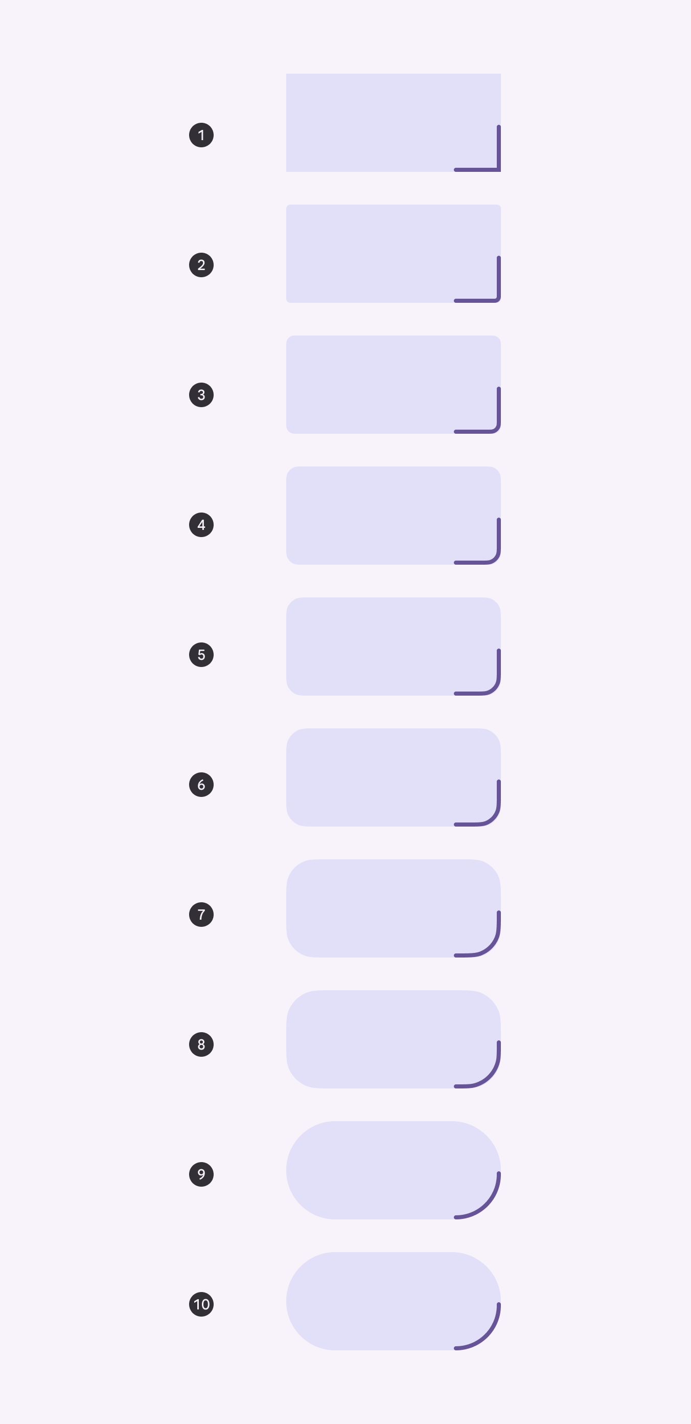
The Material 3 shape system uses a size-based scale with ten styles. Styles are assigned to components based on the desired amount of roundedness.

  1. None - 0dp
  2. Extra small - 4dp
  3. Small - 8dp
  4. Medium - 12dp
  5. Large - 16dp
  6. Large increased - 20dp
  7. Extra large - 28dp
  8. Extra large increased - 32dp
  9. Extra extra large - 48dp
  10. Full - fully rounded corners

Apply shape styles using tokens

10 corner radii styles.
Steps on the scale are named for the amount of roundedness applied to the corner
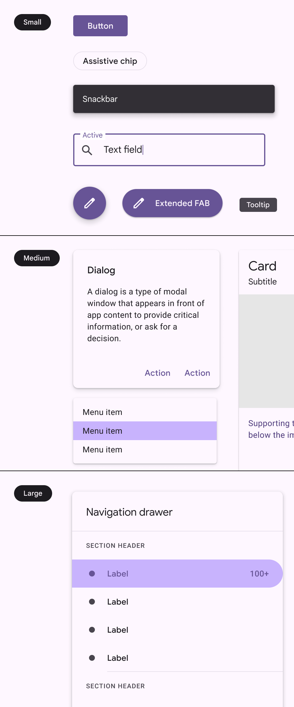
Components illustrating the old 3-level shape scale.
M2: Three-level shape scale based on the size of the component container
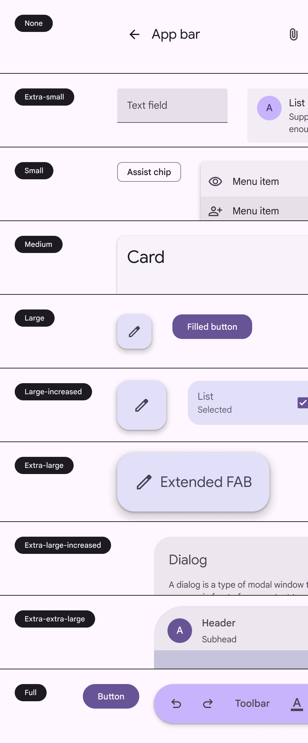
Components illustrating the new 10-level shape scale.
M3: Ten-level shape scale based on the roundedness of shape corners

Symmetry ​

Components can have either symmetric or asymmetric corner shapes. Symmetric shapes have the same values for all corners, while asymmetric shapes can have corners with different values.

Both symmetric and asymmetric shapes use the same 10-step scale.

Asymmetrical shapes are used in M3 components with closely-grouped items, such as menus and split buttons. These are called inner corners.

3 shapes illustrating symmetrical and asymmetrical styles.
Inner corner component tokens always map to individual corner shape tokens

Customizing shapes ​

Generally, products should consistently use the Material 3 shape styles. However, customization is sometimes necessary, and even encouraged, for hero moments or custom components. Shapes can be customized at the style or component level.

Style changes

The corner radius shape style, like medium, can be customized to be a different size.

This applies the change to all components mapped to that shape style, unless they have an override.

Customizing the corner size of the medium style applies the change to all components using this style, such as cards and small FABs

Component changes

The style of a specific component, such as a button, can be changed by customizing which corner radius shape style it maps to.

For example, by default, buttons are mapped to the full corner radius shape style. If your product needs a less rounded shape, remap the token to another style in the shape scale, such as small or medium.

Remapping the shape for a component to a different style applies the change to just that component across the UI

The shape style family can be customized from rounded to cut. This makes the corner a straight line instead of curved.

Add extra padding to avoid cutting off content in information-dense components.

For example, a large cut corner on a card will clip content and images in the area more than a rounded corner of the same size.


Caution Be careful not to apply large or full corners to information-dense components, such as cards
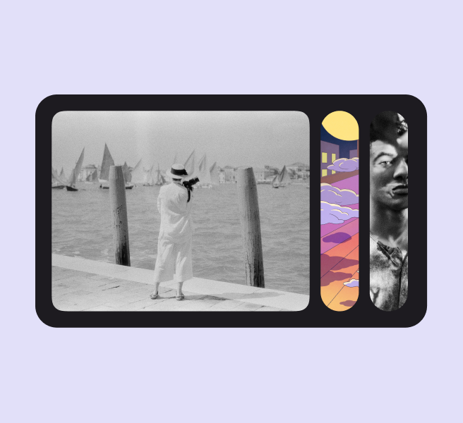
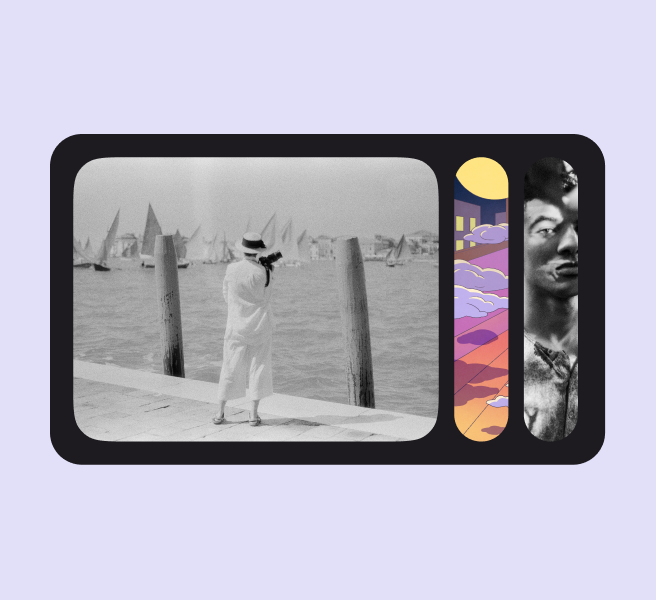
Carousel with images with rounded corners.
Do Shapes can be intentionally rounder to add more visual variety
Carousel with full rounded shapes.
Do Add unexpected moments by switching between square and fully rounded shapes

Adjust for optical roundness

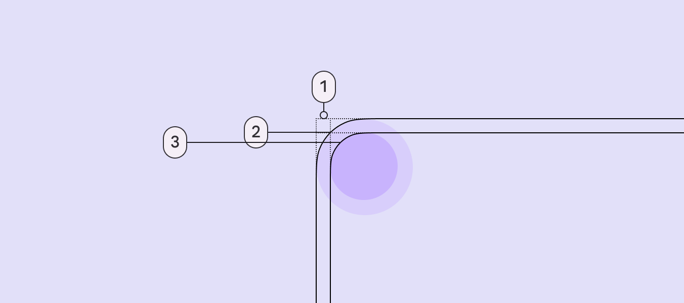
When nesting rounded objects, avoid using the same corner radii for both objects. This can make the corners look unbalanced.

Instead, adjust the corner radii to be proportional to each other; this is called optical roundness. To calculate optical roundness:

  • Outer radius - padding = inner radius
  • For example: 48dp - 14dp = 34dp
3 parts of corner radii to adjust.
  1. Padding
  2. Outer radius
  3. Inner radius
Nested carousel with optical roundness.
Do Use different corner radii values for nested components so they have optical roundness
Nested radii with the same roundness as its container.
Don’t Avoid using the same corner radius value for nested objects

Using the shape library

The Material 3 shape library can be used to create more interesting containers. Use the shape library for mostly visual elements. Avoid applying unconventional shapes to text-heavy containers.

Shapes should be used sparingly to provide a stronger emphasis and moments of delight.

Unexpected shapes in carousel.
Leverage the Material shape library for moments of delight
Pager
Previous pageShape: Overview & principles
Next pageShape: Shape morph

Released under the Apache 2.0 or CC BY 4.0

Copyright © 2018-Present Google

https://m3.material.io/styles/shape/corner-radius-scale

Released under the Apache 2.0 or CC BY 4.0

Copyright © 2018-Present Google