Skip to content
Material Design 3
Main Navigation
v3
v2
v1

English

简体中文
繁體中文
Español
Français
Русский
Português – Brasil
Deutsch
日本語
한국어
Italiano
Polski
Türkçe
čeština
magyar

English

简体中文
繁體中文
Español
Français
Русский
Português – Brasil
Deutsch
日本語
한국어
Italiano
Polski
Türkçe
čeština
magyar

Appearance

Sidebar Navigation

Foundations

Accessibility

Overview: Principles

Overview: Assistive technology

Designing: Overview

Designing: Color contrast

Designing: Structure

Designing: Flow

Designing: Elements

Writing and text: Best practices

Writing and text: Text truncation

Writing and text: Text resizing

Building for all: User needs

Building for all: Co-design

Content design

Overview

Alt text

Global writing: Overview

Global writing: Word choice

Notifications

Style guide: UX writing best practices

Style guide: Word choice

Style guide: Grammar and punctuation

Customizing Material

Devices

Watches: Overview

Watches: Foundations

Watches: Styles

Watches: Layout

XR

Design: Overview

Design: Interaction

Design: Layout

Design: Accessibility

Components: Overview

Components: App bars

Components: Dialogs

Components: Nav bar

Components: Nav rail

Components: Toolbars

Design tokens: Overview

Design tokens: How to use tokens

Interaction

Gestures

Inputs

Selection

States: Overview

States: State layers

States: Applying states

Layout

Overview: Overview

Overview: Parts of layout

Overview: Adaptive design

Scaffold: Overview

Scaffold: Bars

Scaffold: Rails

Scaffold: Panes

Grids & spacing: Overview

Grids & spacing: Grids

Grids & spacing: Spacing

Grids & spacing: Density

Breakpoints: Overview

Breakpoints: Compact

Breakpoints: Medium

Breakpoints: Expanded

Breakpoints: Large & extra-large

Bidirectionality & RTL

Canonical examples: Overview

Canonical examples: Feed

Canonical examples: List-detail

Canonical examples: Supporting pane

Usability: Overview

Usability: Applying M3 Expressive

Material A-Z

Styles

Color

Color system: Overview

Color system: How the system works

Color roles

Color schemes

Choosing a scheme

Static: Baseline

Static: Custom brand

Dynamic: Choosing a source

Dynamic: User-generated source

Dynamic: Content-based source

Advanced: Overview

Advanced: Apply colors

Advanced: Define new colors

Advanced: Adjust existing colors

Color resources

Elevation: Overview

Elevation: Applying elevation

Elevation: Tokens

Icons: Overview

Icons: Designing icons

Icons: Applying icons

Motion

Motion physics system: How it works

Motion physics system: Specs

Easing and duration: Applying easing and duration

Easing and duration: Tokens & specs

Transitions: Transition patterns

Transitions: Applying transitions

Shape: Overview & principles

Shape: Corner radius scale

Shape: Shape morph

Spacing: Overview

Spacing: Applying spacing

Spacing: Tokens

Typography: Overview

Typography: Fonts

Typography: Type scale & tokens

Typography: Applying type

Typography: Editorial treatments

Components

App bars: Overview

App bars: Specs

App bars: Guidelines

App bars: Accessibility

Badges: Overview

Badges: Specs

Badges: Guidelines

Badges: Accessibility

Buttons

All buttons

Button groups: Overview

Button groups: Specs

Button groups: Guidelines

Button groups: Accessibility

Buttons: Overview

Buttons: Specs

Buttons: Guidelines

Buttons: Accessibility

Extended FABs: Overview

Extended FABs: Specs

Extended FABs: Guidelines

Extended FABs: Accessibility

FAB menu: Overview

FAB menu: Specs

FAB menu: Guidelines

FAB menu: Accessibility

FABs: Overview

FABs: Specs

FABs: Guidelines

FABs: Accessibility

Icon buttons: Overview

Icon buttons: Specs

Icon buttons: Guidelines

Icon buttons: Accessibility

Segmented buttons: Overview

Segmented buttons: Specs

Segmented buttons: Guidelines

Segmented buttons: Accessibility

Split button: Overview

Split button: Specs

Split button: Guidelines

Split button: Accessibility

Cards: Overview

Cards: Specs

Cards: Guidelines

Cards: Accessibility

Carousel: Overview

Carousel: Specs

Carousel: Guidelines

Carousel: Accessibility

Checkbox: Overview

Checkbox: Specs

Checkbox: Guidelines

Checkbox: Accessibility

Chips: Overview

Chips: Specs

Chips: Guidelines

Chips: Accessibility

Date & time pickers

Date pickers: Overview

Date pickers: Specs

Date pickers: Guidelines

Date pickers: Accessibility

Time pickers: Overview

Time pickers: Specs

Time pickers: Guidelines

Time pickers: Accessibility

Dialogs: Overview

Dialogs: Specs

Dialogs: Guidelines

Dialogs: Accessibility

Divider: Overview

Divider: Specs

Divider: Guidelines

Divider: Accessibility

Lists: Overview

Lists: Specs

Lists: Guidelines

Lists: Accessibility

Loading & progress

Loading indicator: Overview

Loading indicator: Specs

Loading indicator: Guidelines

Loading indicator: Accessibility

Progress indicators: Overview

Progress indicators: Specs

Progress indicators: Guidelines

Progress indicators: Accessibility

Menus: Overview

Menus: Specs

Menus: Guidelines

Menus: Accessibility

Navigation

Navigation bar: Overview

Navigation bar: Specs

Navigation bar: Guidelines

Navigation bar: Accessibility

Navigation drawer: Overview

Navigation drawer: Specs

Navigation drawer: Guidelines

Navigation drawer: Accessibility

Navigation rail: Overview

Navigation rail: Specs

Navigation rail: Guidelines

Navigation rail: Accessibility

Radio button: Overview

Radio button: Specs

Radio button: Guidelines

Radio button: Accessibility

Search: Overview

Search: Specs

Search: Guidelines

Search: Accessibility

Sheets

Bottom sheets: Overview

Bottom sheets: Specs

Bottom sheets: Guidelines

Bottom sheets: Accessibility

Side sheets: Overview

Side sheets: Specs

Side sheets: Guidelines

Side sheets: Accessibility

Sliders: Overview

Sliders: Specs

Sliders: Guidelines

Sliders: Accessibility

Snackbar: Overview

Snackbar: Specs

Snackbar: Guidelines

Snackbar: Accessibility

Switch: Overview

Switch: Specs

Switch: Guidelines

Switch: Accessibility

Tabs: Overview

Tabs: Specs

Tabs: Guidelines

Tabs: Accessibility

Text fields: Overview

Text fields: Specs

Text fields: Guidelines

Text fields: Accessibility

Toolbars: Overview

Toolbars: Specs

Toolbars: Guidelines

Toolbars: Accessibility

Tooltips: Overview

Tooltips: Specs

Tooltips: Guidelines

Tooltips: Accessibility

On this page

Canonical layout examples: List-detail ​

Canonical layout examples are designs for common screen layouts across all breakpoints

Many layouts can be split into a list view and a detail view.

Key use cases for this layout include parent-child pairings of information like:

  • Text message + conversation
  • File browser + open folder
  • Musical artist + album detail
  • Settings + category detail
  • Email inbox + selected email
An email app in a list-detail layout at a medium breakpoint.
  1. List
  2. Detail

Usage ​

Use the list-detail layout for quickly accessing details of an item from a long list of content.

Examples include:

  • Showing a series of conversations and a text message
  • Browsing files and seeing their details
  • Browsing multiple albums and seeing individual track information
Several stacked cards make up the list area on the left pane, while the detail area is a single section on the right pane.
Simplified diagram of:
  1. List area
  2. Detail area

Dividing space ​


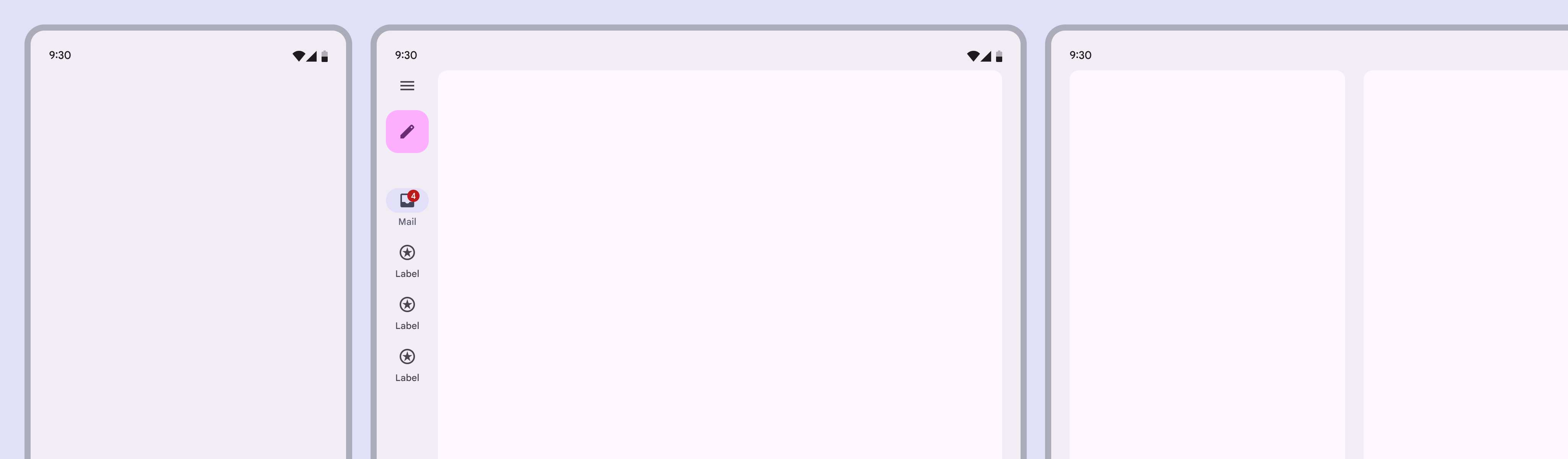
Compact windows have 1 pane, while medium and expanded windows can have 2 panes for list-detailed views.
The most basic list-detail views for compact, medium, and expanded layouts

A list-detail layout uses two panes. Depending on the breakpoint, the two panes may appear together in the same layout or across separate layouts.

List-detail layouts use the same pane guidance as all single and two-pane layouts, including special behavior for foldables.

Breakpoint (dp)Visible panes
Compact (0-599)1 pane
Medium (600-839)1 (recommended) or 2 panes
Expanded (840+)2 panes
Large (1200-1599)2 panes
Extra-large (1600+)2 panes

Across breakpoints ​

Compact

  • Use a single-pane layout
  • Only one view is visible at a time, either list or detail
Single-pane layout on 3 devices at compact breakpoints.
  1. Phone in portrait orientation
  2. Closed foldable
  3. Tablet in split-screen mode

Medium

  • Use a single-pane layout for information-dense content or deep focus
Single-pane layout on a foldable open flat and a tablet in portrait orientation.
  1. Foldable open flat
  2. Tablet in portrait orientation
  • Use a two-pane layout to browse collections and switch between items quickly
  • To maximize horizontal space for two-pane layouts, use a bottom navigation barNavigation bars let people switch between UI views on smaller devices.More on navigation bars or modal navigation railNavigation rails let people switch between UI views on mid-sized devices.More on navigation rails
2-pane layout on a foldable open flat and a tablet in portrait orientation.
  1. Foldable open flat
  2. Tablet in portrait orientation

Expanded, large, & extra-large ​

  • Use a two-pane layout

2-pane layout on a phone and tablet, both in landscape orientation.
  1. Phone in landscape orientation
  2. Tablet in landscape orientation

Behavior ​

Single vs two-pane

  • Back button: Appears in detail view only for single-pane layouts
  • Selected state: Appears only in list view for two-pane layouts
  • Visual focus: Use explicit and implicit grouping to direct focus in two-pane layouts
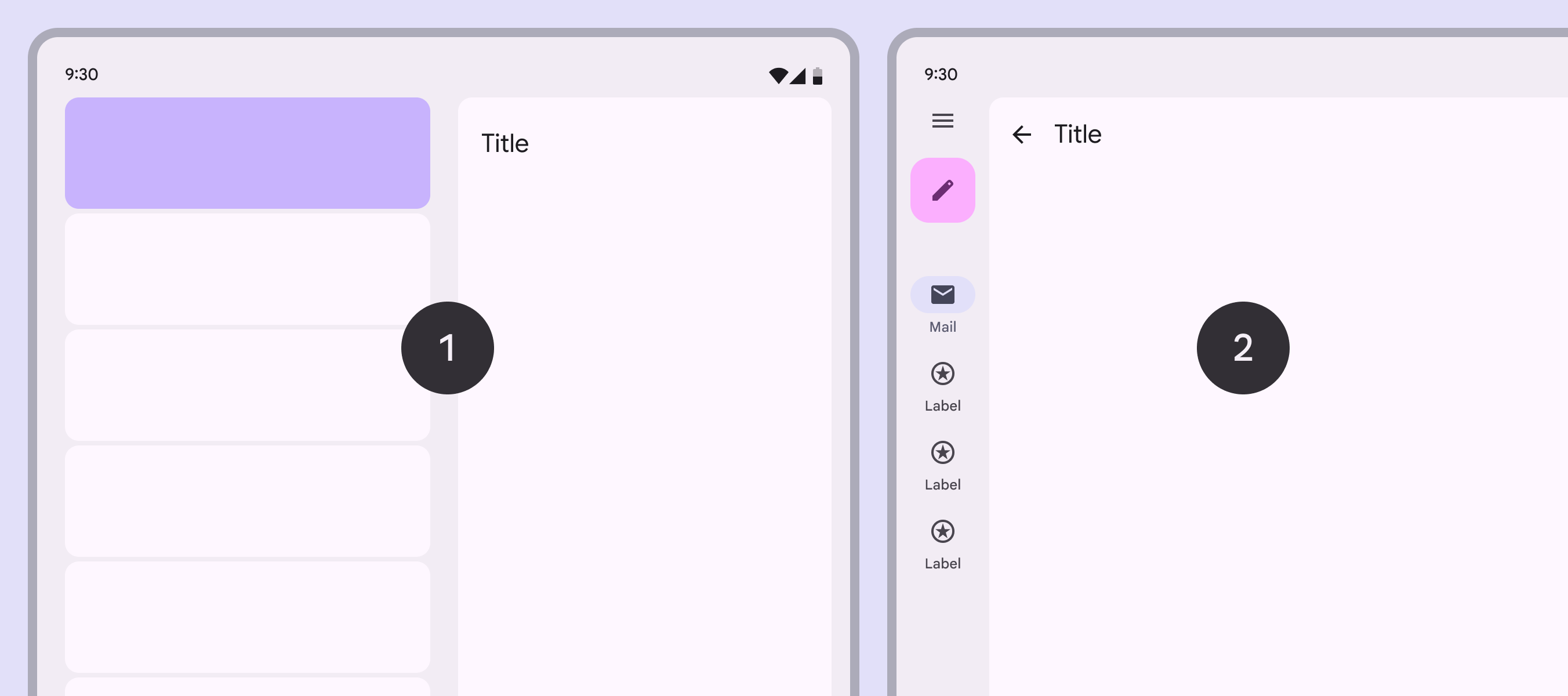
A 2-pane layout shows a selected list item. A single-pane layout uses a Back button to return to the list.
  1. Use a selection state in two-pane layouts only
  2. Use a back button in single-pane layouts only

Transitioning between layouts

The amount of available space is dynamic and changes based on how someone uses a device, such as rotating or unfolding it, or entering multi-window mode.

A two-pane layout adapts to a single-pane layout when a device rotates from an expanded to medium breakpoint

No selected list item

A single-pane layout shows a list view, while a two-pane layout shows placeholder content in the detail pane.

In some cases, such as multi-select, the most recently used pane should stay visible when switching to single-pane layout.

If no item is selected when a foldable opens, the detail pane displays an empty state

Selected list item

When switching from a single- to two-pane layout, both panes should be shown and the selected item’s details are visible.

When going from a two- to single-pane layout, the view depends on the product:

  • The detail pane should typically show in a single-pane layout, and an app bar appears
  • If the product supports selection without deep navigation, like multi-select, the list view can show with the item selected
  • Consistency is key: If a layout showed the list view previously, it should return to that view when returning to a single pane
If an item is selected when a foldable opens, the detail pane shows that item

When a foldable closes with an item selected, the single pane shows the detail view

Persistent states

In most cases, a state should be saved when navigating between detail views. This includes read and unread content.

Detail views should retain their scroll position when navigating to other items
Pager
Previous pageCanonical examples: Feed
Next pageCanonical examples: Supporting pane

Released under the Apache 2.0 or CC BY 4.0

Copyright © 2018-Present Google

https://m3.material.io/foundations/layout/canonical-examples/list-detail

Released under the Apache 2.0 or CC BY 4.0

Copyright © 2018-Present Google