

Checkbox: Specs
Checkboxes let users select one or more items from a list, or turn an item on or off
Tokens & specs
Browse the component elements, attributes, tokens, and their values.
Checkbox

- Container
- Icon
Color
Color values are implemented through design tokens. For design, this means working with color values that correspond with tokens. For implementation, a color value will be a token that references a value. Learn more about design tokens
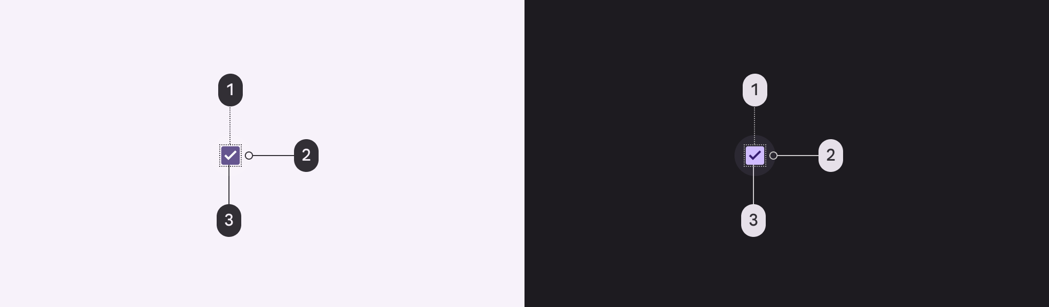
- Checkbox
- State-layer
- Icon
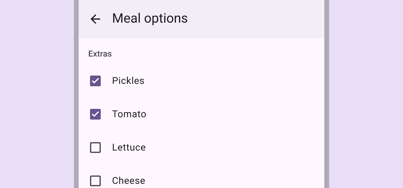
Adjacent text label color
Use the color role on surface for adjacent text labels. This remains the same even if interacting with the label or component.
States
States are visual representations used to communicate the status of a component or interactive element. Learn more about interaction states
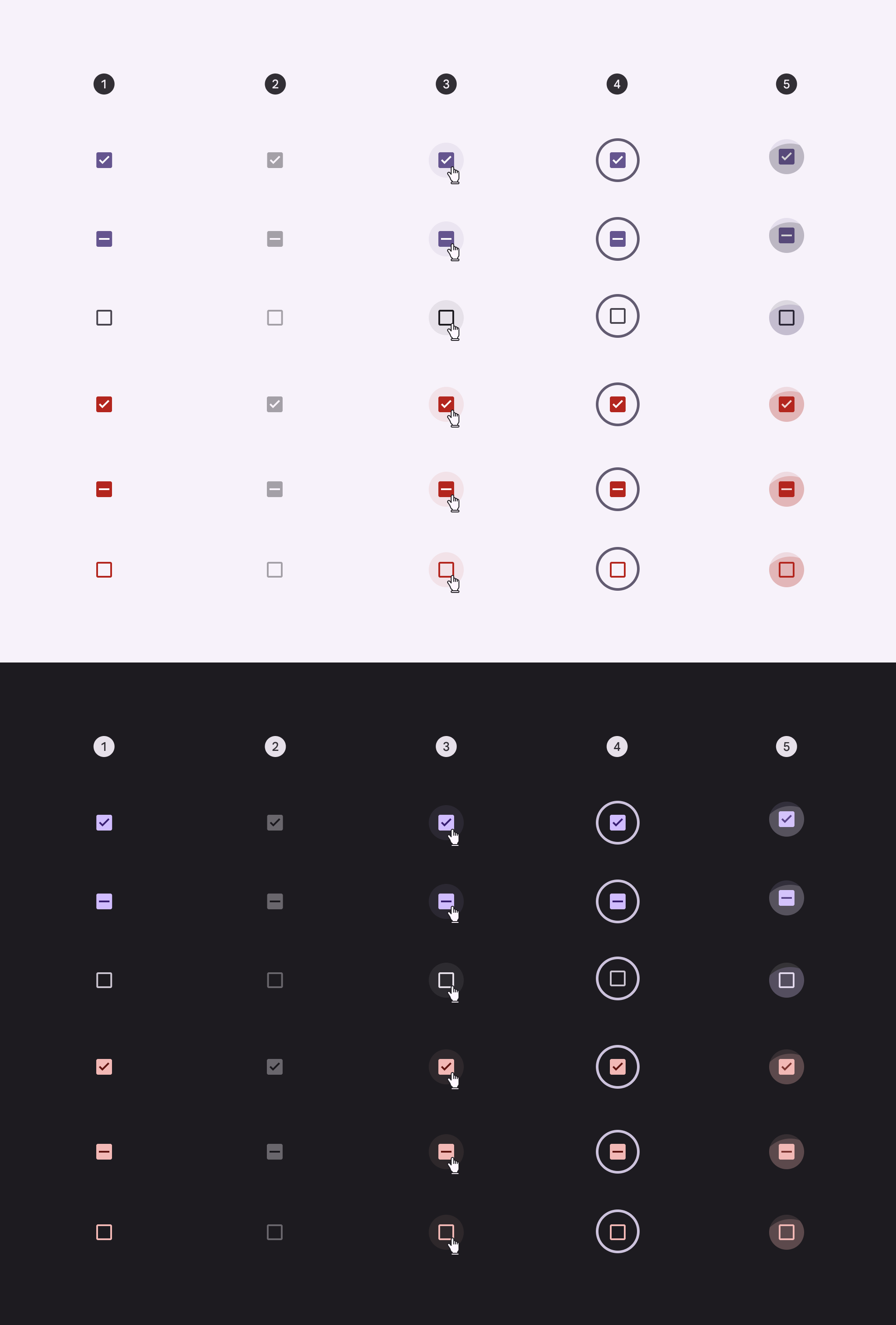
- Enabled
- Disabled
- Hovered
- Focused
- Pressed
Measurements

| Attribute | Value |
|---|---|
| Container size | 18dp |
| Container corner shape | 2dp |
| Icon size | 18dp |
| Icon alignment | Center-aligned |
| Target size | 48dp |
| State-layer size | 40dp |