Skip to content
Material Design 3
Main Navigation
v3
v2
v1

English

简体中文
繁體中文
Español
Français
Русский
Português – Brasil
Deutsch
日本語
한국어
Italiano
Polski
Türkçe
čeština
magyar

English

简体中文
繁體中文
Español
Français
Русский
Português – Brasil
Deutsch
日本語
한국어
Italiano
Polski
Türkçe
čeština
magyar

Appearance

Sidebar Navigation

Foundations

Accessibility

Overview: Principles

Overview: Assistive technology

Designing: Overview

Designing: Color contrast

Designing: Structure

Designing: Flow

Designing: Elements

Writing and text: Best practices

Writing and text: Text truncation

Writing and text: Text resizing

Building for all: User needs

Building for all: Co-design

Content design

Overview

Alt text

Global writing: Overview

Global writing: Word choice

Notifications

Style guide: UX writing best practices

Style guide: Word choice

Style guide: Grammar and punctuation

Customizing Material

Devices

Watches: Overview

Watches: Foundations

Watches: Styles

Watches: Layout

XR

Design: Overview

Design: Interaction

Design: Layout

Design: Accessibility

Components: Overview

Components: App bars

Components: Dialogs

Components: Nav bar

Components: Nav rail

Components: Toolbars

Design tokens: Overview

Design tokens: How to use tokens

Interaction

Gestures

Inputs

Selection

States: Overview

States: State layers

States: Applying states

Layout

Overview: Overview

Overview: Parts of layout

Overview: Adaptive design

Scaffold: Overview

Scaffold: Bars

Scaffold: Rails

Scaffold: Panes

Grids & spacing: Overview

Grids & spacing: Grids

Grids & spacing: Spacing

Grids & spacing: Density

Breakpoints: Overview

Breakpoints: Compact

Breakpoints: Medium

Breakpoints: Expanded

Breakpoints: Large & extra-large

Bidirectionality & RTL

Canonical examples: Overview

Canonical examples: Feed

Canonical examples: List-detail

Canonical examples: Supporting pane

Usability: Overview

Usability: Applying M3 Expressive

Material A-Z

Styles

Color

Color system: Overview

Color system: How the system works

Color roles

Color schemes

Choosing a scheme

Static: Baseline

Static: Custom brand

Dynamic: Choosing a source

Dynamic: User-generated source

Dynamic: Content-based source

Advanced: Overview

Advanced: Apply colors

Advanced: Define new colors

Advanced: Adjust existing colors

Color resources

Elevation: Overview

Elevation: Applying elevation

Elevation: Tokens

Icons: Overview

Icons: Designing icons

Icons: Applying icons

Motion

Motion physics system: How it works

Motion physics system: Specs

Easing and duration: Applying easing and duration

Easing and duration: Tokens & specs

Transitions: Transition patterns

Transitions: Applying transitions

Shape: Overview & principles

Shape: Corner radius scale

Shape: Shape morph

Spacing: Overview

Spacing: Applying spacing

Spacing: Tokens

Typography: Overview

Typography: Fonts

Typography: Type scale & tokens

Typography: Applying type

Typography: Editorial treatments

Components

App bars: Overview

App bars: Specs

App bars: Guidelines

App bars: Accessibility

Badges: Overview

Badges: Specs

Badges: Guidelines

Badges: Accessibility

Buttons

All buttons

Button groups: Overview

Button groups: Specs

Button groups: Guidelines

Button groups: Accessibility

Buttons: Overview

Buttons: Specs

Buttons: Guidelines

Buttons: Accessibility

Extended FABs: Overview

Extended FABs: Specs

Extended FABs: Guidelines

Extended FABs: Accessibility

FAB menu: Overview

FAB menu: Specs

FAB menu: Guidelines

FAB menu: Accessibility

FABs: Overview

FABs: Specs

FABs: Guidelines

FABs: Accessibility

Icon buttons: Overview

Icon buttons: Specs

Icon buttons: Guidelines

Icon buttons: Accessibility

Segmented buttons: Overview

Segmented buttons: Specs

Segmented buttons: Guidelines

Segmented buttons: Accessibility

Split button: Overview

Split button: Specs

Split button: Guidelines

Split button: Accessibility

Cards: Overview

Cards: Specs

Cards: Guidelines

Cards: Accessibility

Carousel: Overview

Carousel: Specs

Carousel: Guidelines

Carousel: Accessibility

Checkbox: Overview

Checkbox: Specs

Checkbox: Guidelines

Checkbox: Accessibility

Chips: Overview

Chips: Specs

Chips: Guidelines

Chips: Accessibility

Date & time pickers

Date pickers: Overview

Date pickers: Specs

Date pickers: Guidelines

Date pickers: Accessibility

Time pickers: Overview

Time pickers: Specs

Time pickers: Guidelines

Time pickers: Accessibility

Dialogs: Overview

Dialogs: Specs

Dialogs: Guidelines

Dialogs: Accessibility

Divider: Overview

Divider: Specs

Divider: Guidelines

Divider: Accessibility

Lists: Overview

Lists: Specs

Lists: Guidelines

Lists: Accessibility

Loading & progress

Loading indicator: Overview

Loading indicator: Specs

Loading indicator: Guidelines

Loading indicator: Accessibility

Progress indicators: Overview

Progress indicators: Specs

Progress indicators: Guidelines

Progress indicators: Accessibility

Menus: Overview

Menus: Specs

Menus: Guidelines

Menus: Accessibility

Navigation

Navigation bar: Overview

Navigation bar: Specs

Navigation bar: Guidelines

Navigation bar: Accessibility

Navigation drawer: Overview

Navigation drawer: Specs

Navigation drawer: Guidelines

Navigation drawer: Accessibility

Navigation rail: Overview

Navigation rail: Specs

Navigation rail: Guidelines

Navigation rail: Accessibility

Radio button: Overview

Radio button: Specs

Radio button: Guidelines

Radio button: Accessibility

Search: Overview

Search: Specs

Search: Guidelines

Search: Accessibility

Sheets

Bottom sheets: Overview

Bottom sheets: Specs

Bottom sheets: Guidelines

Bottom sheets: Accessibility

Side sheets: Overview

Side sheets: Specs

Side sheets: Guidelines

Side sheets: Accessibility

Sliders: Overview

Sliders: Specs

Sliders: Guidelines

Sliders: Accessibility

Snackbar: Overview

Snackbar: Specs

Snackbar: Guidelines

Snackbar: Accessibility

Switch: Overview

Switch: Specs

Switch: Guidelines

Switch: Accessibility

Tabs: Overview

Tabs: Specs

Tabs: Guidelines

Tabs: Accessibility

Text fields: Overview

Text fields: Specs

Text fields: Guidelines

Text fields: Accessibility

Toolbars: Overview

Toolbars: Specs

Toolbars: Guidelines

Toolbars: Accessibility

Tooltips: Overview

Tooltips: Specs

Tooltips: Guidelines

Tooltips: Accessibility

On this page

Typography: Applying type ​

Use typography to make content readable and beautiful

Applying type ​

The Material 3 type scale organizes styles into five roles that are named to describe their purposes: display, headline, title, label, body. Each role has three sizes: large, medium, and small. These roles and sizes create clear page hierarchy and work across many devices.

Roles ​

Display

There are three display styles in the default type scale: Large, medium, and small. As the largest text on the screen, display styles are reserved for short, important text or numerals. They work best on large screens.

For display type, consider choosing a more expressive font, such as a handwritten or script style.

If available, set the appropriate optical size to your usage.
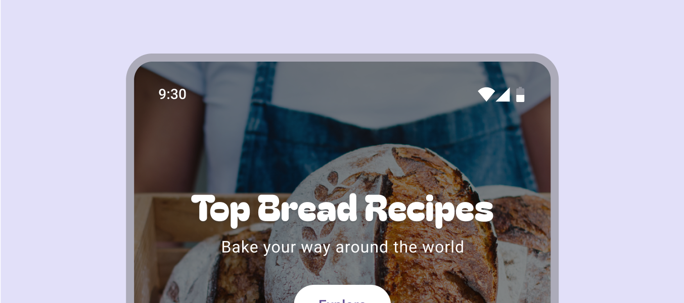
Example display typeface.
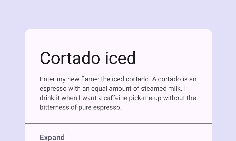
An expressive typeface can be used for display styles, as shown here with Bagel Fat One
Card featuring display size font.
A card using a display size
Large expressive typeface set above text.
An expressive typeface can entice readers to engage with an eye-catching design, as shown here with Anton

Headline

Headlines are best-suited for short, high-emphasis text on smaller screens. These styles can be good for marking primary passages of text or important regions of content.

Headlines can also make use of expressive typefaces, provided that appropriate line height and letter spacing is also integrated to maintain readability.
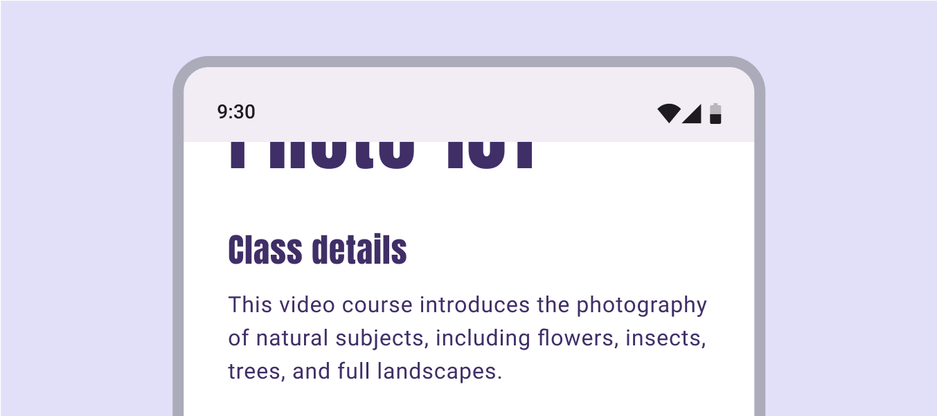

Example expressive headline typeface on phone screen.
Expressive typefaces can be used for headlines styles as well, as shown here with Anton
The name Ana Russo in headline style in a contact card.
Headline style used for short text on a small screen
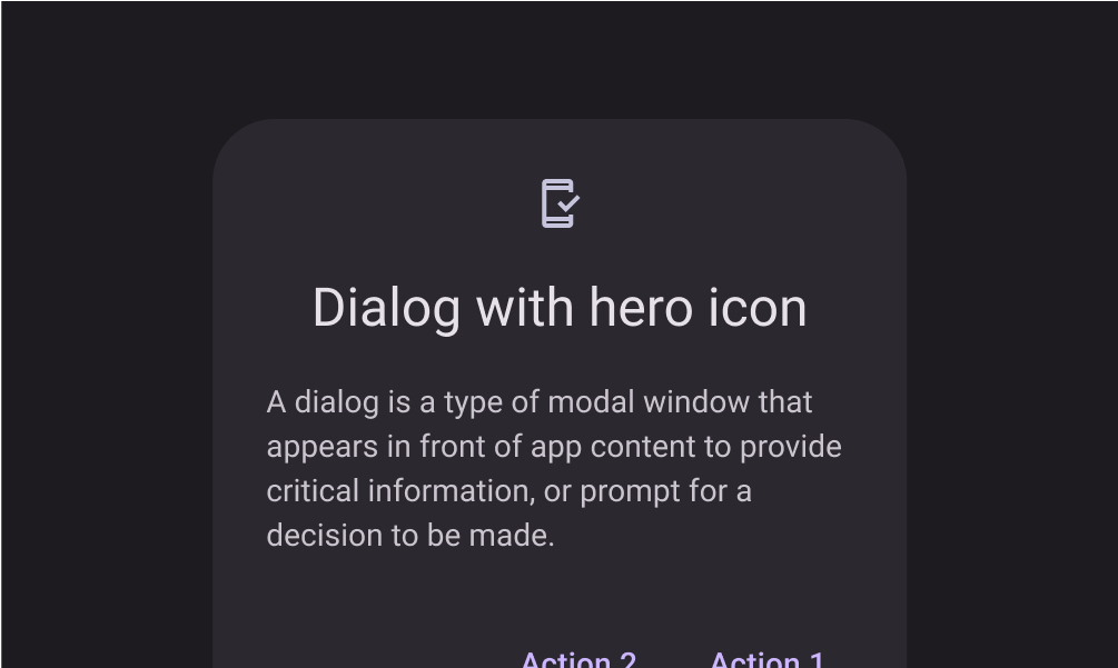
Headline style set above body text.
Dialog using a headline style

Title

Titles are smaller than headline styles, and should be used for medium-emphasis text that remains relatively short. For example, consider using title styles to divide secondary passages of text or secondary regions of content.

For titles, use caution when using expressive fonts, including display, handwritten, and script styles.

An article card using title style for the article title.
A news article title using the title style to capture attention, as shown here with Bebas Neue
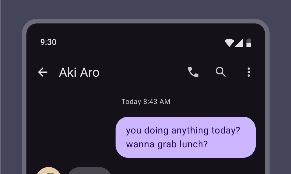
Top app bar using title style for the contact name, Aki Aro.
App bar using title style
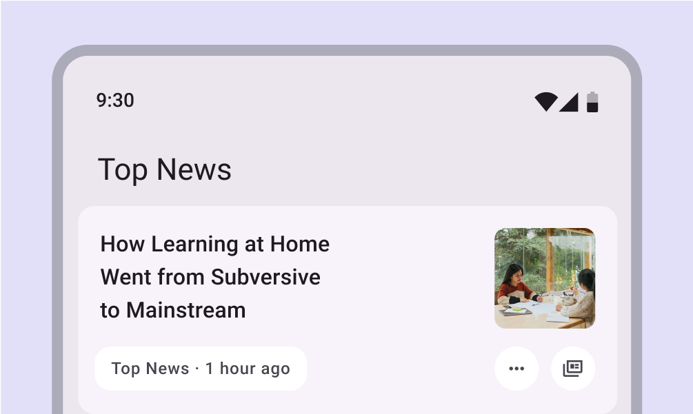
Title style stating ‘Top News’ above headlines.
Example of title style applied to a category header: Top News

Body

Body styles are used for longer passages of text in your app.

Use typefaces intended for body styles, which are readable at smaller sizes and can be comfortably read in longer passages.

Avoid expressive or decorative fonts for body text because these can be harder to read at small sizes.
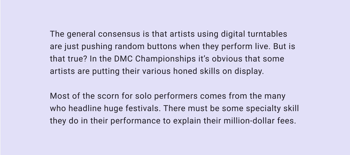
Body-style typeface.
Body styles must be readable for long passages
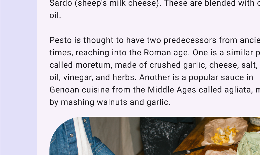
Body style text in article.
Body style used throughout an article about pesto
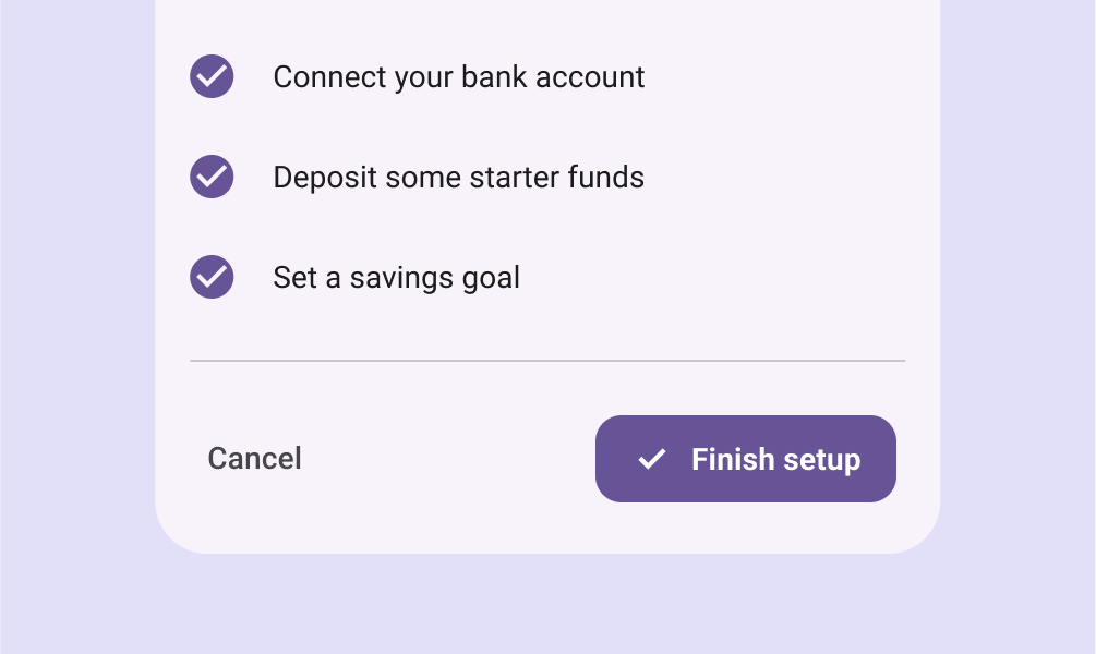
Three stacked examples of body style in app setup flow.
Example of body style used throughout a setup flow

Label

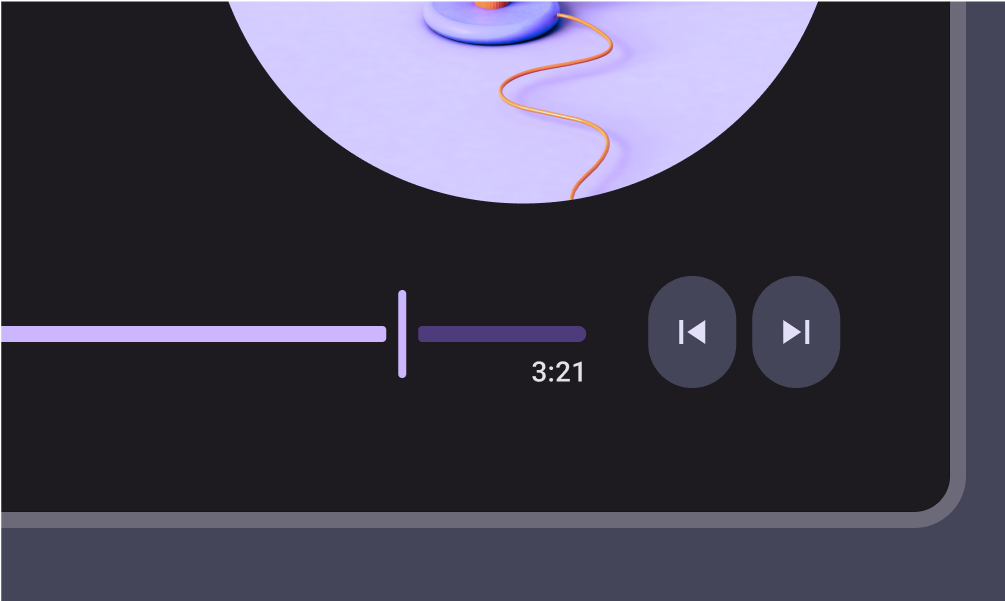
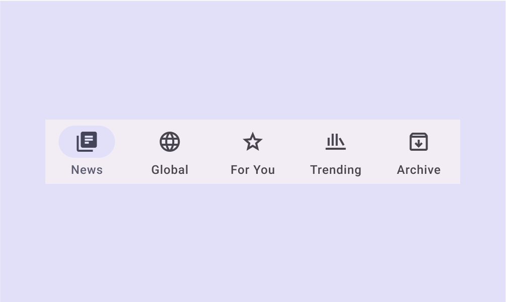
Label styles are smaller, utilitarian styles, used for things like the text inside components or for very small text in the content body, such as captions.

Buttons, for example, use the label large style.
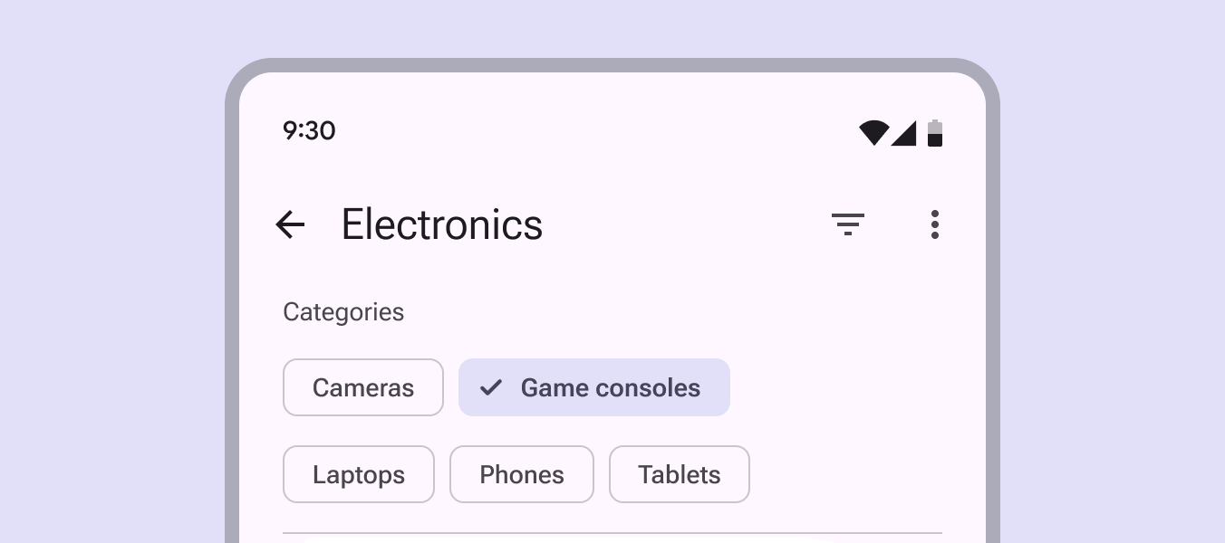
Several label-style buttons on compact window.
Label styles should enable quick reading at small sizes, such as in buttons
Music player timecode featuring label style.
A music player using label style for the timecode
Five labels set horizontally across the navigation bar.
A navigation bar using label style for the destination text

Typesetting ​

Vertical typesetting relies on padding, bounding boxes, and baselines to ensure text legibility at any size.

Take engineering considerations and the conventions of your platform into account when making decisions for typesetting, text resizing, density, and using text in adaptive layouts.

Using padding and bounding boxes ​

Use this method for web products, and iOS products, where applicable. Note that some design tools also use bounding boxes for typesetting, but their methods vary and will need to be reconciled with the engineering implementation.

In web UIs, the line height and bounding box height are the same. Text is vertically centered within the bounding box, following the “half-leading” behavior established by CSS.

The vertical position of the text isn’t controlled directly, but through the combination of the bounding box and font metrics.
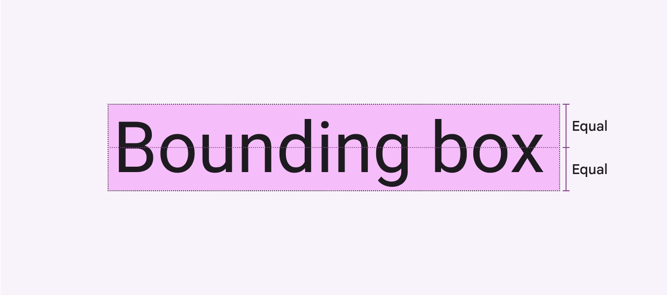
Diagram of bounding box equaling line height.
The bounding box height is defined by the line height specified, with equal space placed above and below the text

Padding is the space between UI elements, such as between an image and a bounding box, or between the inner edge of the bounding box and the text.
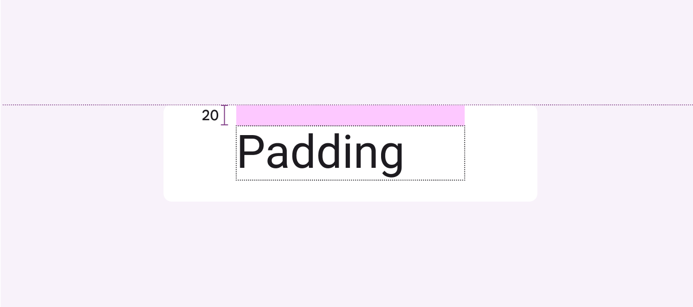
Diagram of 20 dp padding above text.
The padding surrounding the text bounding box

Specify the distance of UI elements from fixed reference points, such as the container edge. For the web, automate this calculation using Sass or CSS.
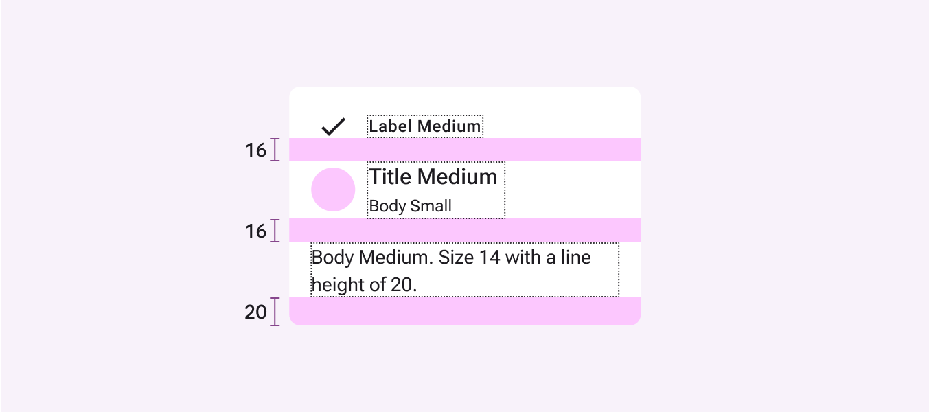
Measurements of label text padding.
Do Use line-height, padding, and container measurements for setting typography on the web and iOS

Vertical alignment using padding and bounding boxes:

  1. Line height
    Measure the height of the bounding box.
  2. Centering
    Ensure equal top and bottom padding around the inner edge of the bounding box by using center align
  3. Spacing
    Use the height of the bounding box, and top and bottom padding to determine spacing
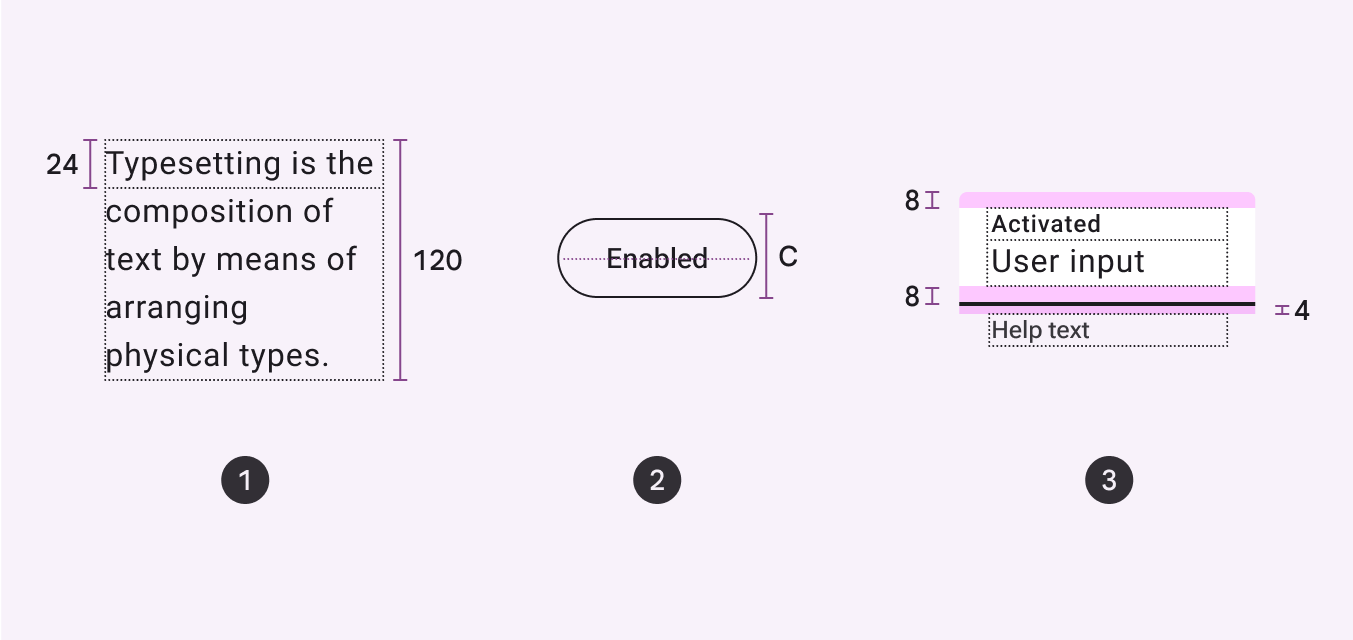
Diagram of using padding and bounding boxes to measure line height, alignment, and spacing,

Using the baseline ​

Use this method for Android products or platform-agnostic specs.

The baseline is the invisible line upon which a line of text rests. In Material Design, the baseline is an important specification in measuring the vertical distance between text and an element.
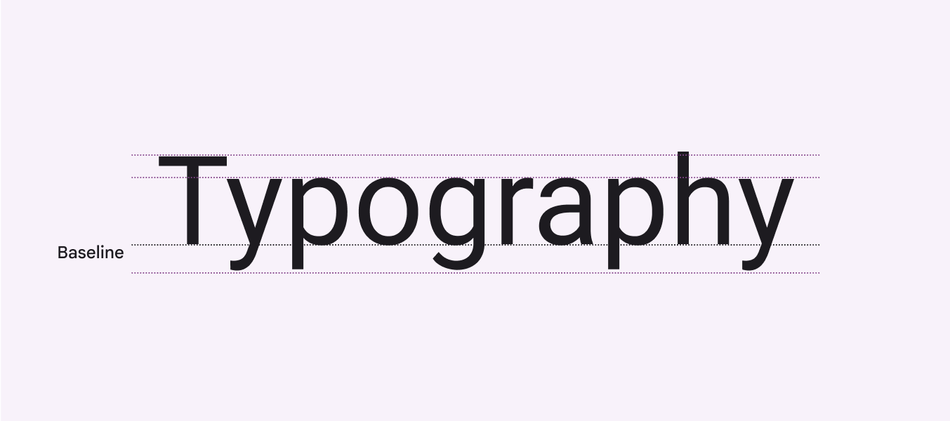
Diagram indicating the baseline of text.
A line of text rests on the invisible baseline

For Android, specifying distances relative to baseline enables accurate implementation.

The baseline can also be used to communicate text position between designers in a way that's agnostic to the platform or design tool.
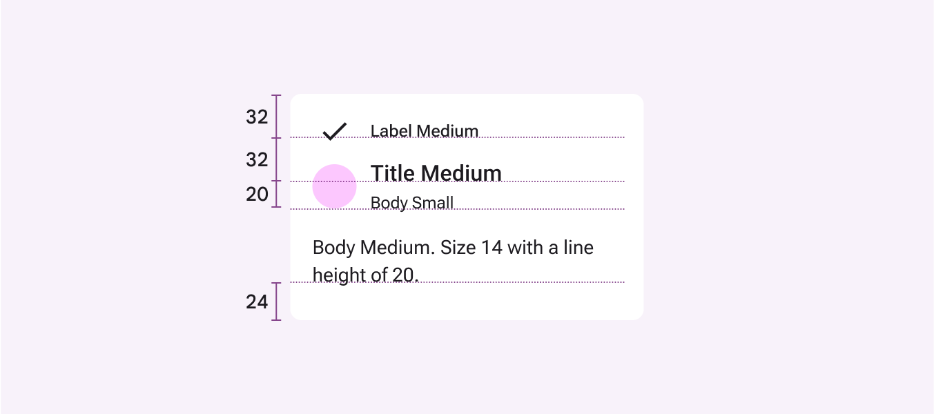
Diagram of the distances between overline and container edge, plus subhead, overline, and caption text.
Do Android screens rely on distance to baselines for spacing

Vertical alignment using the baseline:

  1. Line height
    Measure distance from the text baseline of one line to the text baseline of the next line
  2. Centering
    Specify center alignment as a reference instead of measuring the distance to the text baseline
  3. Spacing
    Use the distance from a reference point to the text baseline
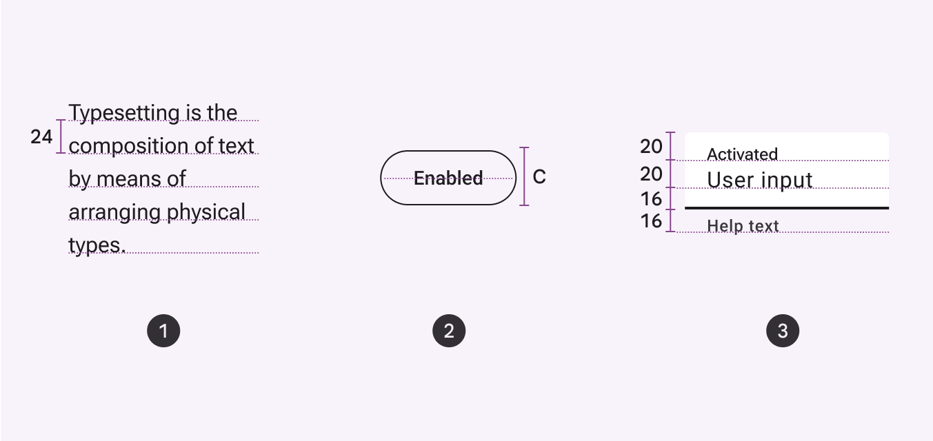
Diagram of using distance to baseline to measure line height, alignment, and spacing.

Ensuring readability ​

Line height

Line height is the space between each line of text and is directly connected to type size.

Material’s type tokens are optimized for intended size and use.
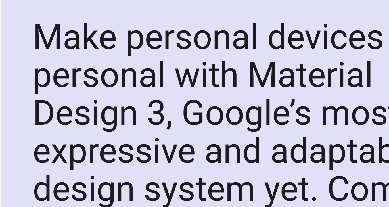
An example of larger type with a line height ratio of 1.2
For larger type legibility using styles like title, headline, and display, we recommend a line height ratio of 1.2 times the type size
An example of body type with a line height ratio of 1.5.
For smaller body copy using styles like body and label, we recommend a line height ratio around 1.5 times the type size. If your line height is too tight, you’ll undermine the flow of the text. Too loose, and the lines won’t feel cohesive.

Tabular numbers

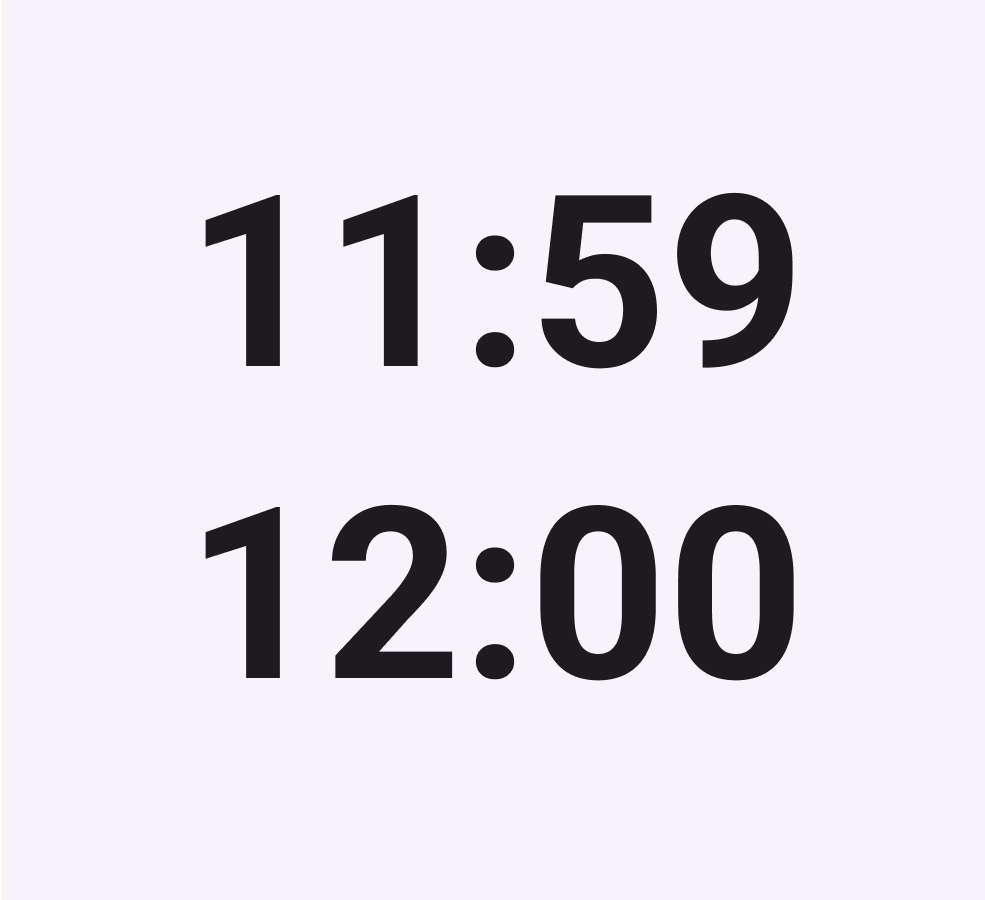
Use tabular figures (also known as monospaced numbers) rather than proportional digits in tables or places where values may change often, such as clocks.

Use monospaced tabular numbers to keep values optically aligned for better scanning.

Vertical view showing the spacing variation in proportional numbers versus monospacing of tabular numbers.
  1. Proportional numbers
  2. Monospaced tabular numbers
Times displayed in tabular numbers.
Use tabular numbers to prevent layout shifting when values change, such as in a clock UI

Using Material Symbols with typography ​

Properly aligning typography with Material Symbols can improve cohesion and unity in your product. Learn more about matching icons and text

Accessibility ​

Color & contrast

Support visual accessibility by choosing the appropriate color contrast between your product’s text and background. Contrast is the perceived difference between the lightness or darkness of two colors, and is quantified by a contrast ratio.
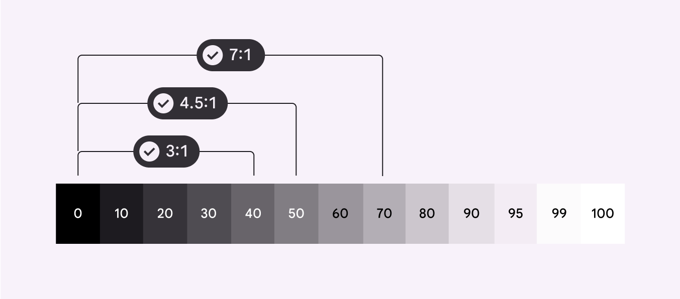
Contrast between two colors, quantified by a contrast ratio, supports visual accessibility.
Label styles should enable quick reading at small sizes, such as in buttons

Text should achieve sufficient contrast between its color and that of its background.

Material aims for two main text contrast levels:

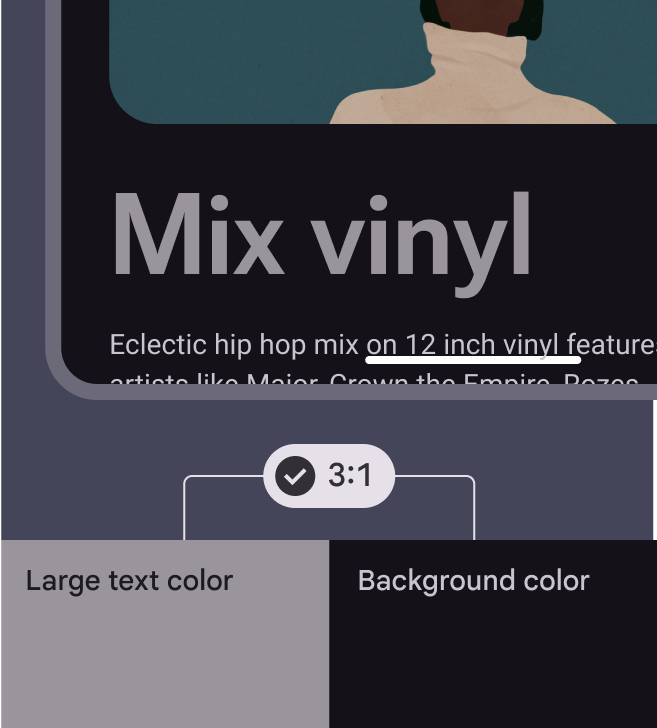
  • 3:1 for large text
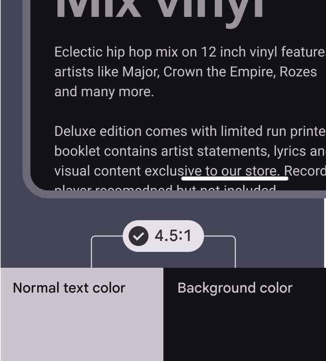
  • 4.5:1 for small text

Learn more about contrast ratios

Large text should achieve a contrast ratio of 3:1.
Large text should achieve a contrast ratio of 3:1
Small text should achieve a contrast ratio of 4.5:1.
Small text should achieve a contrast ratio of 4.5:1

The default color for typography is on surface, although on surface variant is a strong alternative.
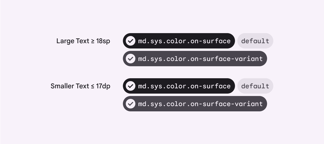
Diagram showing the default color for text is "on surface."
Default typography colors

For hyperlinked text appearing on top of a surface colorColor role used for the default color for backgrounds., use primaryHigh-emphasis fills, texts, and icons against surface.. However, tertiaryComplementary fills, text, and icons against surface. can be used to make links less prominent.

Hyperlinked text must also be underlined.
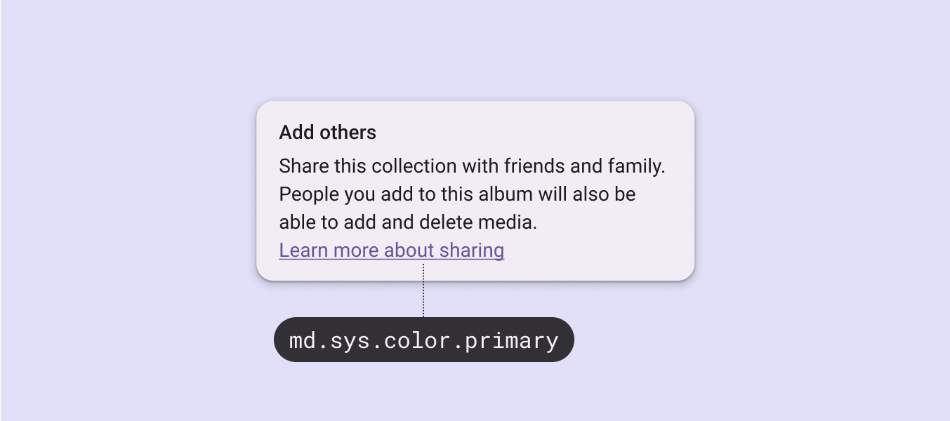
In a paragraph, md.sys.color.primary color is applied to an underlined hyperlink.
Hyperlinks should be underlined and use primary or tertiary color
Pager
Previous pageTypography: Type scale & tokens
Next pageTypography: Editorial treatments

Released under the Apache 2.0 or CC BY 4.0

Copyright © 2018-Present Google

https://m3.material.io/styles/typography/applying-type

Released under the Apache 2.0 or CC BY 4.0

Copyright © 2018-Present Google