

Navigation bar: Specs
Navigation bars let people switch between UI views on smaller devices
Variants

Baseline variants
The baseline nav bar is no longer recommended, and should be replaced by the flexible nav bar, which is shorter and supports horizontal navigation items in medium windows. View baseline nav bar specs

- Navigation bar (not recommended)
| Variant | M3 | M3 Expressive |
|---|---|---|
| Flexible navigation bar | -- | Available |
| Navigation bar | Available | Not recommended. Use flexible navigation bar. |
Configurations
In compact windows, navigation bars use vertical items. In medium windows, navigation bars should use horizontal items.

- Vertical navigation items
- Horizontal navigation items
| Category | Configuration | M3 | M3 Expressive |
|---|---|---|---|
| Navigation item layout | Vertical (default) | Available | Available |
| Horizontal | -- | Available |
Tokens & specs
Use the table's menu to switch between token sets for the navigation bar and the nav items. Learn about design tokens
Nav bar - Common
Nav bar - Item - Vertical
| Token | Value |
|---|---|
| Nav bar item vertical label text font | Roboto |
| Nav bar item vertical label text line height | 16pt |
| Nav bar item vertical label text size | 12pt |
| Nav bar item vertical label text tracking | 0.5pt |
| Nav bar item vertical label text weight | 500 |
| Nav bar item vertical active indicator height | 32dp |
| Nav bar item vertical active indicator width | 56dp |
| Nav bar item vertical container between space | 6dp |
| Nav bar item vertical active indicator icon label space | 4dp |
Nav bar - Item - Horizontal
| Token | Value |
|---|---|
| Nav bar item horizontal label text font | Roboto |
| Nav bar item horizontal label text line height | 16pt |
| Nav bar item horizontal label text size | 12pt |
| Nav bar item horizontal label text tracking | 0.5pt |
| Nav bar item horizontal label text weight | 500 |
| Nav bar item horizontal active indicator height | 40dp |
| Nav bar item horizontal active indicator leading space | 16dp |
| Nav bar item horizontal active indicator trailing space | 16dp |
| Nav bar item horizontal active indicator icon label space | 4dp |
Anatomy
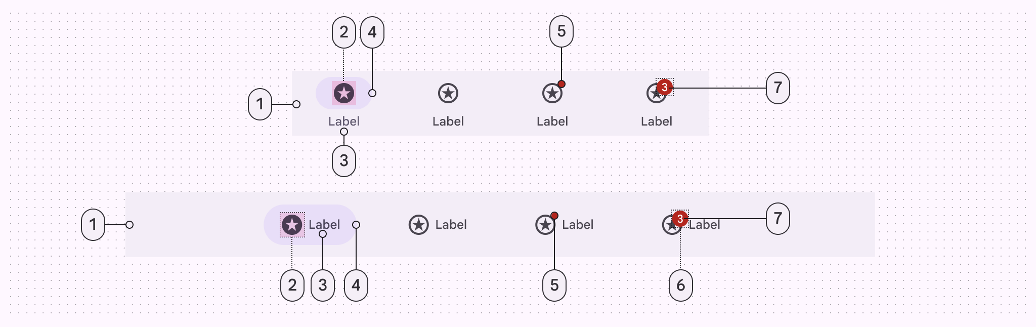
- Container
- Icon
- Label text
- Active indicator
- Small badge (optional)
- Large badge (optional)
- Large badge label
Color
Color values are implemented through design tokens. For designers, this means working with color values that correspond with tokens; in implementation, a color value will be a token that references a value. Learn more about design tokens

Navigation bar color roles used for light and dark schemes:
- Surface container
- On-secondary container
- Secondary
- Secondary container
- On-surface variant
- On-surface variant
For badge color roles, go to badge specs.
States
States are visual representations used to communicate the status of a component or an interactive element.

- Enabled
- Hovered (8% state layer)
- Focused (10% state layer)
- Pressed (10% state layer)
Measurements
The navigation bar stretches the full window width.

Vertical navigation items dynamically change width to equally fit the container. Horizontal navigation items have a fixed width, so extra space is added to the ends of the navigation bar instead.

Navigation bar width and margins for compact and medium windows.
- Vertical navigation item
- Margin from window edge
- Horizontal navigation item
Baseline navigation bar
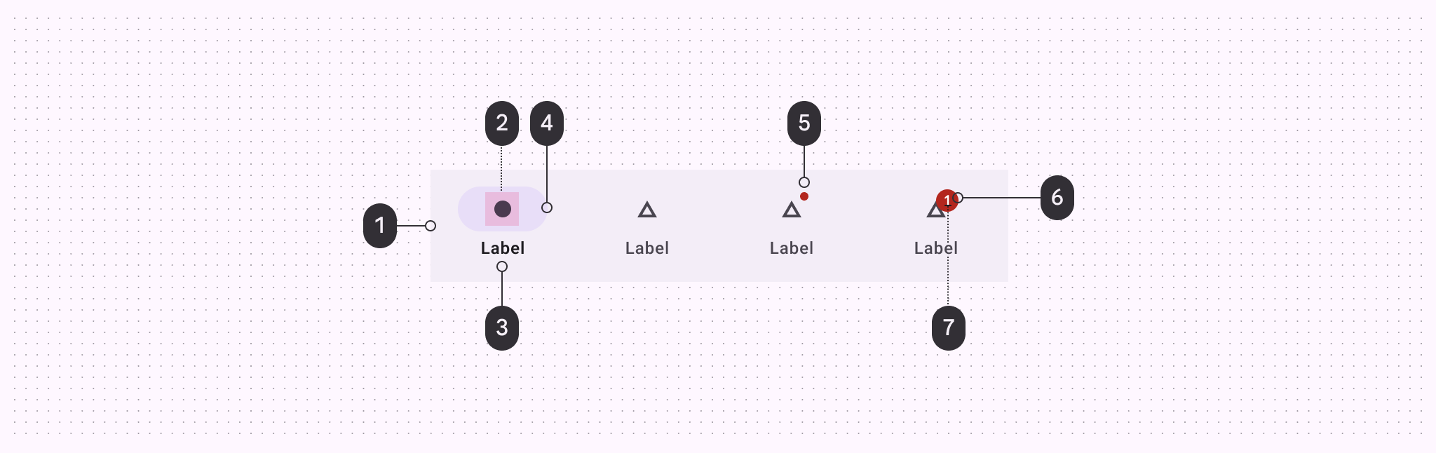
- Container
- Icon
- Label text
- Active indicator
- Small badge
- Large badge
- Large badge label
Tokens & specs
These tokens are for the baseline navigation bar.
Color
Color values are implemented through design tokens. For designers, this means working with color values that correspond with tokens; in implementation, a color value will be a token that references a value. Learn more about design tokens
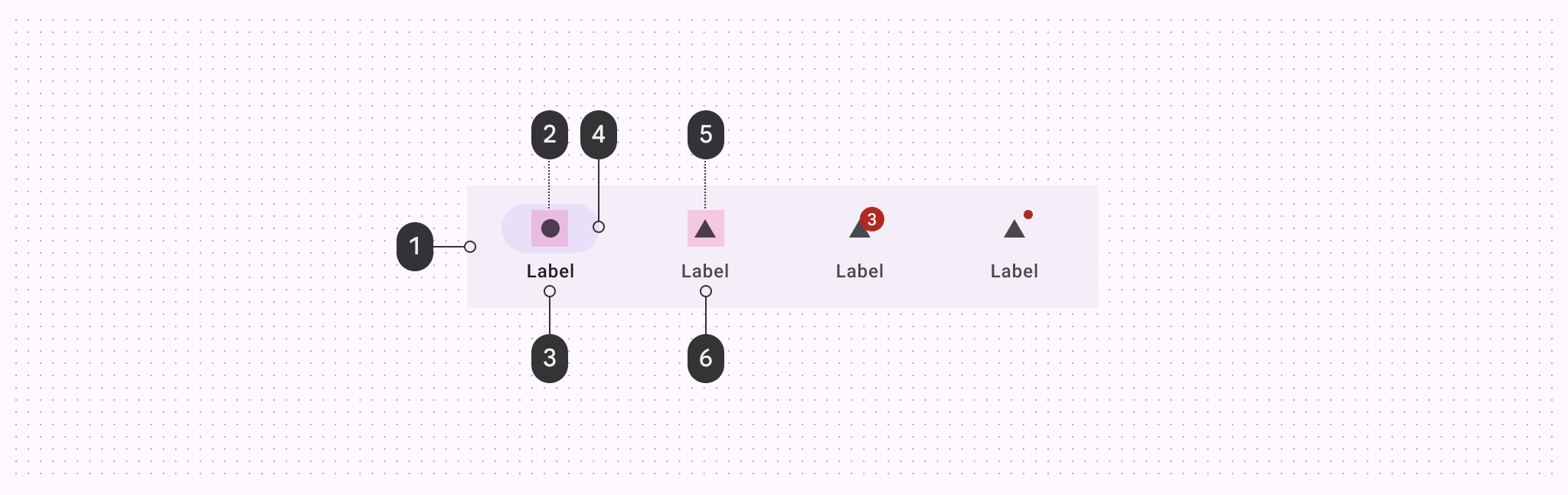
Navigation bar color roles used for light and dark schemes:
- Surface container
- On-secondary container
- Secondary
- Secondary container
- On-surface variant
- On-surface variant
For badge color roles, go to badge specs.
States
States are visual representations used to communicate the status of a component or an interactive element.
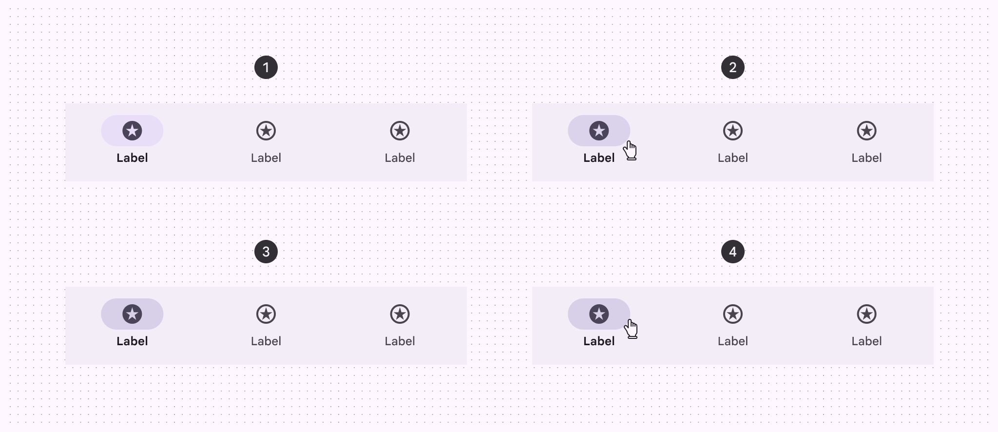
Navigation bar states:
- Enabled
- Hovered
- Focused
- Pressed
Measurements
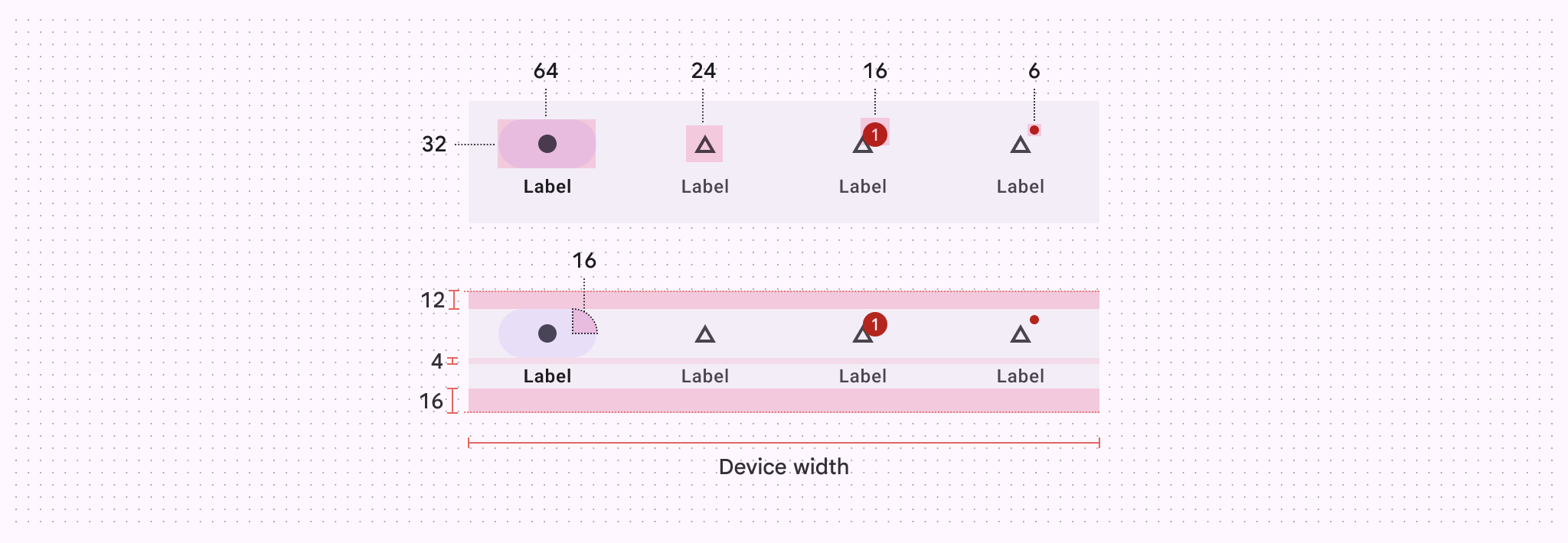

Configurations
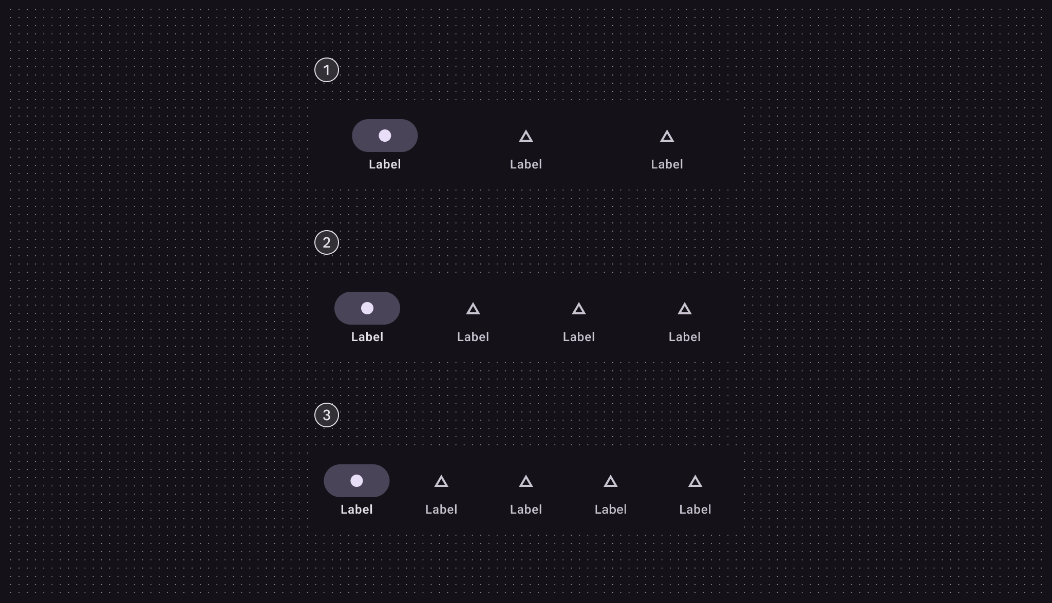
- 3 destinations
- 4 destinations
- 5 destinations