Skip to content
Material Design 3
Main Navigation
v3
v2
v1

English

简体中文
繁體中文
Español
Français
Русский
Português – Brasil
Deutsch
日本語
한국어
Italiano
Polski
Türkçe
čeština
magyar

English

简体中文
繁體中文
Español
Français
Русский
Português – Brasil
Deutsch
日本語
한국어
Italiano
Polski
Türkçe
čeština
magyar

Appearance

Sidebar Navigation

Foundations

Accessibility

Overview: Principles

Overview: Assistive technology

Designing: Overview

Designing: Color contrast

Designing: Structure

Designing: Flow

Designing: Elements

Writing and text: Best practices

Writing and text: Text truncation

Writing and text: Text resizing

Building for all: User needs

Building for all: Co-design

Content design

Overview

Alt text

Global writing: Overview

Global writing: Word choice

Notifications

Style guide: UX writing best practices

Style guide: Word choice

Style guide: Grammar and punctuation

Customizing Material

Devices

Watches: Overview

Watches: Foundations

Watches: Styles

Watches: Layout

XR

Design: Overview

Design: Interaction

Design: Layout

Design: Accessibility

Components: Overview

Components: App bars

Components: Dialogs

Components: Nav bar

Components: Nav rail

Components: Toolbars

Design tokens: Overview

Design tokens: How to use tokens

Interaction

Gestures

Inputs

Selection

States: Overview

States: State layers

States: Applying states

Layout

Overview: Overview

Overview: Parts of layout

Overview: Adaptive design

Scaffold: Overview

Scaffold: Bars

Scaffold: Rails

Scaffold: Panes

Grids & spacing: Overview

Grids & spacing: Grids

Grids & spacing: Spacing

Grids & spacing: Density

Breakpoints: Overview

Breakpoints: Compact

Breakpoints: Medium

Breakpoints: Expanded

Breakpoints: Large & extra-large

Bidirectionality & RTL

Canonical examples: Overview

Canonical examples: Feed

Canonical examples: List-detail

Canonical examples: Supporting pane

Usability: Overview

Usability: Applying M3 Expressive

Material A-Z

Styles

Color

Color system: Overview

Color system: How the system works

Color roles

Color schemes

Choosing a scheme

Static: Baseline

Static: Custom brand

Dynamic: Choosing a source

Dynamic: User-generated source

Dynamic: Content-based source

Advanced: Overview

Advanced: Apply colors

Advanced: Define new colors

Advanced: Adjust existing colors

Color resources

Elevation: Overview

Elevation: Applying elevation

Elevation: Tokens

Icons: Overview

Icons: Designing icons

Icons: Applying icons

Motion

Motion physics system: How it works

Motion physics system: Specs

Easing and duration: Applying easing and duration

Easing and duration: Tokens & specs

Transitions: Transition patterns

Transitions: Applying transitions

Shape: Overview & principles

Shape: Corner radius scale

Shape: Shape morph

Spacing: Overview

Spacing: Applying spacing

Spacing: Tokens

Typography: Overview

Typography: Fonts

Typography: Type scale & tokens

Typography: Applying type

Typography: Editorial treatments

Components

App bars: Overview

App bars: Specs

App bars: Guidelines

App bars: Accessibility

Badges: Overview

Badges: Specs

Badges: Guidelines

Badges: Accessibility

Buttons

All buttons

Button groups: Overview

Button groups: Specs

Button groups: Guidelines

Button groups: Accessibility

Buttons: Overview

Buttons: Specs

Buttons: Guidelines

Buttons: Accessibility

Extended FABs: Overview

Extended FABs: Specs

Extended FABs: Guidelines

Extended FABs: Accessibility

FAB menu: Overview

FAB menu: Specs

FAB menu: Guidelines

FAB menu: Accessibility

FABs: Overview

FABs: Specs

FABs: Guidelines

FABs: Accessibility

Icon buttons: Overview

Icon buttons: Specs

Icon buttons: Guidelines

Icon buttons: Accessibility

Segmented buttons: Overview

Segmented buttons: Specs

Segmented buttons: Guidelines

Segmented buttons: Accessibility

Split button: Overview

Split button: Specs

Split button: Guidelines

Split button: Accessibility

Cards: Overview

Cards: Specs

Cards: Guidelines

Cards: Accessibility

Carousel: Overview

Carousel: Specs

Carousel: Guidelines

Carousel: Accessibility

Checkbox: Overview

Checkbox: Specs

Checkbox: Guidelines

Checkbox: Accessibility

Chips: Overview

Chips: Specs

Chips: Guidelines

Chips: Accessibility

Date & time pickers

Date pickers: Overview

Date pickers: Specs

Date pickers: Guidelines

Date pickers: Accessibility

Time pickers: Overview

Time pickers: Specs

Time pickers: Guidelines

Time pickers: Accessibility

Dialogs: Overview

Dialogs: Specs

Dialogs: Guidelines

Dialogs: Accessibility

Divider: Overview

Divider: Specs

Divider: Guidelines

Divider: Accessibility

Lists: Overview

Lists: Specs

Lists: Guidelines

Lists: Accessibility

Loading & progress

Loading indicator: Overview

Loading indicator: Specs

Loading indicator: Guidelines

Loading indicator: Accessibility

Progress indicators: Overview

Progress indicators: Specs

Progress indicators: Guidelines

Progress indicators: Accessibility

Menus: Overview

Menus: Specs

Menus: Guidelines

Menus: Accessibility

Navigation

Navigation bar: Overview

Navigation bar: Specs

Navigation bar: Guidelines

Navigation bar: Accessibility

Navigation drawer: Overview

Navigation drawer: Specs

Navigation drawer: Guidelines

Navigation drawer: Accessibility

Navigation rail: Overview

Navigation rail: Specs

Navigation rail: Guidelines

Navigation rail: Accessibility

Radio button: Overview

Radio button: Specs

Radio button: Guidelines

Radio button: Accessibility

Search: Overview

Search: Specs

Search: Guidelines

Search: Accessibility

Sheets

Bottom sheets: Overview

Bottom sheets: Specs

Bottom sheets: Guidelines

Bottom sheets: Accessibility

Side sheets: Overview

Side sheets: Specs

Side sheets: Guidelines

Side sheets: Accessibility

Sliders: Overview

Sliders: Specs

Sliders: Guidelines

Sliders: Accessibility

Snackbar: Overview

Snackbar: Specs

Snackbar: Guidelines

Snackbar: Accessibility

Switch: Overview

Switch: Specs

Switch: Guidelines

Switch: Accessibility

Tabs: Overview

Tabs: Specs

Tabs: Guidelines

Tabs: Accessibility

Text fields: Overview

Text fields: Specs

Text fields: Guidelines

Text fields: Accessibility

Toolbars: Overview

Toolbars: Specs

Toolbars: Guidelines

Toolbars: Accessibility

Tooltips: Overview

Tooltips: Specs

Tooltips: Guidelines

Tooltips: Accessibility

On this page

Advanced customizations: Adjust existing colors ​

Apply, define, or adjust colors to create a fine-tuned, unique color experience


You can control the color algorithm's output to adjust the appearance of colors within the roles provided by default.

Define your own baseline scheme ​

You can input colors to define your own baseline scheme.

Why

You may want to define your own baseline scheme so your app's colors stay static (ie. does not change with dynamic color), such as to reflect your brand colors. By providing your own custom input colors for the primary, secondary, tertiary, and neutral colors in the scheme, Material will provide back the scheme's regular color roles with values derived from your reference colors.
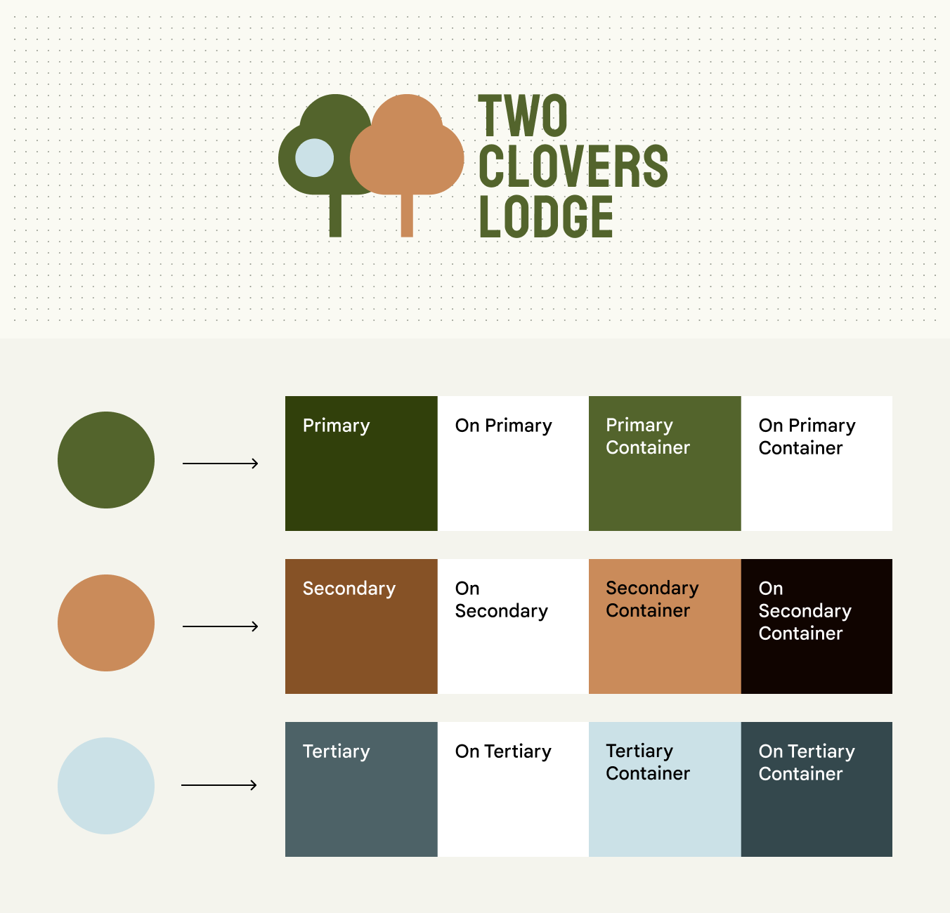
Above, a logo of two trees featuring dark green, orange, and pale blue colors. Below, each of those colors is show as a circle, with an arrow pointing from it to a set of chips showing color roles produced from the original color.
You can input your own colors to produce a static baseline scheme. In this example, colors from the logo are inputted to produce primary, secondary, and tertiary colors.

How ​

Using the Material Theme BuilderMaterial Theme Builder (MTB) is a Figma plugin that allows markers to emulate the color extraction process for dynamic color and create custom tonal schemes.Get the MTB, input your own colors for primary, secondary, tertiary, neutral, and neutral variant. The Theme Builder will generate a color scheme with values based on your inputs, and the given color roles can be used in the same manner as those from any other Material scheme.

Best practices ​

  • Conventionally, primary and tertiary colors are the most visually prominent in the scheme, with tertiary appearing complementary to primary by changing its hue. Secondary, neutral variant, and neutral colors match primary in hue but are progressively less chromatic in that order. Input your colors into the appropriate category to maintain similar relationships as designed by Material, and ensure expected and visually pleasing results when those colors are mapped to components.
  • If the colors provided back from your input color appear differently than expected, you can enable or disable color fidelity. Color fidelity is a feature that adjusts colors’ tones to match that of your input color.
  • If the 26+ standard color roles do not meet your needs, you may need to define custom color roles.

Define your own dynamic scheme ​

You can define color algorithm rules to produce your own dynamic scheme.

Why

Control the appearance of your app’s colors while respecting dynamic color. For example, you may want your app to match the user’s wallpaper theme, but appear more vibrant than the default dynamic theme colors.
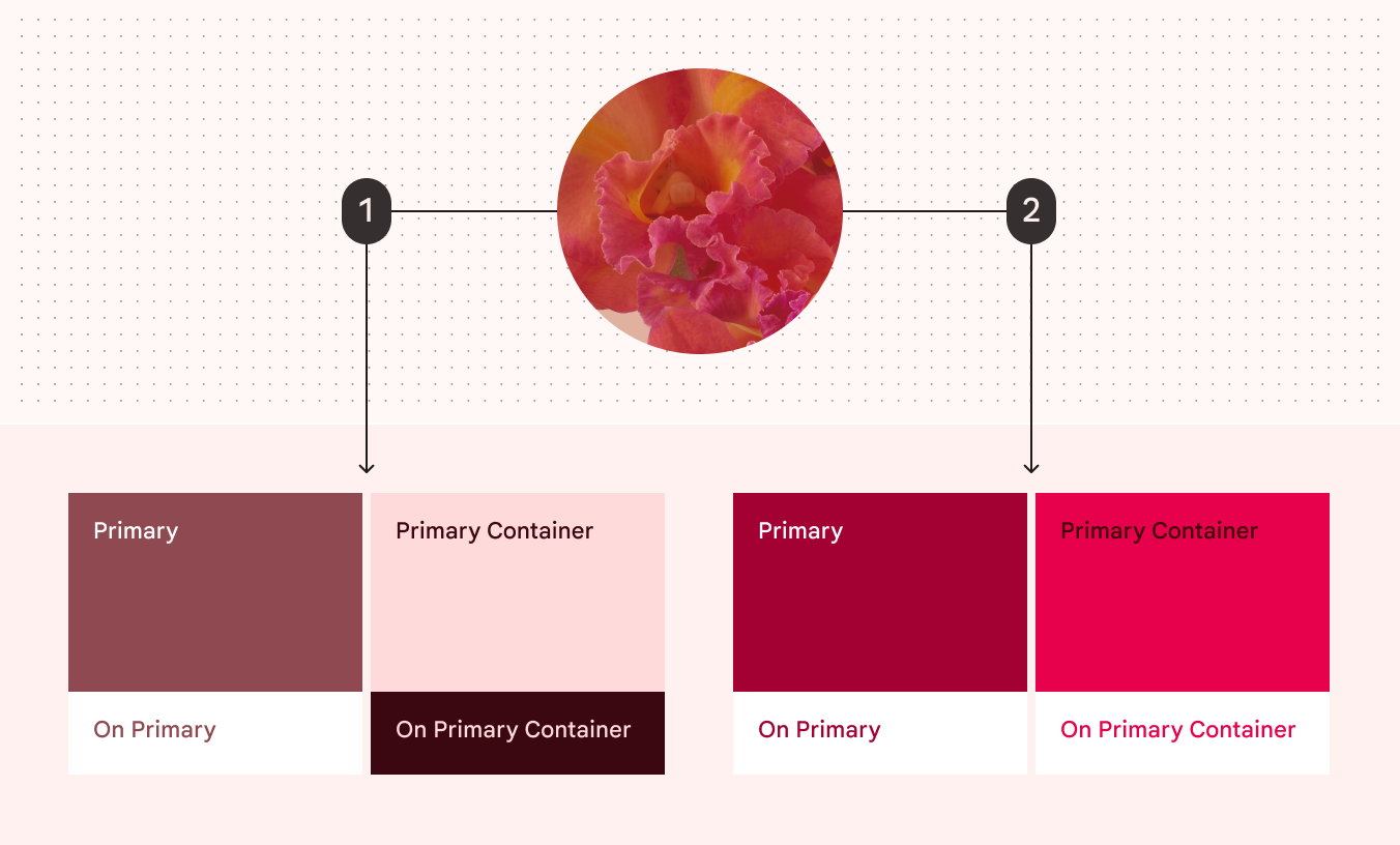
Thumbnail of a red floral wallpaper with two arrows leading out of it, labeled 1 and 2. Arrow 1 leads to a set of red colors chips produced from the wallpaper. Arrow 2 points to another set of red color chips, which appear more vibrant than the first.

You can define your own dynamic scheme to reflect a user's wallpaper but control other aspects such as the colors' vibrancy.

  1. Colors produced dynamically from a user's red wallpaper following default specs
  2. Colors produced dynamically from the same wallpaper following custom-defined specs

How ​

  • Material generates the color scheme by following hue and chroma values specified for each group of colors (primary, secondary, tertiary, neutral, and neutral variant). For more information, see how the system works. To adjust the appearance of these colors and produce your own dynamic scheme, you must provide your own hue and chroma values for each of these color groups.
  • Once these values are known, you may define your own scheme variant and call Material Color Utilities (MCU)Material Color Utilities (MCU) are a set of color libraries containing algorithms and utilities that make it easier for you to develop dynamic color themes and schemes in your app.More on MCU to dynamically generate the scheme and provide color values for each role in the scheme.

Best practices ​

  • Defining custom color roles should be considered only if you cannot achieve your desired colors with other Material color solutions.
  • If the colors provided back from your input color appear differently than intended, you can enable or disable color fidelity. Color fidelity is a feature that adjusts colors’ tones to match that of your input color.
  • If the color roles provided by Material out of the box do not meet your needs, you may need to define custom color roles for greater control over their appearance.

Use color fidelity ​

You can apply color fidelity to make scheme colors better match your input colors.

Why

Material scheme colors are mapped to tones (lightness or darkness) to achieve visually accessible color pairings with sufficient contrast between foreground and background elements. In some cases, these tones can prevent colors from appearing as intended, such as when a color is too light to appear vibrant. Color fidelity is a feature that adjusts tones in these cases to produce the intended visual results without harming visual contrast.

Above, a dark purple circle with an arrow labeled 1 pointing to a set of color chips, whose colors appear similarly dark. Below, a dark purple circle with an arrow labeled 2 pointing to a set of color chips, whose colors appear lighter.

Color fidelity adjusts tones in color roles to produce the closest match to your input color. In this example, colors are produced from a dark purple input with and without color fidelity.

  1. Color roles produced with color fidelity
  2. Color roles produced without color fidelity

How ​

  • In the Material Theme BuilderMaterial Theme Builder (MTB) is a Figma plugin that allows markers to emulate the color extraction process for dynamic color and create custom tonal schemes.Get the MTB, you can toggle the “match color” option on your input color to enable or disable fidelity. By default, fidelity is enabled when you use Theme Builder to create a custom baseline scheme or define static colors.
  • In code, you can flag color roles in your scheme with a boolean which will enable or disable fidelity for those colors.

Best practices ​

  • When producing a custom baseline scheme or defining static colors, you may wish to toggle fidelity on and off to determine which setting better suits your desired design.
  • Because color fidelity adjusts tones (lightness or darkness of colors), to ensure accessible contrast, remember to pair appropriate colors roles together, such as a background color with its corresponding foreground “on” color.

Harmonize colors ​

In dynamic schemes, you can automatically adjust the hue of static colors so they look better alongside the scheme’s primary color.

Why

Static colorsStatic colors are UI colors that don't change based on the user's wallpaper or in-app content. Once assigned to their respective color roles and UI elements, the colors remain constant.More on static color may visually clash with a scheme’s dynamically changing colors. To improve visual harmony, Material provides an optional ‘harmonize’ function that slightly adjusts static colors to look better in dynamic schemes.

Colors that are closer in hueHue is the perception of a color as red, orange, yellow, green, blue, violet, and so on.More on hue, chroma, and tone appear more pleasing together than colors with hues farther apart. Based on this principle, harmonization adjusts the hue of static colors, making them closer to the hue of the scheme’s primary color.

Diagram comparing static colors in an app to harmonized static colors
A. In this example, the color scheme has:
  1. Green as the primary color
  2. Static blue
  3. Static orange
B. When harmonized, those static colors change hue, moving closer to the primary color on the color wheel. The resulting colors appear more visually pleasing together because they are closer in hue.

To preserve the semantic meaning of static colors (such as a red to communicate errors), harmonization limits the amount that a color’s hue can change. Harmonized colors will become warmer or cooler in hue without appearing like another type of color.
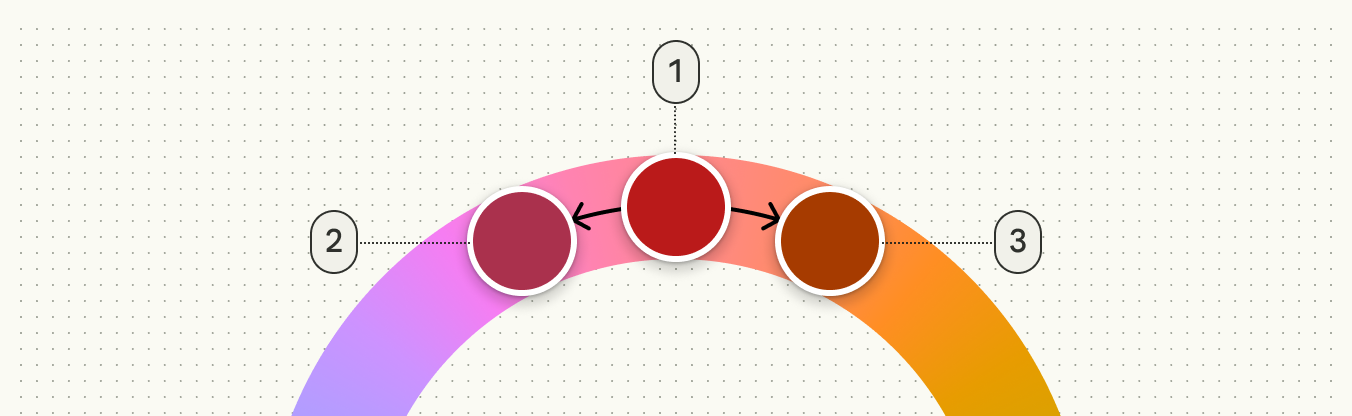
Diagram showing the limited range of harmonized hues
To preserve the semantic meaning of colors, harmonization limits the amount that a color’s hue can change. For example, a red color (1) can become cooler (2) or warmer (3) in hue, but will not appear purple or orange.

How ​

  • In the Material Theme BuilderMaterial Theme Builder (MTB) is a Figma plugin that allows markers to emulate the color extraction process for dynamic color and create custom tonal schemes.Get the MTB, you can toggle harmonization on and off within the overflow menu for each static color you have added to the scheme.
  • In code, use the ‘Blend’ function from Material Color Utilities to harmonize colors

Best practices ​

  • Harmonization will adjust a static color differently depending on the scheme’s primary color, so check the results under a variety of schemes to see the range of how they can appear in dynamic color.
  • Don’t harmonize colors whose appearance should stay absolutely consistent, such as brand colors.
Pager
Previous pageAdvanced: Define new colors
Next pageColor resources

Released under the Apache 2.0 or CC BY 4.0

Copyright © 2018-Present Google

https://m3.material.io/styles/color/advanced/adjust-existing-colors

Released under the Apache 2.0 or CC BY 4.0

Copyright © 2018-Present Google