

Floating action buttons (FABs): Specs
Floating action buttons (FABs) help people take primary actions
Variants
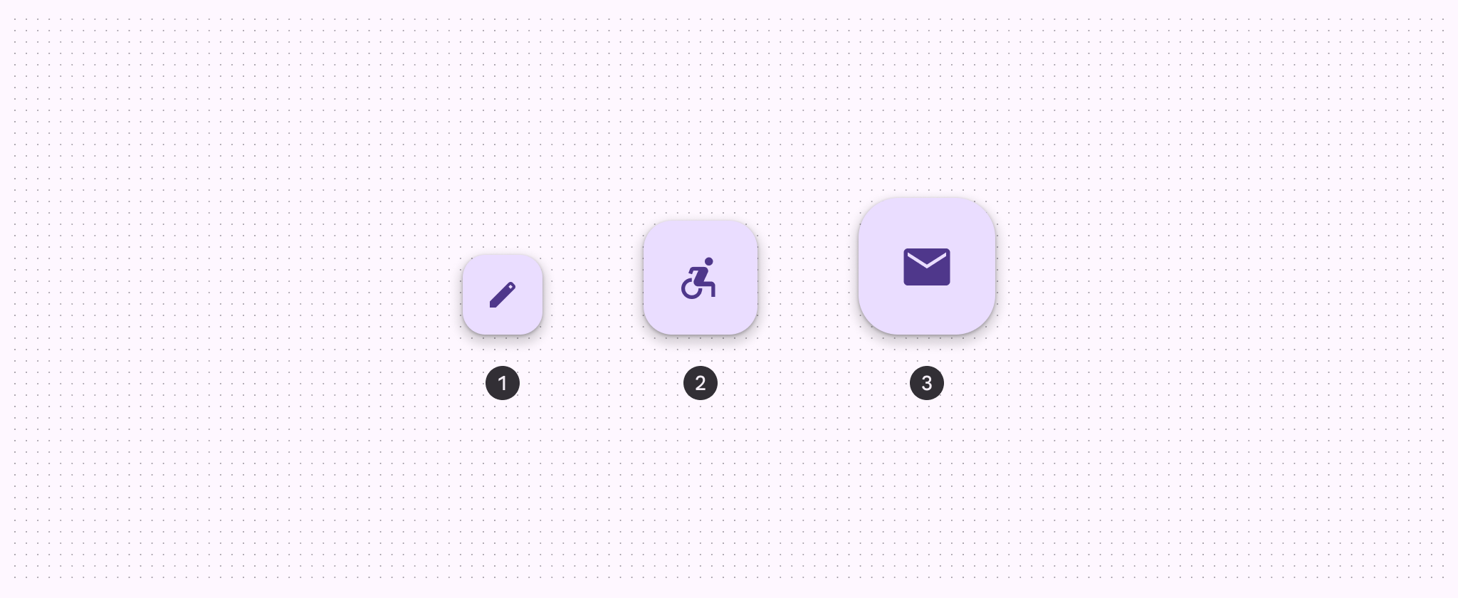
- FAB
- Medium FAB
- Large FAB
Baseline variants
The small FAB is still available, but no longer recommended. Jump to baseline specs

1. Small FAB
| Variant | M3 | M3 Expressive |
|---|---|---|
| FAB | Available | Available |
| Medium FAB | -- | Available |
| Large FAB | Available | Available |
| Small FAB | Available | Not recommended. Use a larger size. |
Configurations
In the expressive update, the primary, secondary, and tertiary set colors were renamed to primary container, secondary container, and tertiary container to match the actual color roles used. New primary, secondary, and tertiary color styles were created to match the corresponding color roles. View details in the color styles section
| Category | Configuration | M3 | M3 Expressive |
|---|---|---|---|
| Color | Primary container, secondary container, tertiary container | Available as primary, secondary, tertiary | Available |
| Primary. secondary, tertiary | -- | Available |
Tokens & specs
Use the table's menu to select a token set. FAB tokens are organized by size and color. Learn more about design tokens
FAB - Size - Regular
| Token | Value |
|---|---|
| FAB container height | 56dp |
| FAB container width | 56dp |
| FAB icon size | 24dp |
| FAB container shape | 16dp |
FAB - Size - Medium
| Token | Value |
|---|---|
| FAB medium container height | 80dp |
| FAB medium container width | 80dp |
| FAB medium icon size | 28dp |
| FAB medium container shape | 20dp |
FAB - Size - Large
| Token | Value |
|---|---|
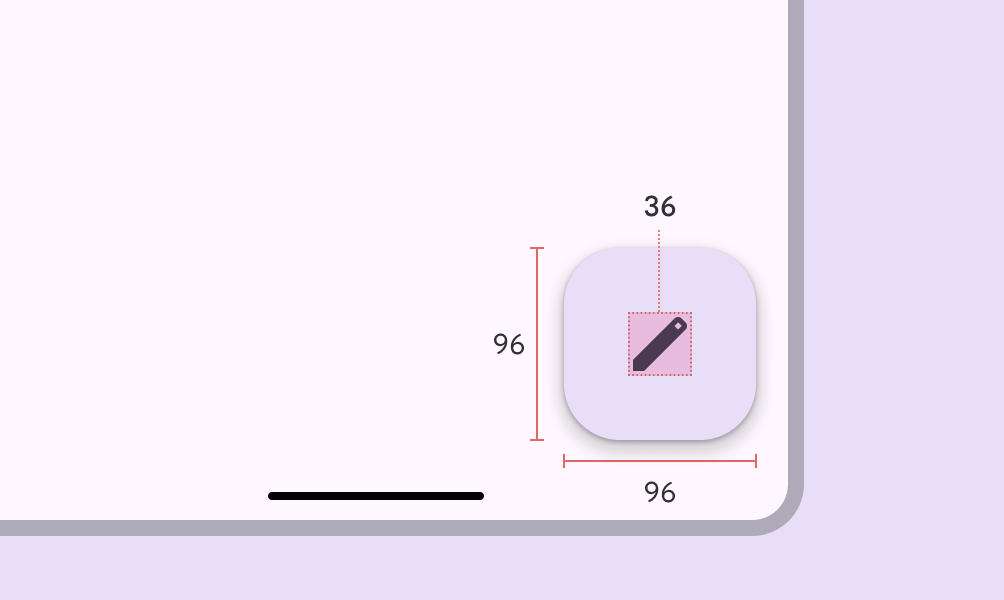
| FAB large container height | 96dp |
| FAB large container width | 96dp |
| FAB large icon size | 36dp |
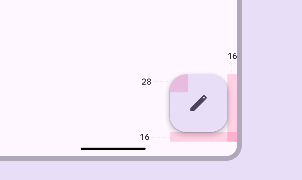
| FAB large container shape | 28dp |
FAB - Color - Tonal primary
FAB - Color - Tonal secondary
FAB - Color - Tonal tertiary
FAB - Color - Primary
FAB - Color - Secondary
FAB - Color - Tertiary
Anatomy
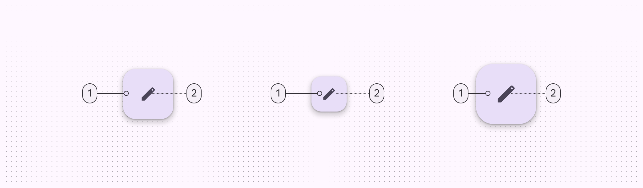
1. Container
2. Icon
Color
Color values are implemented through design tokens. For design, this means working with color values that correspond with tokens. In implementation, a color value will be a token that references a value. Learn more about design tokens
Color styles
FABs can use several combinations of color and on-color styles, such as primary and on-primary. The following color mappings provide the same legibility and functionality, so the color mapping you use depends on style alone.
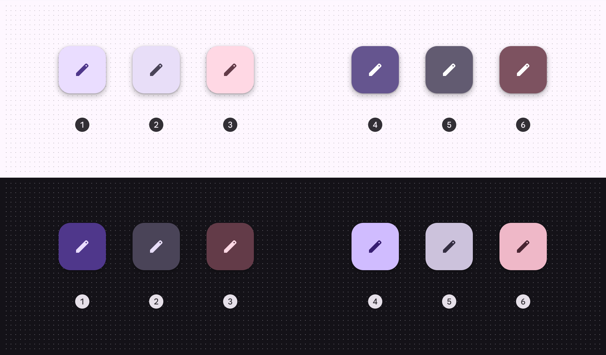
- Primary container & On primary container (default)
- Secondary container & On secondary container
- Tertiary container & On tertiary container
- Primary & On primary
- Secondary & On secondary
- Tertiary & On tertiary
Baseline color styles
Surface FAB color styles are still available, but no longer recommended.

- Surface FABs
States
States are visual representations used to communicate the status of a component or interactive element.
When using a non-default color mapping for FABs, make sure the state layer color is the same as the icon color. For example, the state layer color for the primary color style should be md.sys.color.primary.
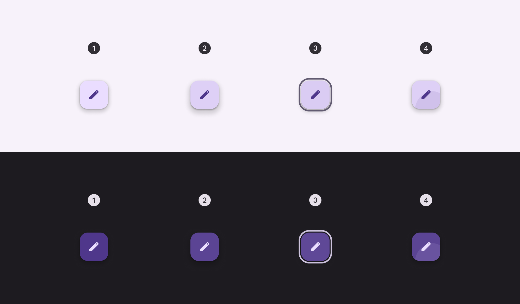
- Enabled
- Hovered (8% state layer) - elevation 4
- Focused (10% state layer)
- Pressed (10% state layer)
Measurements
FAB
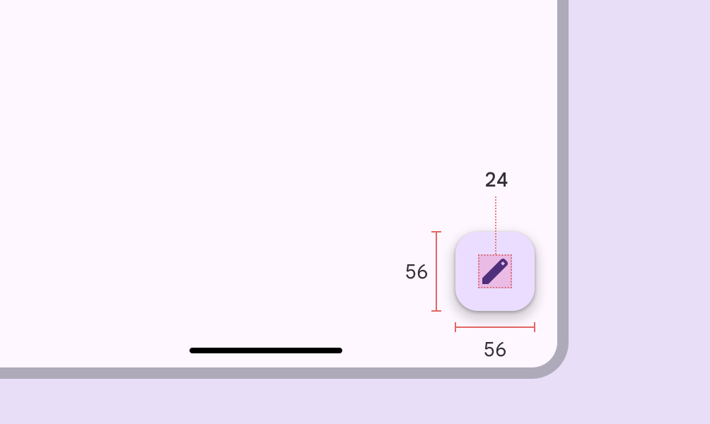
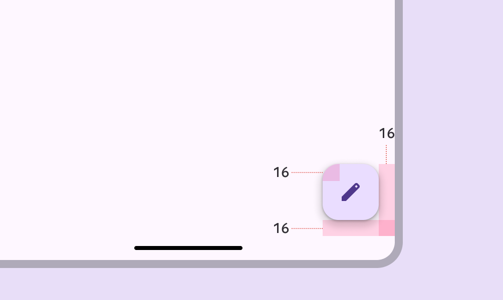
Medium FAB
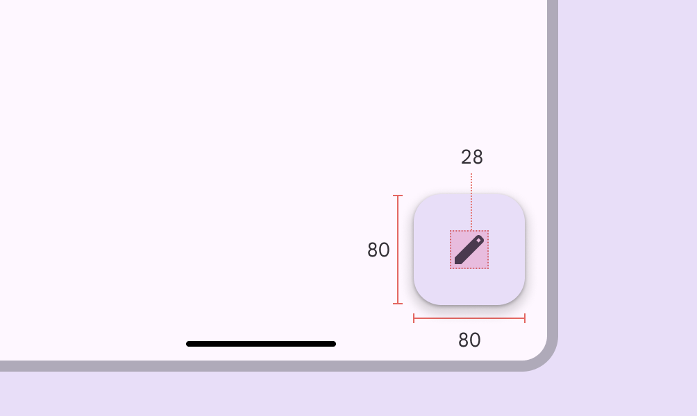
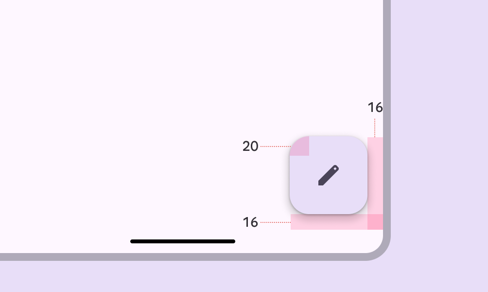
Large FAB
Baseline tokens & specs
Use the table's menu to select a token set. This only includes tokens for small and surface FABs, which are both no longer recommended. It doesn't include other colors, or large or regular FABs, since those are still currently used.