Skip to content
Material Design 3
Main Navigation
v3
v2
v1

English

简体中文
繁體中文
Español
Français
Русский
Português – Brasil
Deutsch
日本語
한국어
Italiano
Polski
Türkçe
čeština
magyar

English

简体中文
繁體中文
Español
Français
Русский
Português – Brasil
Deutsch
日本語
한국어
Italiano
Polski
Türkçe
čeština
magyar

Appearance

Sidebar Navigation

Foundations

Accessibility

Overview: Principles

Overview: Assistive technology

Designing: Overview

Designing: Color contrast

Designing: Structure

Designing: Flow

Designing: Elements

Writing and text: Best practices

Writing and text: Text truncation

Writing and text: Text resizing

Building for all: User needs

Building for all: Co-design

Content design

Overview

Alt text

Global writing: Overview

Global writing: Word choice

Notifications

Style guide: UX writing best practices

Style guide: Word choice

Style guide: Grammar and punctuation

Customizing Material

Devices

Watches: Overview

Watches: Foundations

Watches: Styles

Watches: Layout

XR

Design: Overview

Design: Interaction

Design: Layout

Design: Accessibility

Components: Overview

Components: App bars

Components: Dialogs

Components: Nav bar

Components: Nav rail

Components: Toolbars

Design tokens: Overview

Design tokens: How to use tokens

Interaction

Gestures

Inputs

Selection

States: Overview

States: State layers

States: Applying states

Layout

Overview: Overview

Overview: Parts of layout

Overview: Adaptive design

Scaffold: Overview

Scaffold: Bars

Scaffold: Rails

Scaffold: Panes

Grids & spacing: Overview

Grids & spacing: Grids

Grids & spacing: Spacing

Grids & spacing: Density

Breakpoints: Overview

Breakpoints: Compact

Breakpoints: Medium

Breakpoints: Expanded

Breakpoints: Large & extra-large

Bidirectionality & RTL

Canonical examples: Overview

Canonical examples: Feed

Canonical examples: List-detail

Canonical examples: Supporting pane

Usability: Overview

Usability: Applying M3 Expressive

Material A-Z

Styles

Color

Color system: Overview

Color system: How the system works

Color roles

Color schemes

Choosing a scheme

Static: Baseline

Static: Custom brand

Dynamic: Choosing a source

Dynamic: User-generated source

Dynamic: Content-based source

Advanced: Overview

Advanced: Apply colors

Advanced: Define new colors

Advanced: Adjust existing colors

Color resources

Elevation: Overview

Elevation: Applying elevation

Elevation: Tokens

Icons: Overview

Icons: Designing icons

Icons: Applying icons

Motion

Motion physics system: How it works

Motion physics system: Specs

Easing and duration: Applying easing and duration

Easing and duration: Tokens & specs

Transitions: Transition patterns

Transitions: Applying transitions

Shape: Overview & principles

Shape: Corner radius scale

Shape: Shape morph

Spacing: Overview

Spacing: Applying spacing

Spacing: Tokens

Typography: Overview

Typography: Fonts

Typography: Type scale & tokens

Typography: Applying type

Typography: Editorial treatments

Components

App bars: Overview

App bars: Specs

App bars: Guidelines

App bars: Accessibility

Badges: Overview

Badges: Specs

Badges: Guidelines

Badges: Accessibility

Buttons

All buttons

Button groups: Overview

Button groups: Specs

Button groups: Guidelines

Button groups: Accessibility

Buttons: Overview

Buttons: Specs

Buttons: Guidelines

Buttons: Accessibility

Extended FABs: Overview

Extended FABs: Specs

Extended FABs: Guidelines

Extended FABs: Accessibility

FAB menu: Overview

FAB menu: Specs

FAB menu: Guidelines

FAB menu: Accessibility

FABs: Overview

FABs: Specs

FABs: Guidelines

FABs: Accessibility

Icon buttons: Overview

Icon buttons: Specs

Icon buttons: Guidelines

Icon buttons: Accessibility

Segmented buttons: Overview

Segmented buttons: Specs

Segmented buttons: Guidelines

Segmented buttons: Accessibility

Split button: Overview

Split button: Specs

Split button: Guidelines

Split button: Accessibility

Cards: Overview

Cards: Specs

Cards: Guidelines

Cards: Accessibility

Carousel: Overview

Carousel: Specs

Carousel: Guidelines

Carousel: Accessibility

Checkbox: Overview

Checkbox: Specs

Checkbox: Guidelines

Checkbox: Accessibility

Chips: Overview

Chips: Specs

Chips: Guidelines

Chips: Accessibility

Date & time pickers

Date pickers: Overview

Date pickers: Specs

Date pickers: Guidelines

Date pickers: Accessibility

Time pickers: Overview

Time pickers: Specs

Time pickers: Guidelines

Time pickers: Accessibility

Dialogs: Overview

Dialogs: Specs

Dialogs: Guidelines

Dialogs: Accessibility

Divider: Overview

Divider: Specs

Divider: Guidelines

Divider: Accessibility

Lists: Overview

Lists: Specs

Lists: Guidelines

Lists: Accessibility

Loading & progress

Loading indicator: Overview

Loading indicator: Specs

Loading indicator: Guidelines

Loading indicator: Accessibility

Progress indicators: Overview

Progress indicators: Specs

Progress indicators: Guidelines

Progress indicators: Accessibility

Menus: Overview

Menus: Specs

Menus: Guidelines

Menus: Accessibility

Navigation

Navigation bar: Overview

Navigation bar: Specs

Navigation bar: Guidelines

Navigation bar: Accessibility

Navigation drawer: Overview

Navigation drawer: Specs

Navigation drawer: Guidelines

Navigation drawer: Accessibility

Navigation rail: Overview

Navigation rail: Specs

Navigation rail: Guidelines

Navigation rail: Accessibility

Radio button: Overview

Radio button: Specs

Radio button: Guidelines

Radio button: Accessibility

Search: Overview

Search: Specs

Search: Guidelines

Search: Accessibility

Sheets

Bottom sheets: Overview

Bottom sheets: Specs

Bottom sheets: Guidelines

Bottom sheets: Accessibility

Side sheets: Overview

Side sheets: Specs

Side sheets: Guidelines

Side sheets: Accessibility

Sliders: Overview

Sliders: Specs

Sliders: Guidelines

Sliders: Accessibility

Snackbar: Overview

Snackbar: Specs

Snackbar: Guidelines

Snackbar: Accessibility

Switch: Overview

Switch: Specs

Switch: Guidelines

Switch: Accessibility

Tabs: Overview

Tabs: Specs

Tabs: Guidelines

Tabs: Accessibility

Text fields: Overview

Text fields: Specs

Text fields: Guidelines

Text fields: Accessibility

Toolbars: Overview

Toolbars: Specs

Toolbars: Guidelines

Toolbars: Accessibility

Tooltips: Overview

Tooltips: Specs

Tooltips: Guidelines

Tooltips: Accessibility

On this page

Advanced customizations: Apply colors ​

Apply, define, or adjust colors to create a fine-tuned, unique color experience


You can apply colors in places or ways that aren't provided by default.

Combine multiple color schemes ​

Use multiple color schemes in the same app experience, such as a baseline scheme combined with a dynamic content-based scheme.

Smart home control screen showing media controls, light controls, and wifi and thermostat controls. Annotation 1 points to the media controls, which are colored in a teal scheme. Annotation 2 points to the remaining controls, colored in a red scheme.

This smart home control screen combines two color schemes:

  1. A teal content-based color scheme from the local album art, applied to media controls
  2. A red user-generated color scheme from the user's wallpaper, applied to the rest of the UI

Why ​

If your app features content-rich moments, such as a media player, it can enhance a user's experience by applying local color based on that content.

How ​

  • Start from a baseline or user-generated dynamic scheme to create a consistent color foundation in your app.
  • On top of this foundation, map content-based color roles to contained spaces to emphasize or celebrate content. For example, a music app might derive color from a specific album’s artwork to build upon the personal connection to a music library.

Best practices ​

  • Consider where content exists in the UI and where content-based color can enhance a person’s experience. Your existing app structure can suggest contained areas for content-based color to live.
  • Build hierarchy & direct attention: When many types of information and actions share a screen, use content-based color to add hierarchy and draw attention to the content.
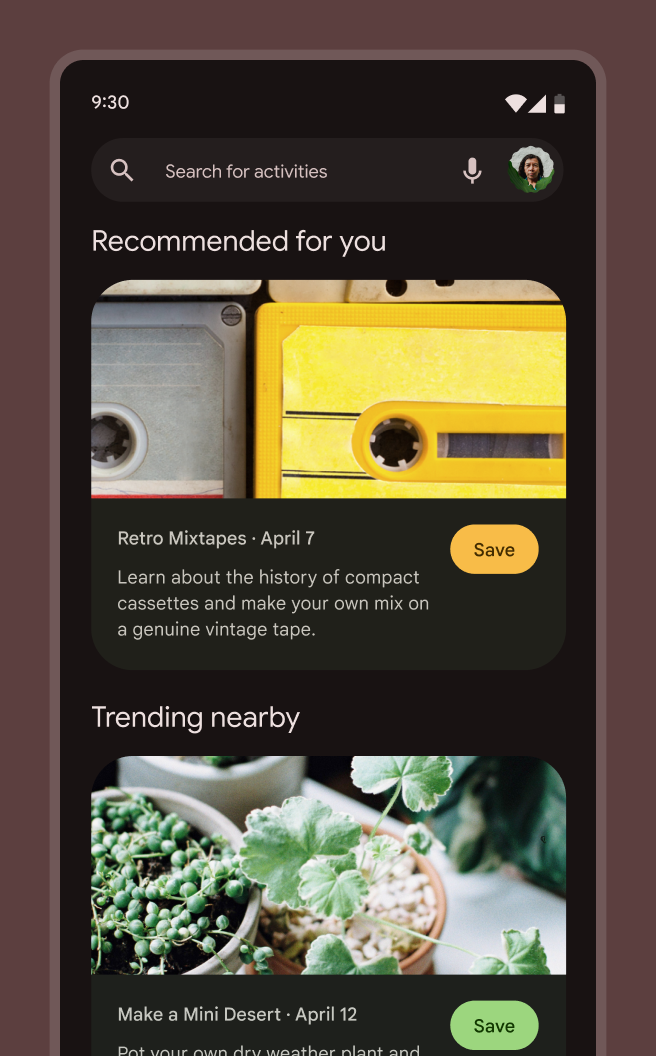
  • Link and associate content on a screen: In lists and collections of repeated items that benefit from differentiation, content-based color can help associate related elements. This helps people quickly distinguish and pair related information, such as a list item and its associated action.
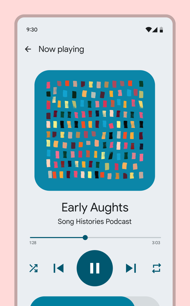
  • Immerse users in content color: Full-screen content-based color moments can orient users within a content-driven experience, such as a media control or a purchase flow.
  • Pair content-based color with its source content: Keep the source for content-based color visible on a screen using the content color. This way users are shown where a content-based color originates. Avoid applying content-based color in spaces where the content itself isn’t visible.
  • Limit the number of color source types per screen: Limit a screen to two color schemes from different source types. Too many color schemes on the same screen may lead to confusion and visual disarray. For example, a baseline or user-generated color scheme can be combined with one type of on-screen content (such as album art).
  • Don’t replace semantic colors: Use caution when applying content-based color in places where a semantic color or conventional color meaning is important for usability. For example, a common red error message or a common green positive action shouldn’t be replaced with dynamic content-based color because it may interfere with someone’s understanding.
Photo options screen in a red theme. Photo editing controls are displayed underneath the photo, and are colored in a teal scheme sourced from the photo.
When many types of information and actions share a screen, use content-based color to add hierarchy and draw attention to the content. This screen uses a content-based scheme sourced from the photo to draw attention to the photo editing controls.
A feed of cards listing different activities. The first card shows an image of a yellow tape cassette, and its UI is colored in a yellow scheme. The second card shows an image of a green plant, and its UI is colored in a green scheme.
In lists and collections of repeated items that benefit from differentiation, content-based color can help associate related elements. This helps people quickly distinguish and pair related information, such as a list item and its associated action. In this list of activities, each card is colored with a scheme sourced from its main image.
Media control screen where a podcast called Early Aughts is playing. The screen displays a teal colored album art for the podcast. The entire screen is colored in a teal scheme.
Full-screen content-based color moments can orient users within a content-driven experience, such as a media control or a purchase flow. This media control screen is colored entirely in a scheme sourced from the in-context album art.

Map or remap colors on UI elements ​

You can change a component’s default color mapping, or apply colors to your own custom components.

A custom volume slider component next to a design software UI palette displaying a list of color roles. The primary color role is linked to the mute button on the volume slider.
Colors can be remapped on existing Material components, or can be mapped as desired to custom-built components, such as this unique volume slider.

Why ​

You want to map colors to a custom-built component or change a Material Component’s default color mapping to improve its function (such as visual contrast) or style.

How ​

Choose an appropriate color role based on how the color is used (see color roles) and how well the role supports your intended design expression.

Design ​

  • In Figma, select the component or element you want to remap so that you see its colors in the Design panel on the right of the screen
  • To remap a color, hover on the color row in the Design panel and select the Style icon (four dots). This opens a selection dialog.
  • Search for your theme name to see the available color roles
  • Select the color role that most closely matches that color's use case in the component. For example, the background color of a component could be replaced with the surface color role and the color for text or icons could be on surface. See Color roles for more information on what color to use where.
  • Select Use style to apply that color to the selected objects
  • Repeat until all colors in the component have been replaced with color roles from your scheme

Best practices ​

  • Make sure to use color roles that support Material's contrast requirements for the component. Any color roles starting with "on-" are guaranteed to have sufficient contrast with the corresponding color role. Other color role pairs may not meet the 4.5:1 (small text) and 3:1 (large text) Material contrast requirements.
  • If you’re applying a dynamic scheme, test how the color on the component appears under different themes (such as light and dark; red, yellow, green and blue) to ensure it looks as desired in dynamic color
  • Always apply color roles rather than static values or tonal palette values, as these colors will break with light and dark themes, contrast control, and other features. If the color in a role does not meet your needs, you can define new colors or adjust existing colors.
Pager
Previous pageAdvanced: Overview
Next pageAdvanced: Define new colors

Released under the Apache 2.0 or CC BY 4.0

Copyright © 2018-Present Google

https://m3.material.io/styles/color/advanced/apply-colors

Released under the Apache 2.0 or CC BY 4.0

Copyright © 2018-Present Google