

Time pickers: Specs
Time pickers help people select and set a specific time
Tokens & specs
Select a component variant below to see its elements, attributes, tokens, and their values. Learn more about design tokens
Time picker - Dial
Time picker - Input
Anatomy
Time picker dial
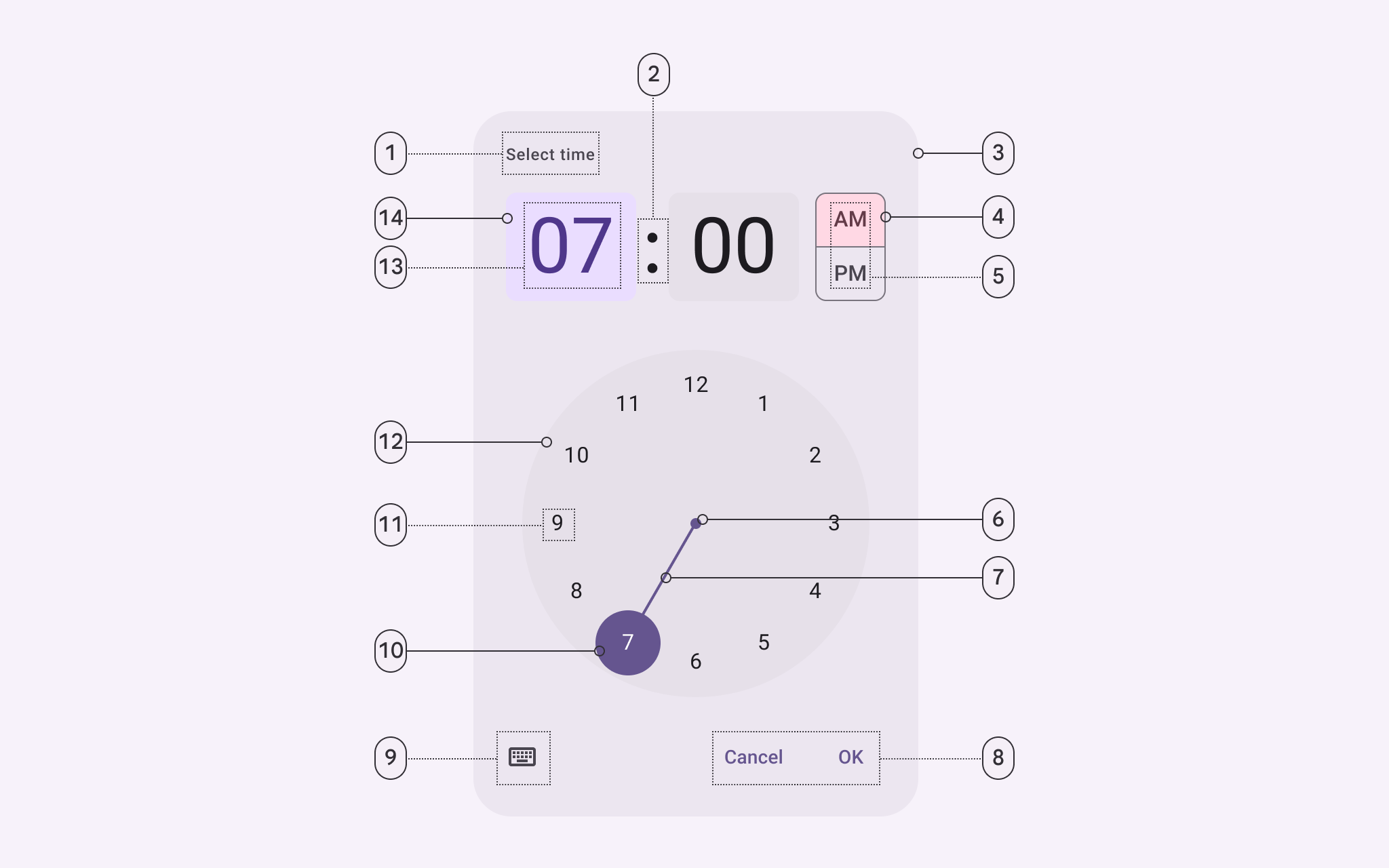
- Headline
- Time selector separator
- Container
- Period selector container
- Period selector label text
- Clock dial selector center
- Clock dial selector track
- Text button
- Icon button
- Clock dial selector container
- Clock dial label text
- Clock dial container
- Time selector label text
- Time selector container
Time picker input
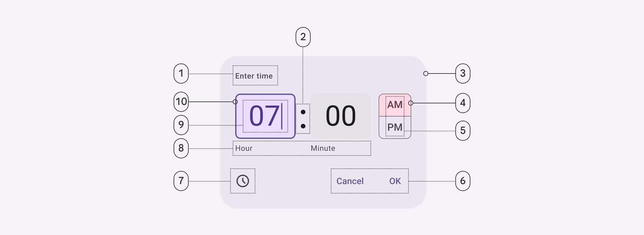
- Headline
- Time input field separator
- Container
- Period selector container
- Period selector label text
- Text button
- Icon button
- Time input field supporting text
- Time input field label text
- Time input field container
Color
Color values are implemented through design tokens. For design, this means working with color values that correspond with tokens. For implementation, a color value will be a token that references a value. Learn more about design tokens
Time picker dial color
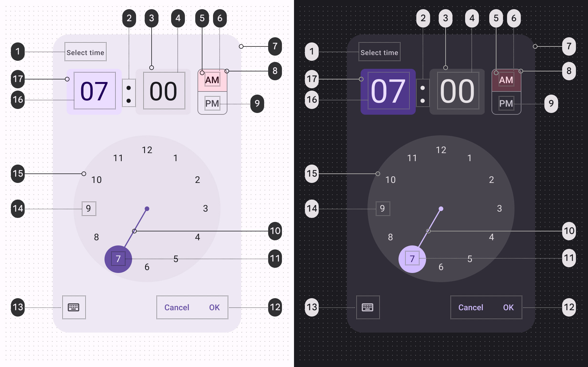
Time picker dial color roles used for light and dark themes:
- On surface variant
- On surface
- Surface container highest
- On surface
- Tertiary container
- On tertiary container
- Surface container high
- Outline
- On surface
- Primary
- On primary
- Primary
- On surface variant
- On surface
- Surface container highest
- On primary container
- Primary container
Time picker input color
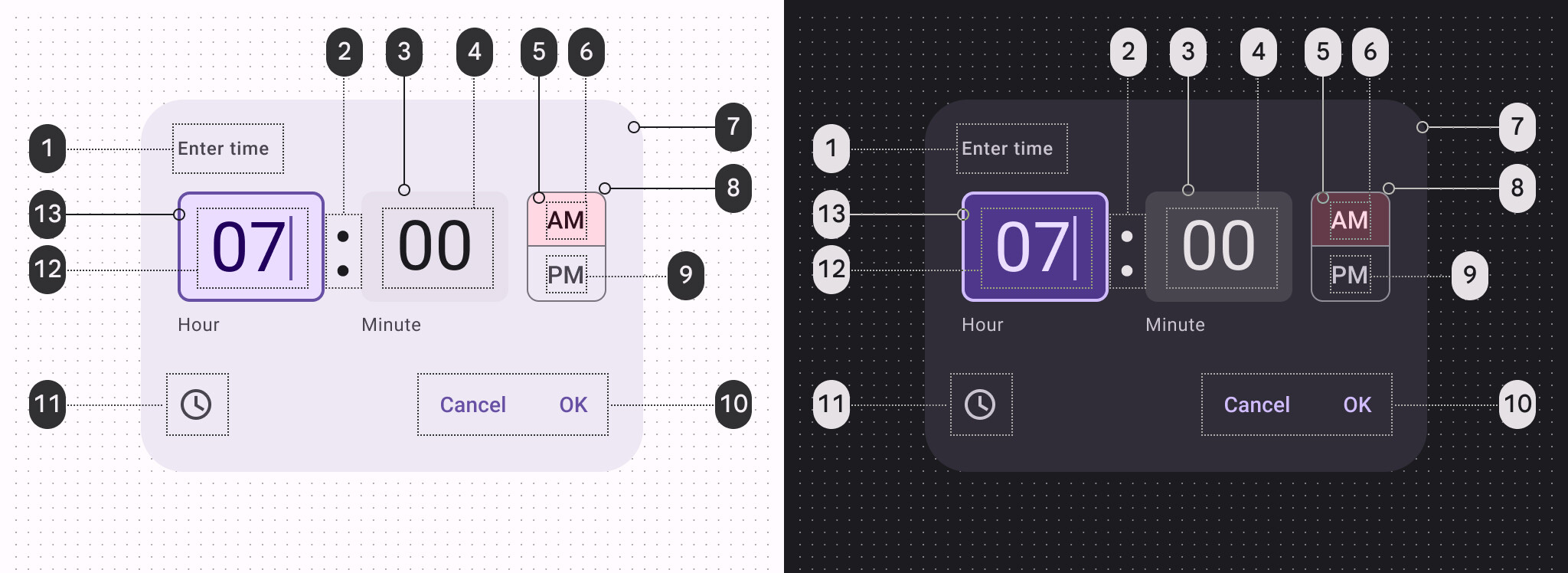
Time picker input color roles used for light and dark themes:
- On surface variant
- On surface
- Surface container highest
- On surface
- Tertiary container
- On tertiary container
- Surface container high
- Outline
- On surface
- Primary
- On surface variant
- On primary container
- Primary container
States
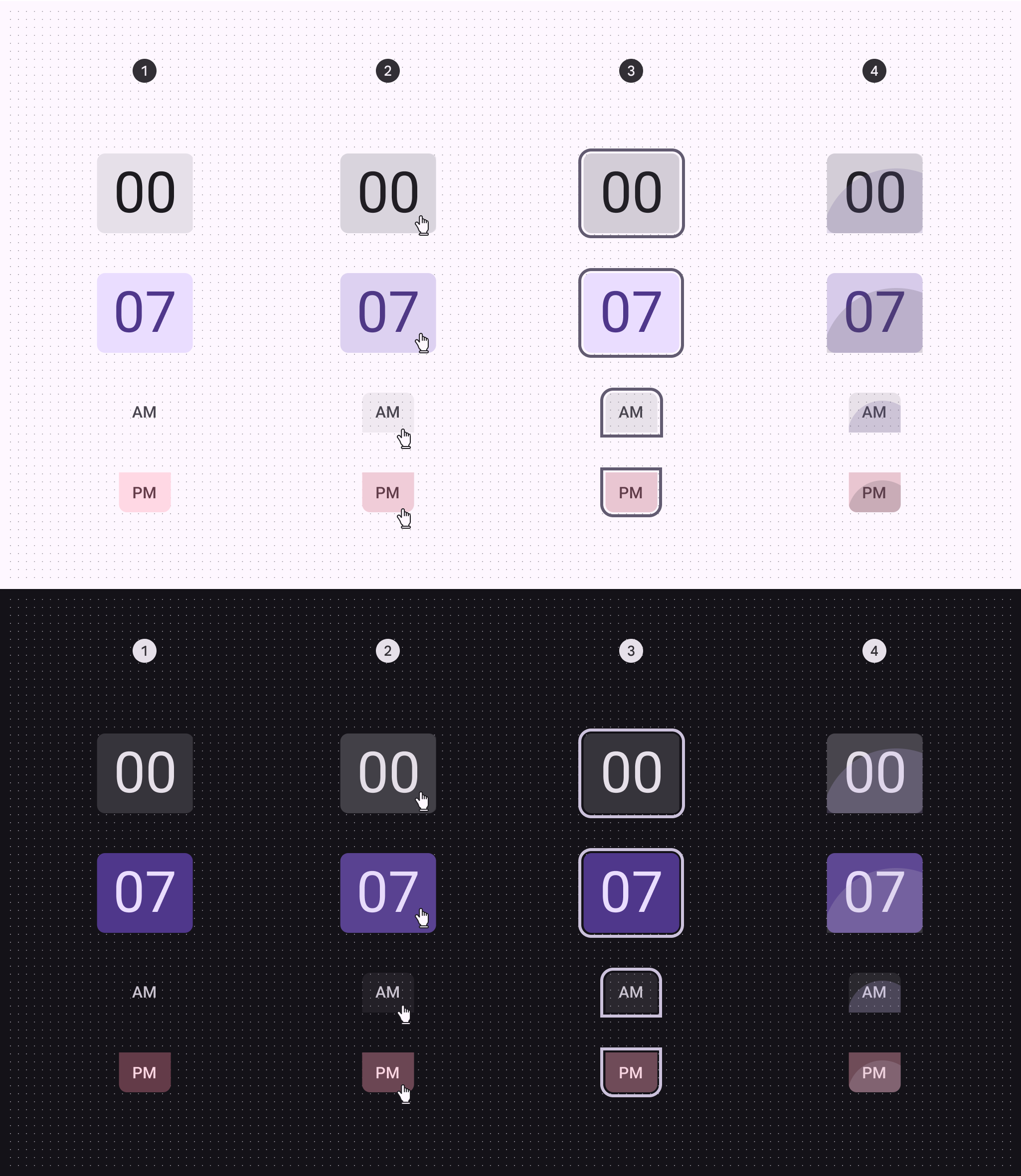
- Enabled
- Hover
- Focus
- Pressed
States specs can be found in the token module above
Measurements
Time picker dial - vertical
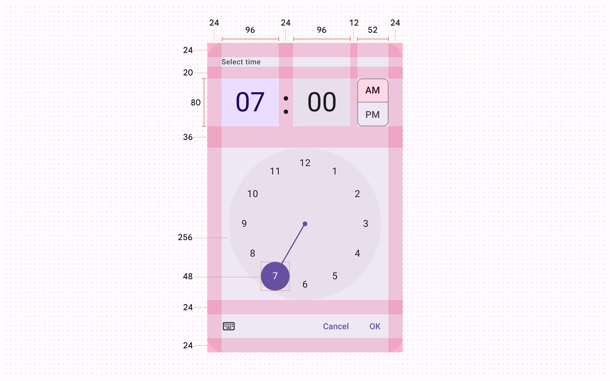
Vertical time picker dial padding and size measurements
| Element | Attribute | Value |
|---|---|---|
| Container | Width | Dynamic |
| Height | Dynamic | |
| Headline alignment | Left | |
| Top/bottom padding | 24dp | |
| Left/right padding | 24dp | |
| Time selector container | Width | 96dp |
| Width (24h vertical) | 114dp | |
| Height | 80dp | |
| Period selector container | Width (vertical layout) | 52dp |
| Height (vertical layout) | 80dp | |
| Width (horizontal layout) | 216dp | |
| Height (horizontal layout) | 38dp | |
| Clock dial container | Size | 256dp |
| Clock dial selector handle | Size | 48dp |
| Clock dial selector center | Size | 8dp |
| Clock dial selector track | Width | 2dp |
Time picker dial - horizontal
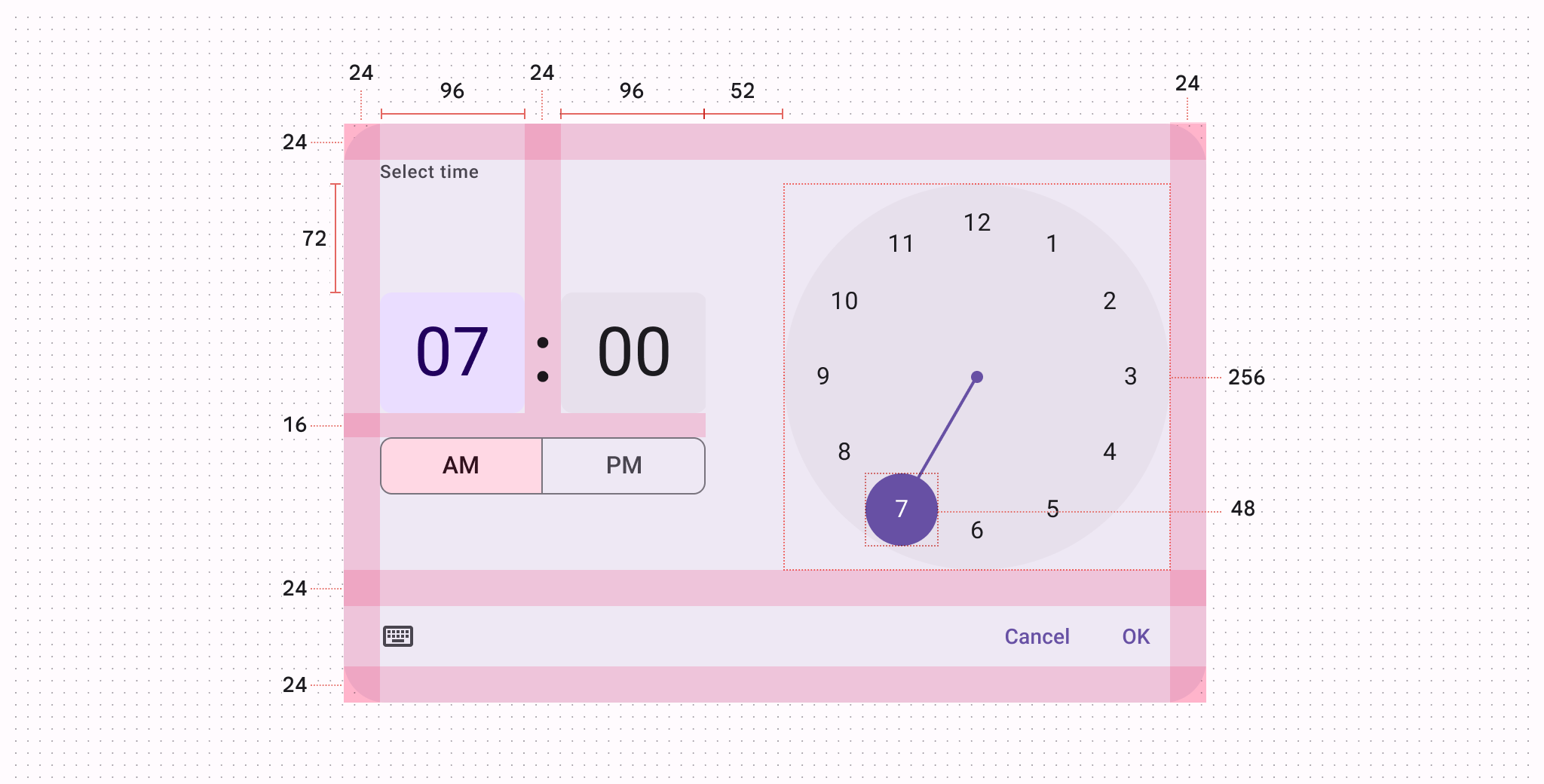
Horizontal time picker dial padding and size measurements
| Element | Attribute | Value |
|---|---|---|
| Container | Width | Dynamic |
| Height | Dynamic | |
| Headline alignment | Left | |
| Top/bottom padding | 24dp | |
| Left/right padding | 24dp | |
| Time selector container | Width | 96dp |
| Width (24h vertical) | 114dp | |
| Height | 80dp | |
| Period selector container | Width (vertical layout) | 52dp |
| Height (vertical layout) | 80dp | |
| Width (horizontal layout) | 216dp | |
| Height (horizontal layout) | 38dp | |
| Clock dial container | Size | 256dp |
| Clock dial selector handle | Size | 48dp |
| Clock dial selector center | Size | 8dp |
| Clock dial selector track | Width | 2dp |
Time picker input
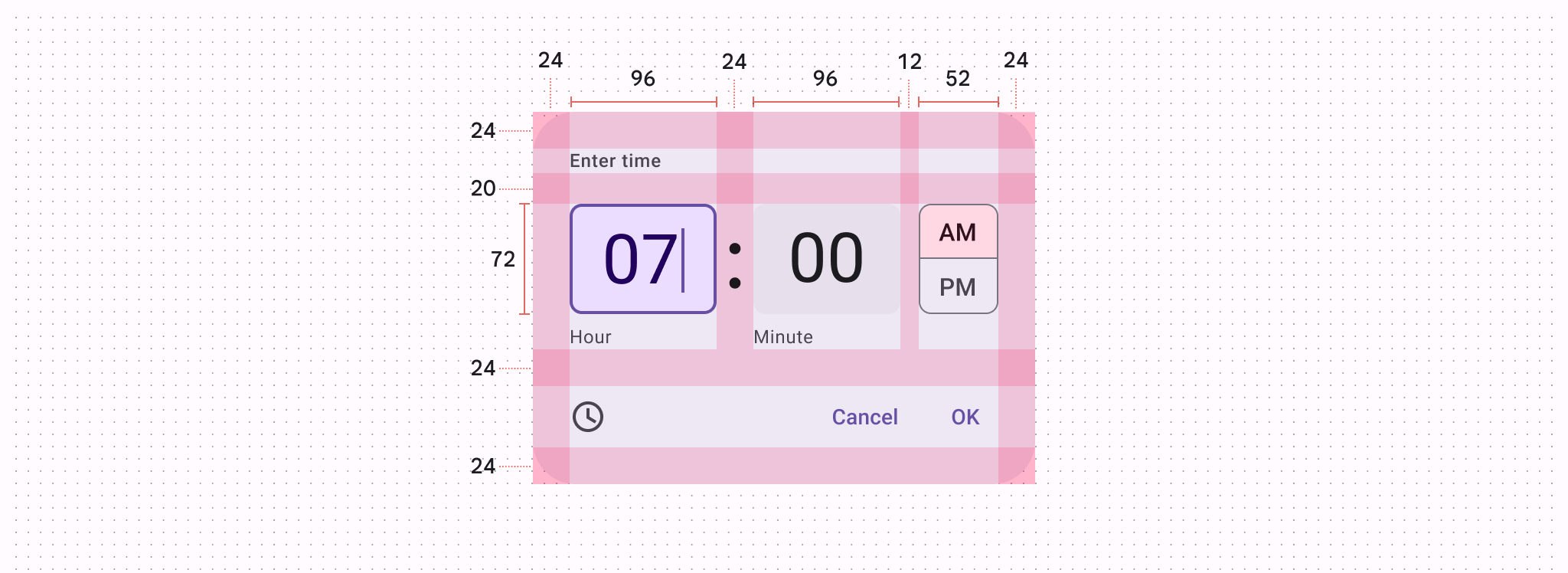
Time picker input padding and size measurements
| Element | Attribute | Value |
|---|---|---|
| Container | Width | Dynamic |
| Height | Dynamic | |
| Headline alignment | Left | |
| Top/bottom padding | 24dp | |
| Left/right padding | 24dp | |
| Time input field container | Width | 96dp |
| Height | 72dp | |
| Period selector container | Width | 52dp |
| Height | 72dp |
Configurations
Vertical orientation and horizontal orientation
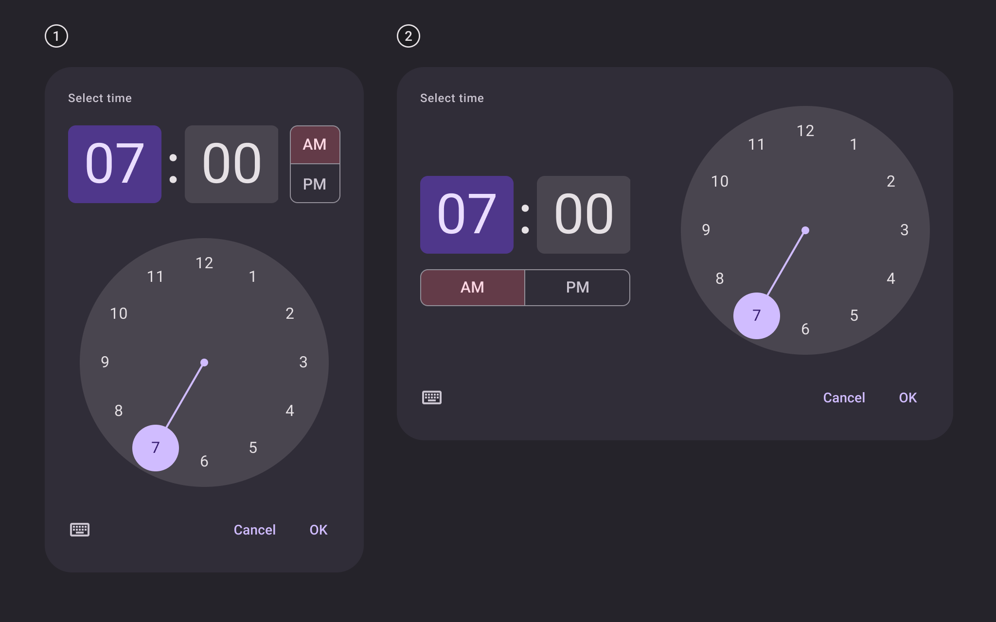
- Vertical layout (default on mobile)
- Horizontal layout
24-hour time picker dial
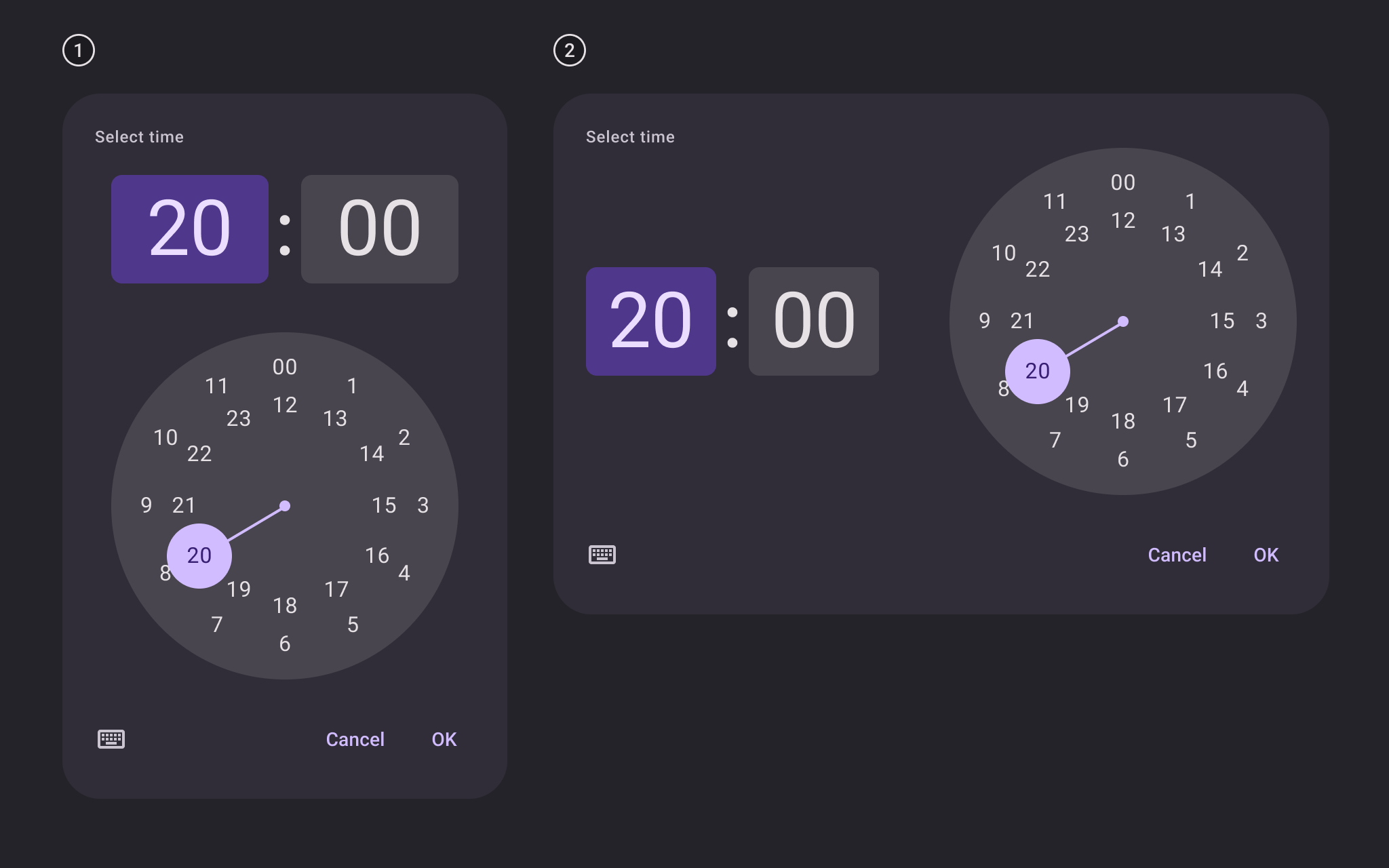
- 24h dial in vertical layout (default on mobile)
- 24h dial in horizontal layout
12-hour and 24-hour time picker inputs
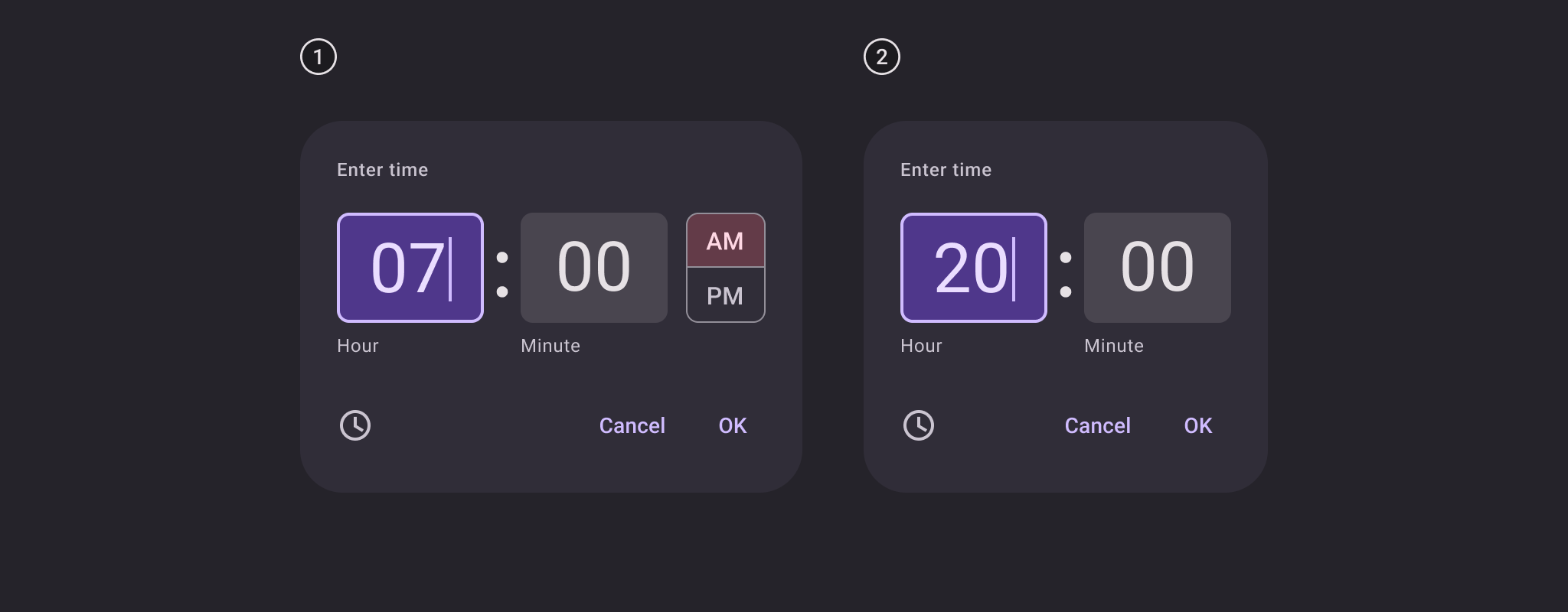
- 12h input
- 24h input