Segmented buttons: Specs
Segmented buttons help people select options, switch views, or sort elements
TIP
Segmented buttons are no longer recommended in the Material 3 expressive update. For those who have updated, use the connected button group instead, which has mostly the same functionality but with an updated visual design.
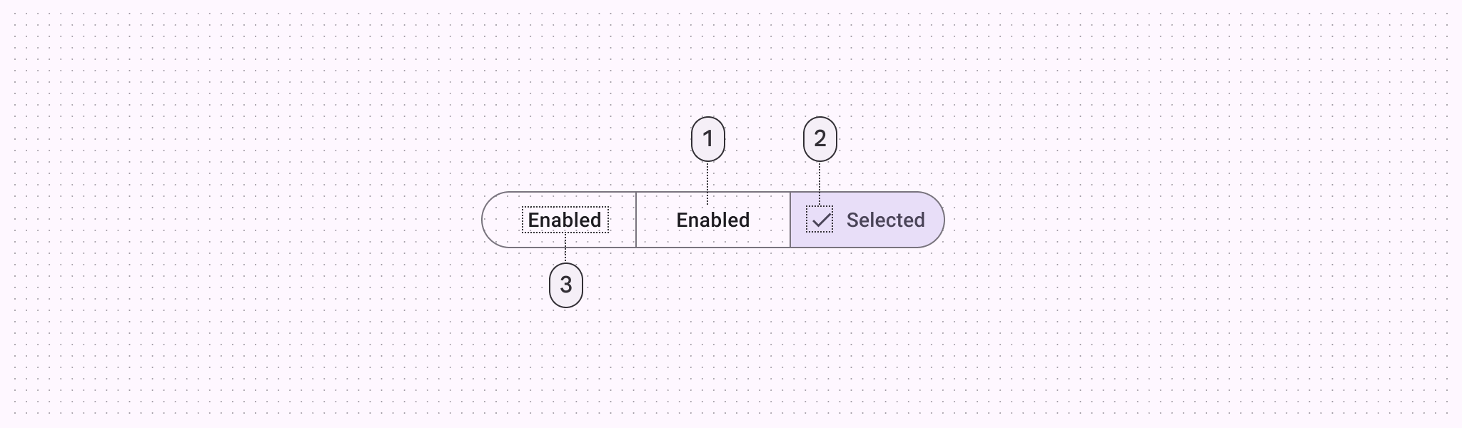
- Container
- Icon (optional for unselected state)
- Label text
Tokens and specs
Browse the component elements, attributes, tokens, and their values. Learn more about design tokens
Segmented button - Outlined
Color
Color values are implemented through design tokens. For design, this means working with color values that correspond with tokens. For implementation, a color value will be a token that references a value. Learn more about design tokens
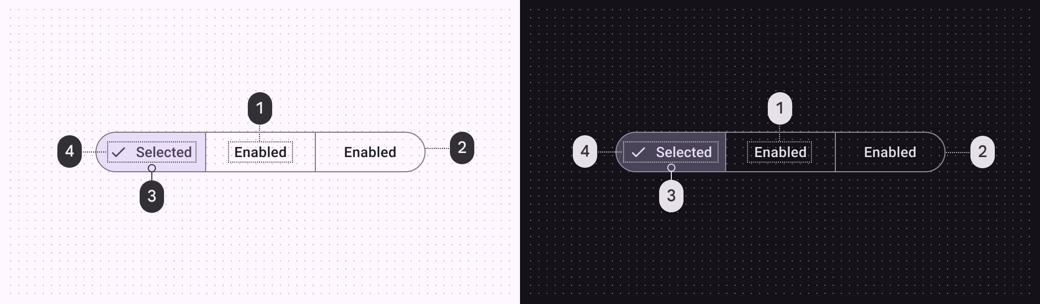
Segmented button color roles used for light and dark schemes:
- On surface
- Outline
- Secondary container
- On secondary container
States
States are visual representations used to communicate the status of a component or interactive element. Learn more about interaction statesUnselected
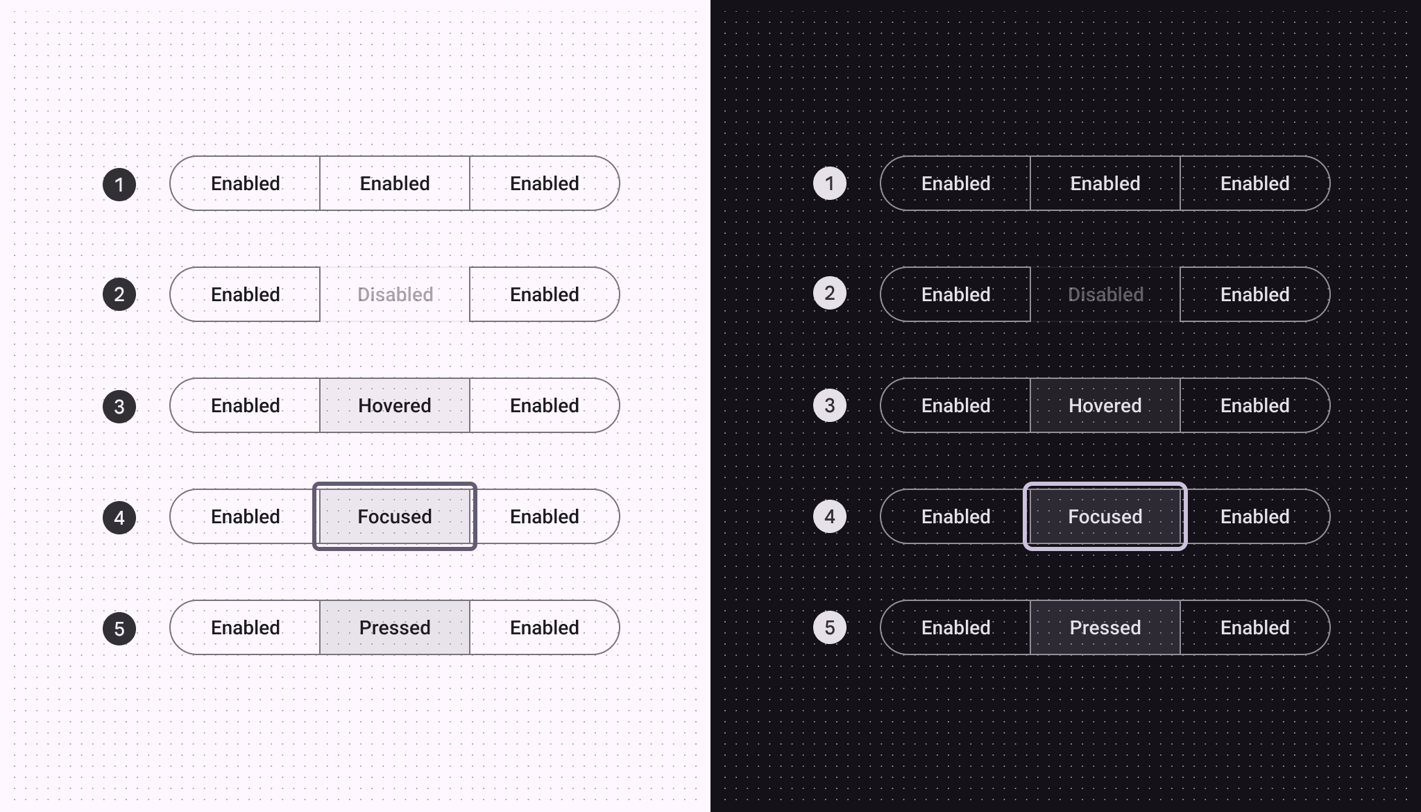
Unselected button states:
- Enabled
- Disabled
- Hovered
- Focused
- Pressed
Selected
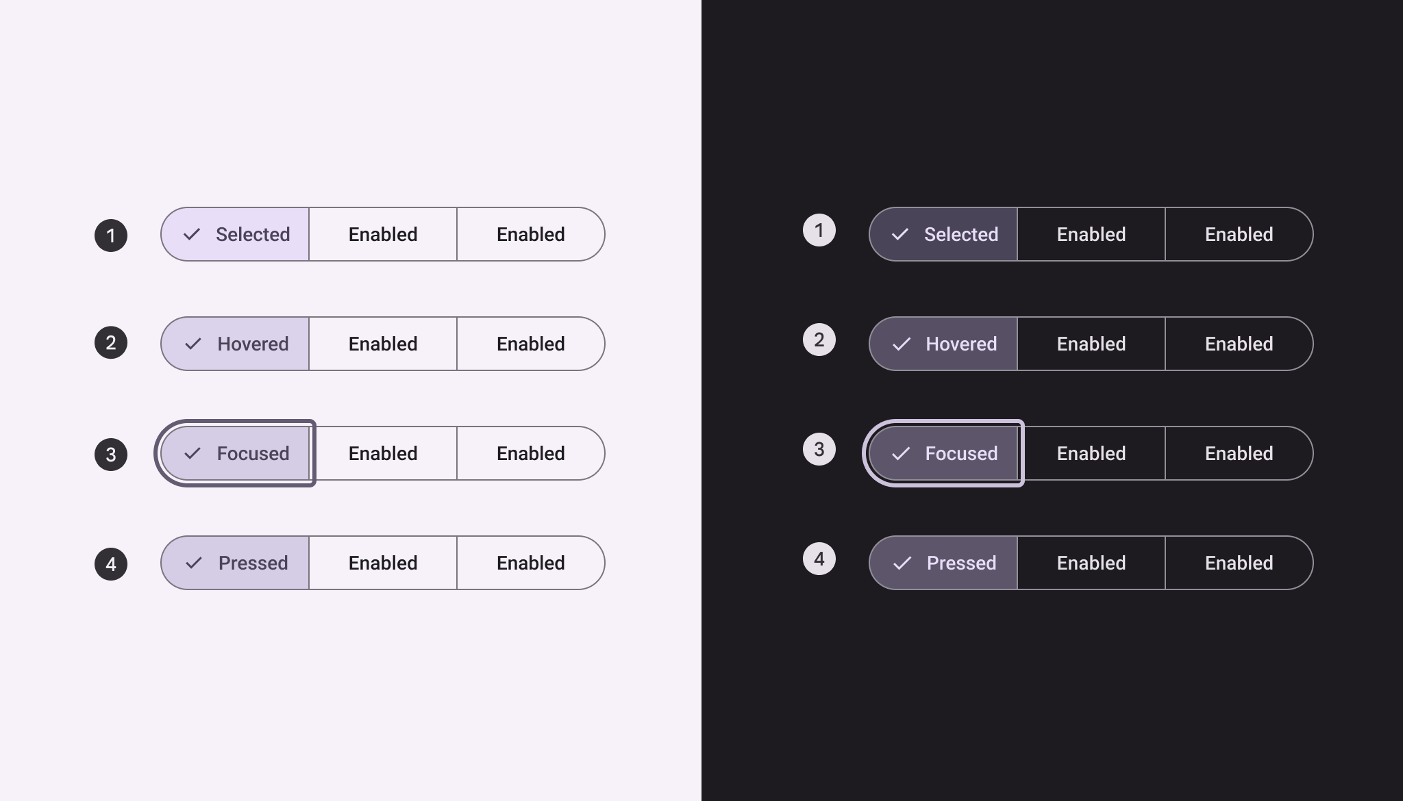
Selected button states:
- Selected
- Hovered on selected
- Focused on selected
- Pressed on selected
Measurements
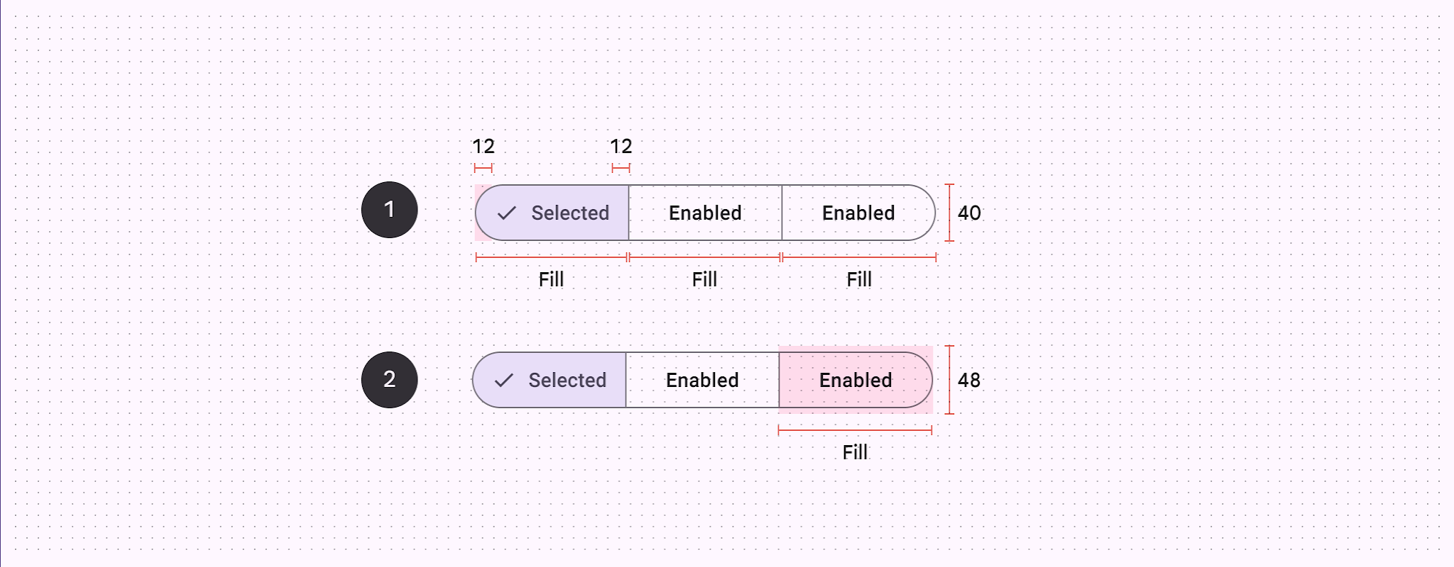
- Padding and container size
- Target size
| Attribute | Value |
|---|---|
| Container width | Dynamic based on labels |
| Segment width | Container width / total segments (Example: 1/3) |
| Height | 40dp |
| Outline width | 1dp |
| Label alignment | Center |
| Left/right padding | Min 12dp |
| Padding between elements | 8dp |
| Target size | 48dp |
Density
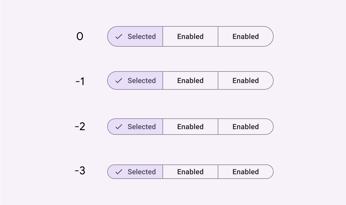
Density can be used in denser UIs where space is limited. Density is only applied to the height.