Skip to content
Material Design 3
Main Navigation
v3
v2
v1

English

简体中文
繁體中文
Español
Français
Русский
Português – Brasil
Deutsch
日本語
한국어
Italiano
Polski
Türkçe
čeština
magyar

English

简体中文
繁體中文
Español
Français
Русский
Português – Brasil
Deutsch
日本語
한국어
Italiano
Polski
Türkçe
čeština
magyar

Appearance

Sidebar Navigation

Foundations

Accessibility

Overview: Principles

Overview: Assistive technology

Designing: Overview

Designing: Color contrast

Designing: Structure

Designing: Flow

Designing: Elements

Writing and text: Best practices

Writing and text: Text truncation

Writing and text: Text resizing

Building for all: User needs

Building for all: Co-design

Content design

Overview

Alt text

Global writing: Overview

Global writing: Word choice

Notifications

Style guide: UX writing best practices

Style guide: Word choice

Style guide: Grammar and punctuation

Customizing Material

Devices

Watches: Overview

Watches: Foundations

Watches: Styles

Watches: Layout

XR

Design: Overview

Design: Interaction

Design: Layout

Design: Accessibility

Components: Overview

Components: App bars

Components: Dialogs

Components: Nav bar

Components: Nav rail

Components: Toolbars

Design tokens: Overview

Design tokens: How to use tokens

Interaction

Gestures

Inputs

Selection

States: Overview

States: State layers

States: Applying states

Layout

Overview: Overview

Overview: Parts of layout

Overview: Adaptive design

Scaffold: Overview

Scaffold: Bars

Scaffold: Rails

Scaffold: Panes

Grids & spacing: Overview

Grids & spacing: Grids

Grids & spacing: Spacing

Grids & spacing: Density

Breakpoints: Overview

Breakpoints: Compact

Breakpoints: Medium

Breakpoints: Expanded

Breakpoints: Large & extra-large

Bidirectionality & RTL

Canonical examples: Overview

Canonical examples: Feed

Canonical examples: List-detail

Canonical examples: Supporting pane

Usability: Overview

Usability: Applying M3 Expressive

Material A-Z

Styles

Color

Color system: Overview

Color system: How the system works

Color roles

Color schemes

Choosing a scheme

Static: Baseline

Static: Custom brand

Dynamic: Choosing a source

Dynamic: User-generated source

Dynamic: Content-based source

Advanced: Overview

Advanced: Apply colors

Advanced: Define new colors

Advanced: Adjust existing colors

Color resources

Elevation: Overview

Elevation: Applying elevation

Elevation: Tokens

Icons: Overview

Icons: Designing icons

Icons: Applying icons

Motion

Motion physics system: How it works

Motion physics system: Specs

Easing and duration: Applying easing and duration

Easing and duration: Tokens & specs

Transitions: Transition patterns

Transitions: Applying transitions

Shape: Overview & principles

Shape: Corner radius scale

Shape: Shape morph

Spacing: Overview

Spacing: Applying spacing

Spacing: Tokens

Typography: Overview

Typography: Fonts

Typography: Type scale & tokens

Typography: Applying type

Typography: Editorial treatments

Components

App bars: Overview

App bars: Specs

App bars: Guidelines

App bars: Accessibility

Badges: Overview

Badges: Specs

Badges: Guidelines

Badges: Accessibility

Buttons

All buttons

Button groups: Overview

Button groups: Specs

Button groups: Guidelines

Button groups: Accessibility

Buttons: Overview

Buttons: Specs

Buttons: Guidelines

Buttons: Accessibility

Extended FABs: Overview

Extended FABs: Specs

Extended FABs: Guidelines

Extended FABs: Accessibility

FAB menu: Overview

FAB menu: Specs

FAB menu: Guidelines

FAB menu: Accessibility

FABs: Overview

FABs: Specs

FABs: Guidelines

FABs: Accessibility

Icon buttons: Overview

Icon buttons: Specs

Icon buttons: Guidelines

Icon buttons: Accessibility

Segmented buttons: Overview

Segmented buttons: Specs

Segmented buttons: Guidelines

Segmented buttons: Accessibility

Split button: Overview

Split button: Specs

Split button: Guidelines

Split button: Accessibility

Cards: Overview

Cards: Specs

Cards: Guidelines

Cards: Accessibility

Carousel: Overview

Carousel: Specs

Carousel: Guidelines

Carousel: Accessibility

Checkbox: Overview

Checkbox: Specs

Checkbox: Guidelines

Checkbox: Accessibility

Chips: Overview

Chips: Specs

Chips: Guidelines

Chips: Accessibility

Date & time pickers

Date pickers: Overview

Date pickers: Specs

Date pickers: Guidelines

Date pickers: Accessibility

Time pickers: Overview

Time pickers: Specs

Time pickers: Guidelines

Time pickers: Accessibility

Dialogs: Overview

Dialogs: Specs

Dialogs: Guidelines

Dialogs: Accessibility

Divider: Overview

Divider: Specs

Divider: Guidelines

Divider: Accessibility

Lists: Overview

Lists: Specs

Lists: Guidelines

Lists: Accessibility

Loading & progress

Loading indicator: Overview

Loading indicator: Specs

Loading indicator: Guidelines

Loading indicator: Accessibility

Progress indicators: Overview

Progress indicators: Specs

Progress indicators: Guidelines

Progress indicators: Accessibility

Menus: Overview

Menus: Specs

Menus: Guidelines

Menus: Accessibility

Navigation

Navigation bar: Overview

Navigation bar: Specs

Navigation bar: Guidelines

Navigation bar: Accessibility

Navigation drawer: Overview

Navigation drawer: Specs

Navigation drawer: Guidelines

Navigation drawer: Accessibility

Navigation rail: Overview

Navigation rail: Specs

Navigation rail: Guidelines

Navigation rail: Accessibility

Radio button: Overview

Radio button: Specs

Radio button: Guidelines

Radio button: Accessibility

Search: Overview

Search: Specs

Search: Guidelines

Search: Accessibility

Sheets

Bottom sheets: Overview

Bottom sheets: Specs

Bottom sheets: Guidelines

Bottom sheets: Accessibility

Side sheets: Overview

Side sheets: Specs

Side sheets: Guidelines

Side sheets: Accessibility

Sliders: Overview

Sliders: Specs

Sliders: Guidelines

Sliders: Accessibility

Snackbar: Overview

Snackbar: Specs

Snackbar: Guidelines

Snackbar: Accessibility

Switch: Overview

Switch: Specs

Switch: Guidelines

Switch: Accessibility

Tabs: Overview

Tabs: Specs

Tabs: Guidelines

Tabs: Accessibility

Text fields: Overview

Text fields: Specs

Text fields: Guidelines

Text fields: Accessibility

Toolbars: Overview

Toolbars: Specs

Toolbars: Guidelines

Toolbars: Accessibility

Tooltips: Overview

Tooltips: Specs

Tooltips: Guidelines

Tooltips: Accessibility

On this page

Floating action buttons (FABs): Guidelines ​

Floating action buttons (FABs) help people take primary actions
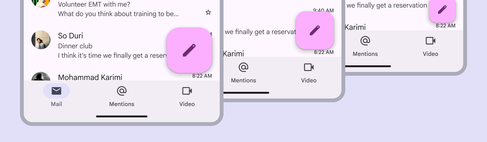

3 screens with various FAB sizes.
FABs have multiple sizes that scale with the breakpoint

Usage ​

Use a FAB for the most important action on a screen; it appears in front of all other content.

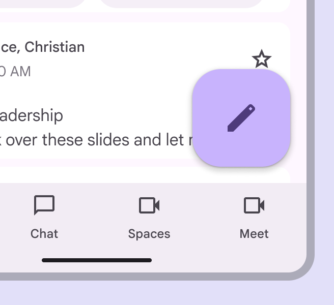
The FAB can be aligned left, center, or right. It can be positioned above the navigation bar, or nested within it.
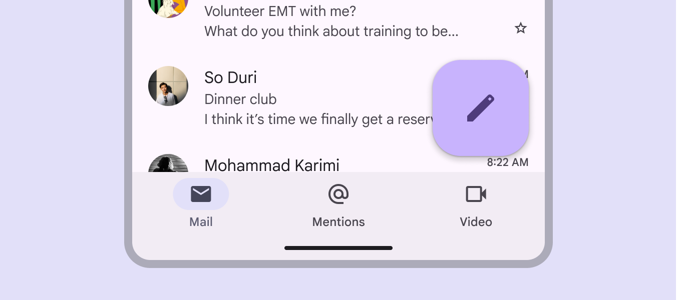
A Compose FAB is positioned above a nav bar on a mobile email inbox.
FABs can use dynamic color

There are three FAB sizes:

  1. FAB
  2. Medium FAB (most recommended)
  3. Large FAB

Choose the FAB size based on the visual hierarchy of your layout.

Note: The small FAB is no longer recommended.
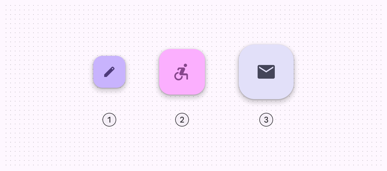
3 FAB sizes.
  1. FAB
  2. Medium FAB
  3. Large FAB

The FAB is the smallest size, and is best used in compact windowsWindow widths smaller than 600dp, such as a phone in portrait orientation.More on compact breakpoints where other actions may be present on screen.

The medium FAB is recommended for most situations, and works best in compact and medium windowsWindow widths from 600dp to 839dp, such as a tablet or foldable in portrait orientation.More on medium breakpoints. Use it for important actions without taking up too much space.

A large FAB is useful in any window size when the layout calls for a clear and prominent primary action, but is best suited for expandedWindow widths 840dp to 1199dp, such as a tablet or foldable in landscape orientation, or desktop.More on expanded breakpoints and larger breakpoints, where its size helps draw attention.
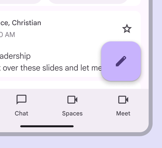
A medium FAB over an email app UI.
Use a medium FAB in most breakpoints
A large FAB over an email app UI.
Use a large FAB when the primary action needs to be prominent
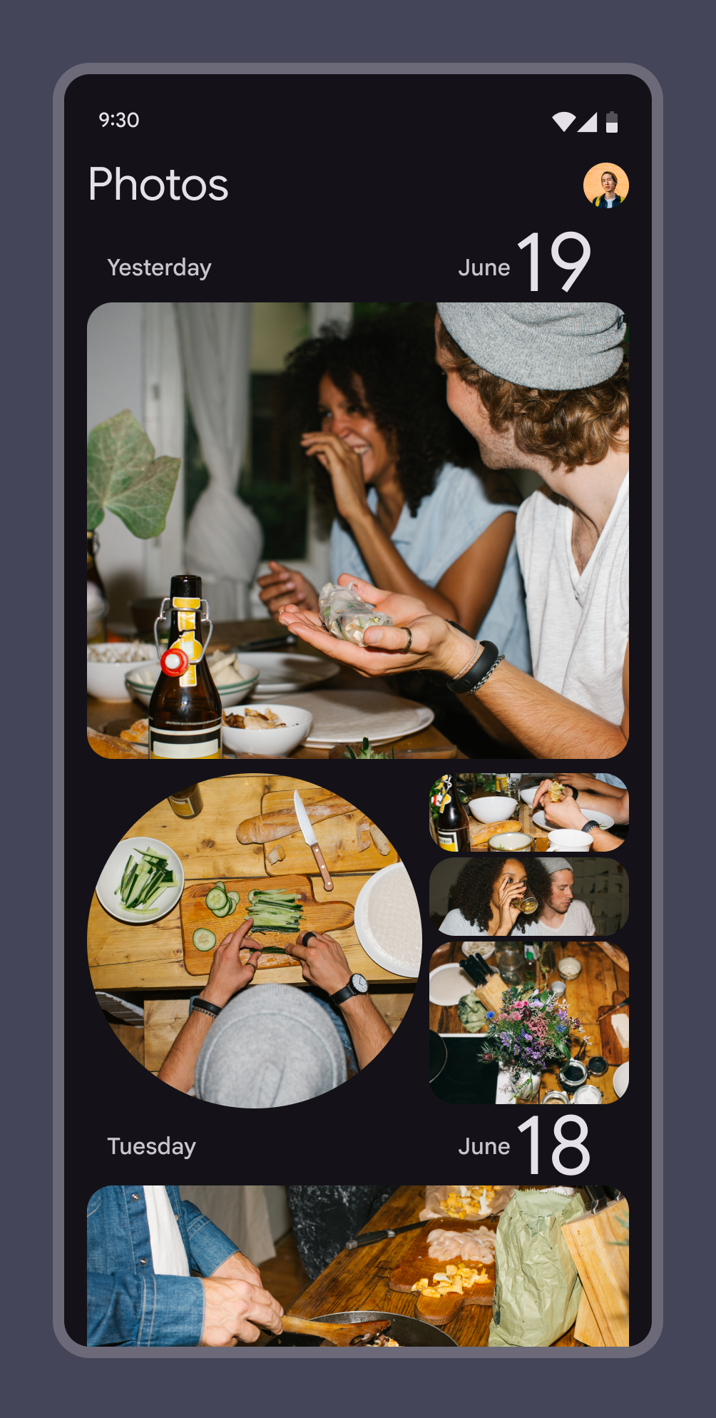
A photo feed with no FAB.
Do FABs are not needed on every screen, such as when images represent primary actions
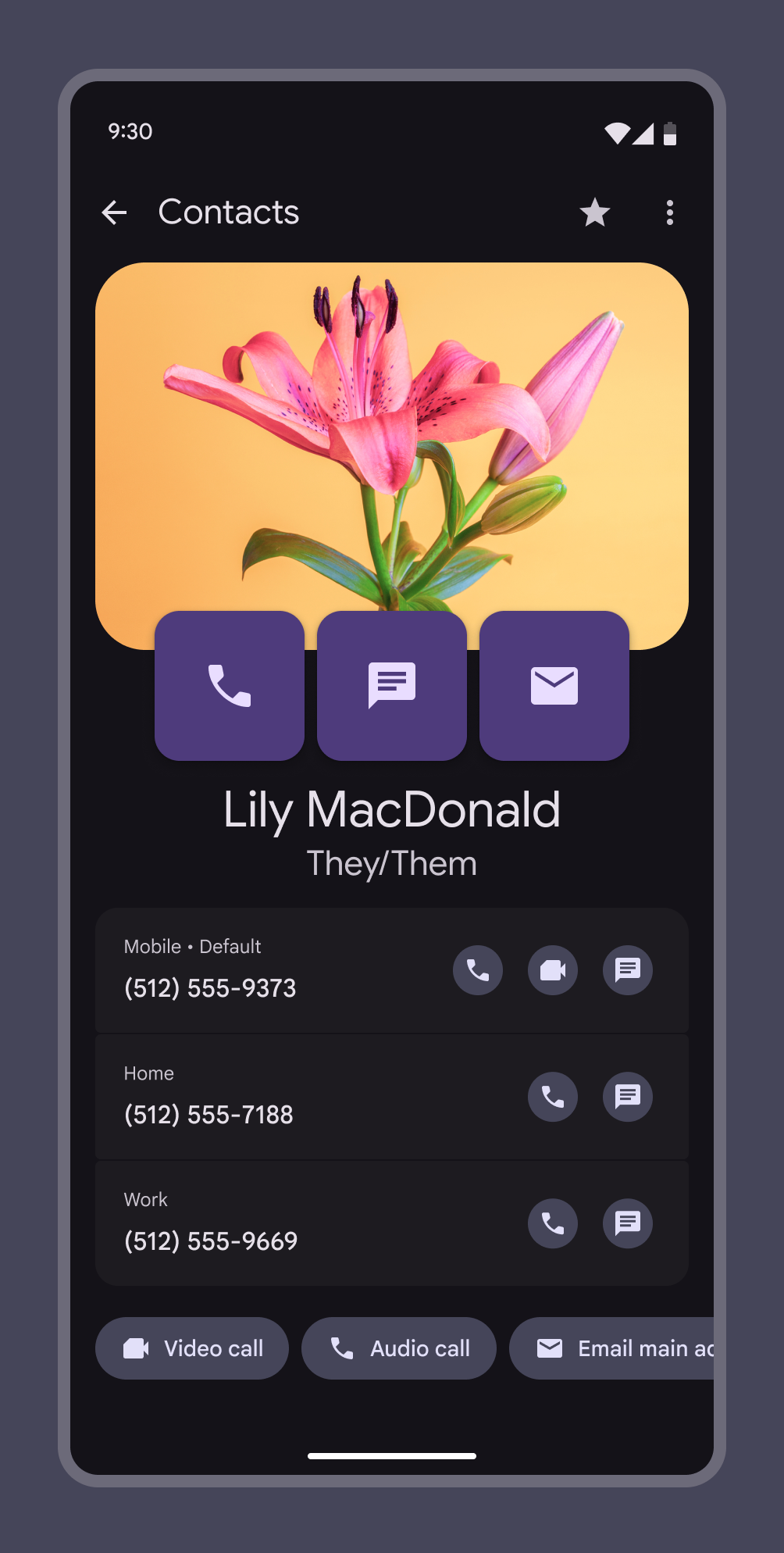
A screen with 3 FABs makes it hard to tell what the primary action should be.
Don't Don't display multiple FABs on a single screen

A FAB can transform into an extended FABExtended floating action buttons (extended FABs) help people take primary actions.More on extended FABs on larger screens, or it can transition into a FAB menu when selected. Use a FAB menu when there are many kinds of actions relevant to the FAB.

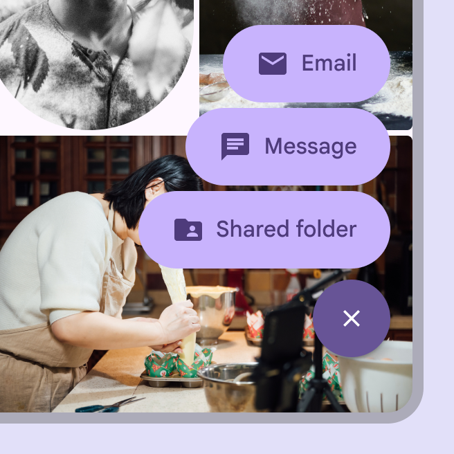
More on FAB menus

A extended FAB saying “Share” with a less popular share icon.
Use the extended FAB when label text is necessary
A FAB menu showing 3 actions related to sharing.
Use the FAB menu when there are many kinds of actions relevant to the FAB

Actions ​

A FAB can trigger an action on the current screen, or it can perform an action that creates a new screen.

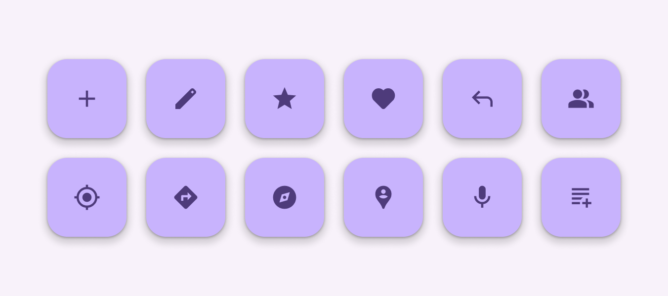
A FAB promotes an important, constructive action such as:

  • Create
  • Favorite
  • Share
  • Start a process
FABS for 12 common actions including, create, edit, and navigate.
Do Use FABs for primary, positive actions

Avoid using a FAB for minor or destructive actions, such as:

  • Archive or trash
  • Alerts or errors
  • Limited tasks like cutting text
  • Controls better suited to a toolbar, like to adjust volume or font color
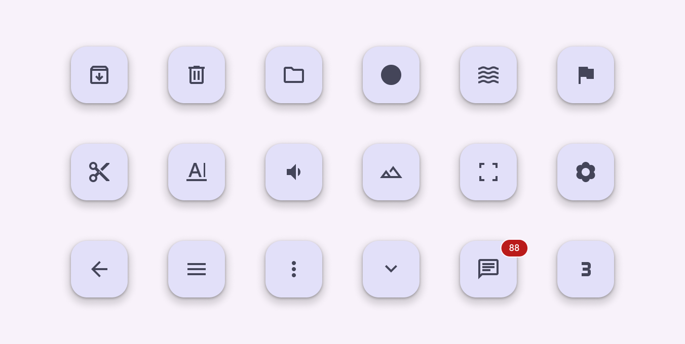
FABs for 18 minor or destructive actions, such as cut, trash, and volume.
Don't Don't use FABs for minor, overflow, unclear, or destructive actions

Anatomy ​

2 elements of a FAB.
  1. Container
  2. Icon

Container

The FAB is typically displayed in a square container. The container shouldn't be covered by other elements, such as badges.

The container must have sufficient color contrast with the surface it's placed on.

A bright colored FAB has high contrast with the background.
A FAB container color needs to stand out from its background

Icon

An icon in a FAB should be clear and understandable. When hovering over a FAB on web products, FABs should display a tooltip with an accompanying icon text label. Use a filled icon instead of an outlined icon.

A FAB shouldn't contain notifications or actions found elsewhere on a screen.
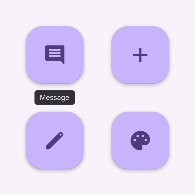
4 FABs each with a simple icon.
Do Use clear and simple icons such as add, message, or edit
4 FABs each with an ambiguous icon.
Don't Don't use confusing or open-ended icons to symbolize less common actions

Adaptive design ​

In compactWindow widths smaller than 600dp, such as a phone in portrait orientation.More on compact breakpoints and medium breakpointsWindow widths from 600dp to 839dp, such as a tablet or foldable in portrait orientation.More on medium breakpoints, the best place for the FAB is typically the lower right corner of a screen, since it's easy to reach and is less likely to cover important content.

In expanded breakpointsWindow widths 840dp to 1199dp, such as a tablet or foldable in landscape orientation, or desktop.More on expanded breakpoints, consider placing the FAB in the upper left corner, like in the navigation railNavigation rails let people switch between UI views on mid-sized devices.More on navigation rails. This positions it as one of the first interactive elements people see when they land on the page.

Adjust the size of the FAB based on the context. Use a medium FAB for mobile layouts, and large FAB for tablets and large screens.
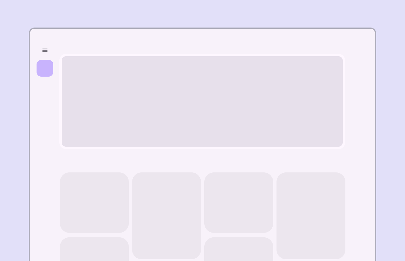
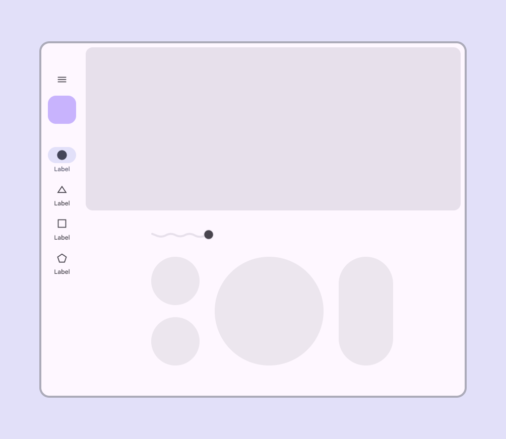
Large screen layout showing FAB in upper left region of the screen, below navigation rail icon.
For large screens, place the FAB in the upper left corner
A screen layout with several interactive elements. A single FAB is in the navigation rail.
Do A FAB can be used within a navigation component, such as a navigation rail
A busy screen layout with 8 cards, each with their own FAB.
Don't Individual components, such as cards, shouldn't have their own FAB

Behaviors ​

Appearing

When a FAB animates on screen, it expands outward from a central point. The icon within it can be animated as well.

While FABs should be relevant to screen content, they aren't attached to the surface on which content appears. FABs move separately from other UI elements because of their relative importance.

Screen transitions
FABs can morph to launch related actions. When a screen changes its layout, the FAB should disappear and reappear during the transition.

Reappearance
The FAB should only reappear if it's relevant to the new screen. It should reappear in the same position, if possible.

FAB animating on screen

Expanding

The FAB can expand and adapt to any shape using a container transform transition pattern. This includes a surface that's part of the app structure, or a surface that spans the entire screen.

The FAB can also transition into a FAB menu.

More on FAB menus

FABs can expand and adapt to any shape

Scrolling

FABs remain in place on scroll.

Extended FABs can collapse into a FAB on scroll and expand on reaching the bottom of the view.

FABs stay in place above a scrolling background

Moving across tabs

When tabs are present, the FAB should briefly disappear, then reappear when the new content moves into place. This shows that the FAB is not connected to any particular tab.

Do The FAB should disappear and reappear when switching pages

Don't animate the FAB with body content.

Don't Don't keep the FAB on screen when switching pages
Pager
Previous pageFABs: Specs
Next pageFABs: Accessibility

Released under the Apache 2.0 or CC BY 4.0

Copyright © 2018-Present Google

https://m3.material.io/components/floating-action-button/guidelines

Released under the Apache 2.0 or CC BY 4.0

Copyright © 2018-Present Google