

Checkbox: Guidelines
Checkboxes let users select one or more items from a list, or turn an item on or off
Usage
Use checkboxes to:
- Select one or more options from a list
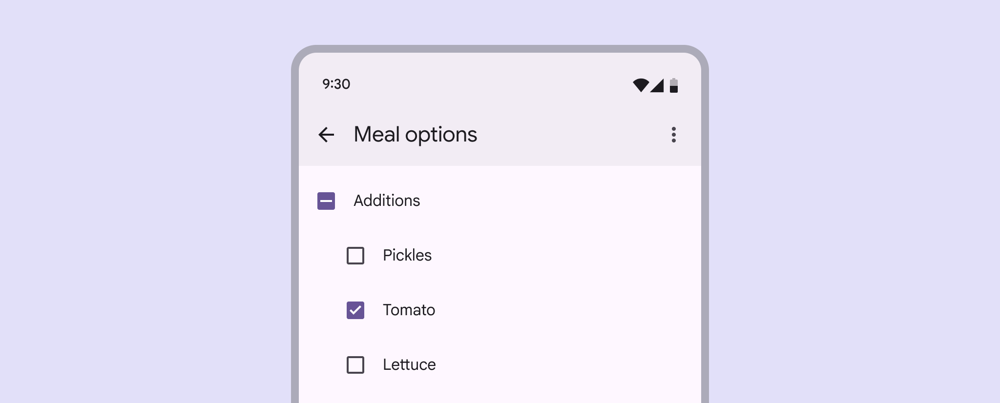
- Present a list containing sub-selections
- Turn an item on or off in a desktop environment
- Visually group similar options together
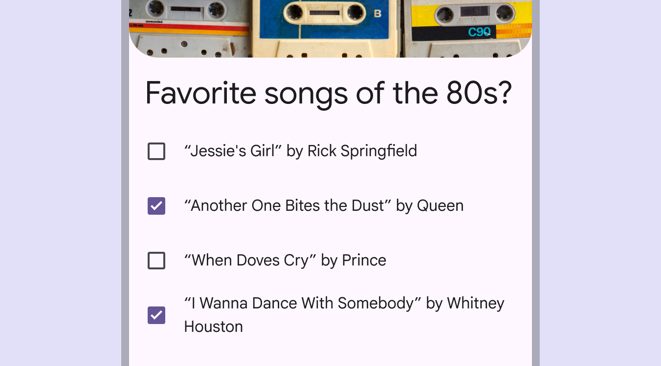
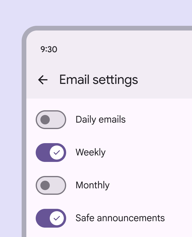
Checkboxes should be used instead of switches if multiple, related options can be selected from a list. Checkboxes visually group similar items effectively and take up less space than switches.
Alternate selection controls
Checkboxes, radio buttons, and switches are the three main selection controls. They all help people make choices, like selecting options or switching settings on or off.
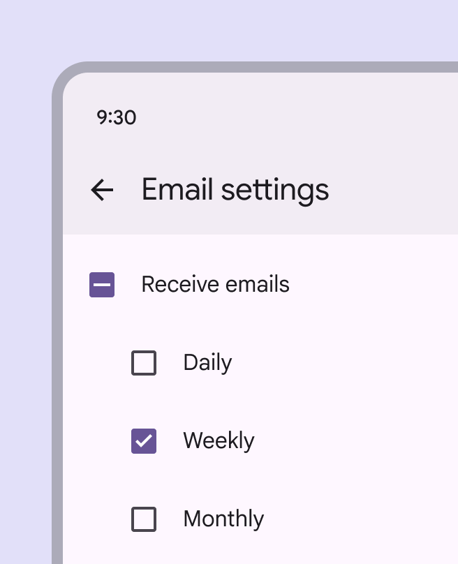
- Use checkboxes to select multiple related options in a list.
- Use radio buttons to select a single option in a list.
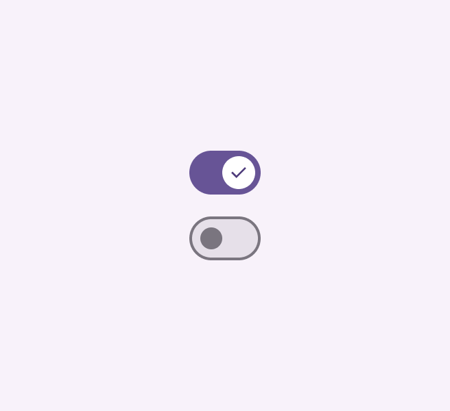
- Use switches to select standalone or more verbose options in a list, like settings.

Anatomy

- Container
- Icon
Responsive layout
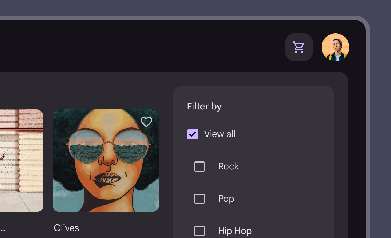
In expanded breakpoints, placing checkboxes within a contained region such as a side sheet can help group related controls and available actions.
Behavior
Multiple checkboxes in a list can be selected.
Checkboxes can have a parent-child relationship with other checkboxes.
- When the parent checkbox is checked, all child checkboxes are checked
- If a parent checkbox is unchecked, all child checkboxes are unchecked
- If some, but not all, child checkboxes are checked, the parent checkbox becomes an indeterminate checkbox. Checking an indeterminate checkbox checks all child items.
When selected, a checkbox clearly and instantly communicates its selected state.
If used to turn something on or off, the action should be immediately executed.