

Dialogs: Specs
Dialogs provide important prompts in a user flow
Tokens & specs
Select a component variant below to see its elements, attributes, tokens, and their values.
Dialog - Basic
Dialog - Full screen
Basic dialogs
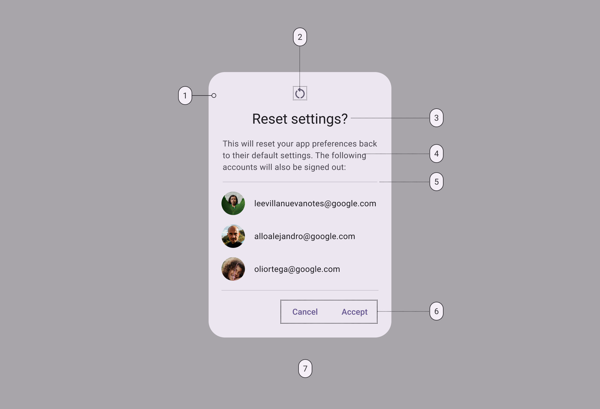
- Container
- Icon (optional)
- Headline (optional)
- Supporting text
- Divider (optional)
- Button label text
- Scrim
Basic dialog color
Color values are implemented through design tokens. For design, this means working with color values that correspond with tokens. For implementation, a color value will be a token that references a value. Learn more about design tokens
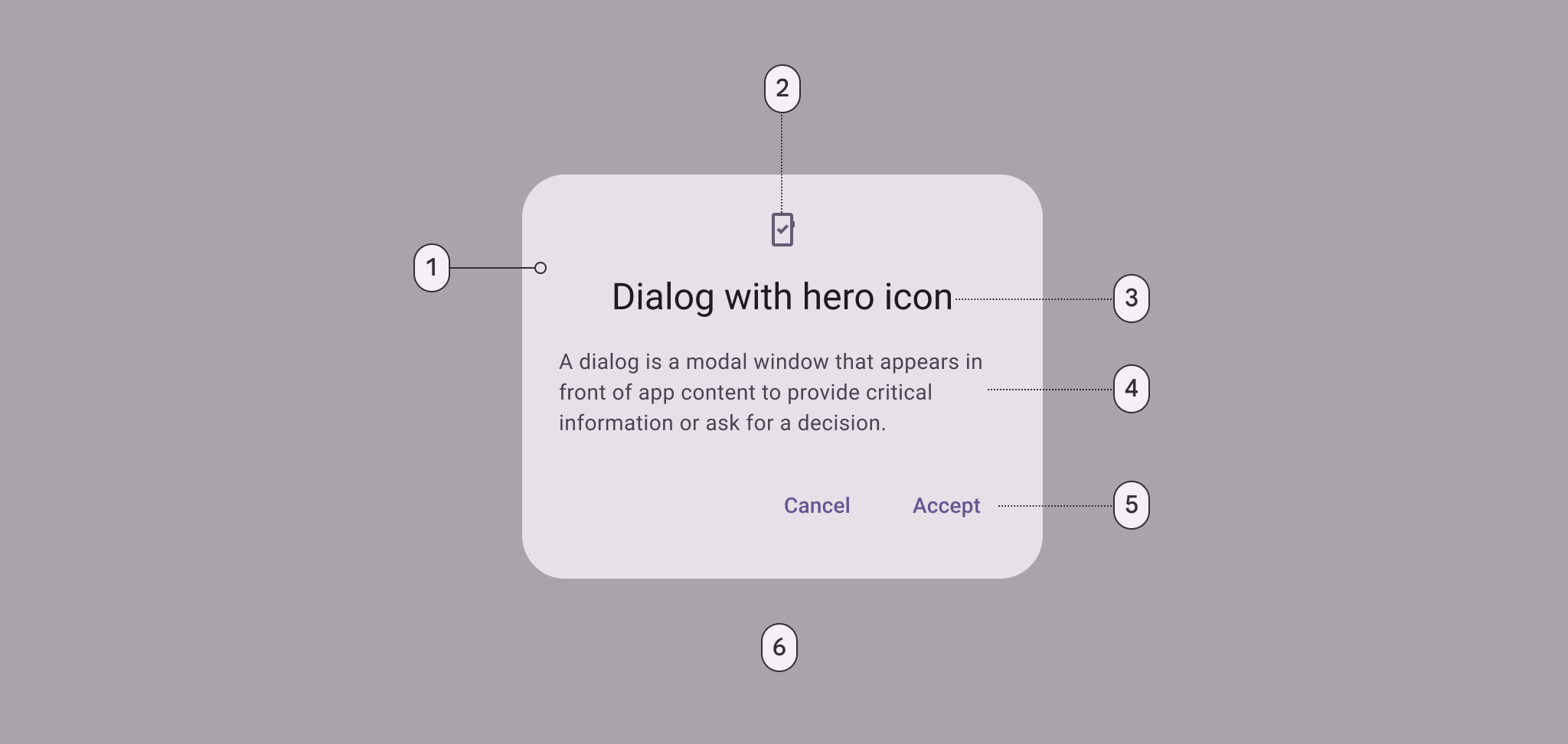
Basic dialog color roles used for light and dark themes:
- Surface container high
- Secondary
- On surface
- On surface variant
- Primary
- Scrim
Basic dialog measurements
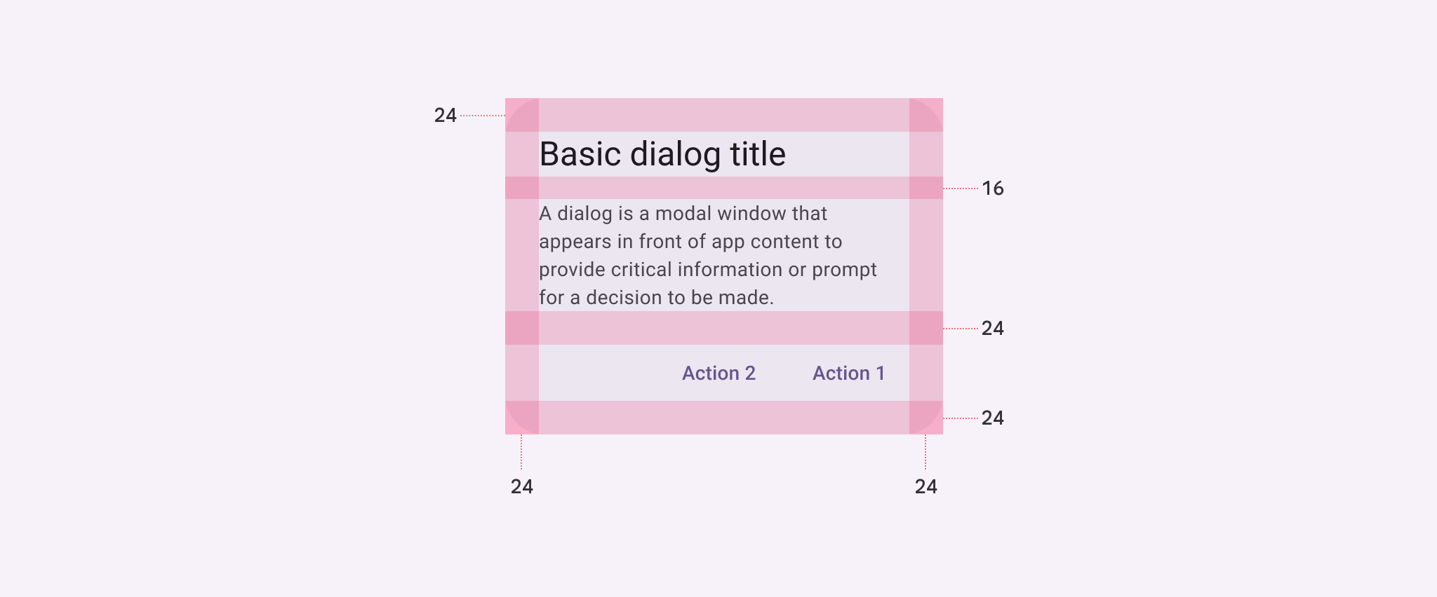
| Attribute | Value |
|---|---|
| Container shape | 28dp corner radius |
| Container height | Dynamic |
| Container width | Min 280dp; Max 560dp |
| Divider height | 1dp |
| Icon size | 24dp |
| Minimum width | 280dp |
| Maximum width | 560dp |
| Alignment with icon | Center-aligned |
| Alignment without icon | Start-aligned |
| Top/Left/right/bottom padding | 24dp |
| Padding between buttons | 8dp |
| Padding between title and body | 16dp |
| Padding between icon and title | 16dp |
| Padding between body and actions | 24dp |
Full-screen dialogs
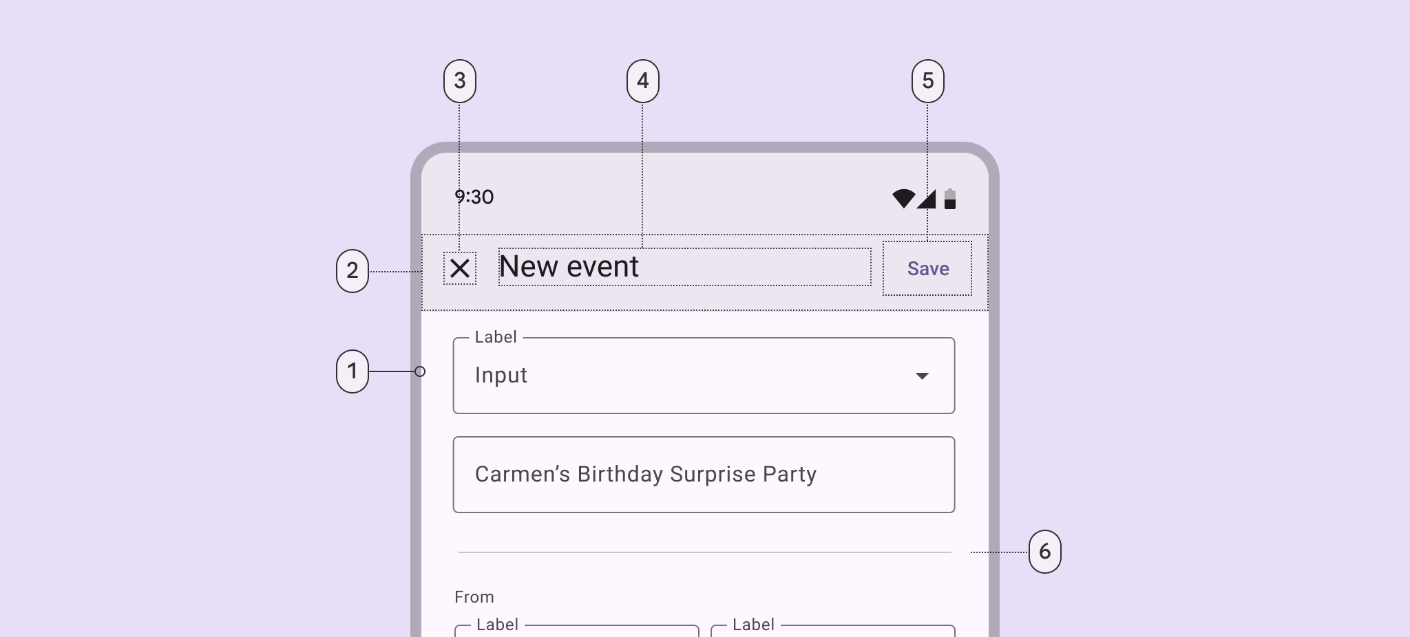
- Container
- Header
- Icon (close affordance)
- Headline (optional)
- Text button
- Divider (optional)
Full-screen dialog color
Color values are implemented through design tokens. For design, this means working with color values that correspond with tokens. For implementation, a color value will be a token that references a value.
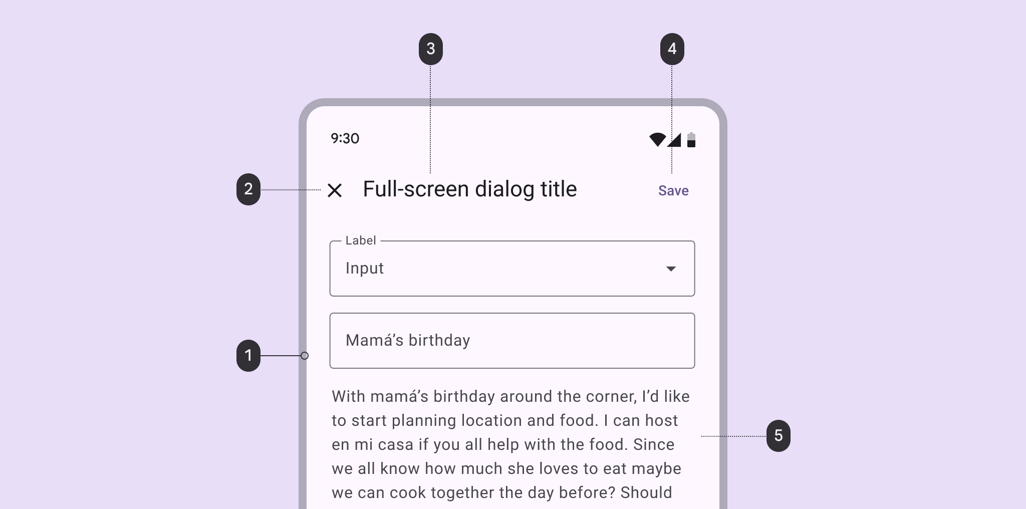
Full-screen dialog color roles used for light and dark themes:
- Surface container high
- On surface
- On surface
- Primary
- On surface variant
Full-screen dialog measurements
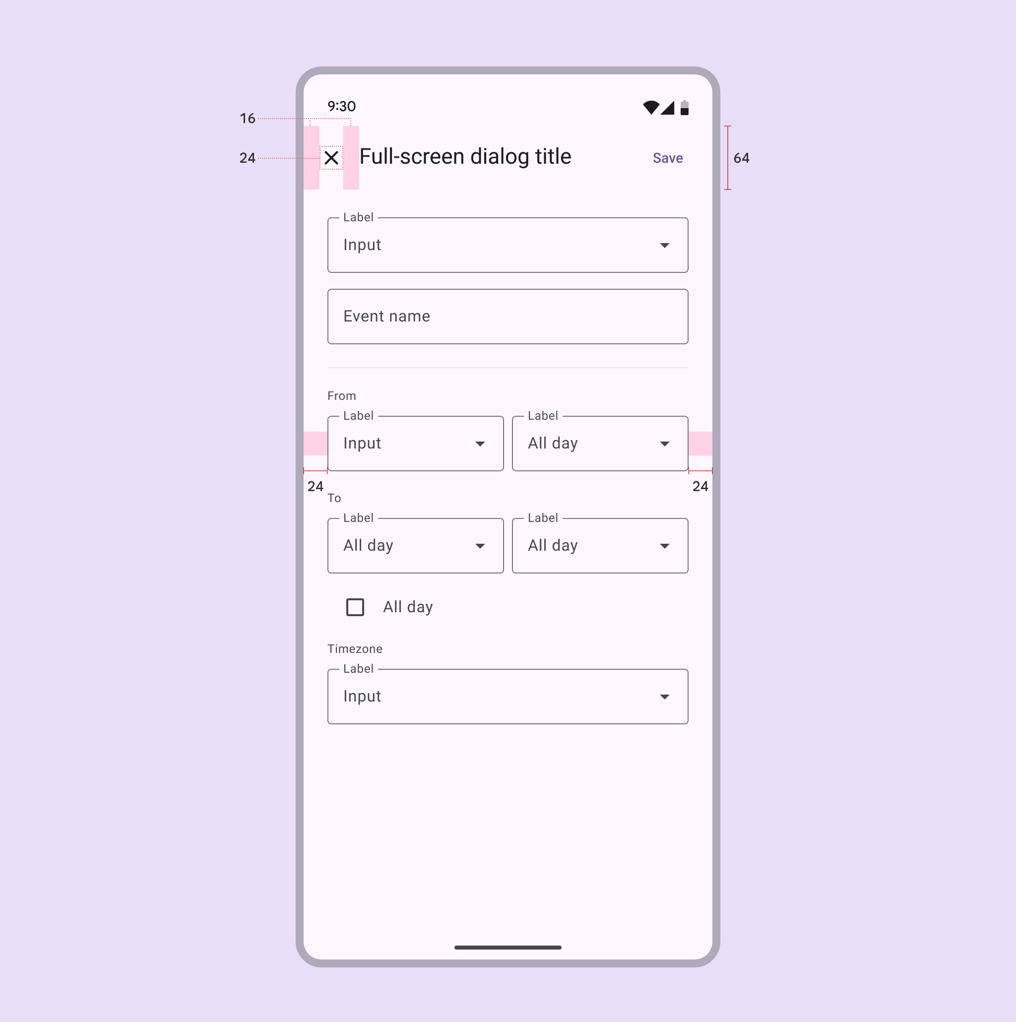
| Attribute | Value |
|---|---|
| Container shape | 0dp corner radius |
| Container height | Dynamic |
| Container width | Container width; Max 560dp |
| Header height | 56dp |
| Header width | Container width |
| Headline text alignment | Start-aligned |
| Divider height | 1dp |
| Icon (close affordance) size | 24dp |
| Bottom action bar height | 56dp |
| Bottom action bar width | Container width |
| Top/left/right padding | 24dp |
| Padding between elements | 8dp |