Bottom sheets: Overview
Bottom sheets show secondary content anchored to the bottom of the screen
- Use bottom sheets in compact and medium breakpoints
- Two variants: standard and modal
- Content should be additional or secondary (not the app’s main content)
- Bottom sheets can be dismissed in order to interact with the main content
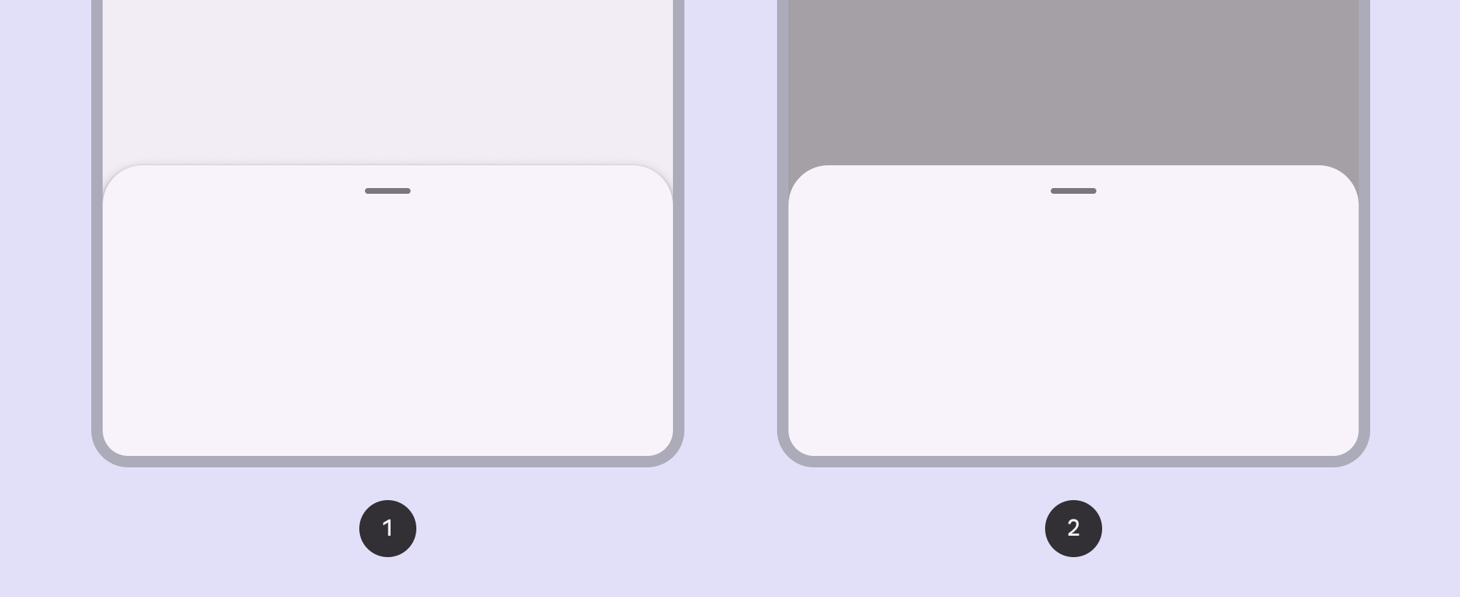
- Standard bottom sheet
- Modal bottom sheet
Availability & resources
| Type | Resource | Status |
|---|---|---|
| Design | Design Kit (Figma) | Available |
| Implementation | Flutter | Available |
| Android Views (MDC-Android) | Available | |
| Jetpack Compose | Available | |
| Web | Unavailable |
Differences from M2
- Color: New color mappings and compatibility with dynamic color
- Shape: Bottom sheets have a 28dp top corner radius
- Layout: New max-width of 640dp and an optional drag handle with an accessible 48dp hit target