Skip to content
Material Design 3
Main Navigation
v3
v2
v1

English

简体中文
繁體中文
Español
Français
Русский
Português – Brasil
Deutsch
日本語
한국어
Italiano
Polski
Türkçe
čeština
magyar

English

简体中文
繁體中文
Español
Français
Русский
Português – Brasil
Deutsch
日本語
한국어
Italiano
Polski
Türkçe
čeština
magyar

Appearance

Sidebar Navigation

Foundations

Accessibility

Overview: Principles

Overview: Assistive technology

Designing: Overview

Designing: Color contrast

Designing: Structure

Designing: Flow

Designing: Elements

Writing and text: Best practices

Writing and text: Text truncation

Writing and text: Text resizing

Building for all: User needs

Building for all: Co-design

Content design

Overview

Alt text

Global writing: Overview

Global writing: Word choice

Notifications

Style guide: UX writing best practices

Style guide: Word choice

Style guide: Grammar and punctuation

Customizing Material

Devices

Watches: Overview

Watches: Foundations

Watches: Styles

Watches: Layout

XR

Design: Overview

Design: Interaction

Design: Layout

Design: Accessibility

Components: Overview

Components: App bars

Components: Dialogs

Components: Nav bar

Components: Nav rail

Components: Toolbars

Design tokens: Overview

Design tokens: How to use tokens

Interaction

Gestures

Inputs

Selection

States: Overview

States: State layers

States: Applying states

Layout

Overview: Overview

Overview: Parts of layout

Overview: Adaptive design

Scaffold: Overview

Scaffold: Bars

Scaffold: Rails

Scaffold: Panes

Grids & spacing: Overview

Grids & spacing: Grids

Grids & spacing: Spacing

Grids & spacing: Density

Breakpoints: Overview

Breakpoints: Compact

Breakpoints: Medium

Breakpoints: Expanded

Breakpoints: Large & extra-large

Bidirectionality & RTL

Canonical examples: Overview

Canonical examples: Feed

Canonical examples: List-detail

Canonical examples: Supporting pane

Usability: Overview

Usability: Applying M3 Expressive

Material A-Z

Styles

Color

Color system: Overview

Color system: How the system works

Color roles

Color schemes

Choosing a scheme

Static: Baseline

Static: Custom brand

Dynamic: Choosing a source

Dynamic: User-generated source

Dynamic: Content-based source

Advanced: Overview

Advanced: Apply colors

Advanced: Define new colors

Advanced: Adjust existing colors

Color resources

Elevation: Overview

Elevation: Applying elevation

Elevation: Tokens

Icons: Overview

Icons: Designing icons

Icons: Applying icons

Motion

Motion physics system: How it works

Motion physics system: Specs

Easing and duration: Applying easing and duration

Easing and duration: Tokens & specs

Transitions: Transition patterns

Transitions: Applying transitions

Shape: Overview & principles

Shape: Corner radius scale

Shape: Shape morph

Spacing: Overview

Spacing: Applying spacing

Spacing: Tokens

Typography: Overview

Typography: Fonts

Typography: Type scale & tokens

Typography: Applying type

Typography: Editorial treatments

Components

App bars: Overview

App bars: Specs

App bars: Guidelines

App bars: Accessibility

Badges: Overview

Badges: Specs

Badges: Guidelines

Badges: Accessibility

Buttons

All buttons

Button groups: Overview

Button groups: Specs

Button groups: Guidelines

Button groups: Accessibility

Buttons: Overview

Buttons: Specs

Buttons: Guidelines

Buttons: Accessibility

Extended FABs: Overview

Extended FABs: Specs

Extended FABs: Guidelines

Extended FABs: Accessibility

FAB menu: Overview

FAB menu: Specs

FAB menu: Guidelines

FAB menu: Accessibility

FABs: Overview

FABs: Specs

FABs: Guidelines

FABs: Accessibility

Icon buttons: Overview

Icon buttons: Specs

Icon buttons: Guidelines

Icon buttons: Accessibility

Segmented buttons: Overview

Segmented buttons: Specs

Segmented buttons: Guidelines

Segmented buttons: Accessibility

Split button: Overview

Split button: Specs

Split button: Guidelines

Split button: Accessibility

Cards: Overview

Cards: Specs

Cards: Guidelines

Cards: Accessibility

Carousel: Overview

Carousel: Specs

Carousel: Guidelines

Carousel: Accessibility

Checkbox: Overview

Checkbox: Specs

Checkbox: Guidelines

Checkbox: Accessibility

Chips: Overview

Chips: Specs

Chips: Guidelines

Chips: Accessibility

Date & time pickers

Date pickers: Overview

Date pickers: Specs

Date pickers: Guidelines

Date pickers: Accessibility

Time pickers: Overview

Time pickers: Specs

Time pickers: Guidelines

Time pickers: Accessibility

Dialogs: Overview

Dialogs: Specs

Dialogs: Guidelines

Dialogs: Accessibility

Divider: Overview

Divider: Specs

Divider: Guidelines

Divider: Accessibility

Lists: Overview

Lists: Specs

Lists: Guidelines

Lists: Accessibility

Loading & progress

Loading indicator: Overview

Loading indicator: Specs

Loading indicator: Guidelines

Loading indicator: Accessibility

Progress indicators: Overview

Progress indicators: Specs

Progress indicators: Guidelines

Progress indicators: Accessibility

Menus: Overview

Menus: Specs

Menus: Guidelines

Menus: Accessibility

Navigation

Navigation bar: Overview

Navigation bar: Specs

Navigation bar: Guidelines

Navigation bar: Accessibility

Navigation drawer: Overview

Navigation drawer: Specs

Navigation drawer: Guidelines

Navigation drawer: Accessibility

Navigation rail: Overview

Navigation rail: Specs

Navigation rail: Guidelines

Navigation rail: Accessibility

Radio button: Overview

Radio button: Specs

Radio button: Guidelines

Radio button: Accessibility

Search: Overview

Search: Specs

Search: Guidelines

Search: Accessibility

Sheets

Bottom sheets: Overview

Bottom sheets: Specs

Bottom sheets: Guidelines

Bottom sheets: Accessibility

Side sheets: Overview

Side sheets: Specs

Side sheets: Guidelines

Side sheets: Accessibility

Sliders: Overview

Sliders: Specs

Sliders: Guidelines

Sliders: Accessibility

Snackbar: Overview

Snackbar: Specs

Snackbar: Guidelines

Snackbar: Accessibility

Switch: Overview

Switch: Specs

Switch: Guidelines

Switch: Accessibility

Tabs: Overview

Tabs: Specs

Tabs: Guidelines

Tabs: Accessibility

Text fields: Overview

Text fields: Specs

Text fields: Guidelines

Text fields: Accessibility

Toolbars: Overview

Toolbars: Specs

Toolbars: Guidelines

Toolbars: Accessibility

Tooltips: Overview

Tooltips: Specs

Tooltips: Guidelines

Tooltips: Accessibility

On this page

Grids & spacing: Spacing ​

Grids and spacing organize content and actions for any layout


  • Spacing helps group content, direct attention, and shape the personality of a product
  • A denser layout can feel more serious and focused, while a more spacious layout can feel calm and open
  • Material’s spacing system can adapt to breakpointsBreakpoints are opinionated window sizes where a layout changes to match available space, device conventions, and ergonomics (previously window size classes).More on breakpoints and density settings. More on the spacing system
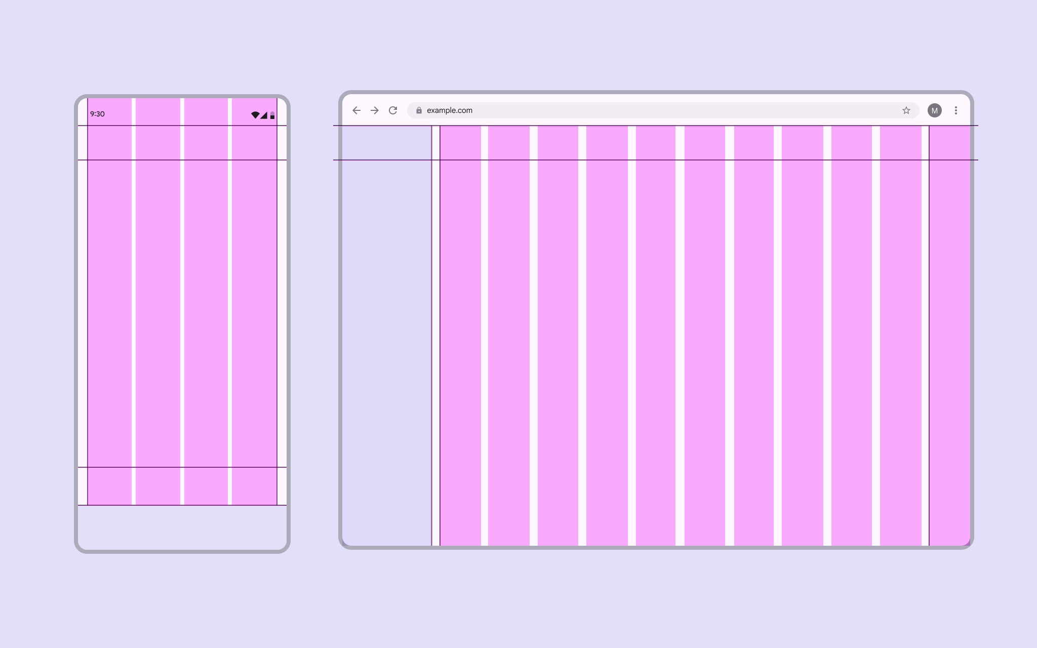
2 screens: 1 mobile with tight spacing, 1 desktop with wider spacing.
Desktop layouts can use more generous spacing than mobile layouts

Spacing to group content ​

Grouping connects related elements that share context, such as an image and its caption. Use spacing to visually tie elements together and establish boundaries between unrelated items.

Photo of dumplings with a caption reading “restaurants in the area”.
Placing a caption under an image creates an implicit group

Explicit grouping uses visual boundaries like outlines, dividers, and shadows to group related elements in an enclosed area.

It can also indicate that an item is interactive, such as:

  • List items between dividers
  • A card displaying an image and its caption

A contact grouped in an outlined card with a photo and caption.
Outlines define clear boundaries to explicitly group elements

Implicit grouping uses close proximity and open space (rather than lines and shadows) to group related items.

For example, the items in a carousel are placed close together, with space around the composition to separate them from other content.

Carousel of food-related photos.
Close spacing implicitly groups carousel images

Spacing to direct attention ​

Use rhythm, similarity, and other grouping principles to distinguish and highlight important elements.

Rhythm

Consistent spacing between related elements or groups makes them easier to navigate with the eye.
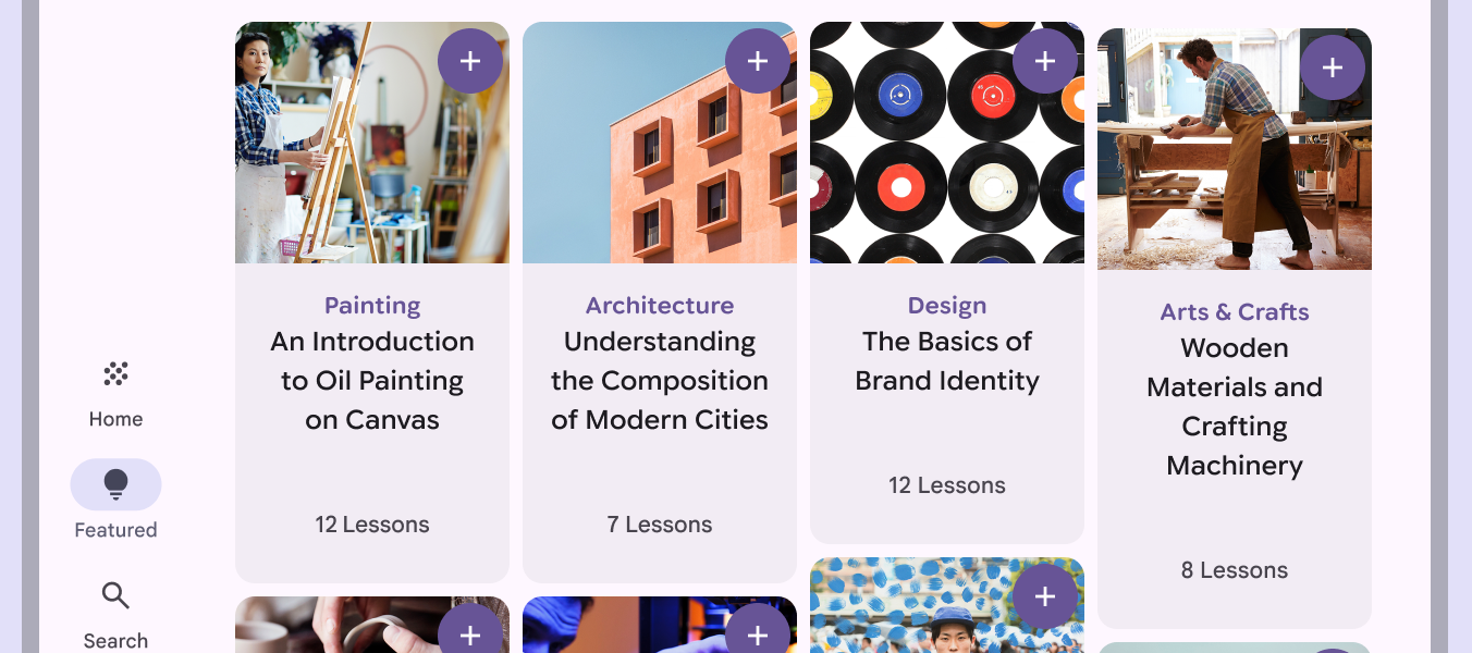
4 art courses in a row of cards with consistent horizontal spacing and different heights.
Cards should maintain consistent horizontal spacing to establish a strong rhythm when their height varies

Similarity

Similar elements should have the same spacing and sizing in a layout to show they’re related.

Leading elements like thumbnails, avatars, or icons should always be aligned.
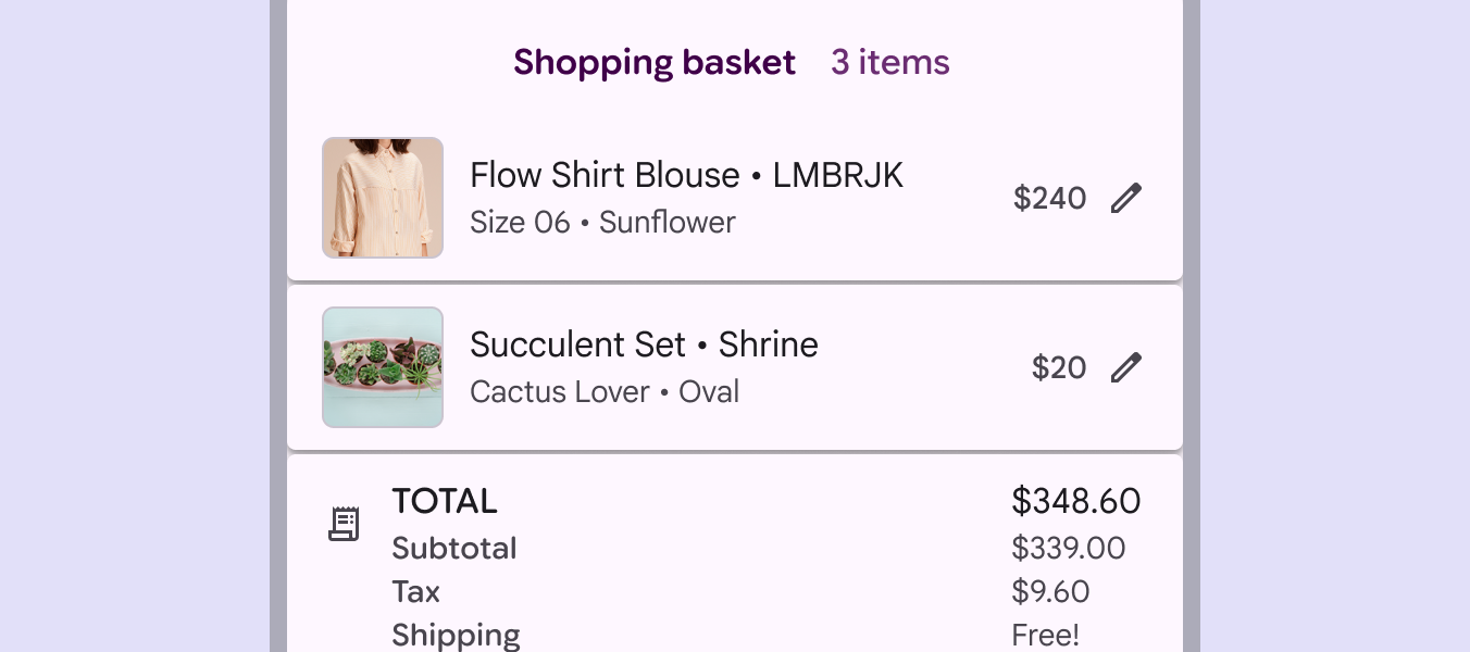
3 shopping basket list items with the same thumbnail sizes and text styles.
Thumbnails in a shopping basket should use identical sizes and styles to signal that each one represents a product, even if the original photos have different aspect ratios

Proximity

Place components near each other to create cohesive groups. This helps people understand the relationships between information and actions.

For example, buttons should be close to the content they’re affecting.
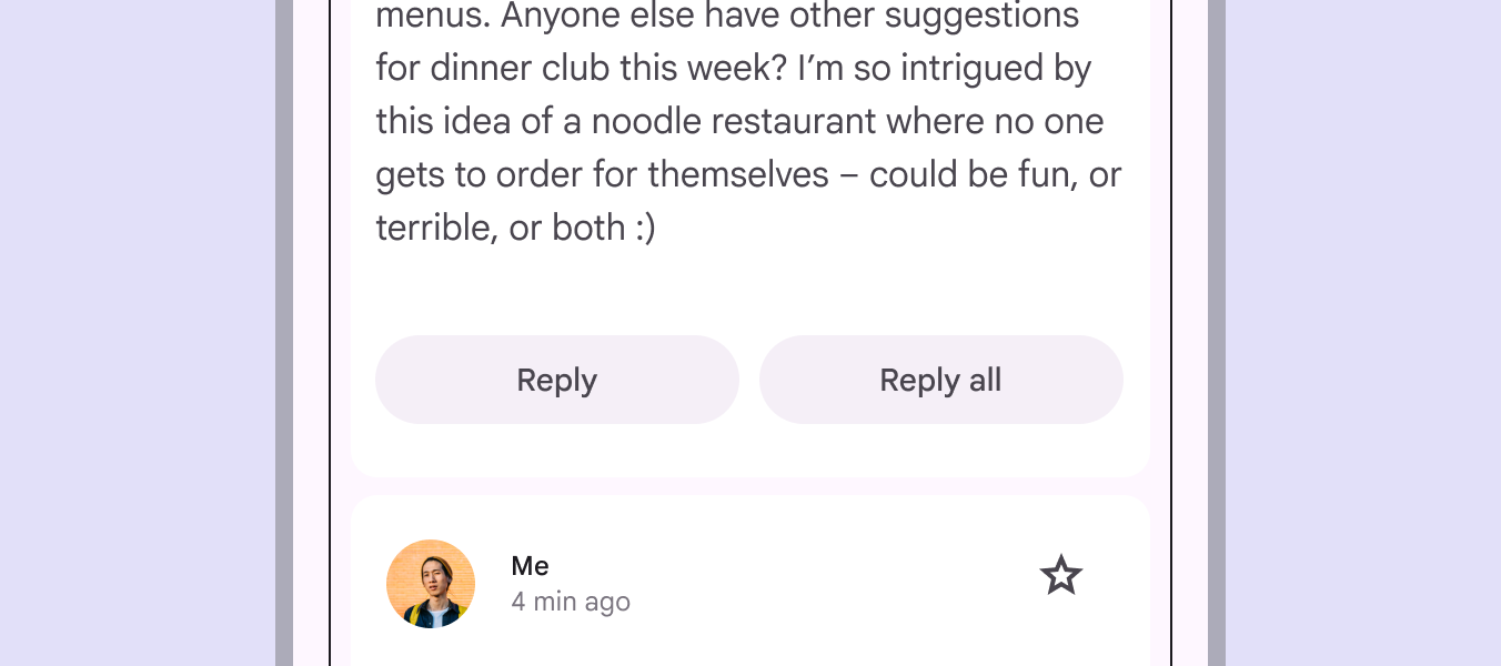
Email message with Reply and Reply all buttons positioned close together.
Placing two buttons as a group near content implies they’ll both affect it in similar ways

Continuity

Place related elements in a container, row, or column to establish a clear group or relationship.
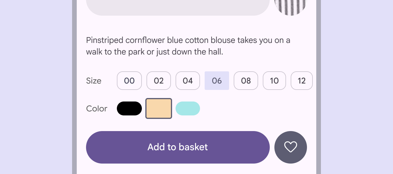
Clothing product page with a horizontal row of size chips, with 6 selected.
Use a row of chips to signal a single, unified control

Spacing as expression ​

Give the most important content, tasks, or actions visual prominence with generous spacing and the brightest surfaces.

Focal points

Consistent placement of key actions and information helps build recognizable focal points across a product.
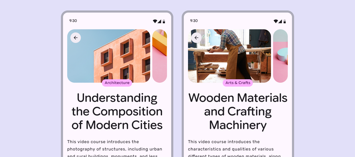
2 mobile screens showing carousels with identical layouts and title placement.
Carousel images, categories, and titles should appear in a consistent location across pages

Negative space

Allow negative space to give form and meaning to elements on screen. Framing important actions or content with generous spacing creates emphasis.
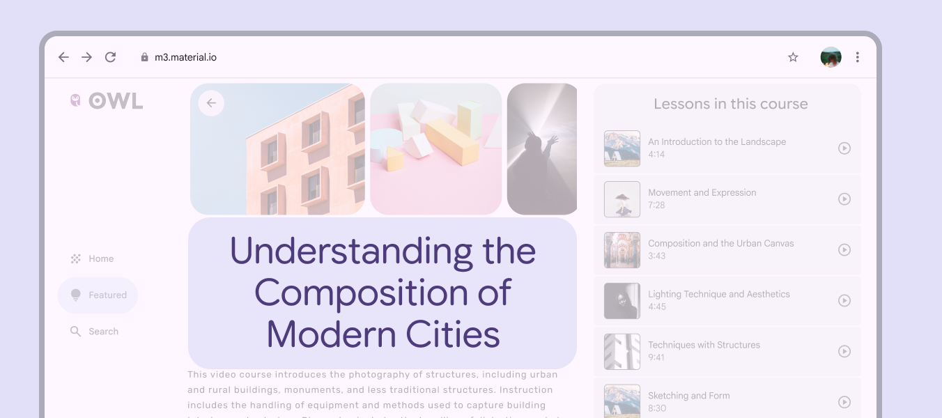
A mobile screen shows  generous negative space around carousel images.
Negative space gives shape and emphasis to the course header
Pager
Previous pageGrids & spacing: Grids
Next pageGrids & spacing: Density

Released under the Apache 2.0 or CC BY 4.0

Copyright © 2018-Present Google

https://m3.material.io/foundations/layout/grids-spacing/spacing

Released under the Apache 2.0 or CC BY 4.0

Copyright © 2018-Present Google