

Tooltips: Specs
Tooltips display brief labels or messages
Tokens & specs
Select a component variant below to see its attributes, tokens, and values.
Tooltip - Plain
Tooltip - Rich
Plain tooltip
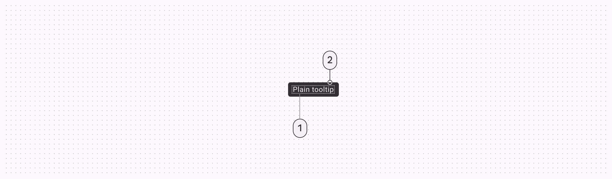
- Supporting text
- Container
Plain tooltip colors
Color values are implemented through design tokens. For design, this means working with color values that correspond with tokens. For implementation, a color value will be a token that references a value. Learn more about design tokens
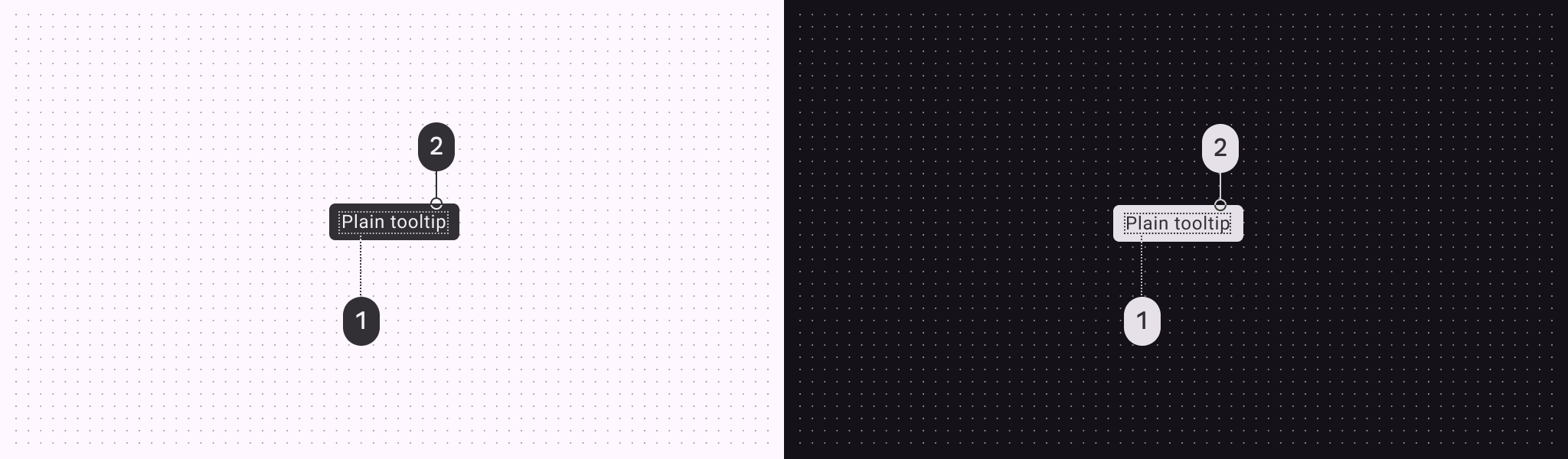
Plain tooltip color roles used for light and dark themes:
- Inverse on surface
- Inverse surface
Plain tooltip measurements
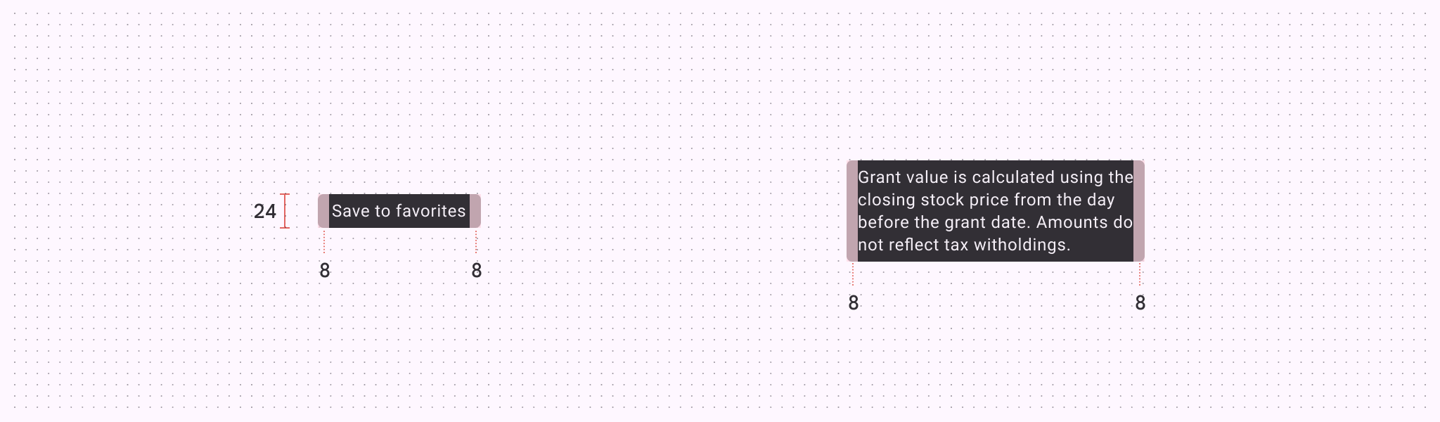
| Attribute | Value |
|---|---|
| Container height | 24dp |
| Padding | 8dp |
Rich tooltip
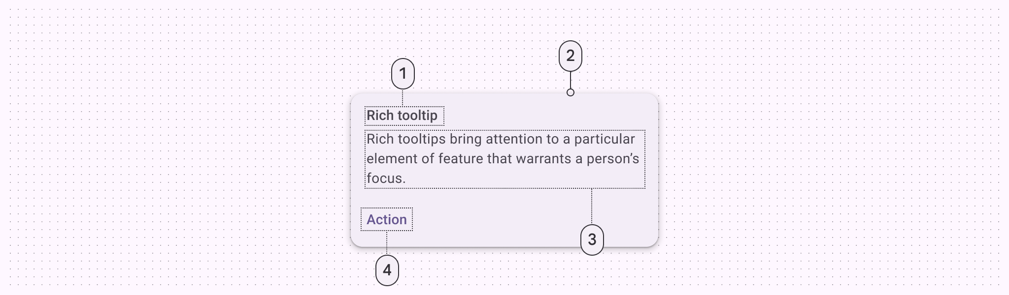
- Subhead
- Container
- Supporting text
- Text button
Rich tooltip colors
Color values are implemented through design tokens. For design, this means working with color values that correspond with tokens. For implementation, a color value will be a token that references a value. Learn more about design tokens
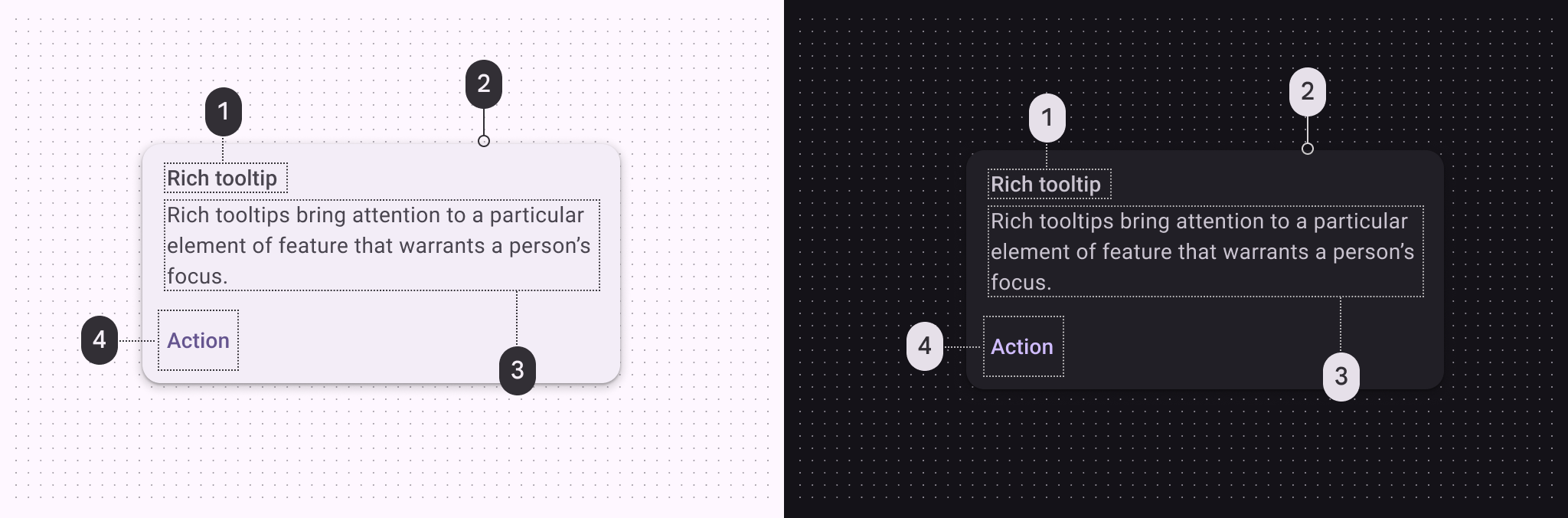
Rich tooltip color roles used for light and dark themes:
- On surface variant
- Surface container
- On surface variant
- Primary
Rich tooltip measurements
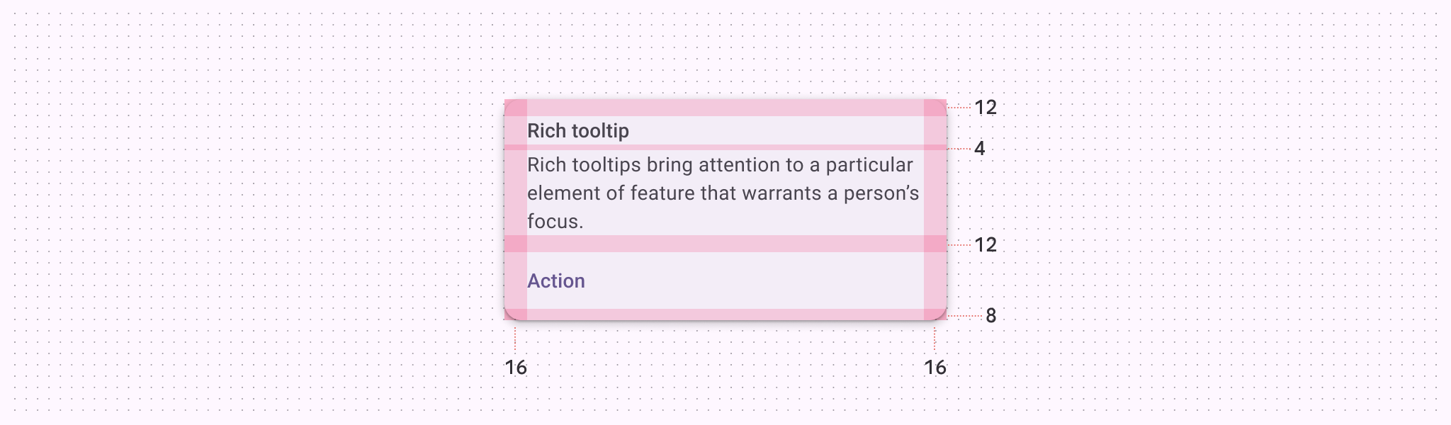
| Attribute | Value |
|---|---|
| Top padding | 12dp |
| Bottom padding | 8dp |
| Left and right padding | 16dp |
Rich tooltip configurations
Rich tooltips can have a headline, body, and up to two buttons. The headline and number of buttons can be configured.
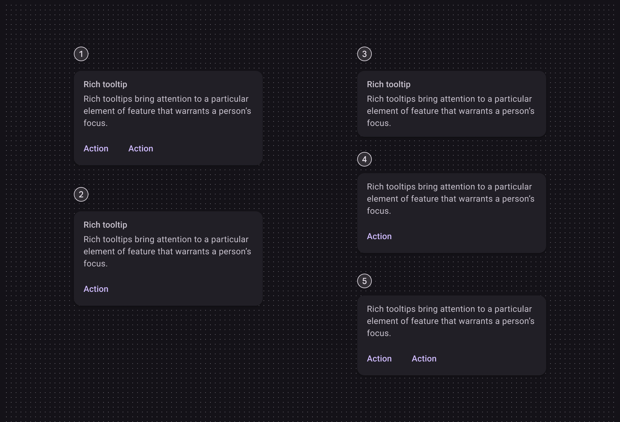
- Subhead, supporting text, and two buttons
- Subhead, supporting text, and one button
- Subhead and supporting text
- Supporting text and one button
- Supporting text and two buttons