Skip to content
Material Design 3
Main Navigation
v3
v2
v1

English

简体中文
繁體中文
Español
Français
Русский
Português – Brasil
Deutsch
日本語
한국어
Italiano
Polski
Türkçe
čeština
magyar

English

简体中文
繁體中文
Español
Français
Русский
Português – Brasil
Deutsch
日本語
한국어
Italiano
Polski
Türkçe
čeština
magyar

Appearance

Sidebar Navigation

Foundations

Accessibility

Overview: Principles

Overview: Assistive technology

Designing: Overview

Designing: Color contrast

Designing: Structure

Designing: Flow

Designing: Elements

Writing and text: Best practices

Writing and text: Text truncation

Writing and text: Text resizing

Building for all: User needs

Building for all: Co-design

Content design

Overview

Alt text

Global writing: Overview

Global writing: Word choice

Notifications

Style guide: UX writing best practices

Style guide: Word choice

Style guide: Grammar and punctuation

Customizing Material

Devices

Watches: Overview

Watches: Foundations

Watches: Styles

Watches: Layout

XR

Design: Overview

Design: Interaction

Design: Layout

Design: Accessibility

Components: Overview

Components: App bars

Components: Dialogs

Components: Nav bar

Components: Nav rail

Components: Toolbars

Design tokens: Overview

Design tokens: How to use tokens

Interaction

Gestures

Inputs

Selection

States: Overview

States: State layers

States: Applying states

Layout

Overview: Overview

Overview: Parts of layout

Overview: Adaptive design

Scaffold: Overview

Scaffold: Bars

Scaffold: Rails

Scaffold: Panes

Grids & spacing: Overview

Grids & spacing: Grids

Grids & spacing: Spacing

Grids & spacing: Density

Breakpoints: Overview

Breakpoints: Compact

Breakpoints: Medium

Breakpoints: Expanded

Breakpoints: Large & extra-large

Bidirectionality & RTL

Canonical examples: Overview

Canonical examples: Feed

Canonical examples: List-detail

Canonical examples: Supporting pane

Usability: Overview

Usability: Applying M3 Expressive

Material A-Z

Styles

Color

Color system: Overview

Color system: How the system works

Color roles

Color schemes

Choosing a scheme

Static: Baseline

Static: Custom brand

Dynamic: Choosing a source

Dynamic: User-generated source

Dynamic: Content-based source

Advanced: Overview

Advanced: Apply colors

Advanced: Define new colors

Advanced: Adjust existing colors

Color resources

Elevation: Overview

Elevation: Applying elevation

Elevation: Tokens

Icons: Overview

Icons: Designing icons

Icons: Applying icons

Motion

Motion physics system: How it works

Motion physics system: Specs

Easing and duration: Applying easing and duration

Easing and duration: Tokens & specs

Transitions: Transition patterns

Transitions: Applying transitions

Shape: Overview & principles

Shape: Corner radius scale

Shape: Shape morph

Spacing: Overview

Spacing: Applying spacing

Spacing: Tokens

Typography: Overview

Typography: Fonts

Typography: Type scale & tokens

Typography: Applying type

Typography: Editorial treatments

Components

App bars: Overview

App bars: Specs

App bars: Guidelines

App bars: Accessibility

Badges: Overview

Badges: Specs

Badges: Guidelines

Badges: Accessibility

Buttons

All buttons

Button groups: Overview

Button groups: Specs

Button groups: Guidelines

Button groups: Accessibility

Buttons: Overview

Buttons: Specs

Buttons: Guidelines

Buttons: Accessibility

Extended FABs: Overview

Extended FABs: Specs

Extended FABs: Guidelines

Extended FABs: Accessibility

FAB menu: Overview

FAB menu: Specs

FAB menu: Guidelines

FAB menu: Accessibility

FABs: Overview

FABs: Specs

FABs: Guidelines

FABs: Accessibility

Icon buttons: Overview

Icon buttons: Specs

Icon buttons: Guidelines

Icon buttons: Accessibility

Segmented buttons: Overview

Segmented buttons: Specs

Segmented buttons: Guidelines

Segmented buttons: Accessibility

Split button: Overview

Split button: Specs

Split button: Guidelines

Split button: Accessibility

Cards: Overview

Cards: Specs

Cards: Guidelines

Cards: Accessibility

Carousel: Overview

Carousel: Specs

Carousel: Guidelines

Carousel: Accessibility

Checkbox: Overview

Checkbox: Specs

Checkbox: Guidelines

Checkbox: Accessibility

Chips: Overview

Chips: Specs

Chips: Guidelines

Chips: Accessibility

Date & time pickers

Date pickers: Overview

Date pickers: Specs

Date pickers: Guidelines

Date pickers: Accessibility

Time pickers: Overview

Time pickers: Specs

Time pickers: Guidelines

Time pickers: Accessibility

Dialogs: Overview

Dialogs: Specs

Dialogs: Guidelines

Dialogs: Accessibility

Divider: Overview

Divider: Specs

Divider: Guidelines

Divider: Accessibility

Lists: Overview

Lists: Specs

Lists: Guidelines

Lists: Accessibility

Loading & progress

Loading indicator: Overview

Loading indicator: Specs

Loading indicator: Guidelines

Loading indicator: Accessibility

Progress indicators: Overview

Progress indicators: Specs

Progress indicators: Guidelines

Progress indicators: Accessibility

Menus: Overview

Menus: Specs

Menus: Guidelines

Menus: Accessibility

Navigation

Navigation bar: Overview

Navigation bar: Specs

Navigation bar: Guidelines

Navigation bar: Accessibility

Navigation drawer: Overview

Navigation drawer: Specs

Navigation drawer: Guidelines

Navigation drawer: Accessibility

Navigation rail: Overview

Navigation rail: Specs

Navigation rail: Guidelines

Navigation rail: Accessibility

Radio button: Overview

Radio button: Specs

Radio button: Guidelines

Radio button: Accessibility

Search: Overview

Search: Specs

Search: Guidelines

Search: Accessibility

Sheets

Bottom sheets: Overview

Bottom sheets: Specs

Bottom sheets: Guidelines

Bottom sheets: Accessibility

Side sheets: Overview

Side sheets: Specs

Side sheets: Guidelines

Side sheets: Accessibility

Sliders: Overview

Sliders: Specs

Sliders: Guidelines

Sliders: Accessibility

Snackbar: Overview

Snackbar: Specs

Snackbar: Guidelines

Snackbar: Accessibility

Switch: Overview

Switch: Specs

Switch: Guidelines

Switch: Accessibility

Tabs: Overview

Tabs: Specs

Tabs: Guidelines

Tabs: Accessibility

Text fields: Overview

Text fields: Specs

Text fields: Guidelines

Text fields: Accessibility

Toolbars: Overview

Toolbars: Specs

Toolbars: Guidelines

Toolbars: Accessibility

Tooltips: Overview

Tooltips: Specs

Tooltips: Guidelines

Tooltips: Accessibility

On this page

Color system: Overview ​

Create accessible, personal color schemes communicating your product's hierarchy, state, and brand


The Material color system includes:

  • Built-in set of accessible color relationshipsFor example, a dark surface color is algorithmically paired with a light text label color so the UI automatically meets contrast requirements.More on color relationships
  • 26+ color rolesColor roles are assigned to UI elements based on emphasis, container type, and relationship with other elements. This ensures proper contrast and usage in any color scheme.More on color roles mapped to Material Components
  • Built-in dark themeA dark theme is a low-light version of a UI that displays mostly dark surfaces. colors
  • Static baseline color schemeBaseline is the default static color scheme for Material products. It includes colors for both light and dark themes.More on the baseline color scheme with default colors assigned to each color role
  • Dynamic colorDynamic color takes a single color from a user's wallpaper or in-app content and creates an accessible color scheme assigned to elements in the UI.More on dynamic color features including user-generatedUser-generated color dynamically creates a color scheme from a user's wallpaper.More on user-generated color and content-based colorContent-based color dynamically creates a color scheme from in-app content like a music album or book cover.More on content-based color

Learn how the system works


Learn about the value and function of Material 3’s dynamic color system and how it differs from past color systems

View transcriptWelcome to color in Material 3. This video will introduce the purpose of color and Material 3’s algorithmic color system, or “dynamic color”. By the end of this video, you’ll understand the value and function of dynamic color and how it differs from past color systems. Color is a powerful design tool and part of the Material system along with styles like typography and shape. In products, colors and the way they’re used can be vast and varied. An app’s color scheme can express brand and style, semantic colors can communicate meaning, and color contrast supports visual accessibility. In many design systems of the past, designers manually picked app colors to support the necessary range of color applications and use cases. But Material 3 has a dynamic color system, which doesn’t rely on handpicked colors. Instead, it uses color algorithms to generate beautiful, accessible color schemes based on dynamic inputs like a user’s wallpaper. This enables greater flexibility, personalization, and expression all while streamlining work for designers and teams.
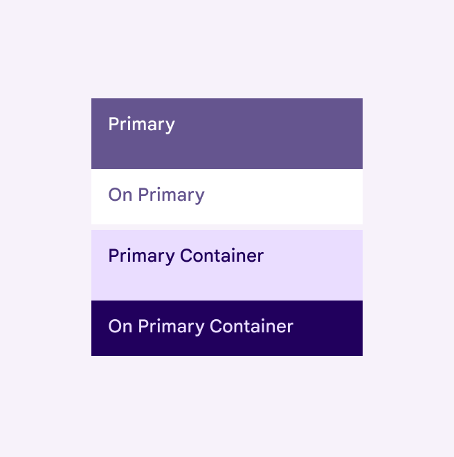
Primary, on primary, primary container, and on primary container roles shown in baseline light theme color scheme.
The baseline color scheme doesn't dynamically change
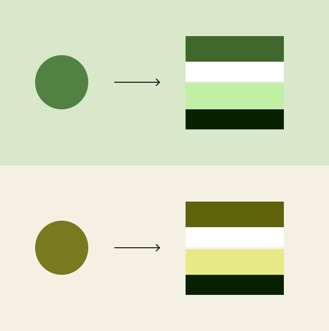
Diagram showing an input color resulting in a simplified illustration of four roles of a color scheme. Shown in green and yellow in light theme.
A dynamic color scheme changes the UI's colors based on different inputs, like a wallpaper
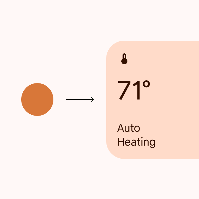
Diagram showing an orange input color generating a static orange color scheme for an auto heating UI element.
Specific colors, such as semantic colors, can be set to not dynamically change

Products with dynamic colorDynamic color takes a single color from a user's wallpaper or in-app content and creates an accessible color scheme assigned to elements in the UI.More on dynamic color can automatically generate and assign colors to each element in the UI.

This provides:

  • Personalized UI
  • Accessible contrast
  • User-controlled contrast
  • Automatic dark theme
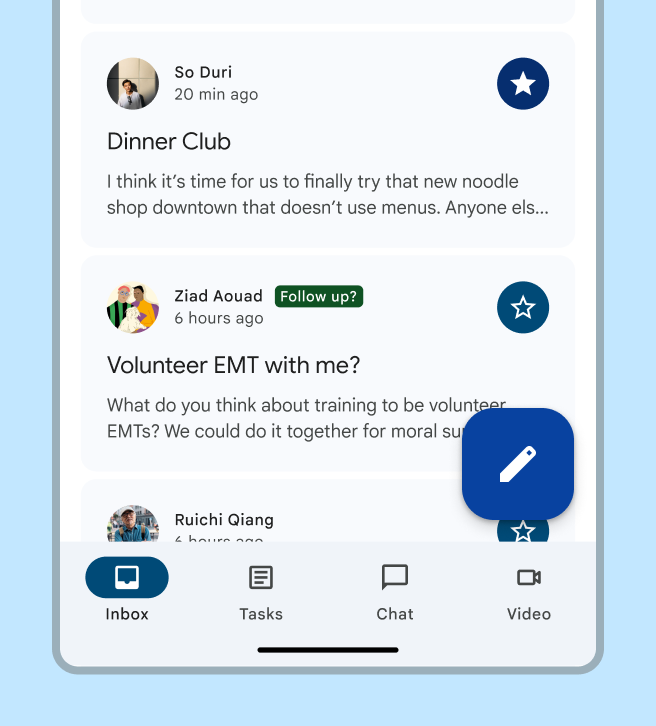
The UI colors change dynamically

Resources ​

TypeLinkStatus
DesignDesign Kit (Figma)Available
ImplementationAndroid Views (MDC-Android)Available
Jetpack ComposeAvailable
FlutterAvailable
ToolsMaterial Theme BuilderAvailable

What's new ​

May 2025

Three levels of contrast ​

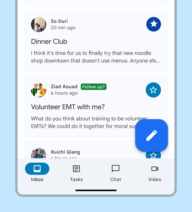
Color roles support three levels of contrast so people can select the one that best suits their vision needs. Contrasts also are tokenized.
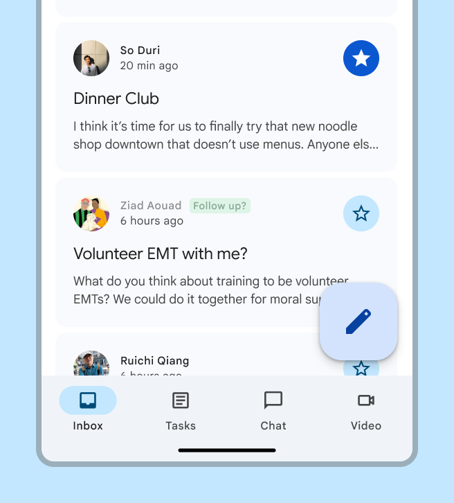
Email app in standard contrast.
Standard contrast
Email app in medium contrast.
Medium contrast
Email app in high contrast.
High contrast

August 2024

More colorful text and icons

The following color roles are updated in light theme to be more colorful while still having accessible color contrast:

  • On primary container
  • On secondary container
  • On tertiary container
  • On error container

Affected components:

  • Badges
  • Buttons
    • Buttons
    • Extended FAB
    • FAB
    • Icon buttons
    • Segmented buttons
  • Chips
  • Lists
  • Menus
  • Navigation bar
  • Navigation drawer
  • Navigation rail
  • Switches
  • Toolbars
Comparison of the color before and after the update, with FAB and button examples.
Colors used for text and icons now appear more colorful

Oct 2023

Reorganized guidelines

Same color system, explained in a new way. Updated sections include:
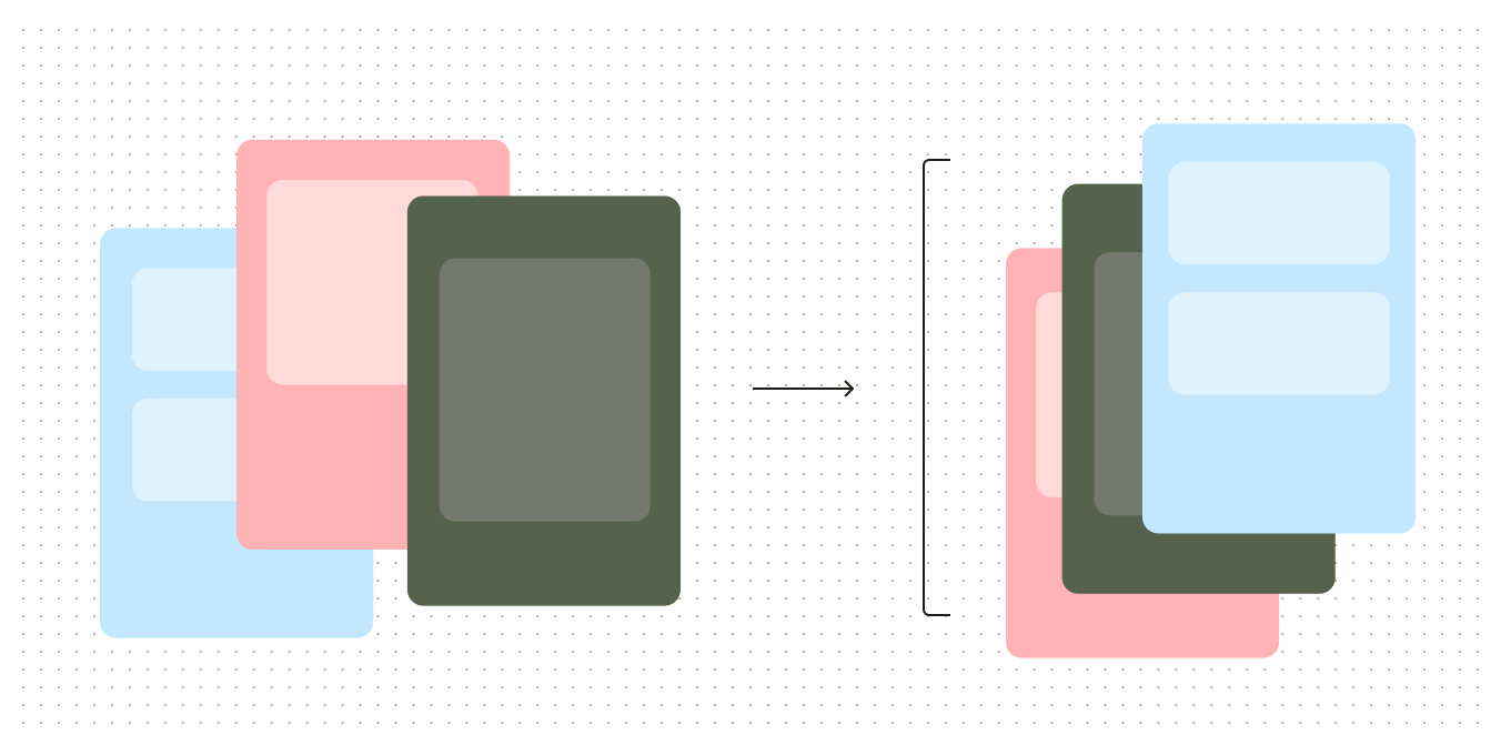
  • How the system works
  • Advanced customizations
  • Color resources
Diagram illustrating guidelines being reorganized
The guidelines have been reorganized and updated

Feb 2023

Tone-based surface colors

Tone-based surface color roles have replaced the previous approach of surfaces at +1 to +5 elevation. The new color roles are not tied to elevationElevation is the distance between two surfaces on the z-axis.More on elevation and offer more flexibility and support for color features, such as user-controlled contrastUser-controlled contrast is a dynamic color feature enabling users to choose from one of three levels of color contrast: standard, medium, and high.More on user-controlled contrast.

Simplified tablet UI showcasing the application of surface roles, shown in light theme
New tone-based surface colors offer more flexibility and support

Technical changes were made to align the color system with Android SysUI:

  • Updated the default light theme surface from tone 99 to tone 98
  • Updated the chroma for the neutral palette, increasing it from 4 to 6
  • Slightly darkened surface roles in dark theme
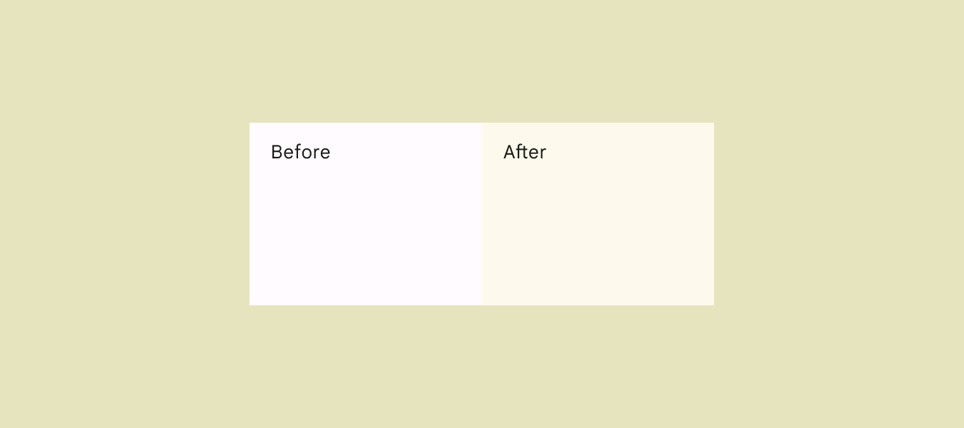
Before and after swatch of the default light theme surface, showcasing the difference in chroma and tone
Changes in tone and chroma in the default light theme surface

Feb 2023

Additional accent colors

Additional accent colors in the scheme provide more flexibility and choice for color application. In particular, a new set of fixed colorsFixed colors keep the same color value in light and dark themes, as opposed to regular container colors, which change tone between themes, or static colors, which don't change at all.More on fixed colors for the primary, secondary, and tertiary accent groups provide colors which stay the same across light and dark themes.
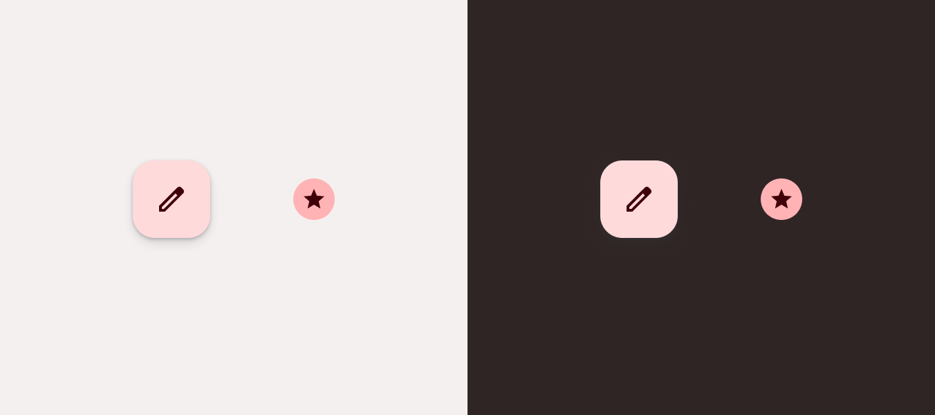
Fab and star icon show in fixed and fixed dim roles, in both light and dark theme
Additional accent colors provide more choice for color application
Pager
Previous pageStyles
Next pageColor system: How the system works

Released under the Apache 2.0 or CC BY 4.0

Copyright © 2018-Present Google

https://m3.material.io/styles/color/system/overview

Released under the Apache 2.0 or CC BY 4.0

Copyright © 2018-Present Google