Skip to content
Material Design 3
Main Navigation
v3
v2
v1

English

简体中文
繁體中文
Español
Français
Русский
Português – Brasil
Deutsch
日本語
한국어
Italiano
Polski
Türkçe
čeština
magyar

English

简体中文
繁體中文
Español
Français
Русский
Português – Brasil
Deutsch
日本語
한국어
Italiano
Polski
Türkçe
čeština
magyar

Appearance

Sidebar Navigation

Foundations

Accessibility

Overview: Principles

Overview: Assistive technology

Designing: Overview

Designing: Color contrast

Designing: Structure

Designing: Flow

Designing: Elements

Writing and text: Best practices

Writing and text: Text truncation

Writing and text: Text resizing

Building for all: User needs

Building for all: Co-design

Content design

Overview

Alt text

Global writing: Overview

Global writing: Word choice

Notifications

Style guide: UX writing best practices

Style guide: Word choice

Style guide: Grammar and punctuation

Customizing Material

Devices

Watches: Overview

Watches: Foundations

Watches: Styles

Watches: Layout

XR

Design: Overview

Design: Interaction

Design: Layout

Design: Accessibility

Components: Overview

Components: App bars

Components: Dialogs

Components: Nav bar

Components: Nav rail

Components: Toolbars

Design tokens: Overview

Design tokens: How to use tokens

Interaction

Gestures

Inputs

Selection

States: Overview

States: State layers

States: Applying states

Layout

Overview: Overview

Overview: Parts of layout

Overview: Adaptive design

Scaffold: Overview

Scaffold: Bars

Scaffold: Rails

Scaffold: Panes

Grids & spacing: Overview

Grids & spacing: Grids

Grids & spacing: Spacing

Grids & spacing: Density

Breakpoints: Overview

Breakpoints: Compact

Breakpoints: Medium

Breakpoints: Expanded

Breakpoints: Large & extra-large

Bidirectionality & RTL

Canonical examples: Overview

Canonical examples: Feed

Canonical examples: List-detail

Canonical examples: Supporting pane

Usability: Overview

Usability: Applying M3 Expressive

Material A-Z

Styles

Color

Color system: Overview

Color system: How the system works

Color roles

Color schemes

Choosing a scheme

Static: Baseline

Static: Custom brand

Dynamic: Choosing a source

Dynamic: User-generated source

Dynamic: Content-based source

Advanced: Overview

Advanced: Apply colors

Advanced: Define new colors

Advanced: Adjust existing colors

Color resources

Elevation: Overview

Elevation: Applying elevation

Elevation: Tokens

Icons: Overview

Icons: Designing icons

Icons: Applying icons

Motion

Motion physics system: How it works

Motion physics system: Specs

Easing and duration: Applying easing and duration

Easing and duration: Tokens & specs

Transitions: Transition patterns

Transitions: Applying transitions

Shape: Overview & principles

Shape: Corner radius scale

Shape: Shape morph

Spacing: Overview

Spacing: Applying spacing

Spacing: Tokens

Typography: Overview

Typography: Fonts

Typography: Type scale & tokens

Typography: Applying type

Typography: Editorial treatments

Components

App bars: Overview

App bars: Specs

App bars: Guidelines

App bars: Accessibility

Badges: Overview

Badges: Specs

Badges: Guidelines

Badges: Accessibility

Buttons

All buttons

Button groups: Overview

Button groups: Specs

Button groups: Guidelines

Button groups: Accessibility

Buttons: Overview

Buttons: Specs

Buttons: Guidelines

Buttons: Accessibility

Extended FABs: Overview

Extended FABs: Specs

Extended FABs: Guidelines

Extended FABs: Accessibility

FAB menu: Overview

FAB menu: Specs

FAB menu: Guidelines

FAB menu: Accessibility

FABs: Overview

FABs: Specs

FABs: Guidelines

FABs: Accessibility

Icon buttons: Overview

Icon buttons: Specs

Icon buttons: Guidelines

Icon buttons: Accessibility

Segmented buttons: Overview

Segmented buttons: Specs

Segmented buttons: Guidelines

Segmented buttons: Accessibility

Split button: Overview

Split button: Specs

Split button: Guidelines

Split button: Accessibility

Cards: Overview

Cards: Specs

Cards: Guidelines

Cards: Accessibility

Carousel: Overview

Carousel: Specs

Carousel: Guidelines

Carousel: Accessibility

Checkbox: Overview

Checkbox: Specs

Checkbox: Guidelines

Checkbox: Accessibility

Chips: Overview

Chips: Specs

Chips: Guidelines

Chips: Accessibility

Date & time pickers

Date pickers: Overview

Date pickers: Specs

Date pickers: Guidelines

Date pickers: Accessibility

Time pickers: Overview

Time pickers: Specs

Time pickers: Guidelines

Time pickers: Accessibility

Dialogs: Overview

Dialogs: Specs

Dialogs: Guidelines

Dialogs: Accessibility

Divider: Overview

Divider: Specs

Divider: Guidelines

Divider: Accessibility

Lists: Overview

Lists: Specs

Lists: Guidelines

Lists: Accessibility

Loading & progress

Loading indicator: Overview

Loading indicator: Specs

Loading indicator: Guidelines

Loading indicator: Accessibility

Progress indicators: Overview

Progress indicators: Specs

Progress indicators: Guidelines

Progress indicators: Accessibility

Menus: Overview

Menus: Specs

Menus: Guidelines

Menus: Accessibility

Navigation

Navigation bar: Overview

Navigation bar: Specs

Navigation bar: Guidelines

Navigation bar: Accessibility

Navigation drawer: Overview

Navigation drawer: Specs

Navigation drawer: Guidelines

Navigation drawer: Accessibility

Navigation rail: Overview

Navigation rail: Specs

Navigation rail: Guidelines

Navigation rail: Accessibility

Radio button: Overview

Radio button: Specs

Radio button: Guidelines

Radio button: Accessibility

Search: Overview

Search: Specs

Search: Guidelines

Search: Accessibility

Sheets

Bottom sheets: Overview

Bottom sheets: Specs

Bottom sheets: Guidelines

Bottom sheets: Accessibility

Side sheets: Overview

Side sheets: Specs

Side sheets: Guidelines

Side sheets: Accessibility

Sliders: Overview

Sliders: Specs

Sliders: Guidelines

Sliders: Accessibility

Snackbar: Overview

Snackbar: Specs

Snackbar: Guidelines

Snackbar: Accessibility

Switch: Overview

Switch: Specs

Switch: Guidelines

Switch: Accessibility

Tabs: Overview

Tabs: Specs

Tabs: Guidelines

Tabs: Accessibility

Text fields: Overview

Text fields: Specs

Text fields: Guidelines

Text fields: Accessibility

Toolbars: Overview

Toolbars: Specs

Toolbars: Guidelines

Toolbars: Accessibility

Tooltips: Overview

Tooltips: Specs

Tooltips: Guidelines

Tooltips: Accessibility

On this page

Chips: Accessibility ​

Chips help people enter information, make selections, filter content, or trigger actions

Use cases ​

People should be able to do the following with assistive technology:

  • Use a chip to perform an action
  • Navigate to a chip
  • Activate a chip

Interaction & style ​

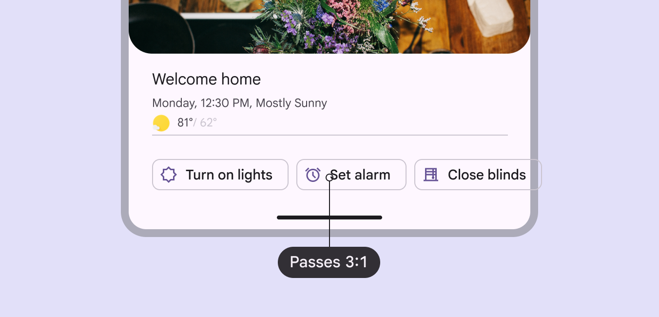
The chip label needs at least 3:1 contrast with the background.

A chip that performs an action should present the same semantics as a buttonButtons let people take action and make choices with one tap.More on buttons to a platform's accessibility API.

The chip label needs to pass 3:1 contrast.
High contrast helps differentiate chips clustered together

Horizontal overflow

When there are too many chips to fit on one row, provide a way to display them all at once and avoid scrolling.

Reflow method: Use a filter chip as a leading element to reflow the horizontal list. This should shift down the content below and make room for all chips to show.

The Show all filter chip is used to reflow the list, displaying all chips at once and pushing down the content below

Menu method: Create a leading button to display all chip options in a menu. Use this option to avoid shifting the position of the content below.

Don’t use the menu method on chips with a second action, like a remove icon.

The Show all leading button shows a menu of chip options, keeping the place of content below

Avoid applying density by default ​

Don't apply density to chips by default — this lowers their targets below our best practice of 48x48 CSS pixels. Instead, give people a way to choose a higher density, like selecting a denser layout or changing the theme.

To ensure that this density setting can be easily reverted when it's active, keep all the targets to change it at minimum 48x48 CSS pixels each.

Keyboard navigation ​

KeysActions
TabMoves focus to enabledAn enabled state communicates an interactive component or element.More on enabled state chip or chip group
Space or EnterActivates, selects, or deselects the focused chip
Backspace or DeleteRemoves currently focusedA focused state communicates when a user has highlighted an element, using an input method such as a keyboard or voice.More on focused state input chip
ArrowsMoves focus between chips

Labeling elements ​

ElementA11y labelRole (Web)Role (Android Views (MDC-Android))Role (Jetpack Compose)
Image / Icon within chipHide image---
Basic chip (one action)“{chip content}”gridcellbuttonbutton
Selectable chip“{chip content}”gridcellradio buttoncheckbox
Remove icon (no other action)“Remove {chip content}”---
Two actions (e.g., select + remove)“{chip content}.” Then “Remove {chip content}”.button or checkboxbutton or checkboxbutton or checkbox

The accessibility label for a chip is the chip's label text. Additional actions, like remove, are labeled separately.
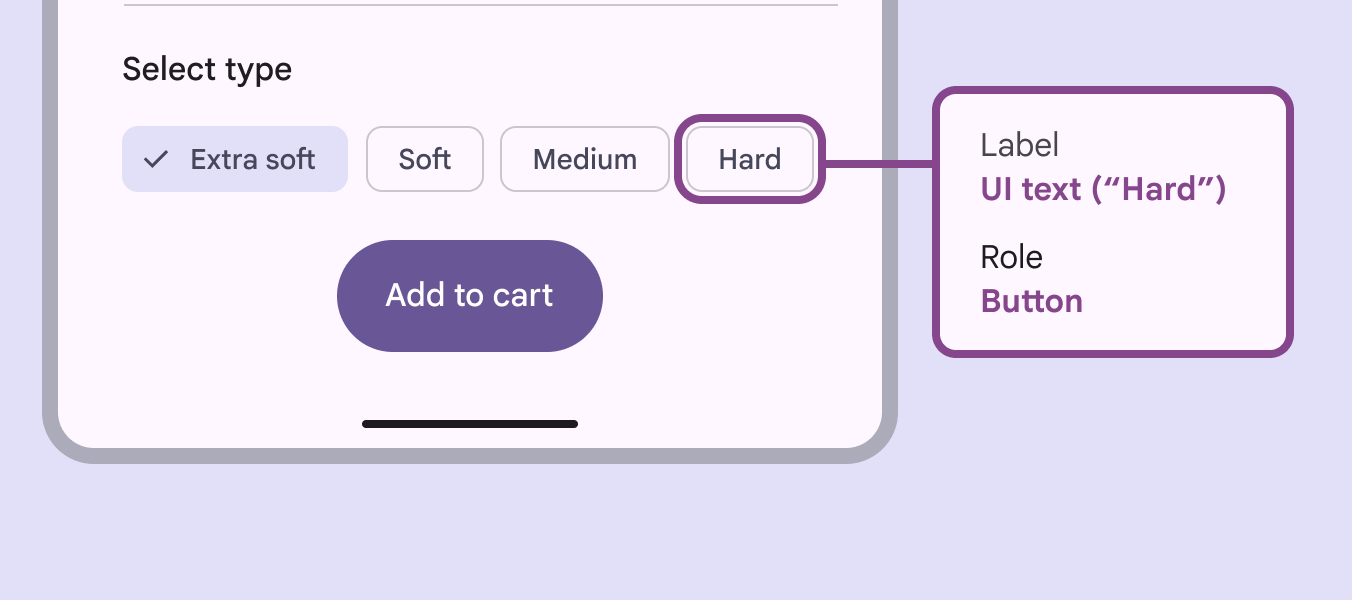
Accessibility tags for a chip.
Accessibility tags should include both the label and role

Multi-select

For multi-select chip sets, Space or Enter will select the focused chip and allow you to select all of the chips. Space or Enter will also deselect a focused selected chip.
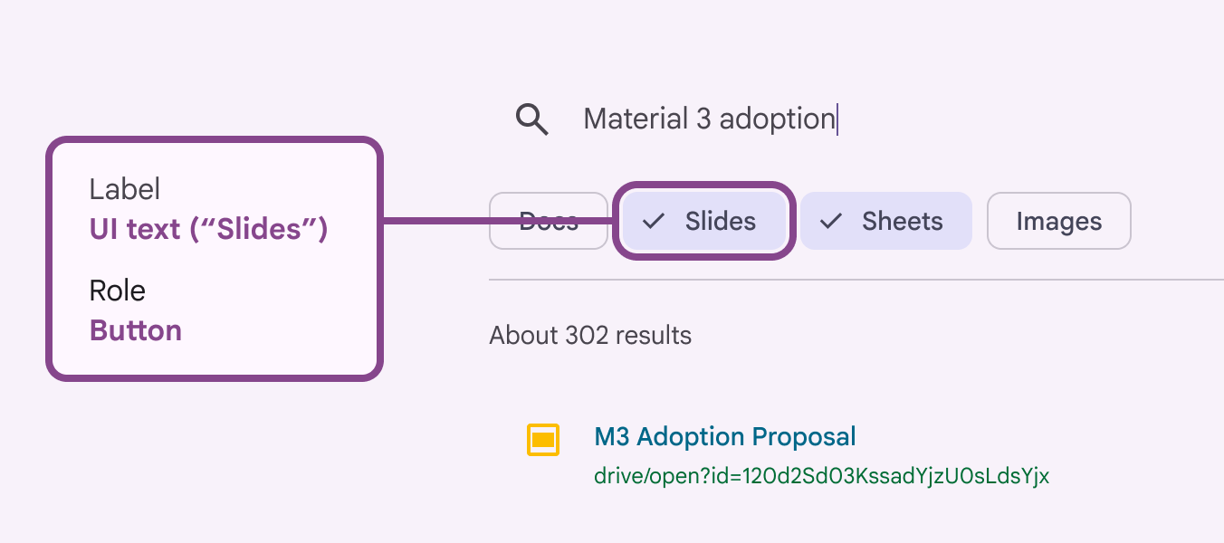
Accessibility tags for a multi-select chip.
While multiple chips can be selected, only one can be in focus

Drop-down list

The accessibility label should align with each list item’s text label.

For list items with text and an icon, the accessibility label should be marked as decorative to avoid redundant verbalizations.
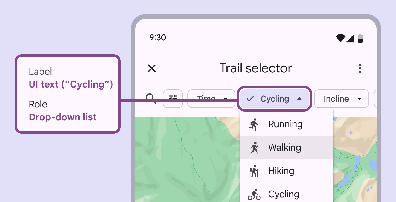
Accessibility tags for a drop-down list chip.
The accessibility label should be the text label

Input chip remove action

Display the remove icon whenever a chip can be removed. On mobile, if remove is the only chip action, the remove icon isn't necessary. Instead the chip can be removed by selecting it and pressing the Delete key on the keyboard.

Each chip is a focusable element.

  • If a chip only has a remove icon, the entire chip and icon are one focusable element.
  • If a chip has a second action, like select, then the chip content and remove icon are two separate focusable elements.
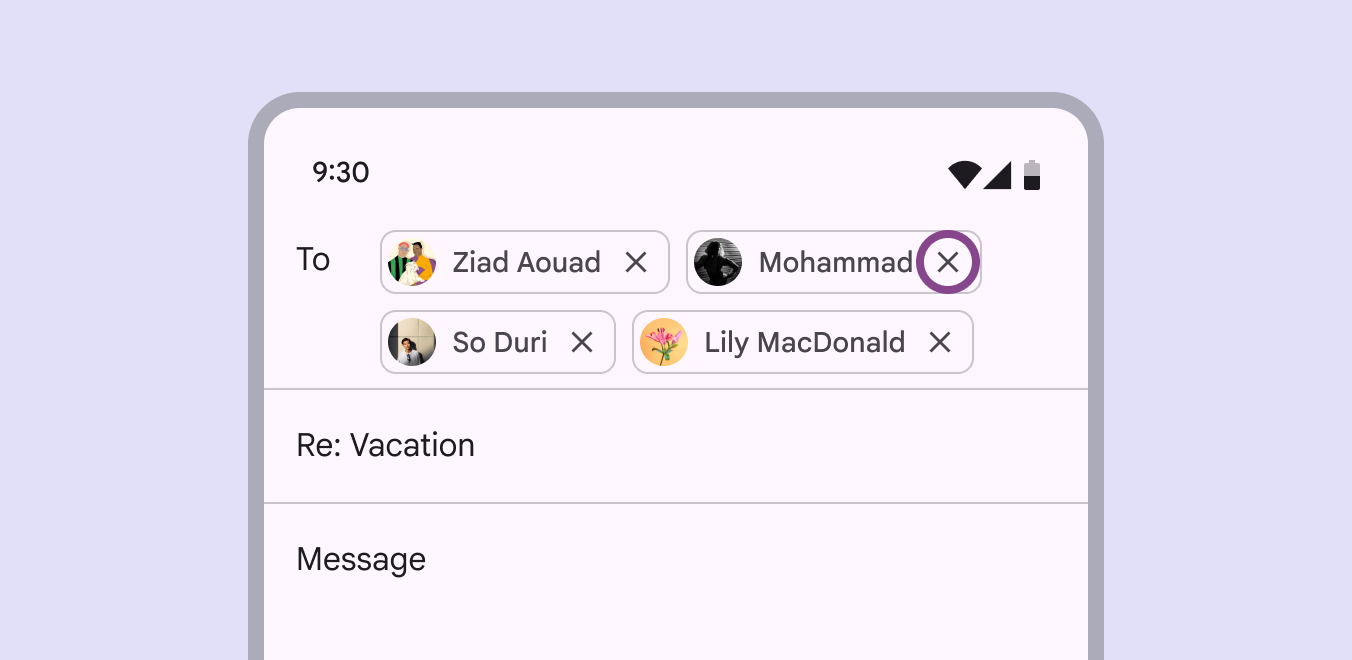
A focused remove action within a chip.
The remove action is focused when the chip can also be selected

Showing chip interactivity

Material requires that chips use a secondary indicator to show that they are interactive in context, allowing users with low vision and cognitive disabilities to see them.

Use one of the following methods:

  • Add a label before the chip group suggesting interaction, such as Select type
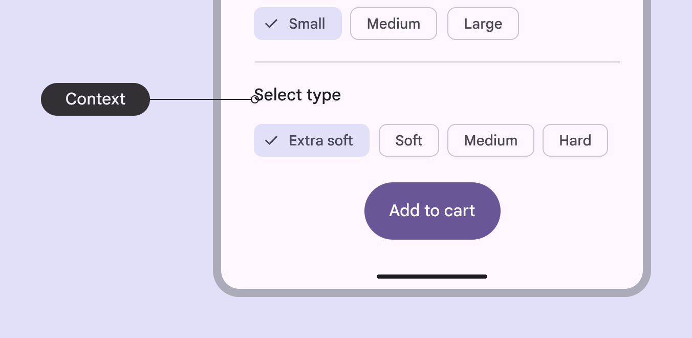
Label saying “Select type” above a series of chips, with “Extra soft” selected.
Labels introducing a chip group can indicate that they are selectable
  • Provide interactive page context, such as Filter results, indicating chips can be selected to narrow results
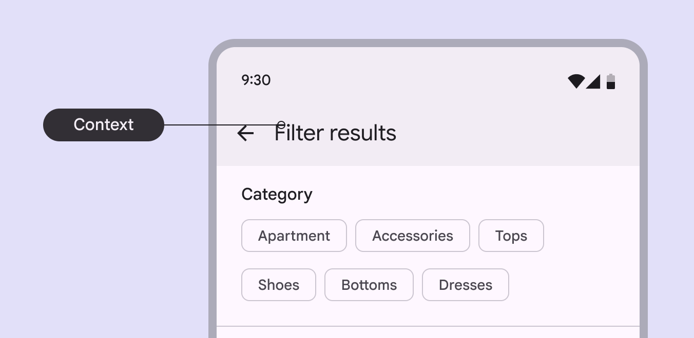
Page context saying “Filter results” above chips listing different categories.
Page context can indicate how search results will be narrowed by selecting chips
  • Use the outline color role, instead of outline variant, to ensure a minimum 3:1 contrast
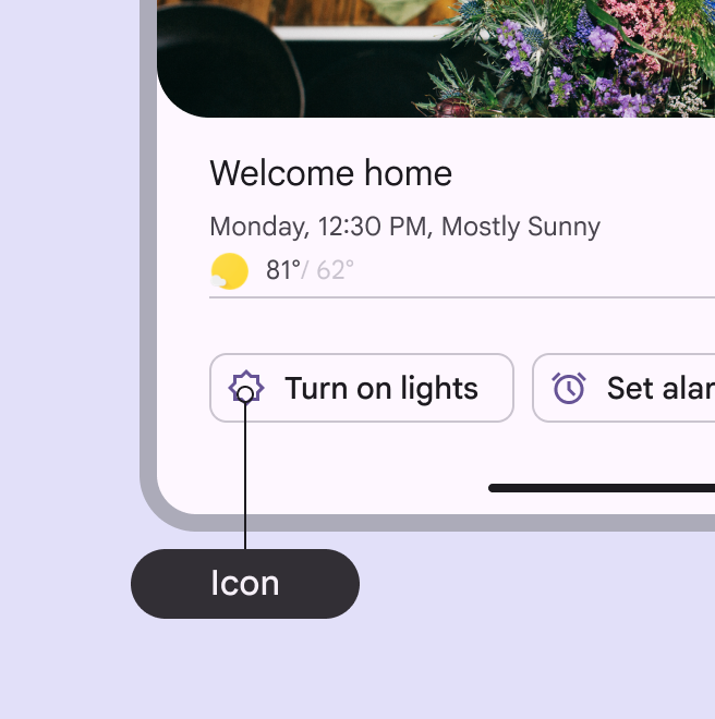
  • Include an interactive chip label, such as Turn on lights, or leading icon
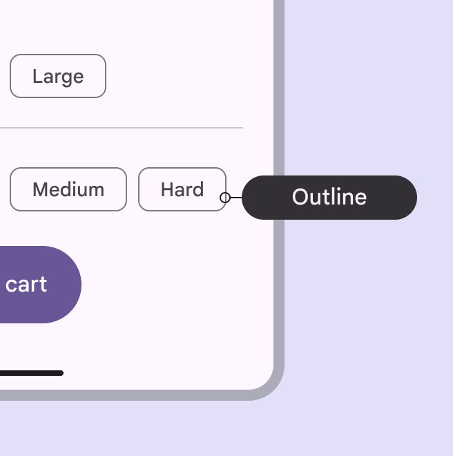
A selectable chip with more pronounced outline stroke.
Chips can show they are interactive with a darker outline color stroke
A chip labeled “Turn on lights” with a leading icon related to lights.
Chips can also use a leading icon or label to show interactivity
Pager
Previous pageChips: Guidelines
Next pageDate pickers: Overview

Released under the Apache 2.0 or CC BY 4.0

Copyright © 2018-Present Google

https://m3.material.io/components/chips/accessibility

Released under the Apache 2.0 or CC BY 4.0

Copyright © 2018-Present Google