Skip to content
Material Design 3
Main Navigation
v3
v2
v1

English

简体中文
繁體中文
Español
Français
Русский
Português – Brasil
Deutsch
日本語
한국어
Italiano
Polski
Türkçe
čeština
magyar

English

简体中文
繁體中文
Español
Français
Русский
Português – Brasil
Deutsch
日本語
한국어
Italiano
Polski
Türkçe
čeština
magyar

Appearance

Sidebar Navigation

Foundations

Accessibility

Overview: Principles

Overview: Assistive technology

Designing: Overview

Designing: Color contrast

Designing: Structure

Designing: Flow

Designing: Elements

Writing and text: Best practices

Writing and text: Text truncation

Writing and text: Text resizing

Building for all: User needs

Building for all: Co-design

Content design

Overview

Alt text

Global writing: Overview

Global writing: Word choice

Notifications

Style guide: UX writing best practices

Style guide: Word choice

Style guide: Grammar and punctuation

Customizing Material

Devices

Watches: Overview

Watches: Foundations

Watches: Styles

Watches: Layout

XR

Design: Overview

Design: Interaction

Design: Layout

Design: Accessibility

Components: Overview

Components: App bars

Components: Dialogs

Components: Nav bar

Components: Nav rail

Components: Toolbars

Design tokens: Overview

Design tokens: How to use tokens

Interaction

Gestures

Inputs

Selection

States: Overview

States: State layers

States: Applying states

Layout

Overview: Overview

Overview: Parts of layout

Overview: Adaptive design

Scaffold: Overview

Scaffold: Bars

Scaffold: Rails

Scaffold: Panes

Grids & spacing: Overview

Grids & spacing: Grids

Grids & spacing: Spacing

Grids & spacing: Density

Breakpoints: Overview

Breakpoints: Compact

Breakpoints: Medium

Breakpoints: Expanded

Breakpoints: Large & extra-large

Bidirectionality & RTL

Canonical examples: Overview

Canonical examples: Feed

Canonical examples: List-detail

Canonical examples: Supporting pane

Usability: Overview

Usability: Applying M3 Expressive

Material A-Z

Styles

Color

Color system: Overview

Color system: How the system works

Color roles

Color schemes

Choosing a scheme

Static: Baseline

Static: Custom brand

Dynamic: Choosing a source

Dynamic: User-generated source

Dynamic: Content-based source

Advanced: Overview

Advanced: Apply colors

Advanced: Define new colors

Advanced: Adjust existing colors

Color resources

Elevation: Overview

Elevation: Applying elevation

Elevation: Tokens

Icons: Overview

Icons: Designing icons

Icons: Applying icons

Motion

Motion physics system: How it works

Motion physics system: Specs

Easing and duration: Applying easing and duration

Easing and duration: Tokens & specs

Transitions: Transition patterns

Transitions: Applying transitions

Shape: Overview & principles

Shape: Corner radius scale

Shape: Shape morph

Spacing: Overview

Spacing: Applying spacing

Spacing: Tokens

Typography: Overview

Typography: Fonts

Typography: Type scale & tokens

Typography: Applying type

Typography: Editorial treatments

Components

App bars: Overview

App bars: Specs

App bars: Guidelines

App bars: Accessibility

Badges: Overview

Badges: Specs

Badges: Guidelines

Badges: Accessibility

Buttons

All buttons

Button groups: Overview

Button groups: Specs

Button groups: Guidelines

Button groups: Accessibility

Buttons: Overview

Buttons: Specs

Buttons: Guidelines

Buttons: Accessibility

Extended FABs: Overview

Extended FABs: Specs

Extended FABs: Guidelines

Extended FABs: Accessibility

FAB menu: Overview

FAB menu: Specs

FAB menu: Guidelines

FAB menu: Accessibility

FABs: Overview

FABs: Specs

FABs: Guidelines

FABs: Accessibility

Icon buttons: Overview

Icon buttons: Specs

Icon buttons: Guidelines

Icon buttons: Accessibility

Segmented buttons: Overview

Segmented buttons: Specs

Segmented buttons: Guidelines

Segmented buttons: Accessibility

Split button: Overview

Split button: Specs

Split button: Guidelines

Split button: Accessibility

Cards: Overview

Cards: Specs

Cards: Guidelines

Cards: Accessibility

Carousel: Overview

Carousel: Specs

Carousel: Guidelines

Carousel: Accessibility

Checkbox: Overview

Checkbox: Specs

Checkbox: Guidelines

Checkbox: Accessibility

Chips: Overview

Chips: Specs

Chips: Guidelines

Chips: Accessibility

Date & time pickers

Date pickers: Overview

Date pickers: Specs

Date pickers: Guidelines

Date pickers: Accessibility

Time pickers: Overview

Time pickers: Specs

Time pickers: Guidelines

Time pickers: Accessibility

Dialogs: Overview

Dialogs: Specs

Dialogs: Guidelines

Dialogs: Accessibility

Divider: Overview

Divider: Specs

Divider: Guidelines

Divider: Accessibility

Lists: Overview

Lists: Specs

Lists: Guidelines

Lists: Accessibility

Loading & progress

Loading indicator: Overview

Loading indicator: Specs

Loading indicator: Guidelines

Loading indicator: Accessibility

Progress indicators: Overview

Progress indicators: Specs

Progress indicators: Guidelines

Progress indicators: Accessibility

Menus: Overview

Menus: Specs

Menus: Guidelines

Menus: Accessibility

Navigation

Navigation bar: Overview

Navigation bar: Specs

Navigation bar: Guidelines

Navigation bar: Accessibility

Navigation drawer: Overview

Navigation drawer: Specs

Navigation drawer: Guidelines

Navigation drawer: Accessibility

Navigation rail: Overview

Navigation rail: Specs

Navigation rail: Guidelines

Navigation rail: Accessibility

Radio button: Overview

Radio button: Specs

Radio button: Guidelines

Radio button: Accessibility

Search: Overview

Search: Specs

Search: Guidelines

Search: Accessibility

Sheets

Bottom sheets: Overview

Bottom sheets: Specs

Bottom sheets: Guidelines

Bottom sheets: Accessibility

Side sheets: Overview

Side sheets: Specs

Side sheets: Guidelines

Side sheets: Accessibility

Sliders: Overview

Sliders: Specs

Sliders: Guidelines

Sliders: Accessibility

Snackbar: Overview

Snackbar: Specs

Snackbar: Guidelines

Snackbar: Accessibility

Switch: Overview

Switch: Specs

Switch: Guidelines

Switch: Accessibility

Tabs: Overview

Tabs: Specs

Tabs: Guidelines

Tabs: Accessibility

Text fields: Overview

Text fields: Specs

Text fields: Guidelines

Text fields: Accessibility

Toolbars: Overview

Toolbars: Specs

Toolbars: Guidelines

Toolbars: Accessibility

Tooltips: Overview

Tooltips: Specs

Tooltips: Guidelines

Tooltips: Accessibility

On this page

Switch: Guidelines ​

Switches toggle the selection of an item on and off


A switch in 2 states, off and on.
Switches change settings and other options immediately

Usage ​

Switches are best used to adjust settings and other standalone options.

They make a binary selectionSelection lets users choose specific items to act on.More on selection:

  • On and off
  • True and false

The effects of a switch should start immediately, without needing to save.

Use a switch to turn an option on and off

Use switches to:

  • Toggle a single item on or off
  • Immediately activate or deactivate something
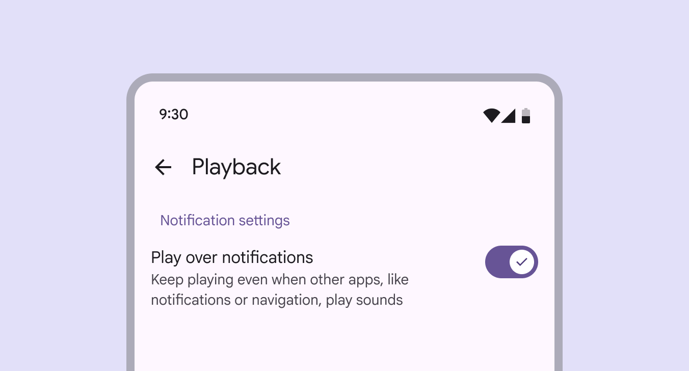
Switch used in notification settings to turn on and off the "play over notifications" function.
Switches are commonly used on mobile to turn settings on or off

Switches control binary options, not opposing ones. A binary option represents a single selectionSelection lets users choose specific items to act on.More on selection that's either on or off.

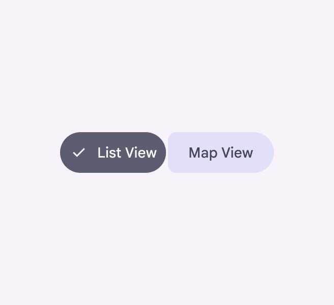
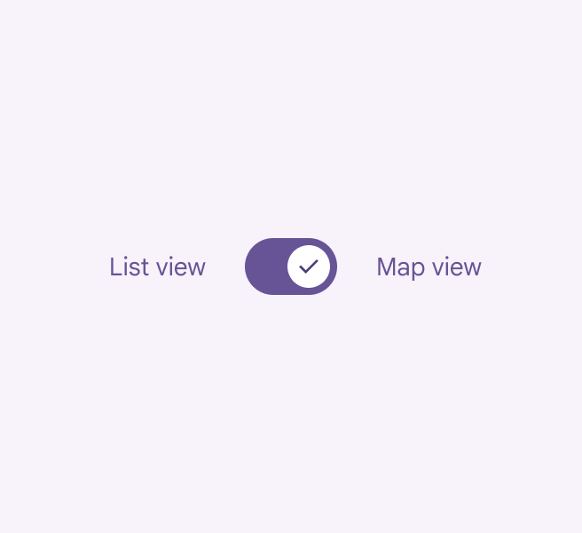
Opposing options are when only one option in a set can be selected at a time, like a listLists are continuous, vertical indexes of text and images.More on lists or map view. Use a connected button groupConnected button groups have smaller inner corners and are best used for selection.More on button groups instead.

A connected button group with options of List View and Map View.
Do Use a connected button group to choose between opposing options
A switch with non-binary options of List View and Map View.
Don't Avoid using switches to toggle between opposing options

Alternate selection controls

CheckboxesCheckboxes let users select one or more items from a list, or turn an item on or off.More on checkboxes, radio buttonsRadio buttons let people select one option from a set of options.More on radio buttons, and switches are the three main kinds of selection controls. They help people make choices, like selecting options or turning settings on and off.

Use checkboxes to select multiple related options in a list.

Use radio buttons to select a single option in a list.

Use switches to select standalone or more verbose options in a list, like settings.
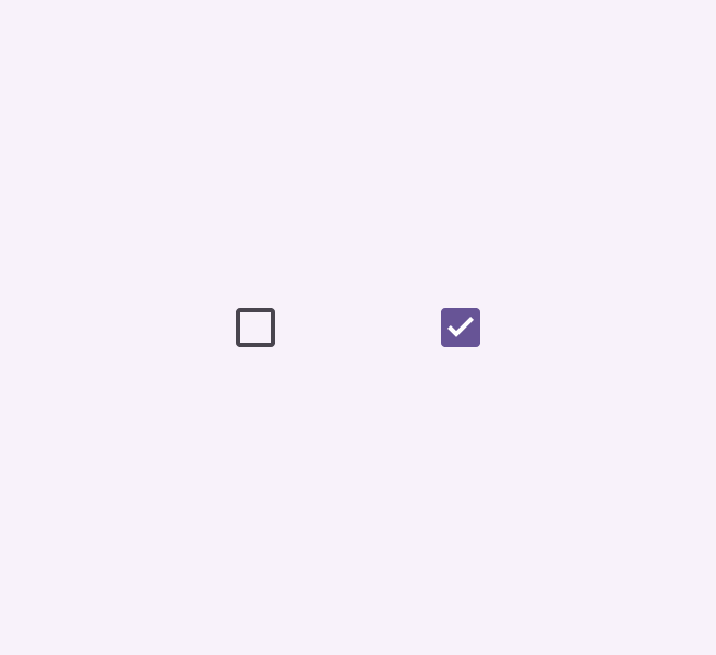
2 checkboxes, 1 unchecked and 1 checked.
Checkboxes
2 radio buttons, 1 in an enabled state, 1 in a disabled state.
Radio buttons
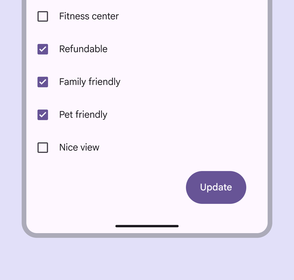
Mobile screen with checkboxes to select list items and call to action button to update the list.
Do Use checkboxes (not switches) to let people select one or more options from a list
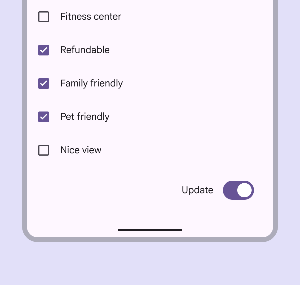
Mobile screen with checkboxes to select list items and call to action switch to update the list.
Don't A switch can't replace a button. People expect a call to action to be a button, not a switch.
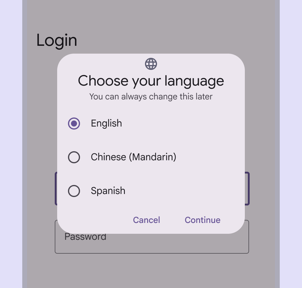
Radio buttons used to select a language for a mobile app.
Do Use radio buttons (not switches) when only one item can be selected from a list
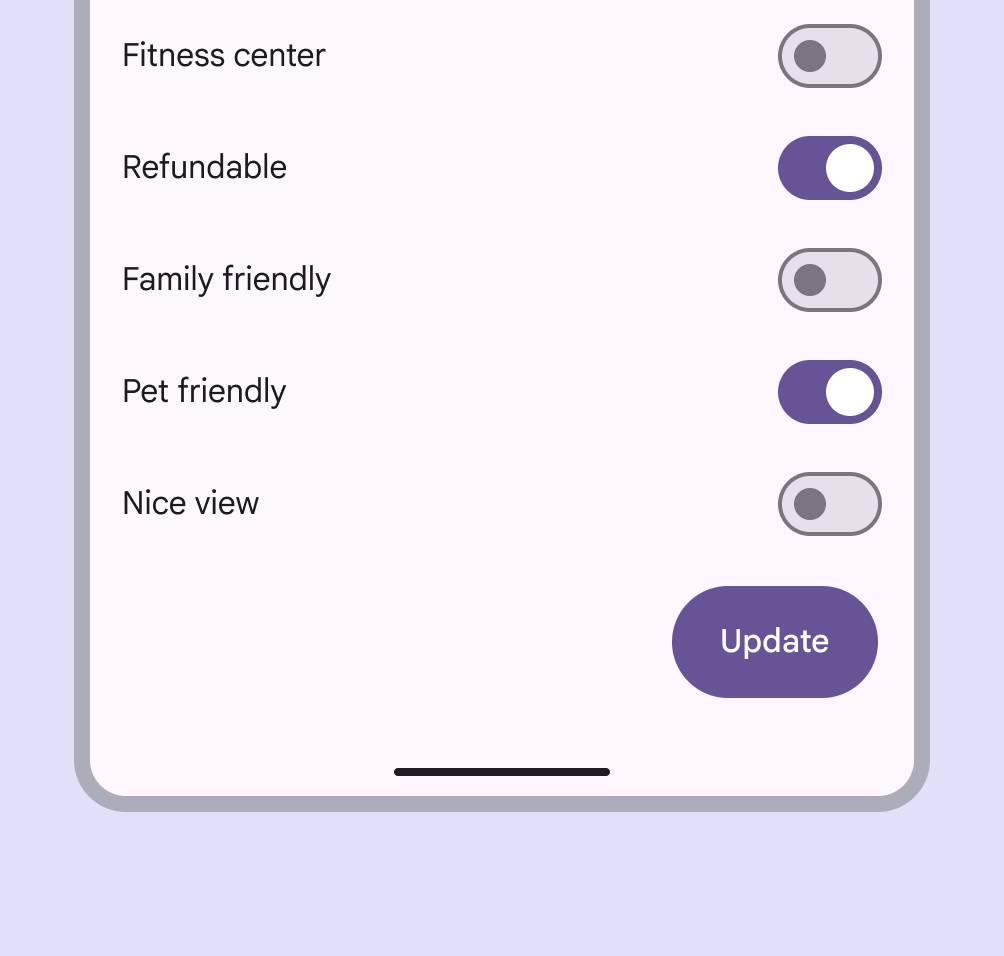
Mobile screen with switches to select list items and call to action button to update the list.
Don't Avoid using a switch to select multiple options that require people to save. Switches should be immediate. Use checkboxes instead.

Anatomy ​

3 elements of a switch.
  1. Track
  2. Handle
  3. Icon (optional)

Icon (optional)

The switch handle can contain an optional icon.

The icon within the handle should always communicate the switch's selection

Icons can be used to visually emphasize the switch's selectionSelection lets users choose specific items to act on.More on selection. The icon's meaning should be clear and unambiguous to help the people understand whether switch is on or off.
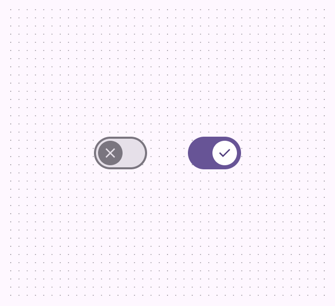
2 switches, the unselected state icon is an X, and the selected state is a checkmark.
Do Use icons that clearly communicate whether the switch is on or off, such as an X and a checkmark
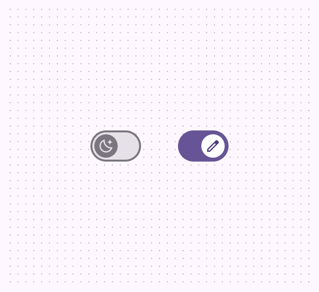
A switch's unselected handle icon is a moon and the selected state icon is a pencil.
Don't Avoid using more ambiguous or non-binary icons, such as a moon or edit icon

Label text

Switches should always be paired with an inline label describing what the switch controls when selected.
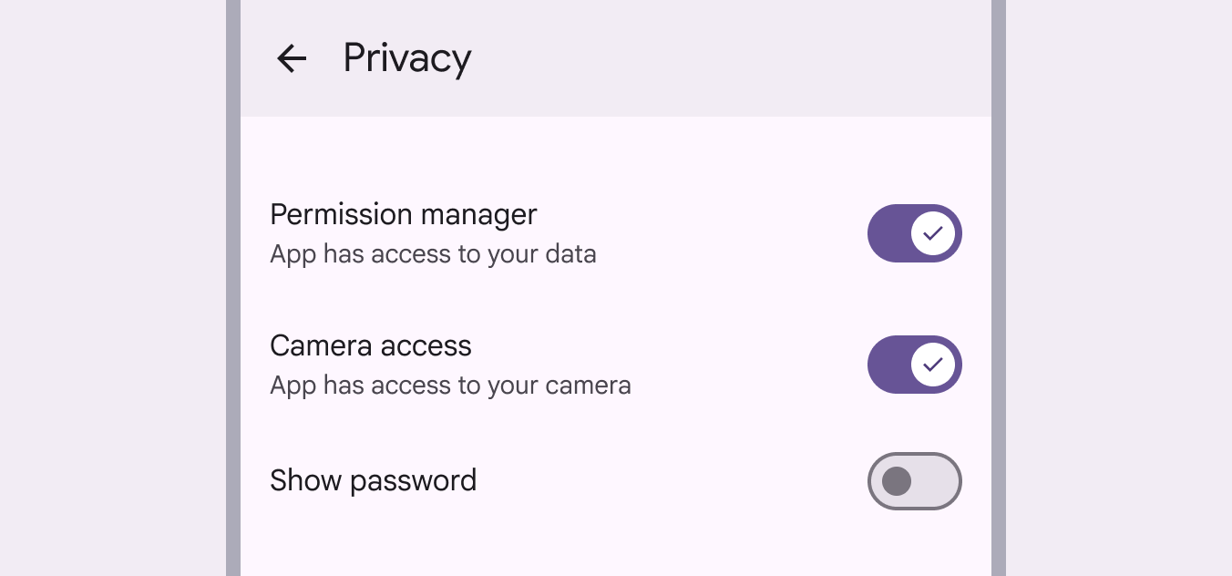
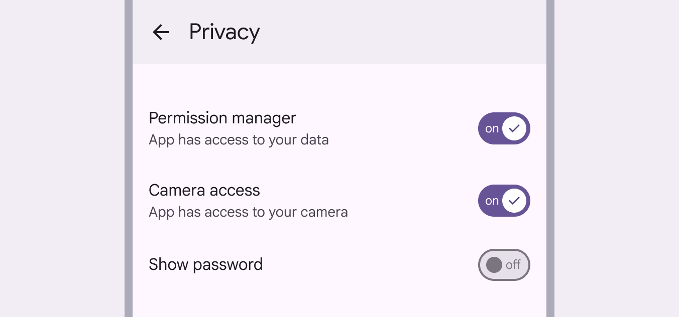
Switch label text: 1. Permission manager, App has access to your data. 2. Camera access, app has access to your camera. 3. Show password.
Do Keep labels short and direct. A label should describe what the control does when the switch is on.
On a mobile screen's privacy settings, 2 switches have "On" label text and checkmark icons. The last switch has "Off" label text and no icon.
Don't Don't add label text into the switch; the font size would be too small to be accessible. Use an appropriate icon instead.

Placement ​

Switches are often arranged in stacked layoutsLayout is the visual arrangement of elements on the screen.More on layout.

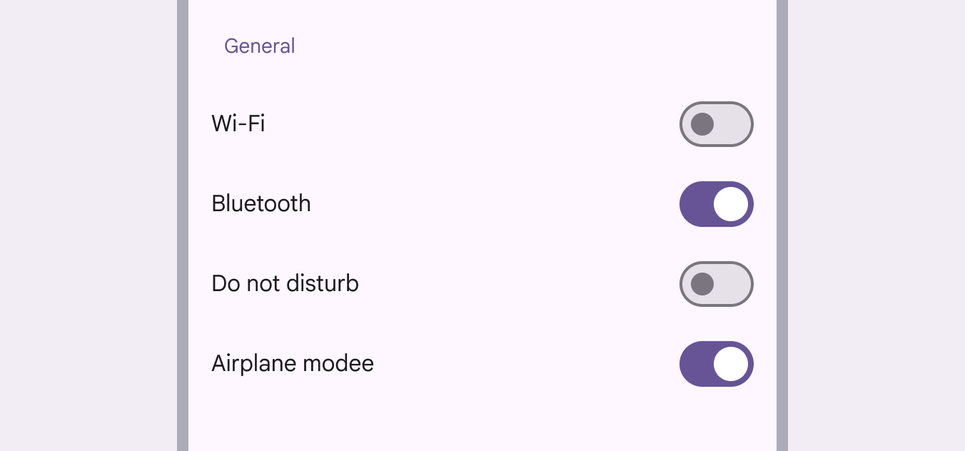
Screen showing labels and stacked switches in varying on/off modes.
Settings screens are common places to use switches

Behavior ​

A switch is successfully toggled when the handle slides to the other side of the track after an interaction.

When selected, the switch handle slides to the opposite end of the track

When a person toggles a switch, its handle size changes and the corresponding action takes effect immediately.

The on state of the switch is indicated by a larger handle size
Pager
Previous pageSwitch: Specs
Next pageSwitch: Accessibility

Released under the Apache 2.0 or CC BY 4.0

Copyright © 2018-Present Google

https://m3.material.io/components/switch/guidelines

Released under the Apache 2.0 or CC BY 4.0

Copyright © 2018-Present Google