

Sliders: Specs
Sliders allow users to make selections from a range of values
Variants
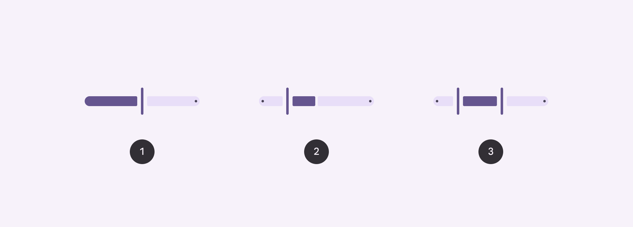
- Standard
- Centered
- Range
| Variant | M3 | M3 Expressive |
|---|---|---|
| Standard | Available as “continuous” slider | Available |
| Centered | Available (web only) | Available |
| Range | Available | Available |
| Discrete | Available | Available as “stops” configuration |
Configurations
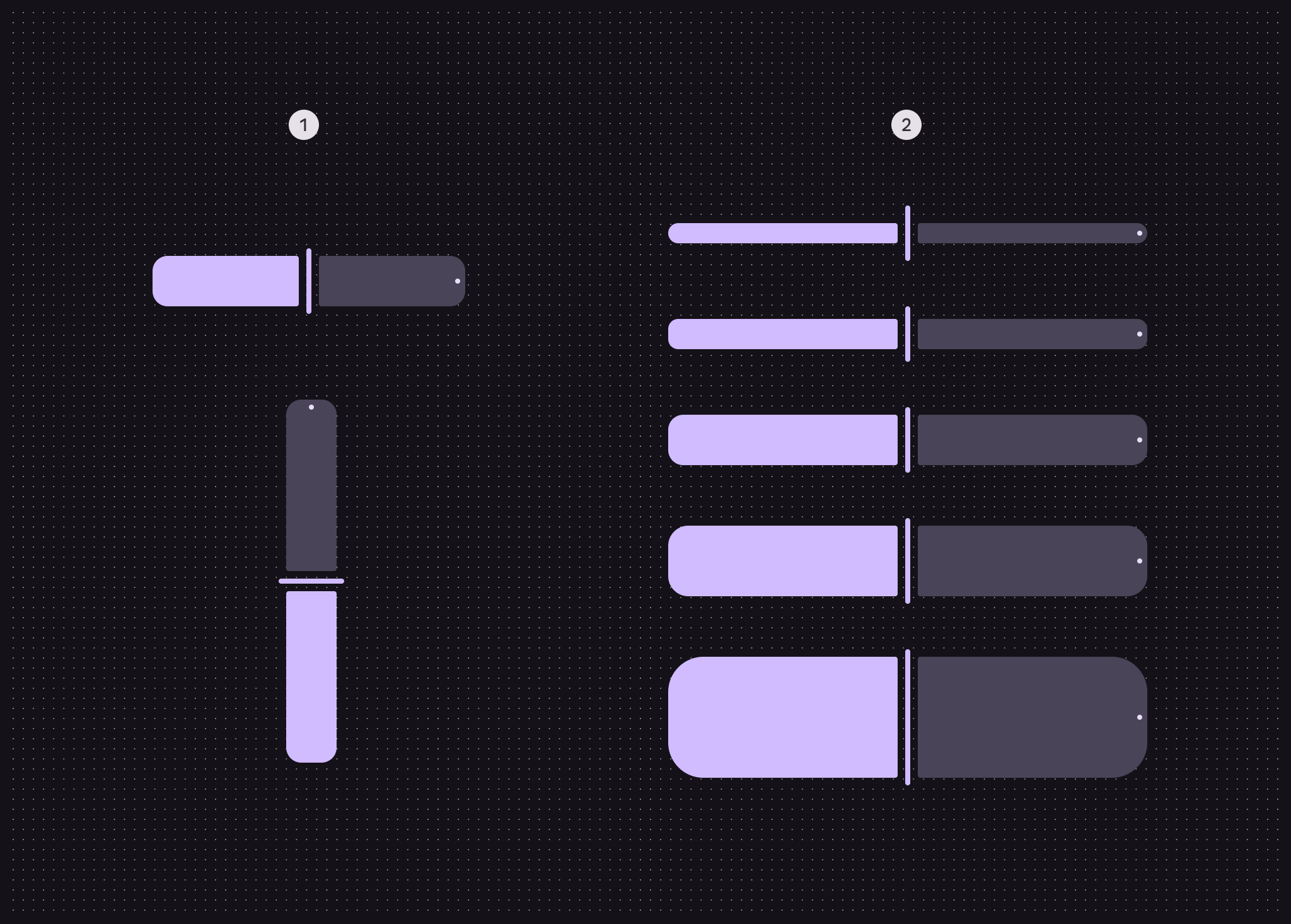
- Orientation: Horizontal, vertical
- Size: XS, S, M, L, XL
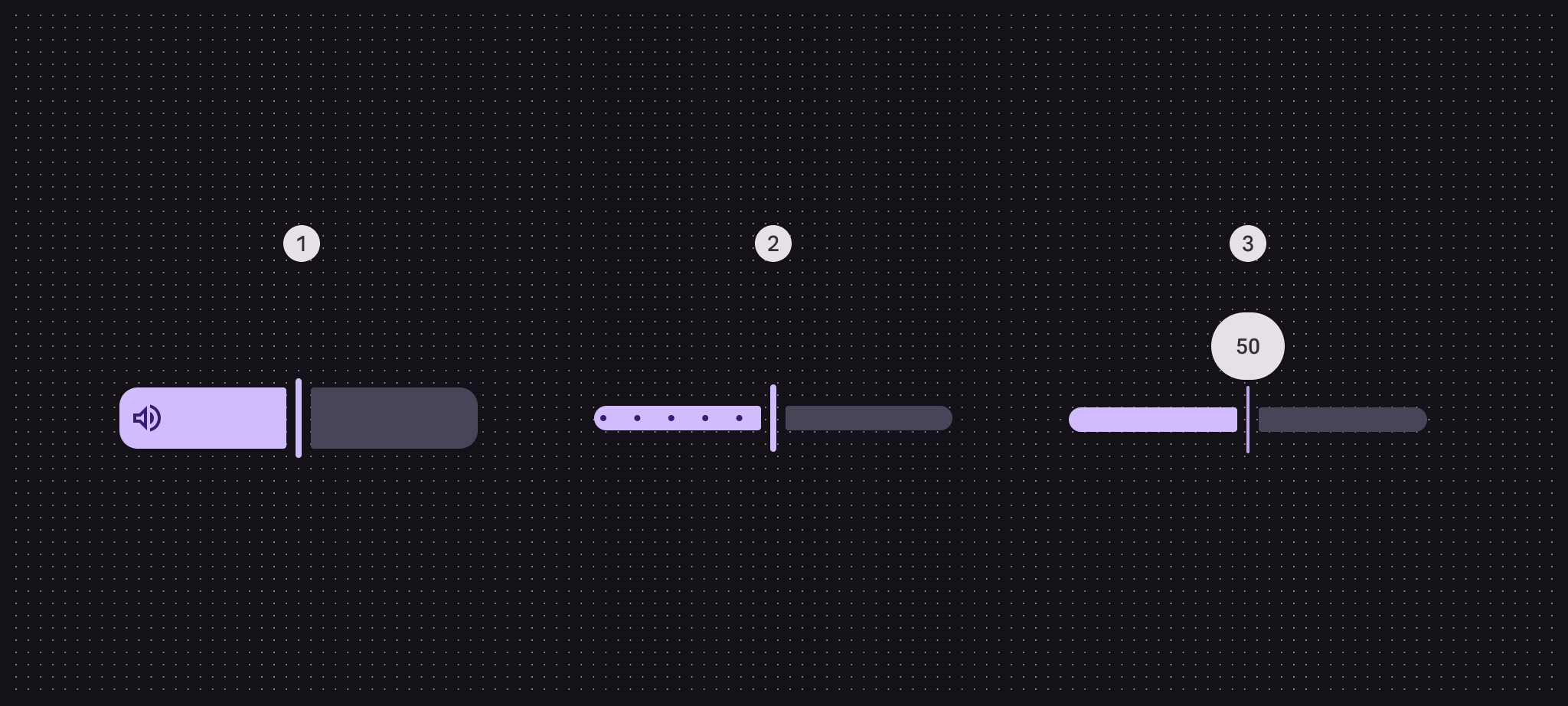
- Inset icon
- Stops
- Value indicator
| Category | Configuration | M3 | M3 Expressive |
|---|---|---|---|
| Inset icon | No (default) | Available | Available |
| Yes | -- | Available | |
| Orientation | Horizontal (default) | Available | Available |
| Vertical | -- | Available | |
| Size | XS (default) | Available | Available |
| S, M, L, XL | -- | Available on Android Views (MDC-Android). Available as tokens on other platforms.* | |
| Stop indicators | No (default), Yes | Available as “discrete” slider | Available |
| Value Indicator | No (default), Yes | Available | Available |
*Configurations only available using tokens don’t have implemented presets in code. To change the size, swap the default size tokens
md.comp.slider.xsmall.[...]with those of the desired size.
Tokens & specs
Slider tokens are organized into a common token set, and token sets for each size. Switch token sets from the table’s menu. Learn more about design tokens
Slider
Slider - Size - Xsmall
Slider - Size - Small
Slider - Size - Medium
Slider - Size - Large
Slider - Size - Xlarge
Anatomy
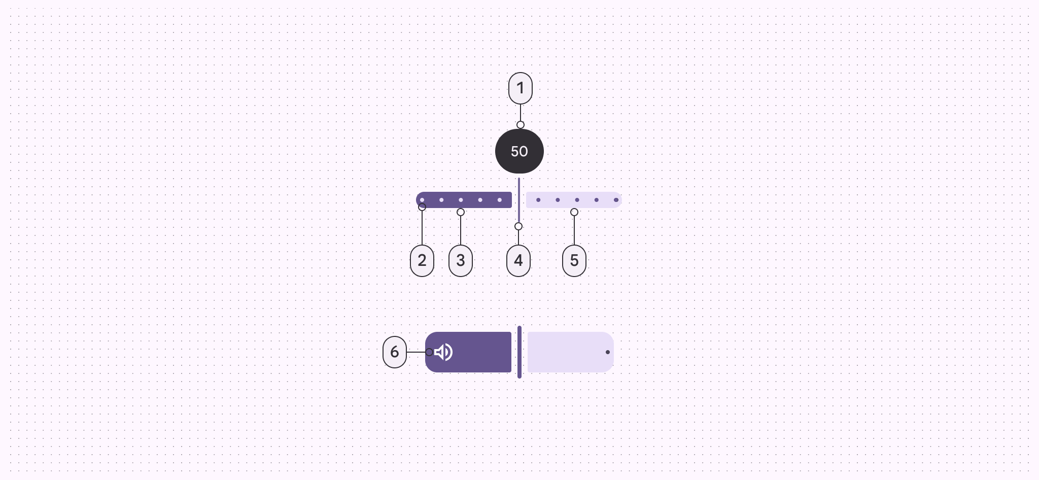
- Value indicator (optional)
- Stop indicators (optional)
- Active track
- Handle
- Inactive track
- Inset icon (optional)
Color
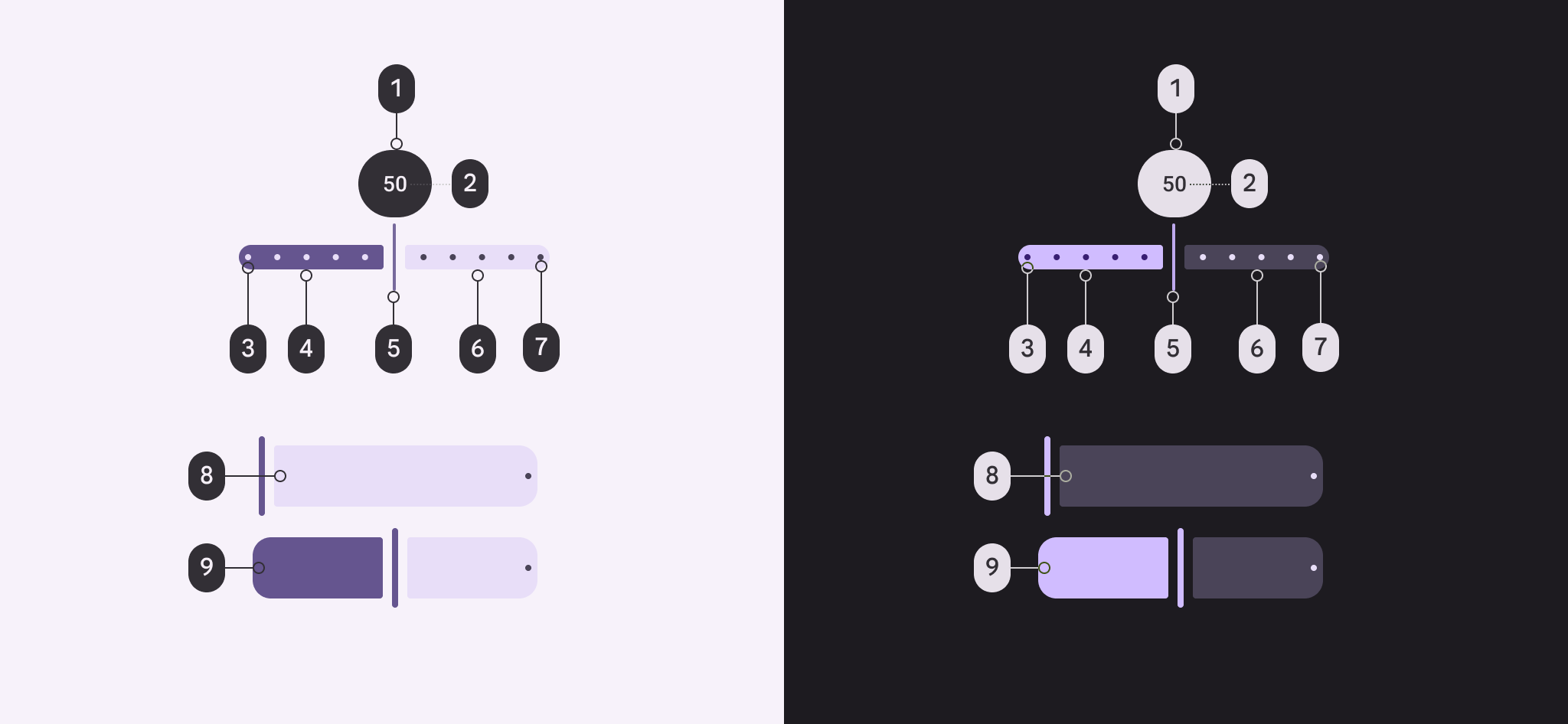
Slider color roles used for light and dark schemes:
- Inverse surface
- Inverse on surface
- Primary
- On primary
- Primary
- Secondary container
- On secondary container
- On secondary container
- On primary
States
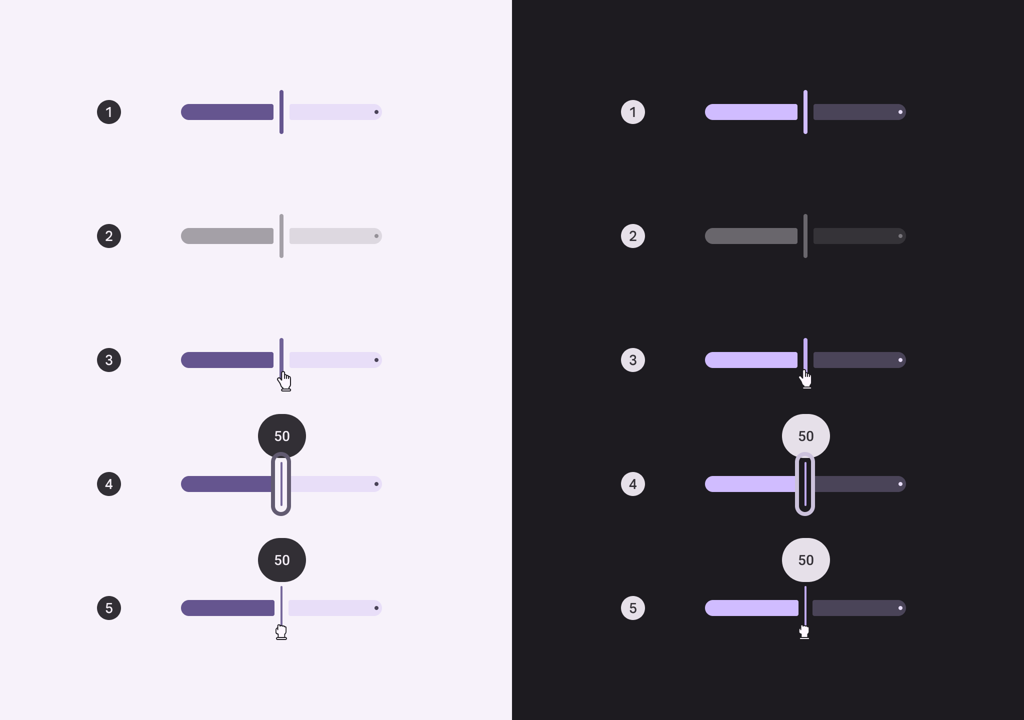
- Enabled
- Disabled
- Hovered
- Focused
- Pressed
Measurements
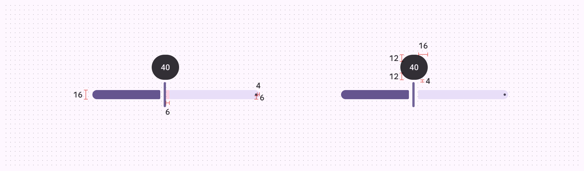
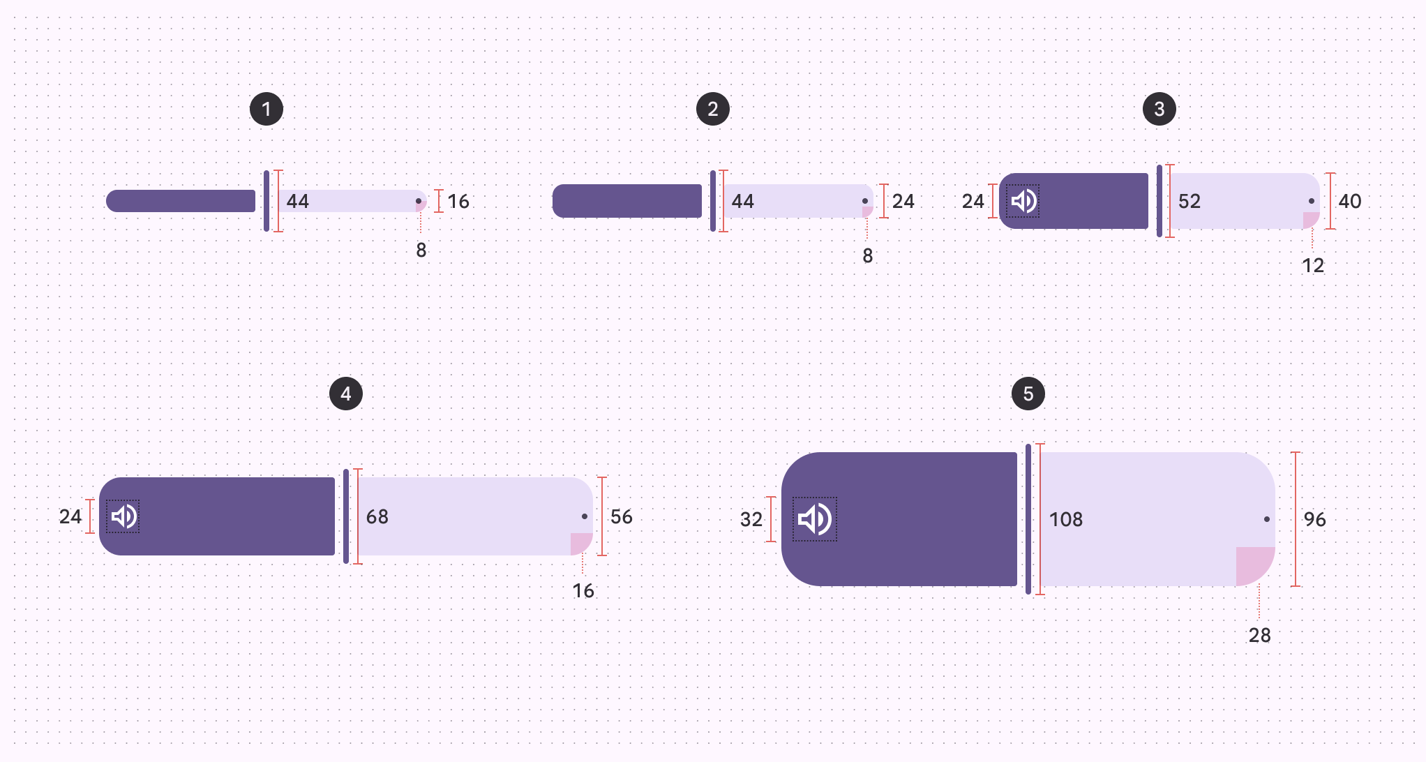
| Attribute | XS | S | M | L | XL |
|---|---|---|---|---|---|
| Track height | 16dp | 24dp | 40dp | 56dp | 96dp |
| Label container height | 44dp | ||||
| Label container width | 48dp | ||||
| Handle height | 44dp | 44dp | 52dp | 68dp | 108dp |
| Handle width | 4dp | ||||
| Track shape | 8dp | 8dp | 12dp | 16dp | 28dp |
| Inset icon size | -- | -- | 24dp | 24dp | 32dp |