Skip to content
Material Design 3
Main Navigation
v3
v2
v1

English

简体中文
繁體中文
Español
Français
Русский
Português – Brasil
Deutsch
日本語
한국어
Italiano
Polski
Türkçe
čeština
magyar

English

简体中文
繁體中文
Español
Français
Русский
Português – Brasil
Deutsch
日本語
한국어
Italiano
Polski
Türkçe
čeština
magyar

Appearance

Sidebar Navigation

Foundations

Accessibility

Overview: Principles

Overview: Assistive technology

Designing: Overview

Designing: Color contrast

Designing: Structure

Designing: Flow

Designing: Elements

Writing and text: Best practices

Writing and text: Text truncation

Writing and text: Text resizing

Building for all: User needs

Building for all: Co-design

Content design

Overview

Alt text

Global writing: Overview

Global writing: Word choice

Notifications

Style guide: UX writing best practices

Style guide: Word choice

Style guide: Grammar and punctuation

Customizing Material

Devices

Watches: Overview

Watches: Foundations

Watches: Styles

Watches: Layout

XR

Design: Overview

Design: Interaction

Design: Layout

Design: Accessibility

Components: Overview

Components: App bars

Components: Dialogs

Components: Nav bar

Components: Nav rail

Components: Toolbars

Design tokens: Overview

Design tokens: How to use tokens

Interaction

Gestures

Inputs

Selection

States: Overview

States: State layers

States: Applying states

Layout

Overview: Overview

Overview: Parts of layout

Overview: Adaptive design

Scaffold: Overview

Scaffold: Bars

Scaffold: Rails

Scaffold: Panes

Grids & spacing: Overview

Grids & spacing: Grids

Grids & spacing: Spacing

Grids & spacing: Density

Breakpoints: Overview

Breakpoints: Compact

Breakpoints: Medium

Breakpoints: Expanded

Breakpoints: Large & extra-large

Bidirectionality & RTL

Canonical examples: Overview

Canonical examples: Feed

Canonical examples: List-detail

Canonical examples: Supporting pane

Usability: Overview

Usability: Applying M3 Expressive

Material A-Z

Styles

Color

Color system: Overview

Color system: How the system works

Color roles

Color schemes

Choosing a scheme

Static: Baseline

Static: Custom brand

Dynamic: Choosing a source

Dynamic: User-generated source

Dynamic: Content-based source

Advanced: Overview

Advanced: Apply colors

Advanced: Define new colors

Advanced: Adjust existing colors

Color resources

Elevation: Overview

Elevation: Applying elevation

Elevation: Tokens

Icons: Overview

Icons: Designing icons

Icons: Applying icons

Motion

Motion physics system: How it works

Motion physics system: Specs

Easing and duration: Applying easing and duration

Easing and duration: Tokens & specs

Transitions: Transition patterns

Transitions: Applying transitions

Shape: Overview & principles

Shape: Corner radius scale

Shape: Shape morph

Spacing: Overview

Spacing: Applying spacing

Spacing: Tokens

Typography: Overview

Typography: Fonts

Typography: Type scale & tokens

Typography: Applying type

Typography: Editorial treatments

Components

App bars: Overview

App bars: Specs

App bars: Guidelines

App bars: Accessibility

Badges: Overview

Badges: Specs

Badges: Guidelines

Badges: Accessibility

Buttons

All buttons

Button groups: Overview

Button groups: Specs

Button groups: Guidelines

Button groups: Accessibility

Buttons: Overview

Buttons: Specs

Buttons: Guidelines

Buttons: Accessibility

Extended FABs: Overview

Extended FABs: Specs

Extended FABs: Guidelines

Extended FABs: Accessibility

FAB menu: Overview

FAB menu: Specs

FAB menu: Guidelines

FAB menu: Accessibility

FABs: Overview

FABs: Specs

FABs: Guidelines

FABs: Accessibility

Icon buttons: Overview

Icon buttons: Specs

Icon buttons: Guidelines

Icon buttons: Accessibility

Segmented buttons: Overview

Segmented buttons: Specs

Segmented buttons: Guidelines

Segmented buttons: Accessibility

Split button: Overview

Split button: Specs

Split button: Guidelines

Split button: Accessibility

Cards: Overview

Cards: Specs

Cards: Guidelines

Cards: Accessibility

Carousel: Overview

Carousel: Specs

Carousel: Guidelines

Carousel: Accessibility

Checkbox: Overview

Checkbox: Specs

Checkbox: Guidelines

Checkbox: Accessibility

Chips: Overview

Chips: Specs

Chips: Guidelines

Chips: Accessibility

Date & time pickers

Date pickers: Overview

Date pickers: Specs

Date pickers: Guidelines

Date pickers: Accessibility

Time pickers: Overview

Time pickers: Specs

Time pickers: Guidelines

Time pickers: Accessibility

Dialogs: Overview

Dialogs: Specs

Dialogs: Guidelines

Dialogs: Accessibility

Divider: Overview

Divider: Specs

Divider: Guidelines

Divider: Accessibility

Lists: Overview

Lists: Specs

Lists: Guidelines

Lists: Accessibility

Loading & progress

Loading indicator: Overview

Loading indicator: Specs

Loading indicator: Guidelines

Loading indicator: Accessibility

Progress indicators: Overview

Progress indicators: Specs

Progress indicators: Guidelines

Progress indicators: Accessibility

Menus: Overview

Menus: Specs

Menus: Guidelines

Menus: Accessibility

Navigation

Navigation bar: Overview

Navigation bar: Specs

Navigation bar: Guidelines

Navigation bar: Accessibility

Navigation drawer: Overview

Navigation drawer: Specs

Navigation drawer: Guidelines

Navigation drawer: Accessibility

Navigation rail: Overview

Navigation rail: Specs

Navigation rail: Guidelines

Navigation rail: Accessibility

Radio button: Overview

Radio button: Specs

Radio button: Guidelines

Radio button: Accessibility

Search: Overview

Search: Specs

Search: Guidelines

Search: Accessibility

Sheets

Bottom sheets: Overview

Bottom sheets: Specs

Bottom sheets: Guidelines

Bottom sheets: Accessibility

Side sheets: Overview

Side sheets: Specs

Side sheets: Guidelines

Side sheets: Accessibility

Sliders: Overview

Sliders: Specs

Sliders: Guidelines

Sliders: Accessibility

Snackbar: Overview

Snackbar: Specs

Snackbar: Guidelines

Snackbar: Accessibility

Switch: Overview

Switch: Specs

Switch: Guidelines

Switch: Accessibility

Tabs: Overview

Tabs: Specs

Tabs: Guidelines

Tabs: Accessibility

Text fields: Overview

Text fields: Specs

Text fields: Guidelines

Text fields: Accessibility

Toolbars: Overview

Toolbars: Specs

Toolbars: Guidelines

Toolbars: Accessibility

Tooltips: Overview

Tooltips: Specs

Tooltips: Guidelines

Tooltips: Accessibility

On this page

Designing: Color contrast ​

Implement intuitive, accessible layouts, considering structure, color, and flow

Color & contrast ​

Color and contrast can be used to help users see and interpret your app’s content, interact with the right elements, and understand actions.

Color can help communicate mood, tone, and critical information. Primary, secondary, and accent colors can be selected to support usability. Sufficient color contrast between elements can help users with low vision see and use your app.
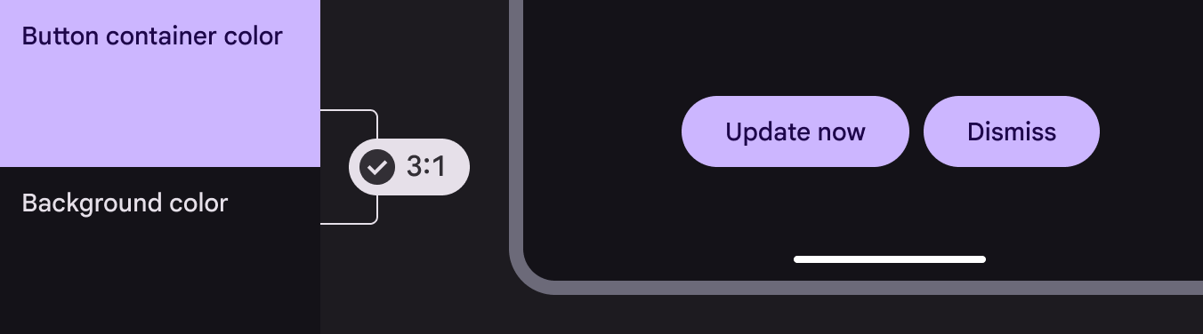
Two colors applied to button container and UI surface with contrast that passes 3:1 minimum

Contrast ratios ​

Color contrast is important for users to distinguish various text and non-text elements. Higher contrast makes the imagery easier to see, while low-contrast images may be difficult for some users to differentiate in bright or low light conditions, such as on a very sunny day or at night.

Contrast ratios represent how different one color is from another color, commonly written as 1:1 or 21:1. The greater the difference is between the two numbers in the ratio, the greater the difference in relative luminance between the colors. The contrast ratio between a color and its background ranges from 1-21 based on its luminance (the intensity of light emitted) according to the World Wide Web Consortium (W3C).

The W3C recommends the following contrasts for body text and image text

Text typeColor contrast ratio
Large text (at 14 pt bold/18 pt regular and up) and graphicsAt least 3:1 against the background
Small textAt least 4.5:1 against the background

Disabled states do not need to meet contrast requirements.

Clustering elements ​

Some non-text elements, such as button containers, should meet a contrast ratio of 3:1 between their container color and the color of their background. Consider the following patterns for combining elements and tones, which are grounded in Material's research into contrast and functional changes when elements are combined.

Learn more about color contrast for accessibility

Elements that are clustered with others, such as a group of buttons, require the user to distinguish each one from the group.

These elements benefit from 3:1 contrast between themselves and the background.
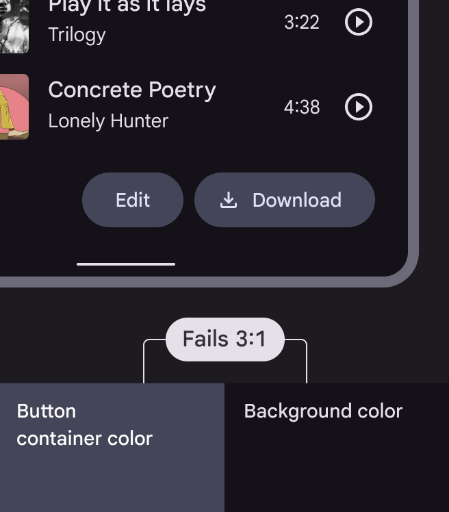
Two colors applied to button container and UI surface with contrast that fails 3:1 minimum
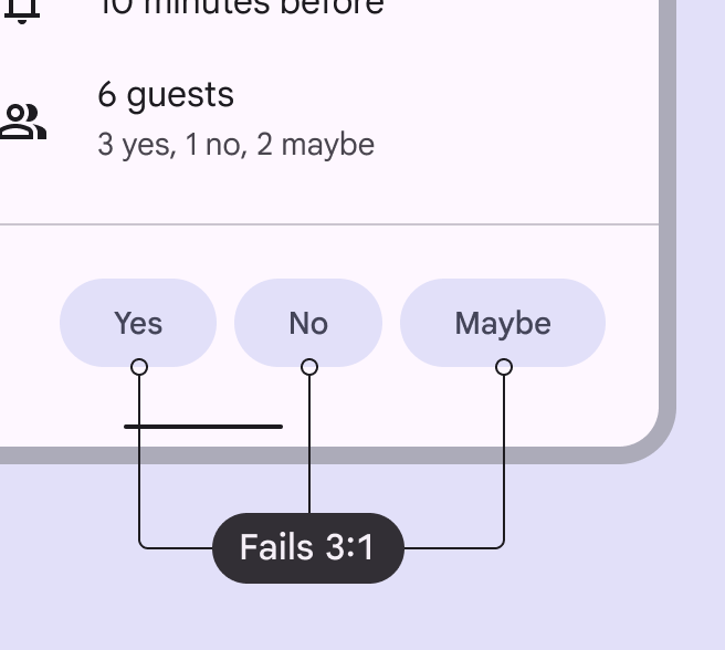
The contrast of the button container color against the background color is less than Material's required contrast of 3:1
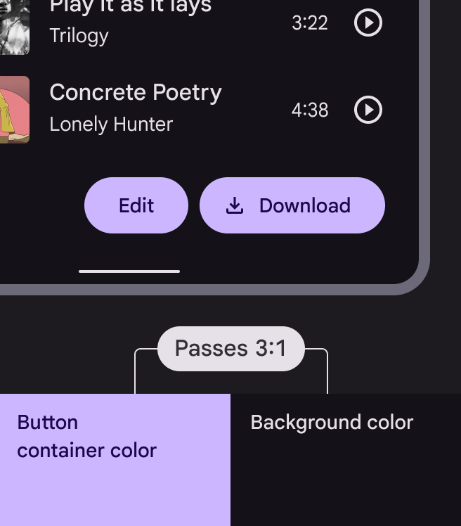
Two colors applied to button container and UI surface with contrast that passes 3:1 minimum
The container color exceeds Material's required minimum contrast of 3:1 against background color

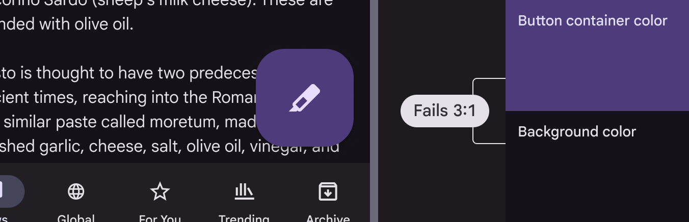
Elements that stand on their own and apart from other elements on the screen, such as a FAB, are already distinguishable to users because of their prominence. These elements don’t benefit from 3:1 contrast between themselves and the background.
Two colors applied to the FAB container and UI surface that fail the minimum contrast of 3:1
Standalone components, such as FABs, don’t need to meet Material's minimum contrast of 3:1 between the container and background colors because of their prominence

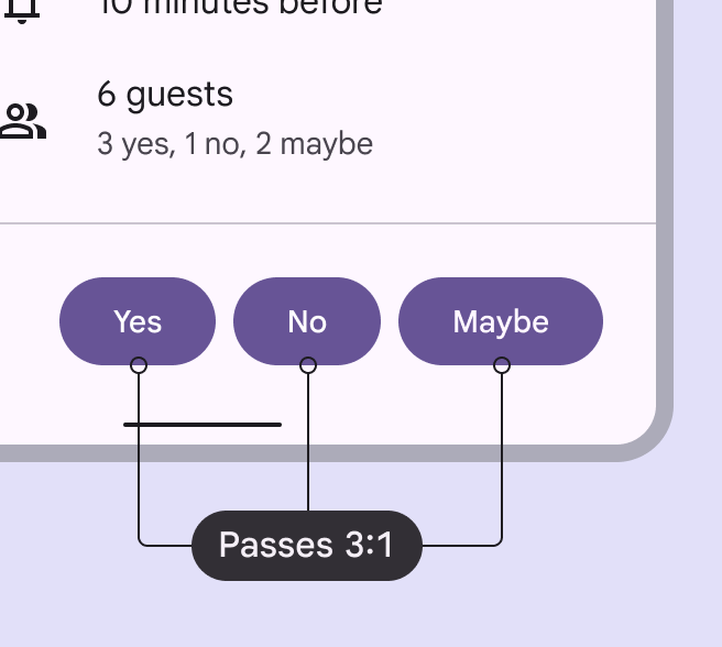
When placing components together in a cluster, use components or types of components that each achieve at least 3:1 contrast between themselves and the background.
A cluster of three buttons with the same container color that fails the minimum contrast of 3:1 with the UI surface
Each button's container color has less than Material's required minimum contrast of 3:1 against the UI background, leading to poor contrast support for users with low vision
A cluster of three buttons with the same container color that passes the minimum contrast of 3:1 with the UI surface
Each button's container color has contrast of at least 3:1 against the UI background, leading to better contrast support for users with low vision
Pager
Previous pageDesigning: Overview
Next pageDesigning: Structure

Released under the Apache 2.0 or CC BY 4.0

Copyright © 2018-Present Google

https://m3.material.io/foundations/designing/color-contrast

Released under the Apache 2.0 or CC BY 4.0

Copyright © 2018-Present Google