Skip to content
Material Design 3
Main Navigation
v3
v2
v1

English

简体中文
繁體中文
Español
Français
Русский
Português – Brasil
Deutsch
日本語
한국어
Italiano
Polski
Türkçe
čeština
magyar

English

简体中文
繁體中文
Español
Français
Русский
Português – Brasil
Deutsch
日本語
한국어
Italiano
Polski
Türkçe
čeština
magyar

Appearance

Sidebar Navigation

Foundations

Accessibility

Overview: Principles

Overview: Assistive technology

Designing: Overview

Designing: Color contrast

Designing: Structure

Designing: Flow

Designing: Elements

Writing and text: Best practices

Writing and text: Text truncation

Writing and text: Text resizing

Building for all: User needs

Building for all: Co-design

Content design

Overview

Alt text

Global writing: Overview

Global writing: Word choice

Notifications

Style guide: UX writing best practices

Style guide: Word choice

Style guide: Grammar and punctuation

Customizing Material

Devices

Watches: Overview

Watches: Foundations

Watches: Styles

Watches: Layout

XR

Design: Overview

Design: Interaction

Design: Layout

Design: Accessibility

Components: Overview

Components: App bars

Components: Dialogs

Components: Nav bar

Components: Nav rail

Components: Toolbars

Design tokens: Overview

Design tokens: How to use tokens

Interaction

Gestures

Inputs

Selection

States: Overview

States: State layers

States: Applying states

Layout

Overview: Overview

Overview: Parts of layout

Overview: Adaptive design

Scaffold: Overview

Scaffold: Bars

Scaffold: Rails

Scaffold: Panes

Grids & spacing: Overview

Grids & spacing: Grids

Grids & spacing: Spacing

Grids & spacing: Density

Breakpoints: Overview

Breakpoints: Compact

Breakpoints: Medium

Breakpoints: Expanded

Breakpoints: Large & extra-large

Bidirectionality & RTL

Canonical examples: Overview

Canonical examples: Feed

Canonical examples: List-detail

Canonical examples: Supporting pane

Usability: Overview

Usability: Applying M3 Expressive

Material A-Z

Styles

Color

Color system: Overview

Color system: How the system works

Color roles

Color schemes

Choosing a scheme

Static: Baseline

Static: Custom brand

Dynamic: Choosing a source

Dynamic: User-generated source

Dynamic: Content-based source

Advanced: Overview

Advanced: Apply colors

Advanced: Define new colors

Advanced: Adjust existing colors

Color resources

Elevation: Overview

Elevation: Applying elevation

Elevation: Tokens

Icons: Overview

Icons: Designing icons

Icons: Applying icons

Motion

Motion physics system: How it works

Motion physics system: Specs

Easing and duration: Applying easing and duration

Easing and duration: Tokens & specs

Transitions: Transition patterns

Transitions: Applying transitions

Shape: Overview & principles

Shape: Corner radius scale

Shape: Shape morph

Spacing: Overview

Spacing: Applying spacing

Spacing: Tokens

Typography: Overview

Typography: Fonts

Typography: Type scale & tokens

Typography: Applying type

Typography: Editorial treatments

Components

App bars: Overview

App bars: Specs

App bars: Guidelines

App bars: Accessibility

Badges: Overview

Badges: Specs

Badges: Guidelines

Badges: Accessibility

Buttons

All buttons

Button groups: Overview

Button groups: Specs

Button groups: Guidelines

Button groups: Accessibility

Buttons: Overview

Buttons: Specs

Buttons: Guidelines

Buttons: Accessibility

Extended FABs: Overview

Extended FABs: Specs

Extended FABs: Guidelines

Extended FABs: Accessibility

FAB menu: Overview

FAB menu: Specs

FAB menu: Guidelines

FAB menu: Accessibility

FABs: Overview

FABs: Specs

FABs: Guidelines

FABs: Accessibility

Icon buttons: Overview

Icon buttons: Specs

Icon buttons: Guidelines

Icon buttons: Accessibility

Segmented buttons: Overview

Segmented buttons: Specs

Segmented buttons: Guidelines

Segmented buttons: Accessibility

Split button: Overview

Split button: Specs

Split button: Guidelines

Split button: Accessibility

Cards: Overview

Cards: Specs

Cards: Guidelines

Cards: Accessibility

Carousel: Overview

Carousel: Specs

Carousel: Guidelines

Carousel: Accessibility

Checkbox: Overview

Checkbox: Specs

Checkbox: Guidelines

Checkbox: Accessibility

Chips: Overview

Chips: Specs

Chips: Guidelines

Chips: Accessibility

Date & time pickers

Date pickers: Overview

Date pickers: Specs

Date pickers: Guidelines

Date pickers: Accessibility

Time pickers: Overview

Time pickers: Specs

Time pickers: Guidelines

Time pickers: Accessibility

Dialogs: Overview

Dialogs: Specs

Dialogs: Guidelines

Dialogs: Accessibility

Divider: Overview

Divider: Specs

Divider: Guidelines

Divider: Accessibility

Lists: Overview

Lists: Specs

Lists: Guidelines

Lists: Accessibility

Loading & progress

Loading indicator: Overview

Loading indicator: Specs

Loading indicator: Guidelines

Loading indicator: Accessibility

Progress indicators: Overview

Progress indicators: Specs

Progress indicators: Guidelines

Progress indicators: Accessibility

Menus: Overview

Menus: Specs

Menus: Guidelines

Menus: Accessibility

Navigation

Navigation bar: Overview

Navigation bar: Specs

Navigation bar: Guidelines

Navigation bar: Accessibility

Navigation drawer: Overview

Navigation drawer: Specs

Navigation drawer: Guidelines

Navigation drawer: Accessibility

Navigation rail: Overview

Navigation rail: Specs

Navigation rail: Guidelines

Navigation rail: Accessibility

Radio button: Overview

Radio button: Specs

Radio button: Guidelines

Radio button: Accessibility

Search: Overview

Search: Specs

Search: Guidelines

Search: Accessibility

Sheets

Bottom sheets: Overview

Bottom sheets: Specs

Bottom sheets: Guidelines

Bottom sheets: Accessibility

Side sheets: Overview

Side sheets: Specs

Side sheets: Guidelines

Side sheets: Accessibility

Sliders: Overview

Sliders: Specs

Sliders: Guidelines

Sliders: Accessibility

Snackbar: Overview

Snackbar: Specs

Snackbar: Guidelines

Snackbar: Accessibility

Switch: Overview

Switch: Specs

Switch: Guidelines

Switch: Accessibility

Tabs: Overview

Tabs: Specs

Tabs: Guidelines

Tabs: Accessibility

Text fields: Overview

Text fields: Specs

Text fields: Guidelines

Text fields: Accessibility

Toolbars: Overview

Toolbars: Specs

Toolbars: Guidelines

Toolbars: Accessibility

Tooltips: Overview

Tooltips: Specs

Tooltips: Guidelines

Tooltips: Accessibility

On this page

Snackbar: Guidelines ​

Snackbars show short updates about app processes at the bottom of the screen
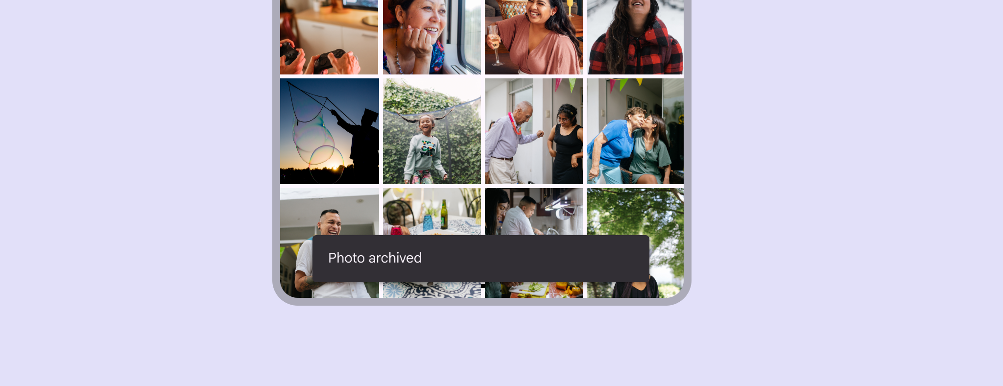

Snackbar at the bottom of a mobile device.

Usage ​

Snackbars inform users of a process that an app has performed or will perform. They appear temporarily, towards the bottom of the screen.

They shouldn't interrupt the user experience. People can browse the page content without being required to interact with the snackbar.

Frequency
Only one snackbar may be displayed at a time.

Actions
A snackbar can contain a single action. "Dismiss" or "cancel" actions are optional.
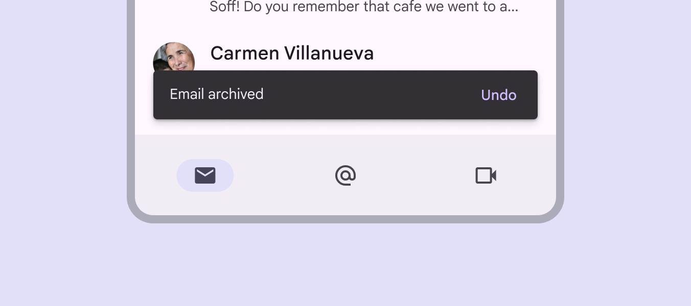
Snackbar showing 'Email archived' text with an 'Undo' text button.

Similar components

DialogsDialogs provide important prompts in a user flow.More on dialogs are also designed to show important messages.

Choose the right component based on the importance of the message. This component messaging strategy can help avoid overusing snackbars.
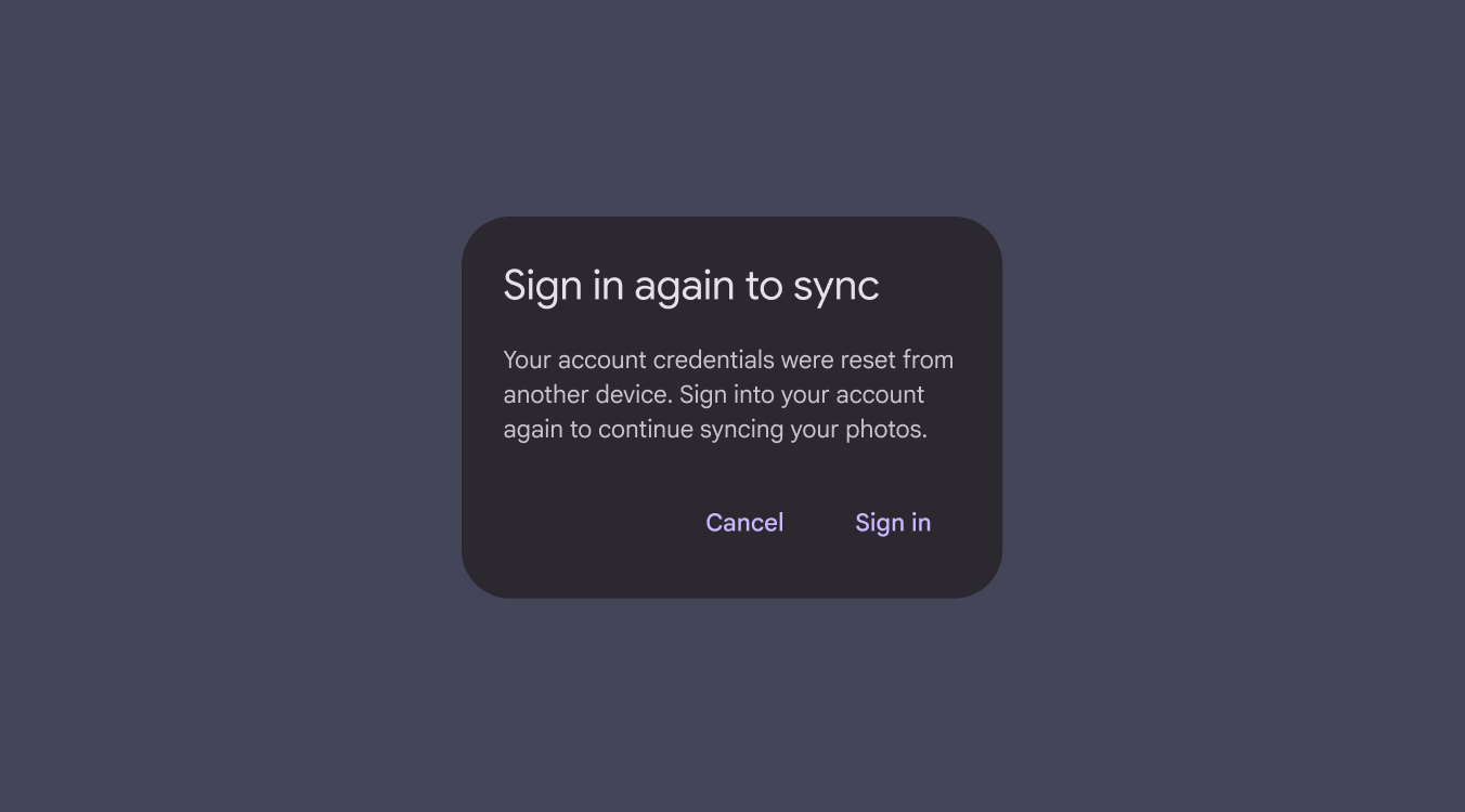
Dialog on a phone requiring the user to sign in to continue. Dismissing prevents them from progressing.
Dialogs require immediate action

When to use snackbars

Snackbars communicate messages that are minimally interruptive and don’t require user action.

ComponentPriorityUser action
SnackbarLow priorityOptional: Snackbars disappear automatically
DialogHigh priorityRequired: Dialogs block app usage until the user takes a dialog action or exits the dialog (if available)

Accessibility requirements for web

On web, auto-dismissing snackbars are inaccessible for people with low vision or who require additional time to perceive information. This can be solved in 2 ways:

1. Add inline feedback

Information in auto-dismissing snackbars must also be communicated using another accessible method inline or near the action that triggered the snackbar.

For example, update the label on a "Save" buttonButtons let people take action and make choices with one tap.More on buttons to “Saved”, and trigger an auto-dismissing snackbar that communicates the same message.

2. Make the snackbar actionable

Alternatively, add actions to the snackbar so it doesn't dismiss until acted on.
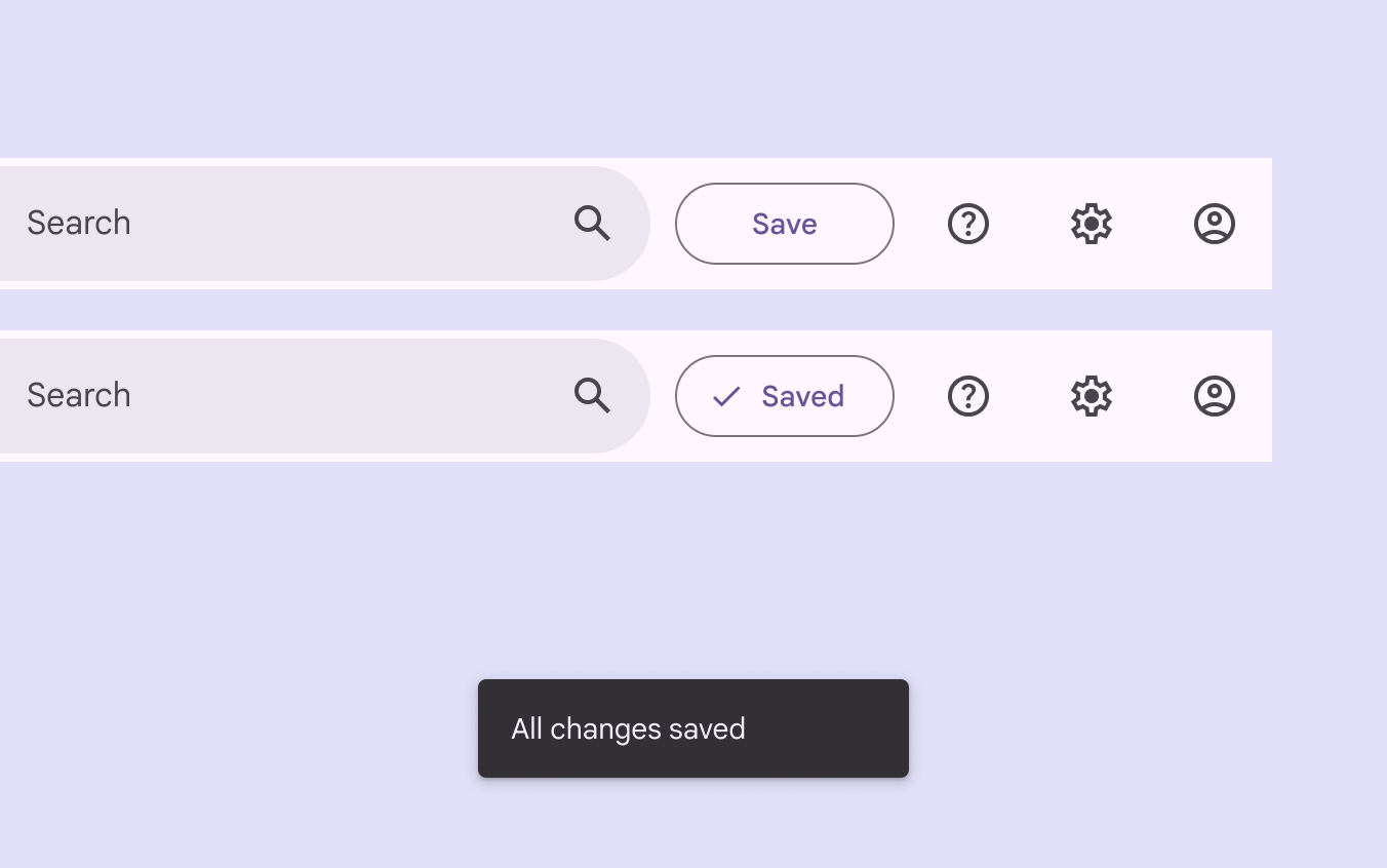
A button labelled "Save" changes to "Saved" after a moment. A snackbar confirms all changes are saved.
Also communicate snackbar information near the action that triggered the snackbar

Anatomy ​

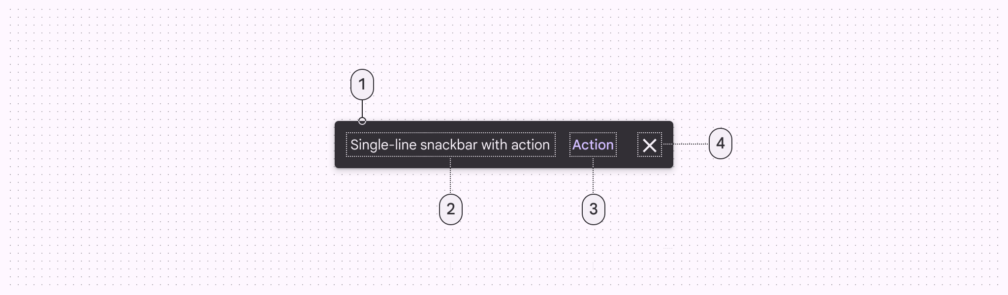
4 elements of a snackbar.
  1. Container
  2. Supporting text
  3. Action (optional)
  4. Close button (optional)

Text label

Snackbars contain a text label that directly relates to the process being performed. In compact breakpointsWindow widths smaller than 600dp, such as a phone in portrait orientation.More on compact breakpoints, the text label can contain up to two lines of text.
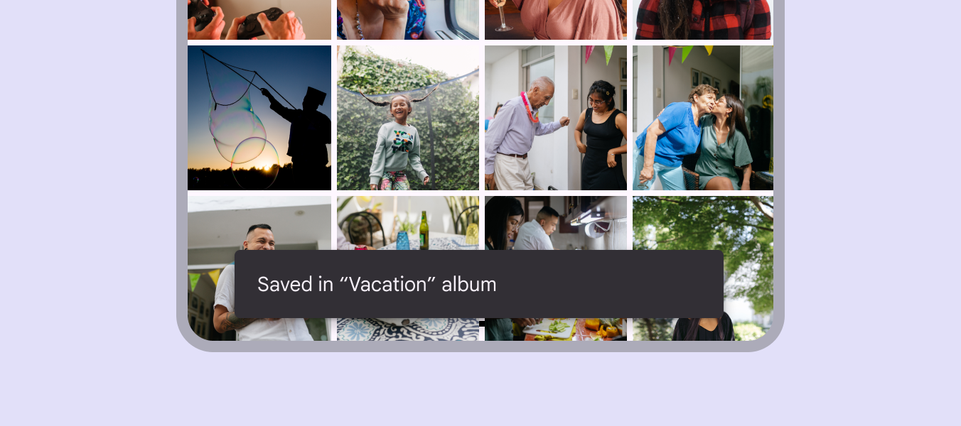
Snackbar on a mobile device reading: "Saved in Vacation album".
Text labels are short, clear updates on processes that have been performed
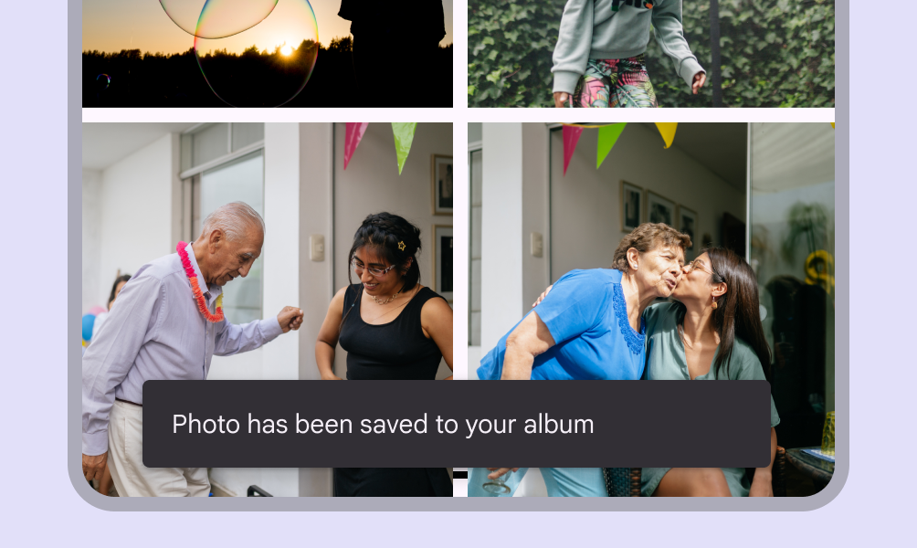
Snackbar on mobile with one line of content.
Do Keep the snackbar text label to one line long when possible
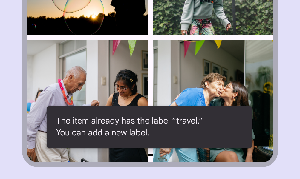
Snackbar on mobile with two lines of content.
Do On mobile, the text label can be up to two lines long
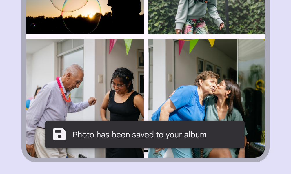
Snackbar on mobile with an icon and one line of content.
Caution Avoid adding icons to snackbars. If your message needs an icon, consider using a different component such as a dialog.
Snackbar on mobile with bolded and hyperlinked words.
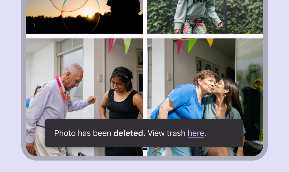
Don't Avoid using stylized text or inline links in snackbars; they can add unwanted complexity. If your message needs a link, add a button instead, or use a different component.

Container

Snackbars are displayed in rectangular containers with a grey background. Containers should be completely opaque, so that text labels remain legible.
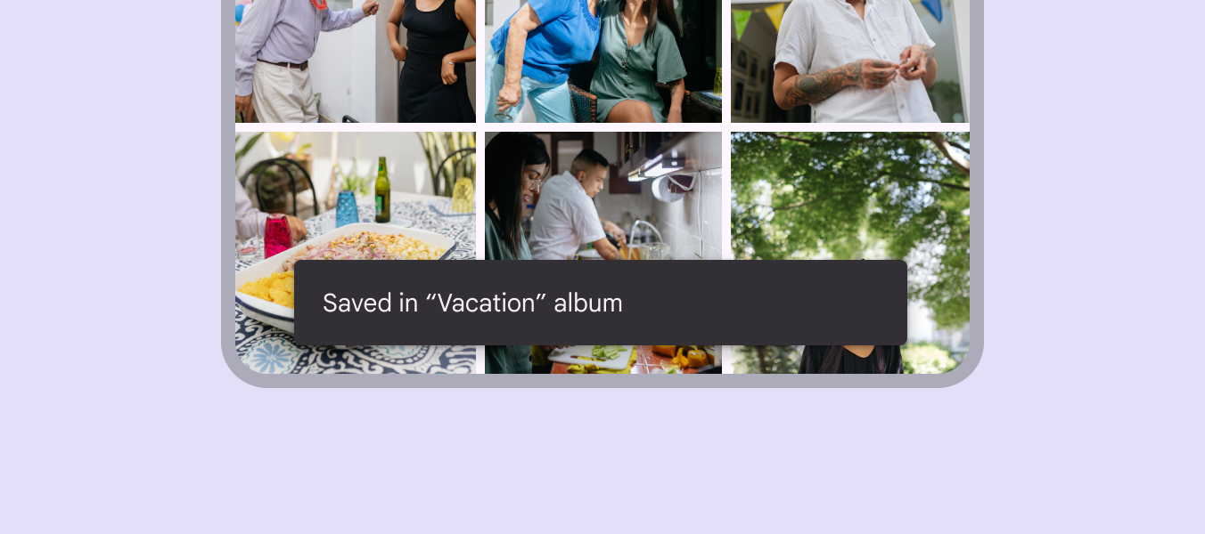
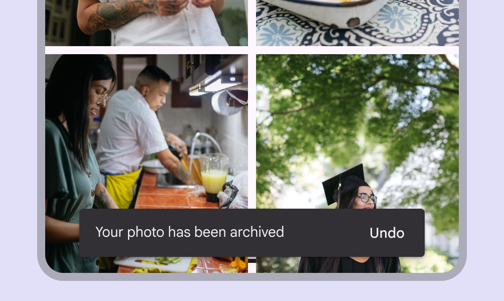
Snackbar showing a light text label on a black color container.
Snackbar containers use a solid background color with a shadow to stand out against content
A snackbar with button text the same color as supporting text.
Don't The text label shouldn’t share the same color as the text button
A snackbar with the action in elevated style.
Don't Don’t use a filled or elevated button in a snackbar, as it draws too much attention
An extended snackbar on tablet with a long text label.
Do In wide layouts, extend the container width to accommodate longer text labels
Snackbar with a slightly transparent container and a clearly visible text label.
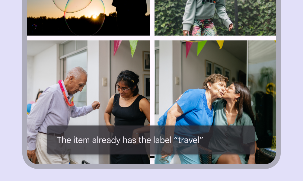
Caution An app can apply slight transparency to the container background, as long as text remains clearly legible
Snackbar with an altered container shape.
Don't Avoid significantly altering the shape of a snackbar container

Action

Snackbars can display a single text button that lets users take action on a process performed by the app. Snackbars shouldn’t be the only way to access a core use case, to make an app usable.
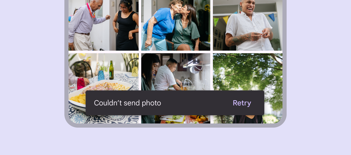
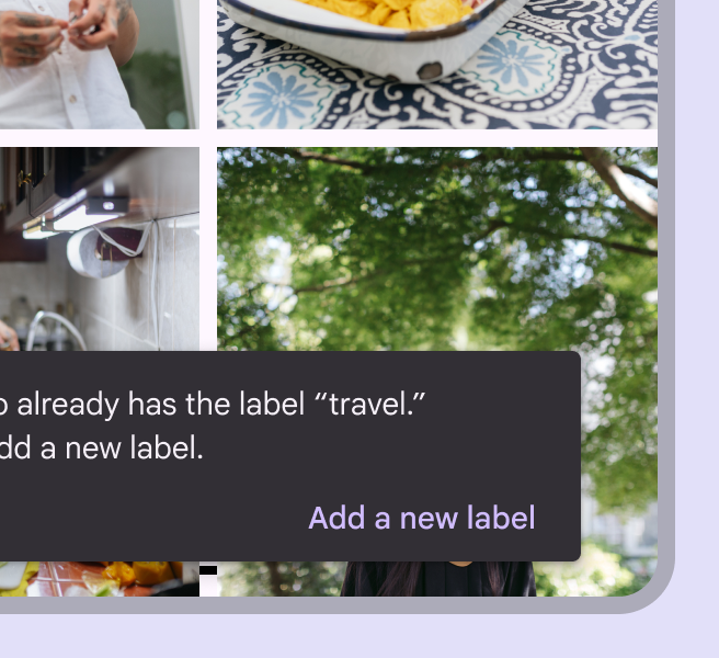
A snackbar container with rounded corners.
To distinguish the action from the text label, text buttons should display colored text
Snackbar with a long text button displayed on a third line.
Do If an action is long, it can be displayed on a third line
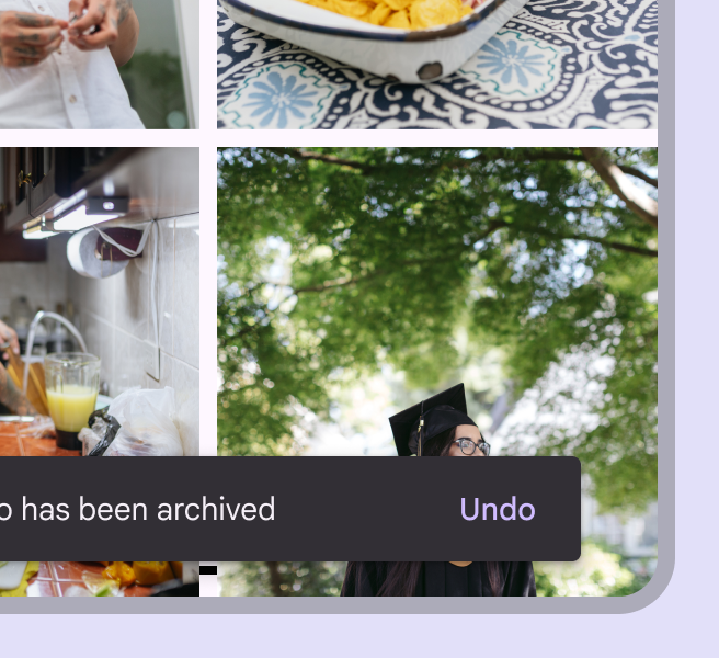
Snackbar with a single text button labeled undo.
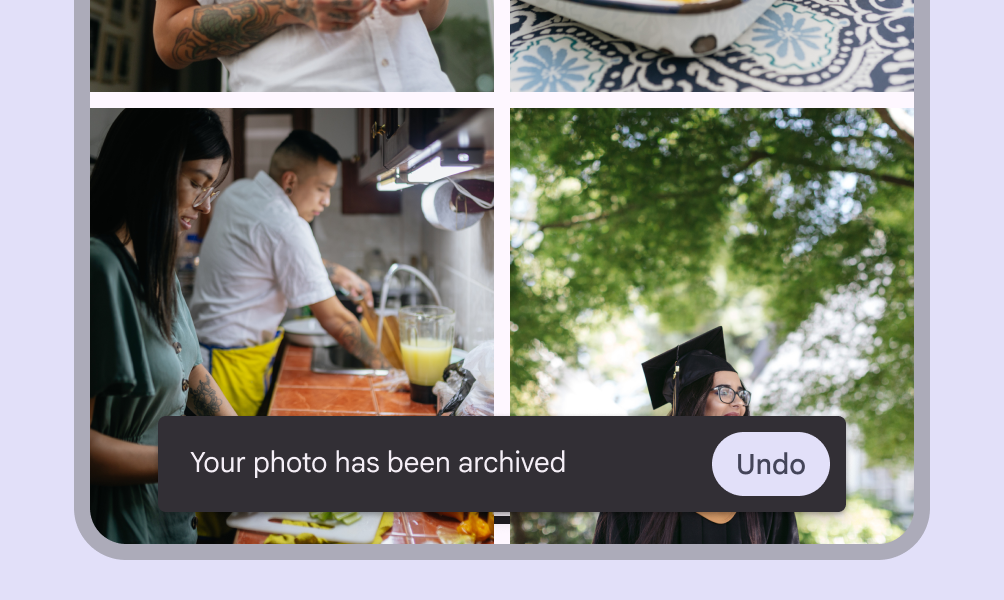
Do To allow users to amend choices, display an "Undo" action
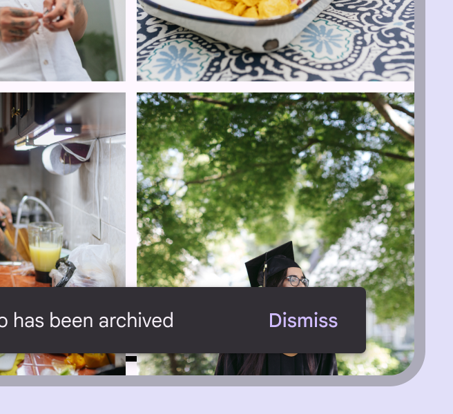
Snackbar with a single text button labeled dismiss.
Caution A dismiss action is unnecessary, as snackbar disappears on their own by default

Placement ​

At the bottom of a UI

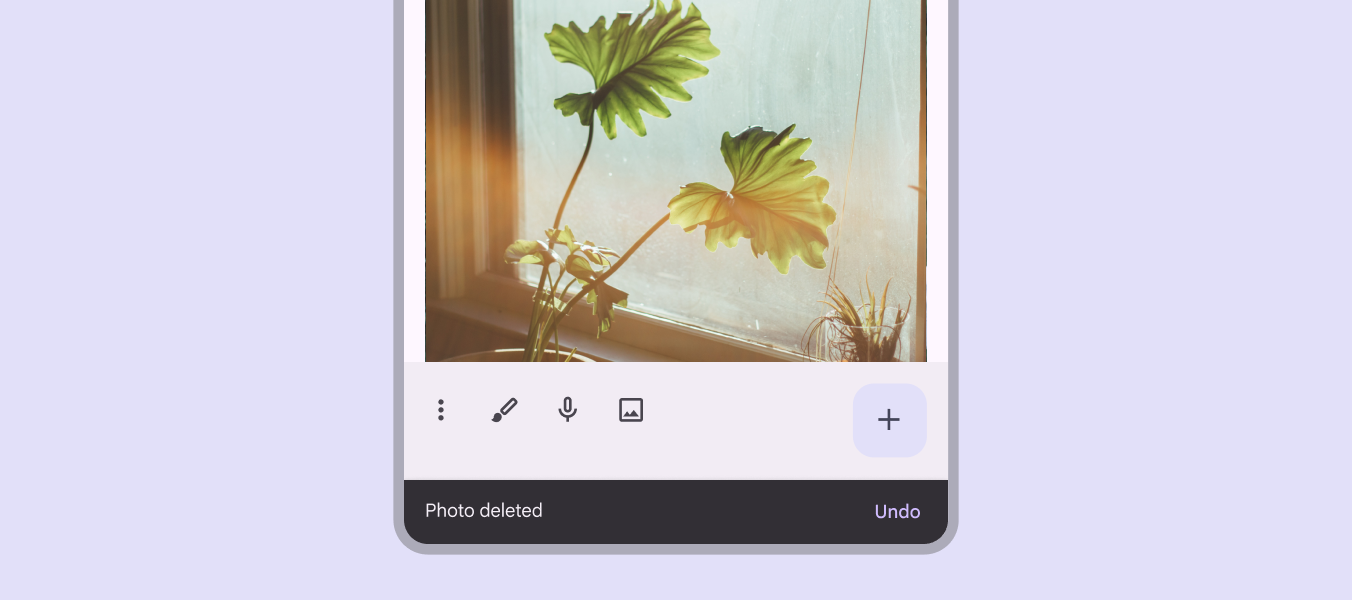
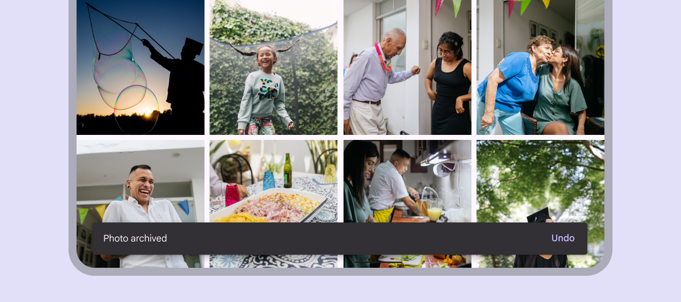
Snackbars should be placed at the bottom of a UI, in front of the main content. In some cases, snackbars can be nudged upwards to avoid overlapping with other UI elements near the bottom, such as FABsFloating action buttons (FABs) help people take primary actions.More on FABs or docked toolbarsDocked toolbars (formerly bottom app bars) are placed at the bottom of the page..

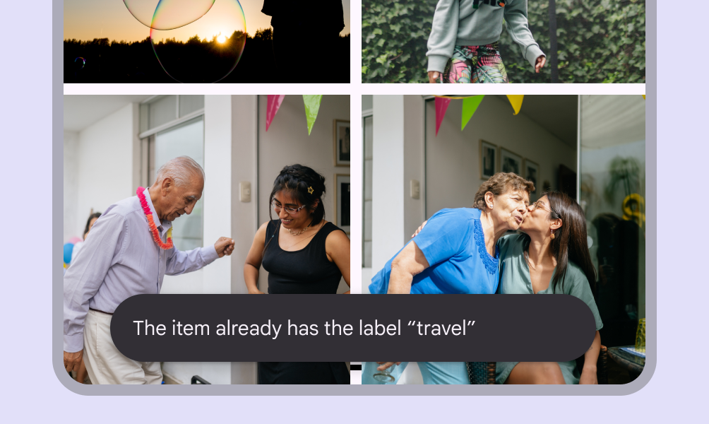
Avoid placing a snackbar in front of frequently used touch targets or navigation.
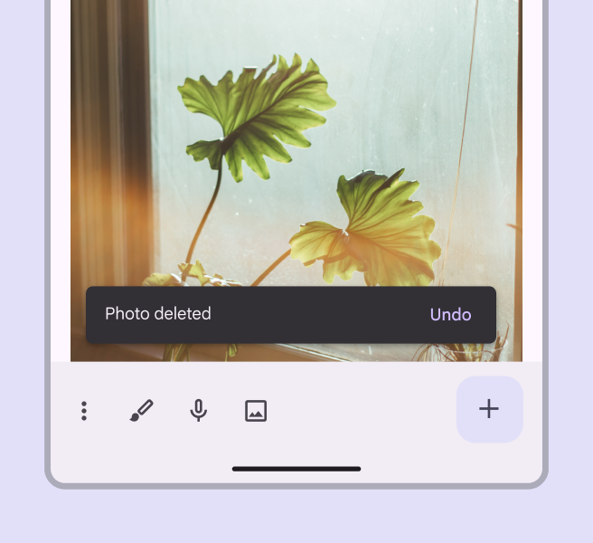
Snackbar appearing in front of photo content.
Do Place a snackbar in front of the main content
Snackbar placed in front of the navigation components.
Don't Avoid placing snackbars in front of navigation components

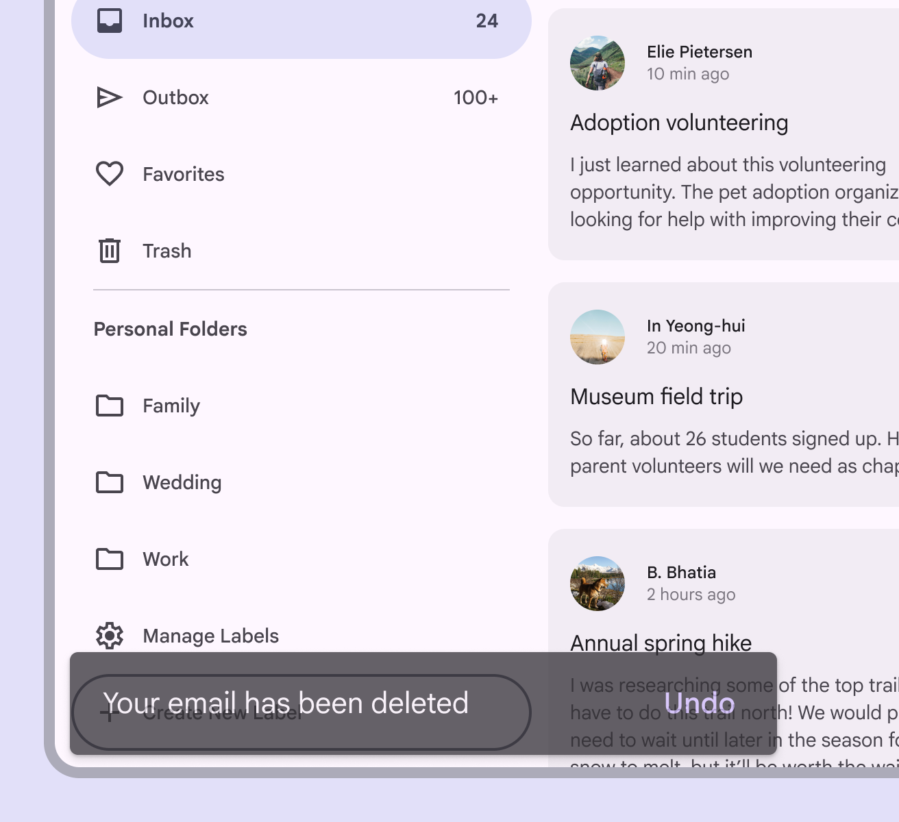
To ensure accessibility for keyboard users on the web, avoid positioning the snackbar in a way that completely obscures actionable elements. Blocking elements makes it difficult to know what is being focused and selected.
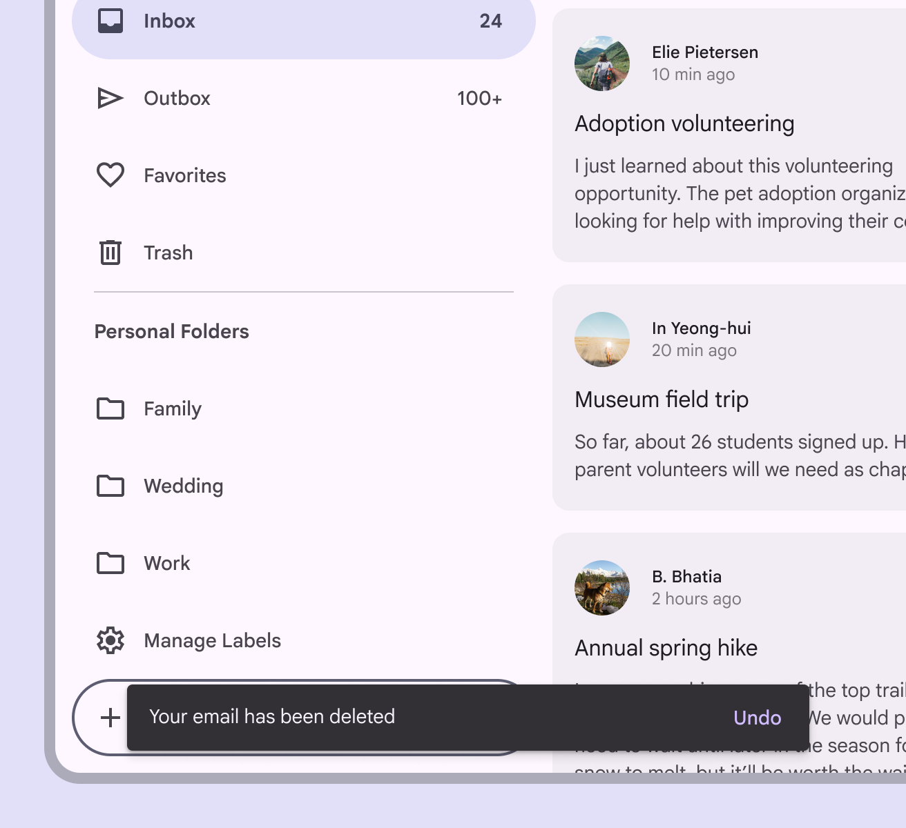
Thin snackbar in front of a focused element that is still visible.
Do Adjust the size of the snackbar to avoid blocking elements in focus
Larger snackbar that is obscuring a focused element.
Don't Don’t let the snackbar fully cover elements in focus

Snackbars can span the entire width of the screen only when a UI does not use persistent navigation components like app bars or navigation barsNavigation bars let people switch between UI views on smaller devices.More on navigation bars.

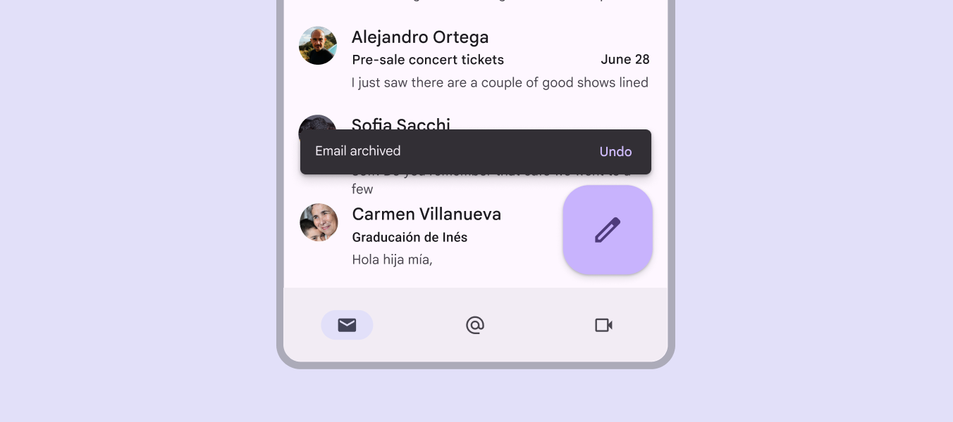
Snackbars that span the entire width of a UI can push up FABsFloating action buttons (FABs) help people take primary actions.More on FABs when they appear.

Snackbar spanning the width of a mobile device is placed in front of the navigation components and FAB.
Caution Snackbars can span the entire width of a UI. However, they should not appear in front of navigation or other important UI elements like floating action buttons.

Snackbars and floating action buttons (FABs)

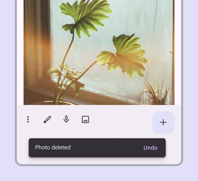
Snackbars should appear above FABsFloating action buttons (FABs) help people take primary actions.More on FABs.

Snackbar placed above a FAB on a mobile device.
Snackbar above a FAB
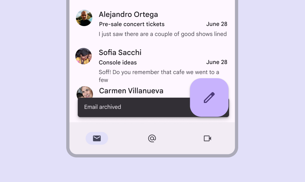
Snackbar placed in front of a FAB on a mobile device.
Don't Don’t place a snackbar in front of a FAB
Snackbar placed behind a FAB on a mobile device.
Don't Don’t place a snackbar behind a FAB

Responsive layout ​

Compact breakpoint

In compact breakpointsWindow widths smaller than 600dp, such as a phone in portrait orientation.More on compact breakpoints, snackbars should expand vertically from 48dp to 64dp to accommodate one or two lines of text, while maintaining a fixed distance from the leading, trailing, and bottom edges of the screen.
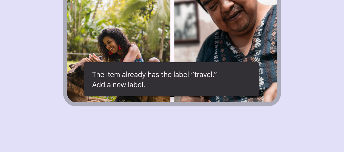
Snackbar with its label text extending to the second line and maintaining fixed distance from the edges of a mobile device.

Medium & expanded breakpoints

On mediumWindow widths from 600dp to 839dp, such as a tablet or foldable in portrait orientation.More on medium breakpoints and expanded breakpointsWindow widths 840dp to 1199dp, such as a tablet or foldable in landscape orientation, or desktop.More on expanded breakpoints, like tablet and desktop, snackbars should scale horizontally to accommodate longer text strings, keeping in mind that the ideal line length for text is typically between 40-60 characters.

Snackbars use a flexible distance from the trailing edge of the screen. Whenever possible, snackbars on medium and large displays should aim for a single line of text with an optional buttonButtons let people take action and make choices with one tap.More on buttons.

A horizontally expanded snackbar placed at the bottom of screen on a medium-size device.

In wider layoutsLayout is the visual arrangement of elements on the screen.More on layout, snackbars can be left-aligned or center-aligned if they are consistently placed on the same spot at the bottom of the screen.
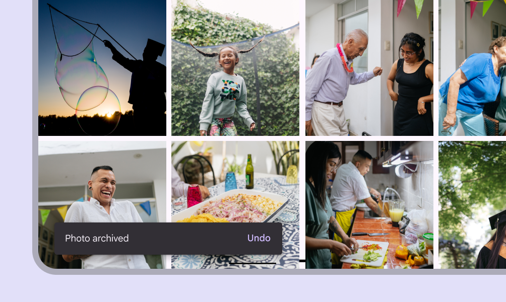

A left-aligned snackbar placed at the bottom of screen on a medium-size device.
Left-aligned snackbar
A center-aligned snackbar placed at the bottom of screen on a medium-size device.
Center-aligned snackbar
Snackbar displayed at the left edge of the screen, near the bottom, on a medium-sized device.
Don't Don’t place snackbars flush to one edge of the layout

2 snackbars placed side-by-side at the bottom of the screen on a medium-size device.
Don't Don’t place consecutive snackbars side by side or next to one another

Behavior ​

Appearing and disappearing

Snackbars appear without warning, but they don’t block users from interacting with page content.

Snackbars without actions can auto-dismiss after 4–10 seconds, depending on platform. Avoid using auto-dismissing snackbars on web unless there's also inline feedback.

Snackbars with actions should remain on the screen until the user takes an action on the snackbar, or dismisses it.

Consecutive snackbars

Consecutive snackbars must appear one at a time.

Snackbars without actions appear and disappear automatically, while those with actions remain on screen until dismissed. However, a snackbar with updated information can immediately replace an outdated snackbar.

Don't Don’t stack snackbars on top of one another
Don't Don’t animate other components along with snackbar animations, such as the floating action button
Pager
Previous pageSnackbar: Specs
Next pageSnackbar: Accessibility

Released under the Apache 2.0 or CC BY 4.0

Copyright © 2018-Present Google

https://m3.material.io/components/snackbar/guidelines

Released under the Apache 2.0 or CC BY 4.0

Copyright © 2018-Present Google