Skip to content
Material Design 3
Main Navigation
v3
v2
v1

English

简体中文
繁體中文
Español
Français
Русский
Português – Brasil
Deutsch
日本語
한국어
Italiano
Polski
Türkçe
čeština
magyar

English

简体中文
繁體中文
Español
Français
Русский
Português – Brasil
Deutsch
日本語
한국어
Italiano
Polski
Türkçe
čeština
magyar

Appearance

Sidebar Navigation

Foundations

Accessibility

Overview: Principles

Overview: Assistive technology

Designing: Overview

Designing: Color contrast

Designing: Structure

Designing: Flow

Designing: Elements

Writing and text: Best practices

Writing and text: Text truncation

Writing and text: Text resizing

Building for all: User needs

Building for all: Co-design

Content design

Overview

Alt text

Global writing: Overview

Global writing: Word choice

Notifications

Style guide: UX writing best practices

Style guide: Word choice

Style guide: Grammar and punctuation

Customizing Material

Devices

Watches: Overview

Watches: Foundations

Watches: Styles

Watches: Layout

XR

Design: Overview

Design: Interaction

Design: Layout

Design: Accessibility

Components: Overview

Components: App bars

Components: Dialogs

Components: Nav bar

Components: Nav rail

Components: Toolbars

Design tokens: Overview

Design tokens: How to use tokens

Interaction

Gestures

Inputs

Selection

States: Overview

States: State layers

States: Applying states

Layout

Overview: Overview

Overview: Parts of layout

Overview: Adaptive design

Scaffold: Overview

Scaffold: Bars

Scaffold: Rails

Scaffold: Panes

Grids & spacing: Overview

Grids & spacing: Grids

Grids & spacing: Spacing

Grids & spacing: Density

Breakpoints: Overview

Breakpoints: Compact

Breakpoints: Medium

Breakpoints: Expanded

Breakpoints: Large & extra-large

Bidirectionality & RTL

Canonical examples: Overview

Canonical examples: Feed

Canonical examples: List-detail

Canonical examples: Supporting pane

Usability: Overview

Usability: Applying M3 Expressive

Material A-Z

Styles

Color

Color system: Overview

Color system: How the system works

Color roles

Color schemes

Choosing a scheme

Static: Baseline

Static: Custom brand

Dynamic: Choosing a source

Dynamic: User-generated source

Dynamic: Content-based source

Advanced: Overview

Advanced: Apply colors

Advanced: Define new colors

Advanced: Adjust existing colors

Color resources

Elevation: Overview

Elevation: Applying elevation

Elevation: Tokens

Icons: Overview

Icons: Designing icons

Icons: Applying icons

Motion

Motion physics system: How it works

Motion physics system: Specs

Easing and duration: Applying easing and duration

Easing and duration: Tokens & specs

Transitions: Transition patterns

Transitions: Applying transitions

Shape: Overview & principles

Shape: Corner radius scale

Shape: Shape morph

Spacing: Overview

Spacing: Applying spacing

Spacing: Tokens

Typography: Overview

Typography: Fonts

Typography: Type scale & tokens

Typography: Applying type

Typography: Editorial treatments

Components

App bars: Overview

App bars: Specs

App bars: Guidelines

App bars: Accessibility

Badges: Overview

Badges: Specs

Badges: Guidelines

Badges: Accessibility

Buttons

All buttons

Button groups: Overview

Button groups: Specs

Button groups: Guidelines

Button groups: Accessibility

Buttons: Overview

Buttons: Specs

Buttons: Guidelines

Buttons: Accessibility

Extended FABs: Overview

Extended FABs: Specs

Extended FABs: Guidelines

Extended FABs: Accessibility

FAB menu: Overview

FAB menu: Specs

FAB menu: Guidelines

FAB menu: Accessibility

FABs: Overview

FABs: Specs

FABs: Guidelines

FABs: Accessibility

Icon buttons: Overview

Icon buttons: Specs

Icon buttons: Guidelines

Icon buttons: Accessibility

Segmented buttons: Overview

Segmented buttons: Specs

Segmented buttons: Guidelines

Segmented buttons: Accessibility

Split button: Overview

Split button: Specs

Split button: Guidelines

Split button: Accessibility

Cards: Overview

Cards: Specs

Cards: Guidelines

Cards: Accessibility

Carousel: Overview

Carousel: Specs

Carousel: Guidelines

Carousel: Accessibility

Checkbox: Overview

Checkbox: Specs

Checkbox: Guidelines

Checkbox: Accessibility

Chips: Overview

Chips: Specs

Chips: Guidelines

Chips: Accessibility

Date & time pickers

Date pickers: Overview

Date pickers: Specs

Date pickers: Guidelines

Date pickers: Accessibility

Time pickers: Overview

Time pickers: Specs

Time pickers: Guidelines

Time pickers: Accessibility

Dialogs: Overview

Dialogs: Specs

Dialogs: Guidelines

Dialogs: Accessibility

Divider: Overview

Divider: Specs

Divider: Guidelines

Divider: Accessibility

Lists: Overview

Lists: Specs

Lists: Guidelines

Lists: Accessibility

Loading & progress

Loading indicator: Overview

Loading indicator: Specs

Loading indicator: Guidelines

Loading indicator: Accessibility

Progress indicators: Overview

Progress indicators: Specs

Progress indicators: Guidelines

Progress indicators: Accessibility

Menus: Overview

Menus: Specs

Menus: Guidelines

Menus: Accessibility

Navigation

Navigation bar: Overview

Navigation bar: Specs

Navigation bar: Guidelines

Navigation bar: Accessibility

Navigation drawer: Overview

Navigation drawer: Specs

Navigation drawer: Guidelines

Navigation drawer: Accessibility

Navigation rail: Overview

Navigation rail: Specs

Navigation rail: Guidelines

Navigation rail: Accessibility

Radio button: Overview

Radio button: Specs

Radio button: Guidelines

Radio button: Accessibility

Search: Overview

Search: Specs

Search: Guidelines

Search: Accessibility

Sheets

Bottom sheets: Overview

Bottom sheets: Specs

Bottom sheets: Guidelines

Bottom sheets: Accessibility

Side sheets: Overview

Side sheets: Specs

Side sheets: Guidelines

Side sheets: Accessibility

Sliders: Overview

Sliders: Specs

Sliders: Guidelines

Sliders: Accessibility

Snackbar: Overview

Snackbar: Specs

Snackbar: Guidelines

Snackbar: Accessibility

Switch: Overview

Switch: Specs

Switch: Guidelines

Switch: Accessibility

Tabs: Overview

Tabs: Specs

Tabs: Guidelines

Tabs: Accessibility

Text fields: Overview

Text fields: Specs

Text fields: Guidelines

Text fields: Accessibility

Toolbars: Overview

Toolbars: Specs

Toolbars: Guidelines

Toolbars: Accessibility

Tooltips: Overview

Tooltips: Specs

Tooltips: Guidelines

Tooltips: Accessibility

On this page

Notifications ​

Notifications help people see information they need or want at the right time


Notifications should:

  • Be about the user, not the product
  • Be precise, timely, actionable, contextual, and relevant
  • Give users easy controls to opt out
  • Not be used to send unsolicited ads

A visual representing Material Design 3 notifications.

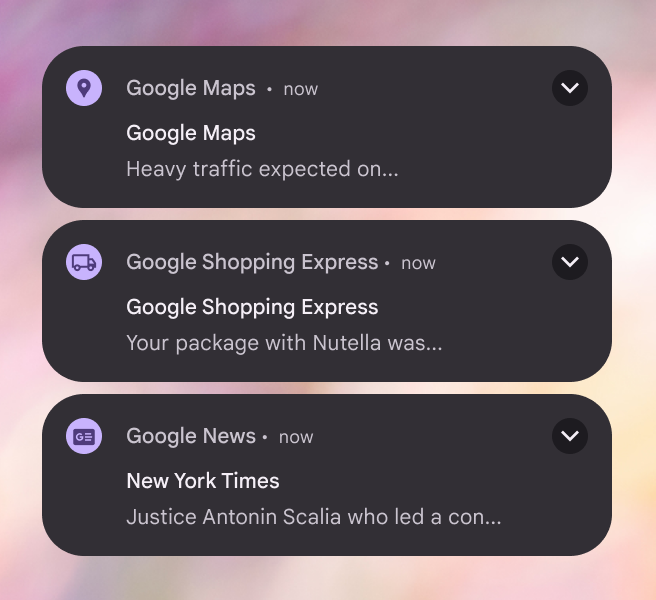
Put important information at the top

Put the most important info at the beginning and make it easy to understand. People skim rather than read, often in an F shape. When it makes sense, try to move the most critical information to the front of sentences, rather than the end, where it may get overlooked or truncated.
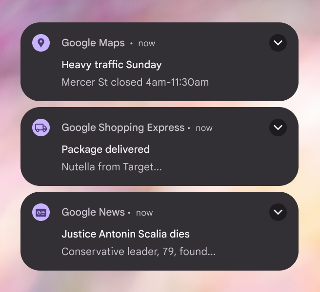
Three notifications from Google apps that include the point of the notification in the header.
Do Prioritize the most important information
Three notifications from Google apps that include app names repeated in the header, instead of important information.
Don’t Don’t waste characters on app names, niceties, or unimportant information

Tell users what they can do

If you’re prompting someone to take action, make that clear. CTAs should be concise, specific, and actionable. If you know what motivates people to take action, add it.
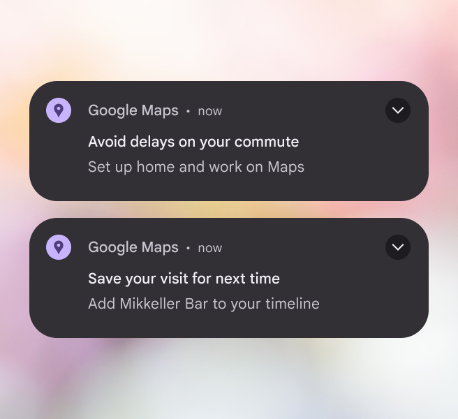
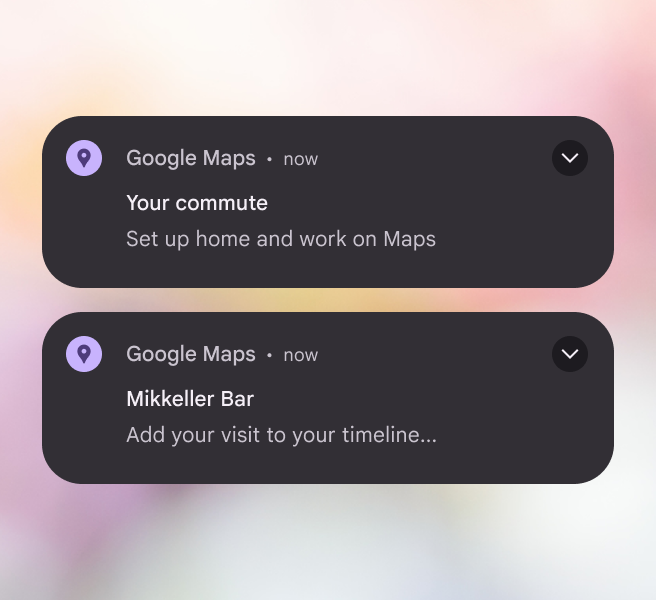
Two notifications from Google maps that include actionable information in the header.
Do Clearly guide the user to their next action
Two notifications from Google apps with non-actionable headers.
Don’t Don’t bury next steps

Make it relevant and personal

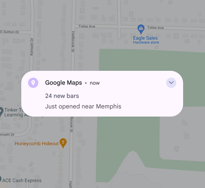
A notification shouldn’t be sent to everyone. The more you broaden the audience and the message for a notification, the more you risk being irrelevant. Consider user segments, in-app behavior, and personalized information to make sure notifications go to people who will benefit most from them.
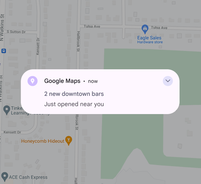
A Google maps notification in Memphis, TN that’s personalized to the user’s location downtown.
Do Be specific to capture user attention
A Google maps notification in Memphis, TN that’s generic to the city, rather than the area.
Don’t Don’t be so generic as to lose value

Avoid dynamic text

Dynamic text are words that are implemented by engineering to change based on the user or context, like adding a user’s campaign name to headline or “good afternoon” when users log in at certain times.

Try not to use dynamic text in notifications. It often breaks character limits, especially in headlines when translated. Text that gets truncated in the headline will not expand, even in expandable notifications. If you must use dynamic text in the headline, try to pair it with no more than one additional word. Create a backup notification that fits the character count when your primary notification won’t.
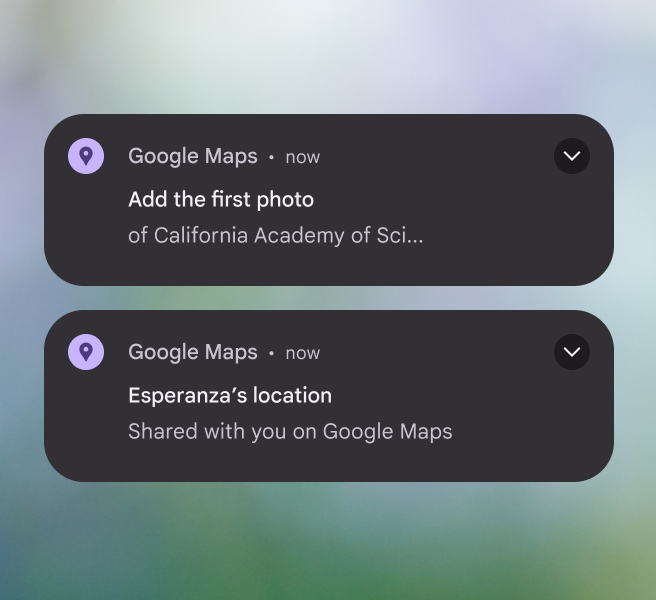
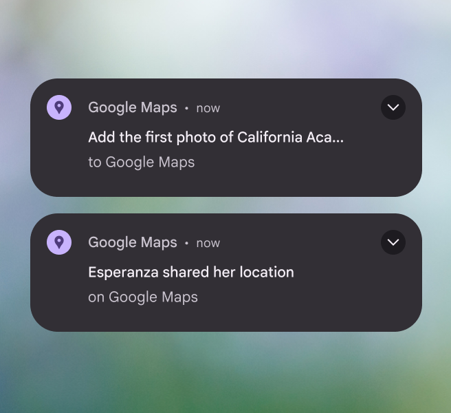
Two notifications, one with dynamic text in the body, and the other with dynamic text in the header that’s formatted to always be short.
Do Place dynamic text in the notification body, where there is more space. If you place dynamic text in the title, keep it very short.
Two notifications with dynamic text in the header that’s too long and truncates.
Don’t Don’t place dynamic text in a long notification title

Mind your characters

Stay within these suggested character counts so text doesn’t get cut off:

  • Title: <29 chars
  • Collapsed body: <40 chars
  • Expanded body: <80 chars; start with collapsed body and add to it
  • Button: 1-2 buttons (1-2 words each)

There’s more room for text on later versions of Android, but these limits are still recommended to prevent truncation on smaller devices.
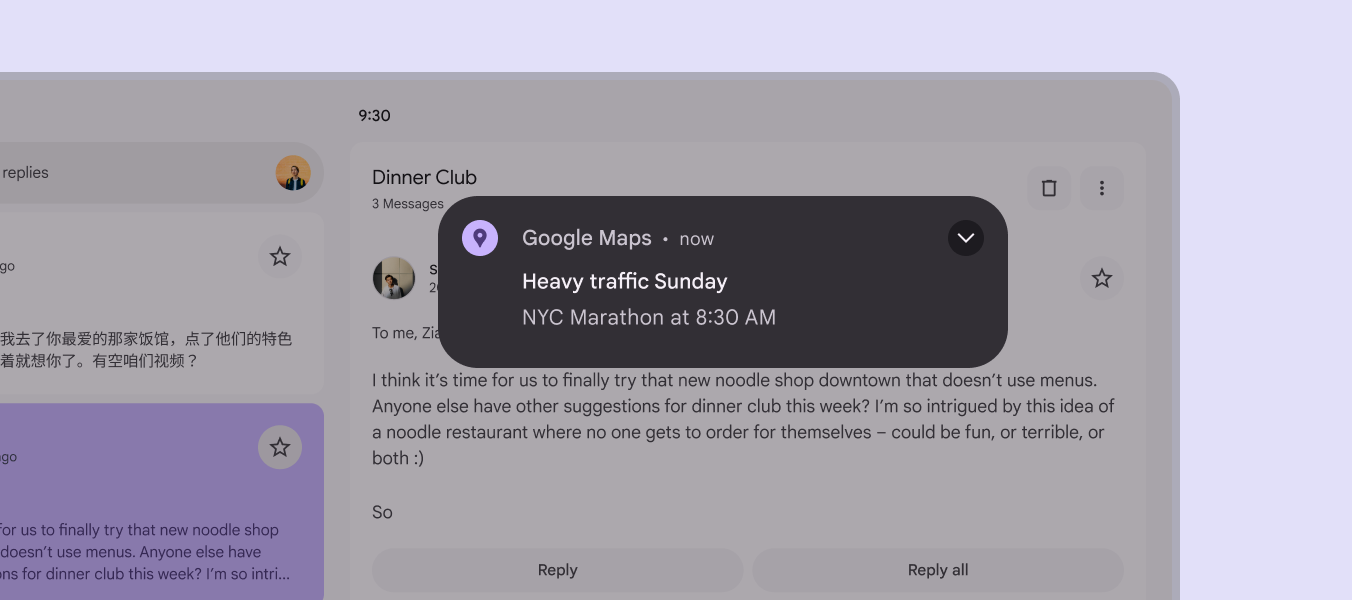
A short, relevant, and informative notification.
Do Keep notifications short and information-dense

SMS messages

SMS helps users get messages when they might not have access to their Google Account. It’s used for important or urgent communication only.

SMS breaks into multiple messages after a certain number of characters, resulting in increased costs. To avoid this, stick to the following character limits:

  • Latin languages: <160 characters
  • Non-latin languages: <134 characters

If translation is needed, let translators know about the character limits in the message description.
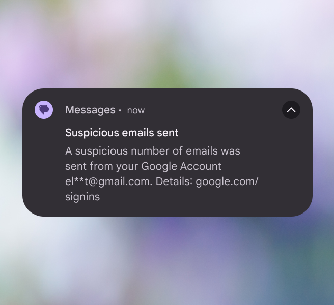
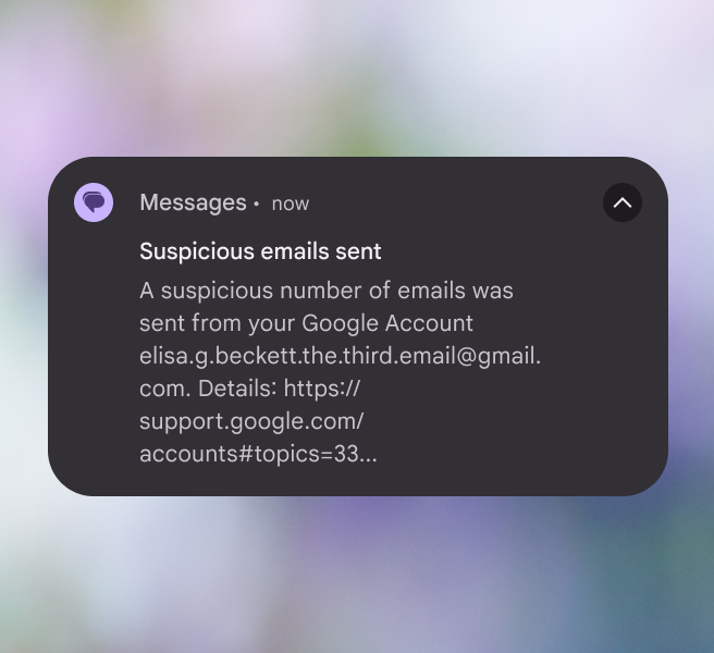
An SMS notification that’s brief and truncates sensitive information.
Do SMS messages should be brief and important
An SMS notification that’s too long with too many links.
Don’t Don’t use full emails or website links for text length

Emoji with caution

Use emoji sparingly. Many don’t translate and aren’t universally understood across cultures. Experiments show that face and hand gesture emoji perform better than generic emoji because they tell a better story. Emoji should enhance content, not replace it.

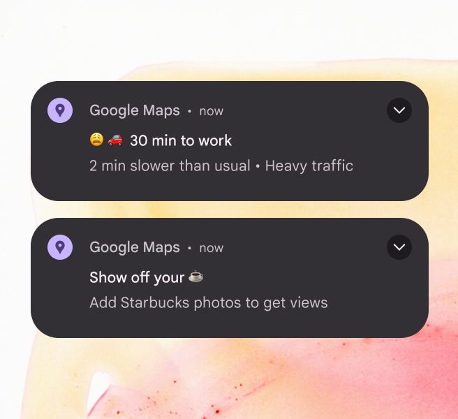
Since it’s not clear to users whether emoji mean we’re sympathizing with them or attempting to project our feelings onto them, don’t use emoji to accentuate bad news. In experiments, there was a strong negative reaction to negative emoji, such as frowning face, anguished face, and weary face.

Gen Z adds another cultural nuance to emoji by inventing new meanings that go beyond the official or literal definitions.
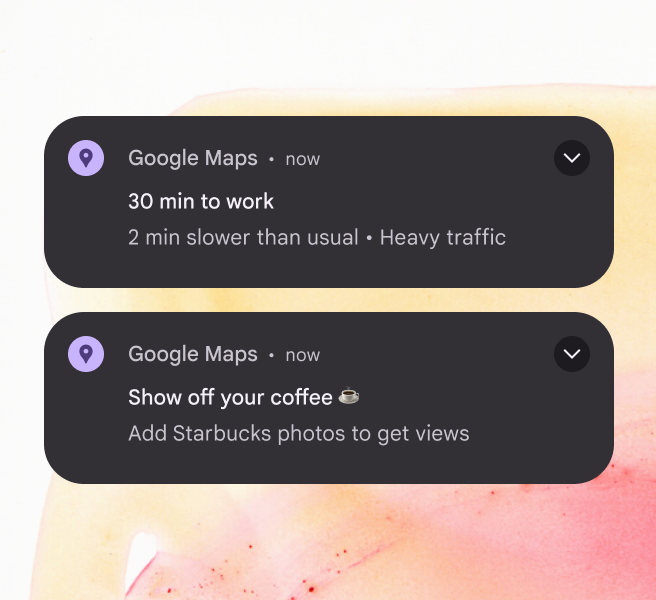
A notification about coffee with a coffee emoji at the end of the header.
Do Use emoji only to enhance a message
A notification about high traffic volume on a route to work that uses upset emoji. A notification about coffee that substitutes a coffee emoji for the word “coffee.”
Don’t Don’t add negative emotions to a message. Don’t replace words with emoji.

Don’t overdo delight

What seems funny or cute may not come across that way. When vying for limited user attention, be useful. Don’t focus on delight: delicately added and tested polish can better support Google’s brand.
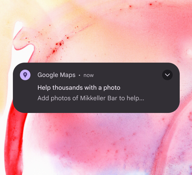
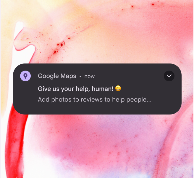
A notification that’s short and effective.
Do Prioritize straightforward and useful messages
A notification that’s meant to be funny, but comes across as creepy where the application calls the user “human.”
Don’t Jokes aren’t appropriate for notifications

Be day-specific

Use the days of the week. Don’t use “today,” “tomorrow,” “tonight,” or similar words. About 20% of users don’t see notifications on the day they’re sent, so “tomorrow” might be read when it’s “today” for the user.

An exception is when a notification auto-dismisses at a specific timestamp.
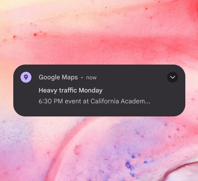
A notification that specifies a day of the week.
Do Specify the day of the week so that it makes sense if someone reads it the following day
A notification that uses relative terms like “today” or “tomorrow.”
Don’t Don’t use relative terms like “today” or “tomorrow”

Don’t interrupt the flow

If you have notifications or emails related to the onboarding process, make sure they don’t trigger during onboarding.
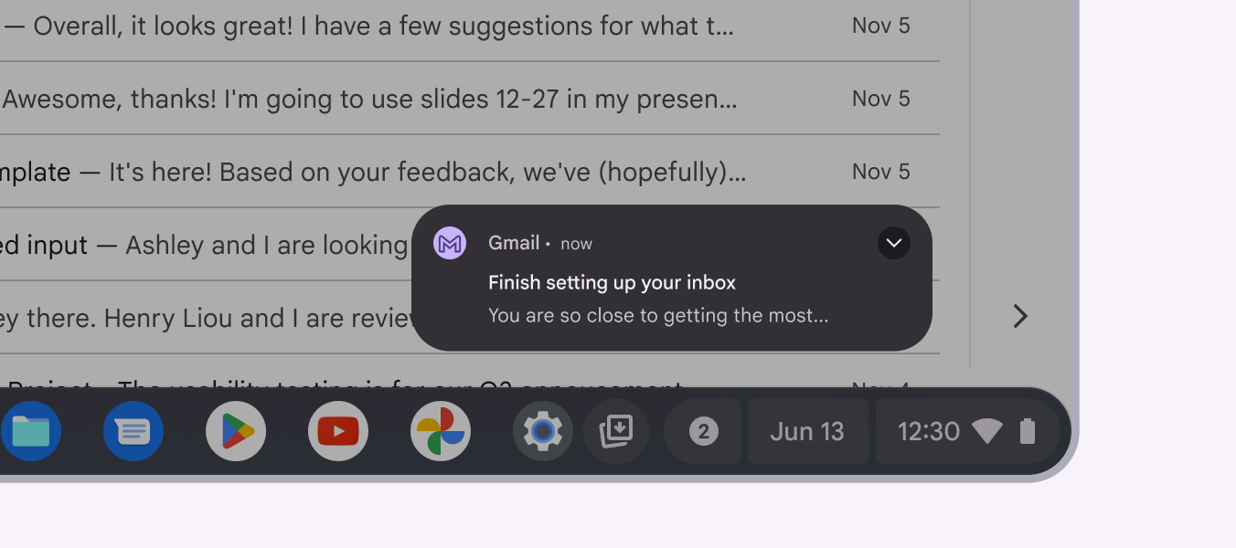
A notification interrupting a user during an important moment.
Don’t Don’t prompt the user with a notification or email that might interrupt an important moment

Don’t name the product (again)

An app’s name or logo is already included in a notification’s design. Use the limited space for other information.
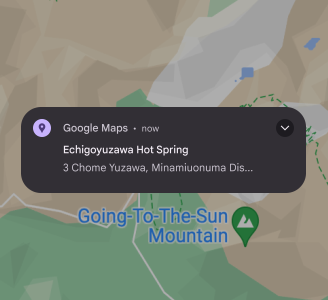
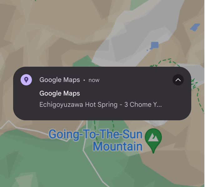
A notification using its space for useful information instead of repeating the app name.
Do Use the available space for useful information
A notification that repeats the app name already shown by the OS.
Don’t Don’t waste space repeating information that is already included by the OS

Opting in and out

Give users a way to opt-out of notifications in context. If you don’t, they’ll have to dig into settings and may get frustrated. If you do offer opt-outs or opt-ins, make it clear what benefit the user is getting or losing.
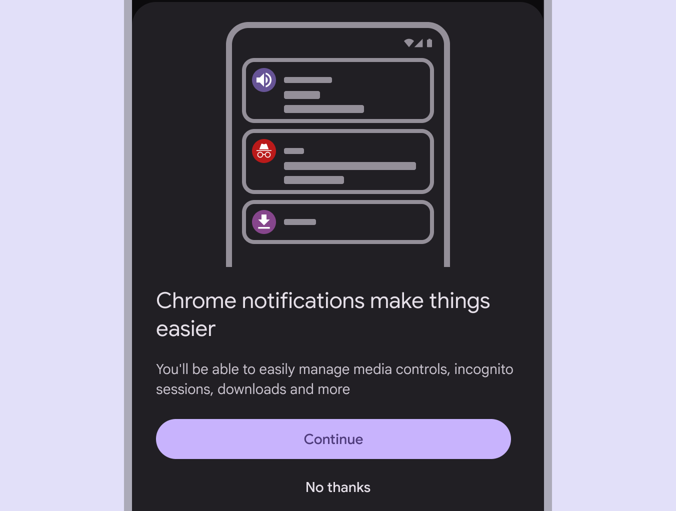
A notification with clear controls to opt in or out.
Do Make it easy for users to start or stop receiving notifications
Pager
Previous pageGlobal writing: Word choice
Next pageStyle guide: UX writing best practices

Released under the Apache 2.0 or CC BY 4.0

Copyright © 2018-Present Google

https://m3.material.io/foundations/content-design/notifications

Released under the Apache 2.0 or CC BY 4.0

Copyright © 2018-Present Google