Skip to content
Material Design 3
Main Navigation
v3
v2
v1

English

简体中文
繁體中文
Español
Français
Русский
Português – Brasil
Deutsch
日本語
한국어
Italiano
Polski
Türkçe
čeština
magyar

English

简体中文
繁體中文
Español
Français
Русский
Português – Brasil
Deutsch
日本語
한국어
Italiano
Polski
Türkçe
čeština
magyar

Appearance

Sidebar Navigation

Foundations

Accessibility

Overview: Principles

Overview: Assistive technology

Designing: Overview

Designing: Color contrast

Designing: Structure

Designing: Flow

Designing: Elements

Writing and text: Best practices

Writing and text: Text truncation

Writing and text: Text resizing

Building for all: User needs

Building for all: Co-design

Content design

Overview

Alt text

Global writing: Overview

Global writing: Word choice

Notifications

Style guide: UX writing best practices

Style guide: Word choice

Style guide: Grammar and punctuation

Customizing Material

Devices

Watches: Overview

Watches: Foundations

Watches: Styles

Watches: Layout

XR

Design: Overview

Design: Interaction

Design: Layout

Design: Accessibility

Components: Overview

Components: App bars

Components: Dialogs

Components: Nav bar

Components: Nav rail

Components: Toolbars

Design tokens: Overview

Design tokens: How to use tokens

Interaction

Gestures

Inputs

Selection

States: Overview

States: State layers

States: Applying states

Layout

Overview: Overview

Overview: Parts of layout

Overview: Adaptive design

Scaffold: Overview

Scaffold: Bars

Scaffold: Rails

Scaffold: Panes

Grids & spacing: Overview

Grids & spacing: Grids

Grids & spacing: Spacing

Grids & spacing: Density

Breakpoints: Overview

Breakpoints: Compact

Breakpoints: Medium

Breakpoints: Expanded

Breakpoints: Large & extra-large

Bidirectionality & RTL

Canonical examples: Overview

Canonical examples: Feed

Canonical examples: List-detail

Canonical examples: Supporting pane

Usability: Overview

Usability: Applying M3 Expressive

Material A-Z

Styles

Color

Color system: Overview

Color system: How the system works

Color roles

Color schemes

Choosing a scheme

Static: Baseline

Static: Custom brand

Dynamic: Choosing a source

Dynamic: User-generated source

Dynamic: Content-based source

Advanced: Overview

Advanced: Apply colors

Advanced: Define new colors

Advanced: Adjust existing colors

Color resources

Elevation: Overview

Elevation: Applying elevation

Elevation: Tokens

Icons: Overview

Icons: Designing icons

Icons: Applying icons

Motion

Motion physics system: How it works

Motion physics system: Specs

Easing and duration: Applying easing and duration

Easing and duration: Tokens & specs

Transitions: Transition patterns

Transitions: Applying transitions

Shape: Overview & principles

Shape: Corner radius scale

Shape: Shape morph

Spacing: Overview

Spacing: Applying spacing

Spacing: Tokens

Typography: Overview

Typography: Fonts

Typography: Type scale & tokens

Typography: Applying type

Typography: Editorial treatments

Components

App bars: Overview

App bars: Specs

App bars: Guidelines

App bars: Accessibility

Badges: Overview

Badges: Specs

Badges: Guidelines

Badges: Accessibility

Buttons

All buttons

Button groups: Overview

Button groups: Specs

Button groups: Guidelines

Button groups: Accessibility

Buttons: Overview

Buttons: Specs

Buttons: Guidelines

Buttons: Accessibility

Extended FABs: Overview

Extended FABs: Specs

Extended FABs: Guidelines

Extended FABs: Accessibility

FAB menu: Overview

FAB menu: Specs

FAB menu: Guidelines

FAB menu: Accessibility

FABs: Overview

FABs: Specs

FABs: Guidelines

FABs: Accessibility

Icon buttons: Overview

Icon buttons: Specs

Icon buttons: Guidelines

Icon buttons: Accessibility

Segmented buttons: Overview

Segmented buttons: Specs

Segmented buttons: Guidelines

Segmented buttons: Accessibility

Split button: Overview

Split button: Specs

Split button: Guidelines

Split button: Accessibility

Cards: Overview

Cards: Specs

Cards: Guidelines

Cards: Accessibility

Carousel: Overview

Carousel: Specs

Carousel: Guidelines

Carousel: Accessibility

Checkbox: Overview

Checkbox: Specs

Checkbox: Guidelines

Checkbox: Accessibility

Chips: Overview

Chips: Specs

Chips: Guidelines

Chips: Accessibility

Date & time pickers

Date pickers: Overview

Date pickers: Specs

Date pickers: Guidelines

Date pickers: Accessibility

Time pickers: Overview

Time pickers: Specs

Time pickers: Guidelines

Time pickers: Accessibility

Dialogs: Overview

Dialogs: Specs

Dialogs: Guidelines

Dialogs: Accessibility

Divider: Overview

Divider: Specs

Divider: Guidelines

Divider: Accessibility

Lists: Overview

Lists: Specs

Lists: Guidelines

Lists: Accessibility

Loading & progress

Loading indicator: Overview

Loading indicator: Specs

Loading indicator: Guidelines

Loading indicator: Accessibility

Progress indicators: Overview

Progress indicators: Specs

Progress indicators: Guidelines

Progress indicators: Accessibility

Menus: Overview

Menus: Specs

Menus: Guidelines

Menus: Accessibility

Navigation

Navigation bar: Overview

Navigation bar: Specs

Navigation bar: Guidelines

Navigation bar: Accessibility

Navigation drawer: Overview

Navigation drawer: Specs

Navigation drawer: Guidelines

Navigation drawer: Accessibility

Navigation rail: Overview

Navigation rail: Specs

Navigation rail: Guidelines

Navigation rail: Accessibility

Radio button: Overview

Radio button: Specs

Radio button: Guidelines

Radio button: Accessibility

Search: Overview

Search: Specs

Search: Guidelines

Search: Accessibility

Sheets

Bottom sheets: Overview

Bottom sheets: Specs

Bottom sheets: Guidelines

Bottom sheets: Accessibility

Side sheets: Overview

Side sheets: Specs

Side sheets: Guidelines

Side sheets: Accessibility

Sliders: Overview

Sliders: Specs

Sliders: Guidelines

Sliders: Accessibility

Snackbar: Overview

Snackbar: Specs

Snackbar: Guidelines

Snackbar: Accessibility

Switch: Overview

Switch: Specs

Switch: Guidelines

Switch: Accessibility

Tabs: Overview

Tabs: Specs

Tabs: Guidelines

Tabs: Accessibility

Text fields: Overview

Text fields: Specs

Text fields: Guidelines

Text fields: Accessibility

Toolbars: Overview

Toolbars: Specs

Toolbars: Guidelines

Toolbars: Accessibility

Tooltips: Overview

Tooltips: Specs

Tooltips: Guidelines

Tooltips: Accessibility

On this page

Text fields: Guidelines ​

Text fields let users enter text into a UI
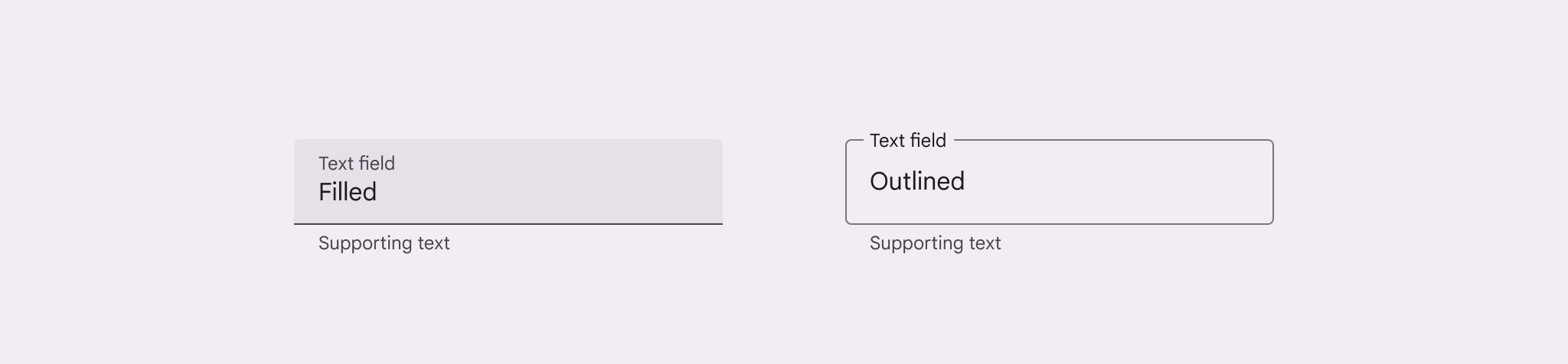

A side by side view of a filled and a outlined text field.
Filled and outlined text fields

Usage ​

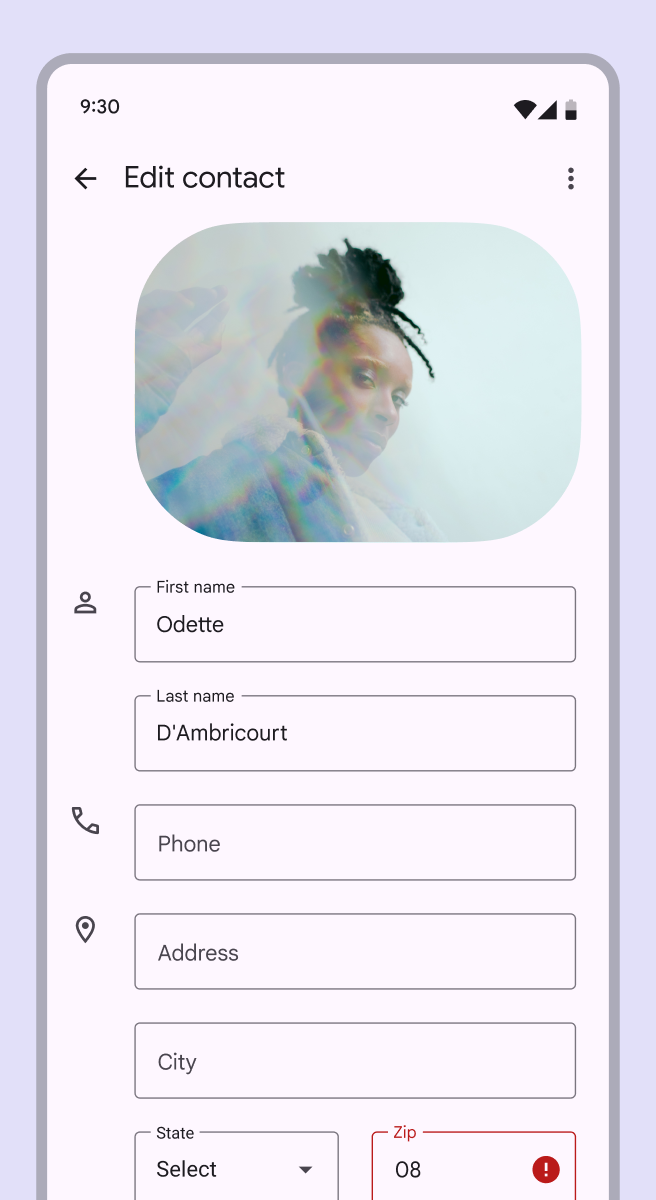
Use a text field when someone needs to enter text into a UI, such as filling in contact or payment information.
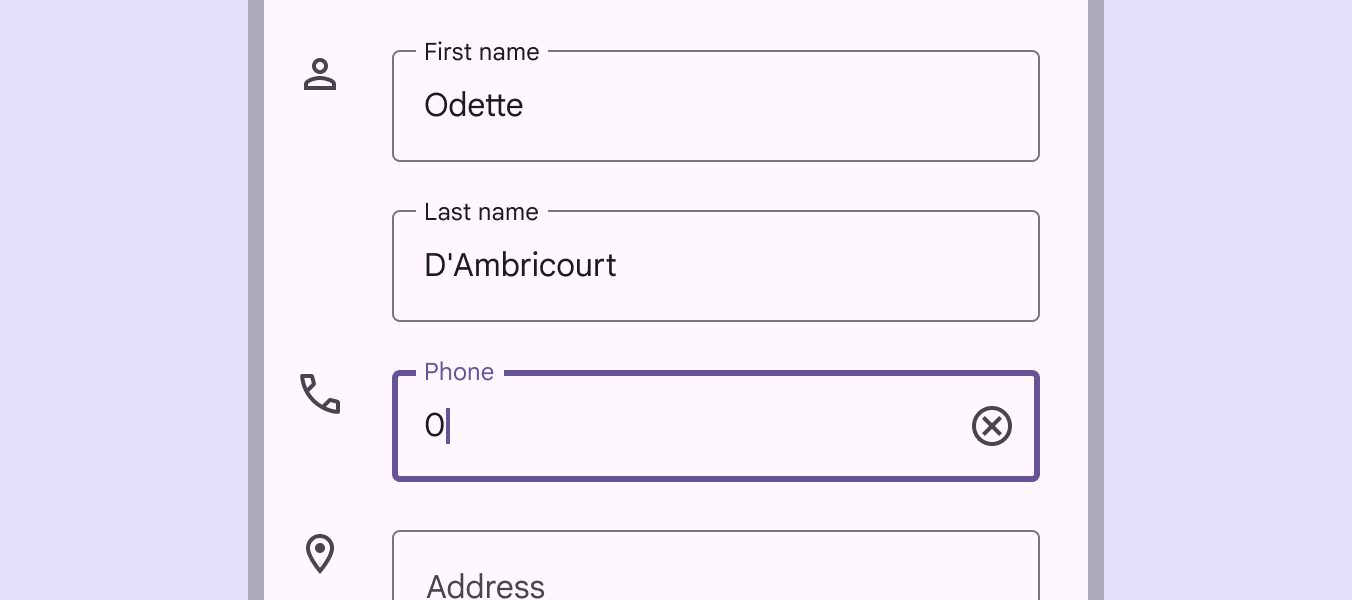
Mobile UI of contact form with several text fields.
Contact form using outlined text fields

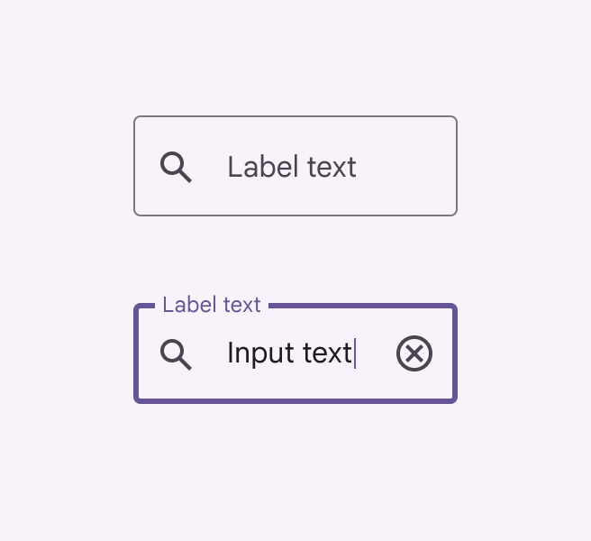
There are two variants of text fields:

  1. Filled text fields
  2. Outlined text fields

Both variants of text fields use a container to provide a visual cue for interaction and provide the same functionality.
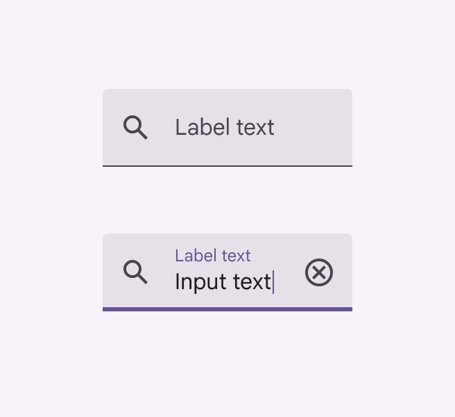
Side by side view of a populated and unpopulated filled text field.
Filled text field
Side by side view of a populated and unpopulated outlined text field.
Outlined text field

Outlined text fields

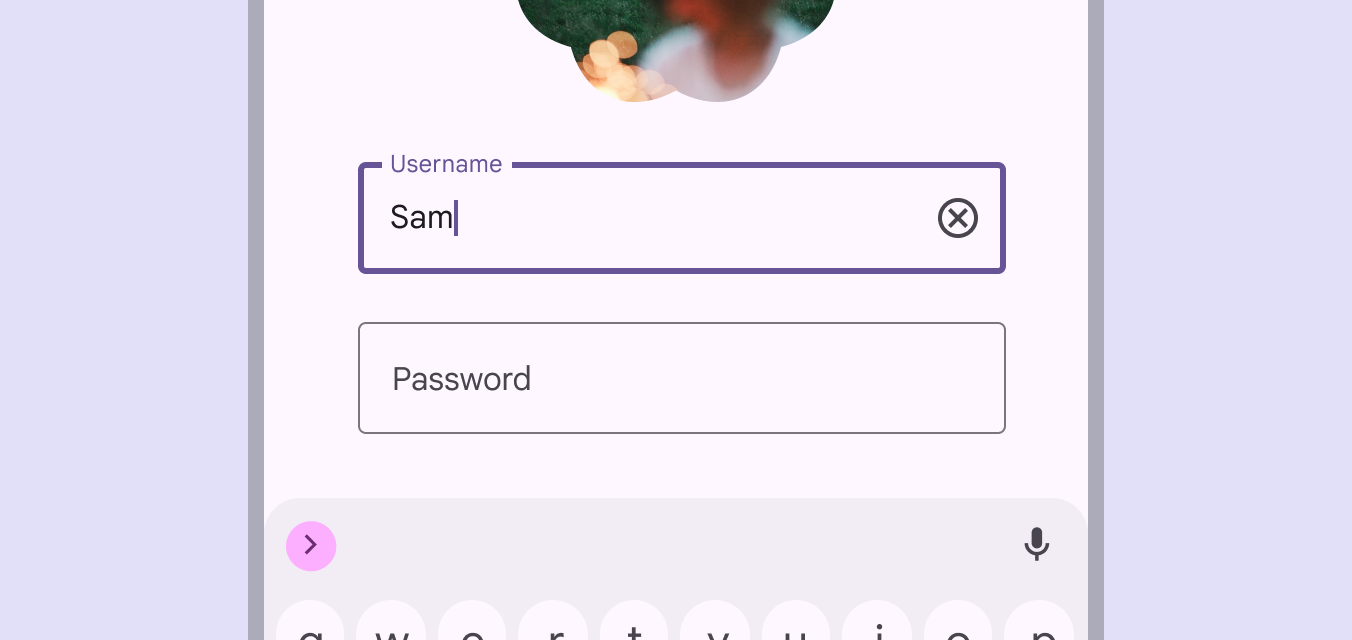
Outlined text fields have less visual emphasis than filled text fieldsFilled text fields have more visual emphasis than outlined text fields. They're often used in dialogs and short forms where their style draws more attention.. When they appear in places like forms (where many text fields are placed together), their reduced emphasis helps simplify the layoutLayout is the visual arrangement of elements on the screen.More on layout.

App screen with 1 focused and 1 unfocused outlined text field.
Login screen with outlined text fields

Choosing text fields ​

Choosing text fields

Both variants of text field provide the same functionality. The variant of text field used can depend on style alone.

Choose the variant that:

  • Works best with an app’s visual style
  • Best accommodates the UI's goals
  • Is most distinct from other components (like buttonsButtons let people take action and make choices with one tap.More on buttons) and surrounding content
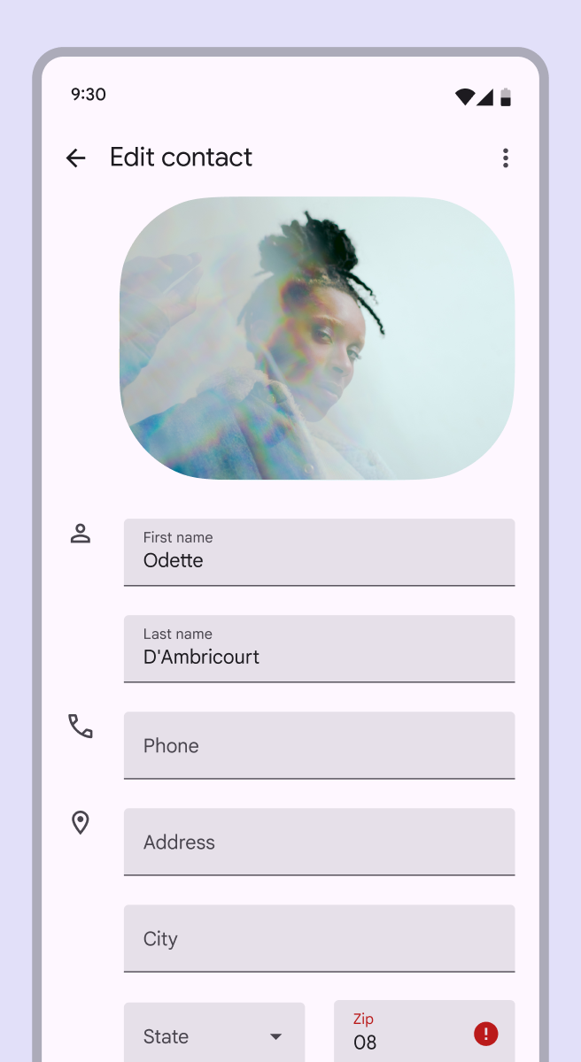
Mobile UI of a contact form with several filled text fields.
Mobile form using filled text fields
Mobile UI of a contact form with several outlined text fields.
The same mobile form using outlined text fields

Using both text field variants on the same screen

If both variants of text field are used in a UI, they should be used consistently within different sections, and not intermixed within the same region.

For example, use outlined text fieldsOutlined text fields have less visual emphasis than filled text fields. They're often used in long forms where their reduced emphasis helps simplify the layout. in one section and filled text fieldsFilled text fields have more visual emphasis than outlined text fields. They're often used in dialogs and short forms where their style draws more attention. in another.
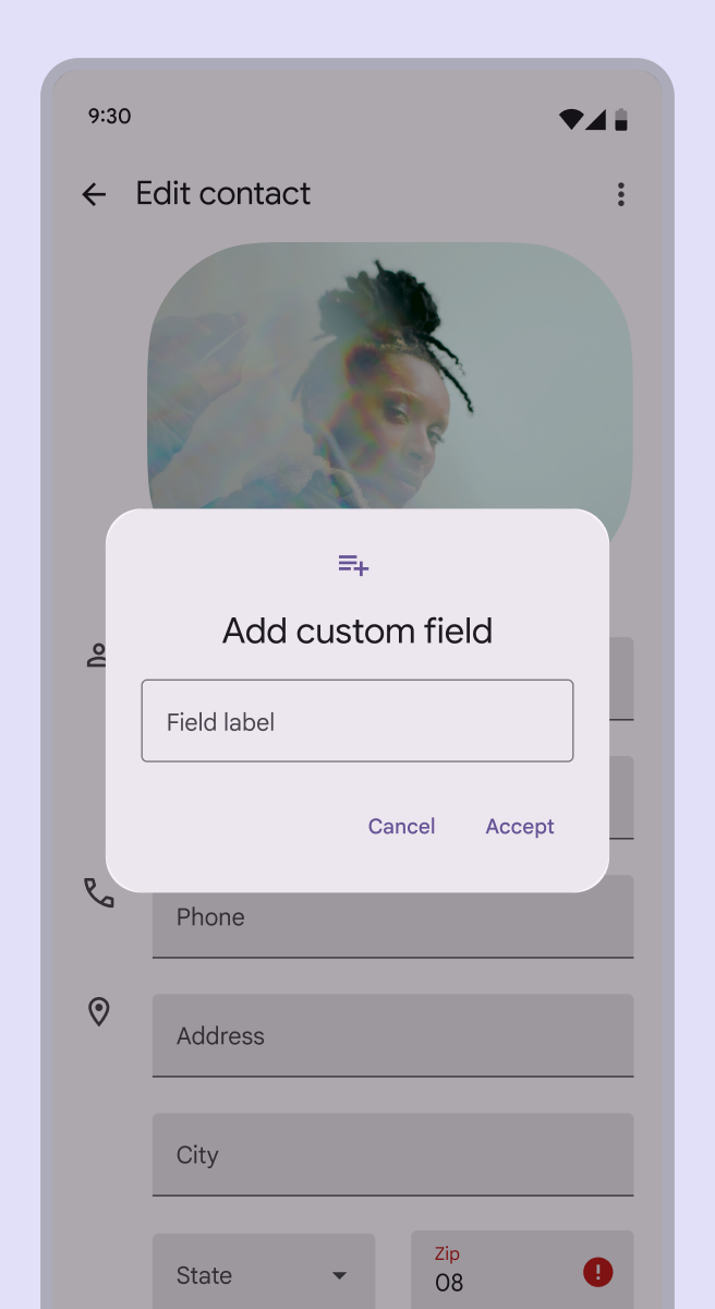
Mobile UI of a contact form with several filled text fields, and an open dialog on top using an outlined text field.
Do When using both variants of text fields in a UI, separate them by region
Mobile UI of a contact form with a mix of outlined and filled text fields.
Don't When using both variants of text fields, don't use both next to each other or within the same form

Anatomy ​

Filled text field ​


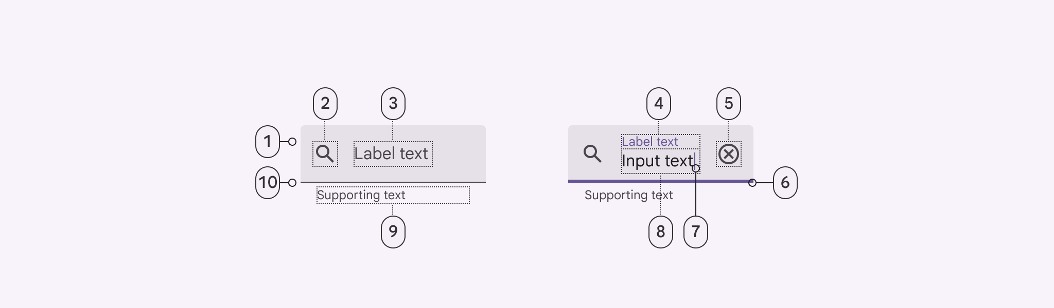
Diagram of filled text field indicating the 10 parts of its anatomy.
  1. Container
  2. Leading icon (optional)
  3. Label text in empty field
  4. Label text in populated field
  5. Trailing icon (optional)
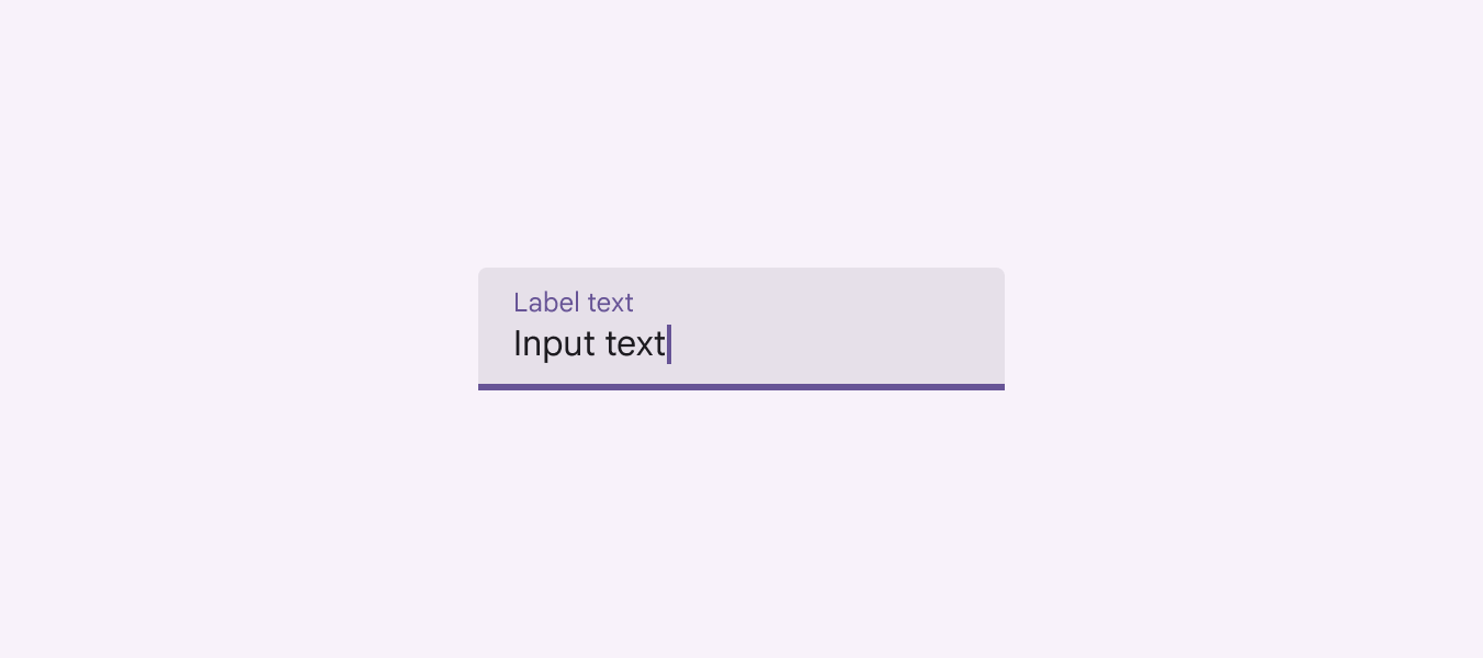
  6. Focused active Indicator
  7. Caret
  8. Input text
  9. Supporting text (optional)
  10. Enabled active Indicator

Outlined text field ​
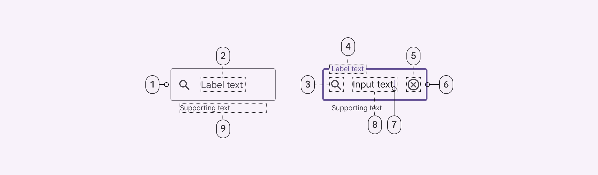

Diagram of an outlined text field indicating the 9 parts of its anatomy.
  1. Enabled container outline
  2. Label text in empty field
  3. Leading icon (optional)
  4. Label text in populated field
  5. Trailing icon (optional)
  6. Focused container outline
  7. Caret
  8. Input text
  9. Supporting text (optional)

Containers

Containers improve the discoverability of text fields by creating contrast between the text field and surrounding content.

Fill and stroke
A text field container has a fill and a stroke either around the entire container, or just the bottom edge. The color and thickness of a stroke can change to indicate when the text field is active.

Rounded corners
The container of an outlined text field has rounded corners, while the container of a filled text field has rounded top corners and square bottom corners.
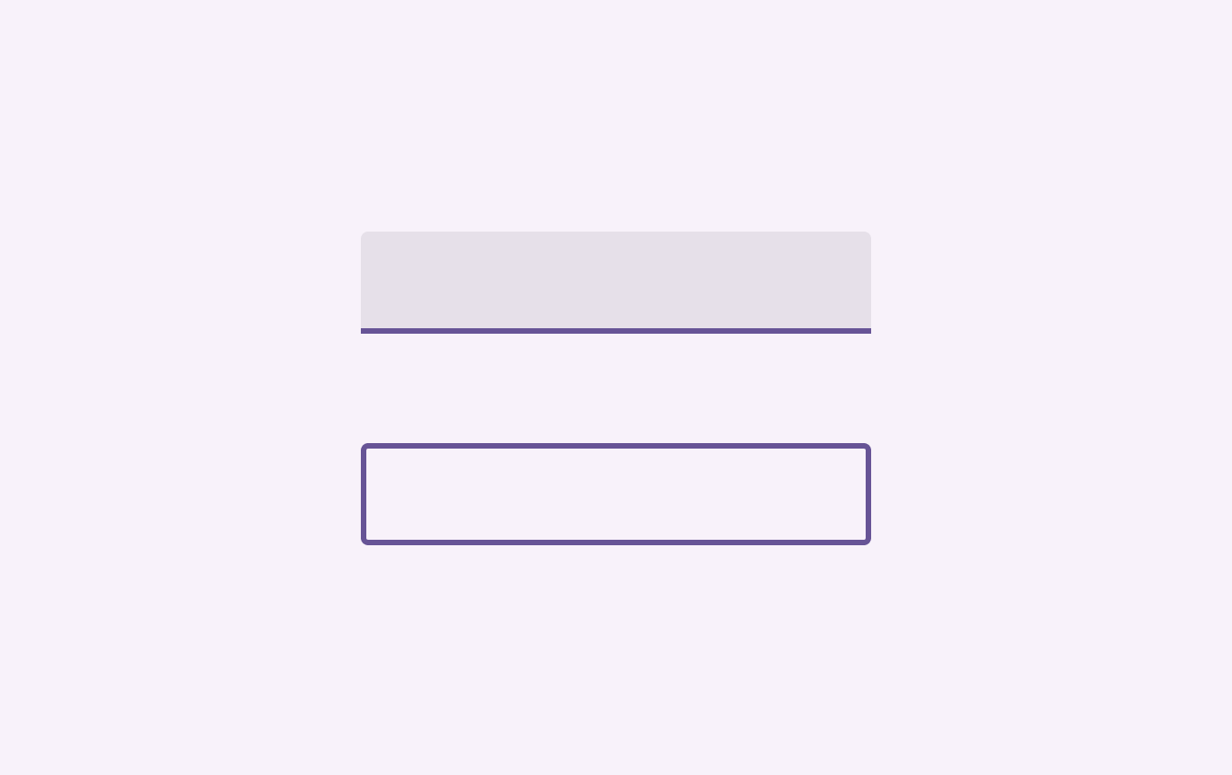
Side by side view of the containers of a filled and outlined text field.
Text field containers

Label text

Label text tells people what information is requested. Every text field should have a label.

Label text should be aligned with the input text, and always visible. It can be placed in the middle of a text field, or rest near the top of the container.

Label text shouldn't be truncated or take up multiple lines. Keep it short, clear, and fully visible.

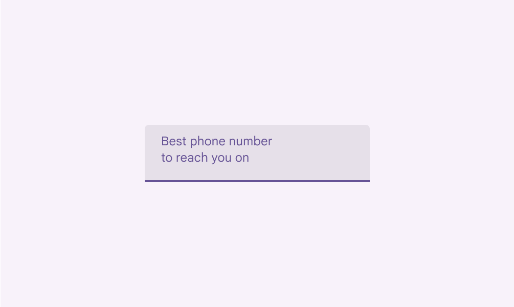
Label text should always be visible. When the field is selected, the label text moves from the middle of the text field to the top.
Text field with very long label text, too long to display fully display inside the text field container.
Don't Don’t truncate label text. Keep it short, clear, and fully visible.
Text field with very long label text split into 2 lines.
Don't Label text shouldn’t take up multiple lines

Adjacent label

A text field doesn't require a label if the field's purpose is indicated by a separate, adjacent label.

Adjacent labels should be aligned to the leading edge of the text field container.
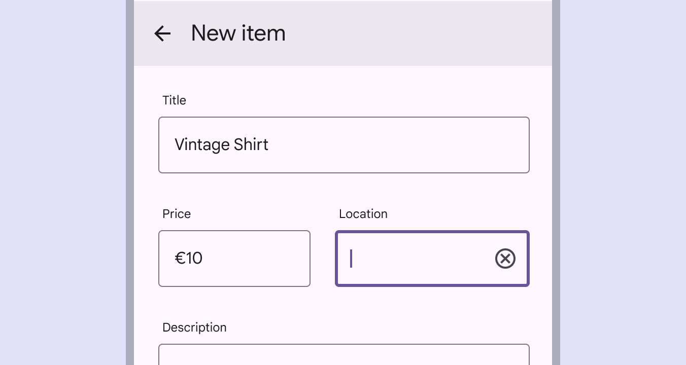
Mobile UI of a contact form with label texts placed outside and on top of the text fields.
Text fields with adjacent labels

Required text indicator

To show a field is required, display an asterisk (*) next to the label text, and explain that asterisks indicate required fields in one of two ways:

  • Supporting text
  • A single note at the beginning of the form

Additional best practices include:

  • Indicate all required fields
  • If required text has a particular color, use the same color for the asterisk
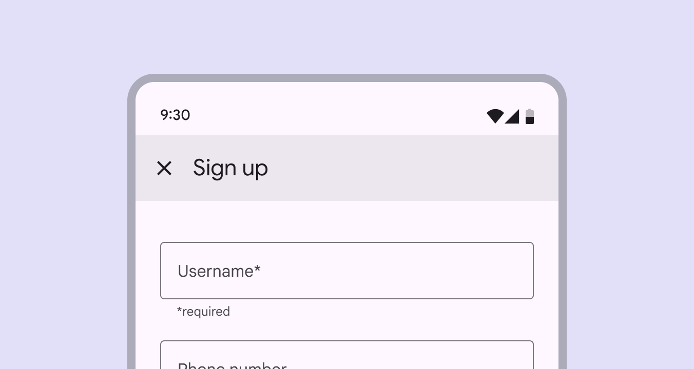
Mobile UI of a contact form showing supporting text below the text field, indicating an input is required.
Asterisk with required supporting text

Input text

Input text is text a person has entered into a text field.

Text fields can display input text in the following ways:

  • Single line text fields display only one line of text
  • Multi-line text fields grow to accommodate multiple lines of text
  • Text areas are fixed-height fields
Text field with populated input text.
Input text in a filled text field
In single-line fields, as the cursor reaches the right field edge, text longer than the input line automatically scrolls left. Single-line fields are not suitable for collecting long responses; use a multi-line text field or text area instead.
In multi-line fields, overflow text causes the text field to expand, shifting screen elements downward and text wraps onto a new line. These fields initially appear as single-line fields, which is useful for compact layouts that need to accommodate large amounts of text.
Text areas are taller than text fields and wrap overflow text onto a new line. They are a fixed height and scroll vertically when the cursor reaches the bottom of the field. The large initial size indicates that longer responses are possible and encouraged. These should be used instead of multi-line fields on the web. Ensure the height of a text area fits within mobile screen sizes.

Prefix text

Text fields can contain prefix text such as currency symbol.
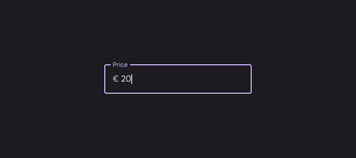
Text field with a currency prefix before the input text.
A text field with a currency symbol text prefix

Suffix text

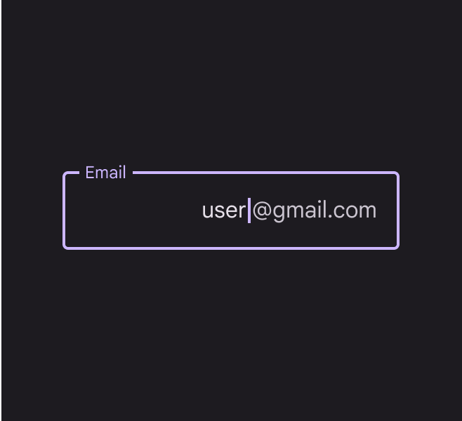
Text fields can contain suffix text such as unit of measurement or email domain.
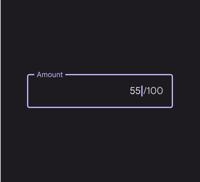
Text field with a suffix after the input text indicating a maximum input of 100.
A text field with a grading scale as suffix
Text field with a suffix after the input text indicating an email address.
A text field with an email domain suffix

Supporting text & character counter

Supporting text conveys additional information about the input field, such as how it will be used. It should ideally be one line, though may wrap to multiple lines if required. It can be either persistently visible or visible only on focus.

If there is a character or word limit, include a character or word counter. They display the ratio of characters used and the total character limit.
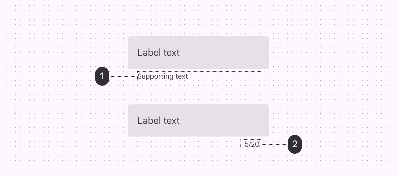
A side by side view of a text field with supporting text aligned with the trailing side, and a character counter aligned with the trailing side.
  1. Supporting text
  2. Character counter

Error text

For text fields that validate their content such as passwords, replace supporting text with error text. Swapping supporting text with error text prevents new lines of text from bumping content and changing the layout.

  • If only one error is possible, error text should describe how to avoid the error
  • If multiple errors are possible, error text should describe how to avoid the most likely error
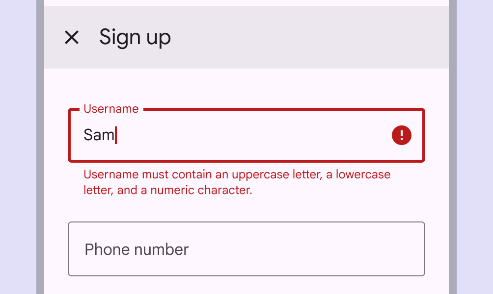
Do Swap supporting text with error text
Don't Don't add error text in addition to supporting text, as their appearance will shift content
Mobile UI of a sign up form with an invalid text field entry. The error message wraps to 2 lines.
Caution Long errors can wrap to multiple lines if there isn't enough space to clearly describe the error. In this case, ensure padding between text fields is sufficient to prevent multi-lined errors from bumping layout content.

Error icon

It’s strongly recommended to show an error icon when the text field is in the error state.

This highlights the error for people with visual impairments, and provides an additional sensory indicator.
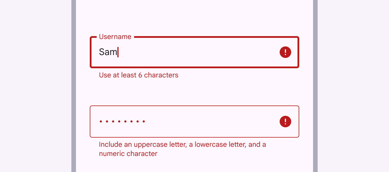
2 text fields with error messages. The active text field has a thicker border. Both text fields have a trailing error icon.
The error icon is an important second visual indicator that a text field has an error

Icons & images ​

Icons in text fields are optional. Text field icons can:

  • Describe valid inputInputs are devices that provide interactive control of an app. Common inputs are a mouse, keyboard, and touchpad. methods such as a microphone icon
  • Provide affordances to access additional functionality such as clearing the content of a field
  • Express an error

Leading and trailing icons change their position based on LTR or RTL contexts.

Images that are 24dp in height can be placed inside of text fields. This image height allows for optimal top and bottom padding within the field and is consistent with icon size recommendations.

  1. Icon signifier
    Icon signifiers can describe the type of input a text field requires, and be touch targets for nested components. For example, a calendar icon may be tapped to reveal a date pickerDate pickers let people select a date, or a range of dates.More on date pickers.
  2. Valid or error icon
    Iconography can indicate both valid and invalid inputs, making error states clear for colorblind users.
  3. Clear icon
    Clear icons let a person clear an entire input field. They appear only when input text is present.
  4. Voice input icon
    A microphone icon signifies that people can input characters using voice.
  5. Dropdown icon
    A dropdown arrow indicates that a text field has a nested selectionSelection lets users choose specific items to act on.More on selection component.
  6. Image
    An image can help contextualize the required input text such as a credit card number.
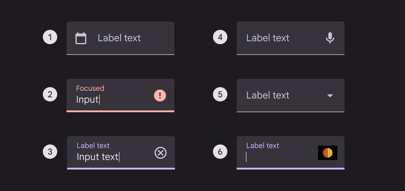
Side by side view of text fields with different icons and images as trailing elements within the container.
  1. Icon signifier
  2. Valid or error icon
  3. Clear icon
  4. Voice input icon
  5. Dropdown icon
  6. Image

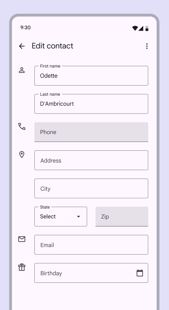
Read-only fields

Read-only text fields display pre-filled text that people cannot edit.

A read-only text field is styled the same as a regular text field and is clearly labeled as read-only.
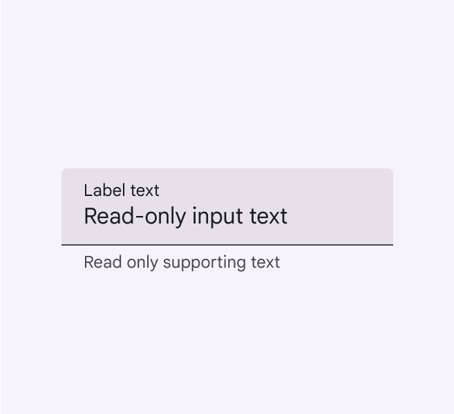
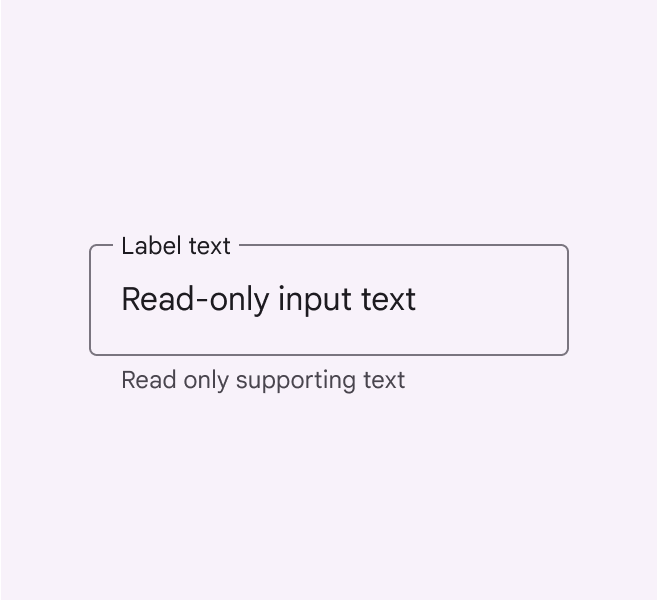
Read only filled text field.
A filled read-only text field
Read only outlined text field.
An outlined read-only text field

Adaptive design ​

As layouts adapt to larger screens and different breakpointsBreakpoints are opinionated window sizes where a layout changes to match available space, device conventions, and ergonomics (previously window size classes).More on breakpoints, apply flexible container dimensions to text fields. Set minimum and maximum values for marginsMargins are the spaces between the edge of a nested element and its parent element, such as the space between a button's label text and the edge of its container.More on margins, padding, and container dimensions as layouts scale so that typography adjusts for better reading experiences.
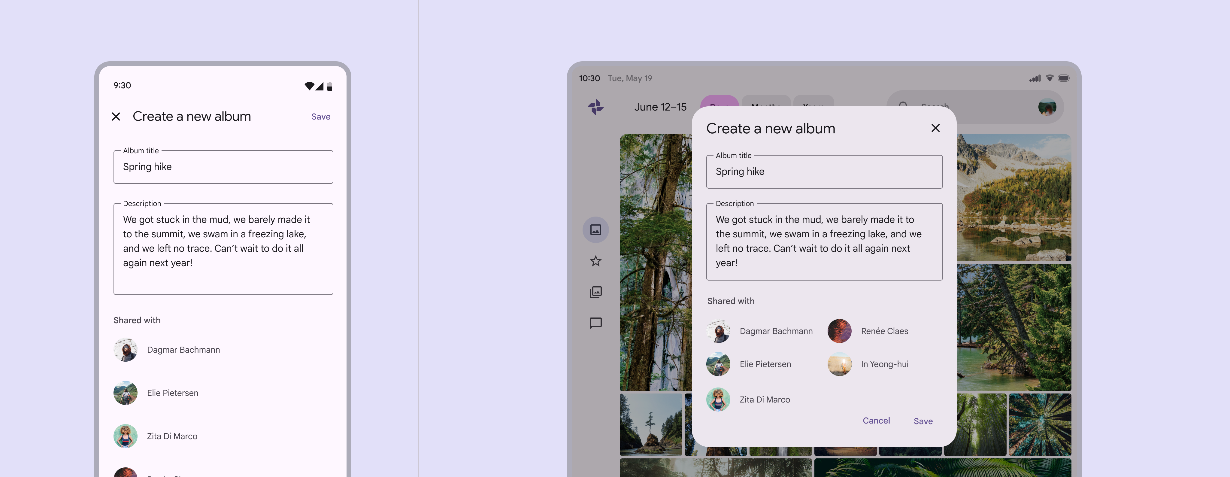
UI for creating a new album in a side by side view on mobile and tablet.
For compact breakpoints, text fields can span the full width of the display. For medium and expanded breakpoints, text fields should be bound by flexible margins or other containers.

As text fields expand in fluid layouts, avoid maintaining fixed margins and typography properties. This can lead to extra long text fields.

For example, text fields should not span the full width of a large screen.
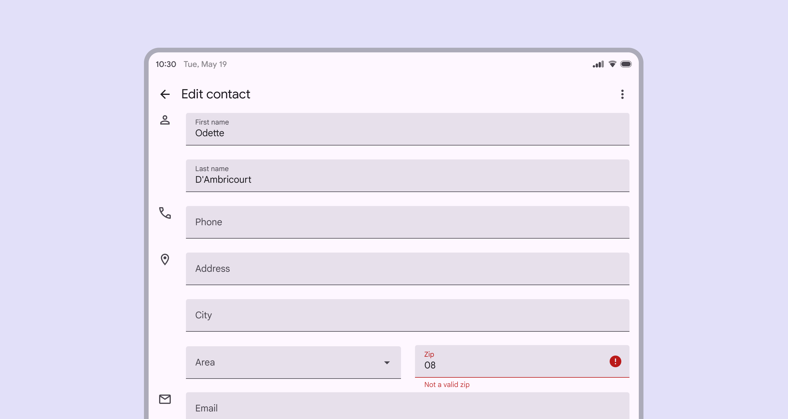
Tablet UI with text fields spanning the complete width of the screen.
Don't Don’t use fixed text field margins on large devices. Text fields shouldn’t span the full width of a large screen.

Density

Dense text fields enable people to scan and take action on large amounts of information.
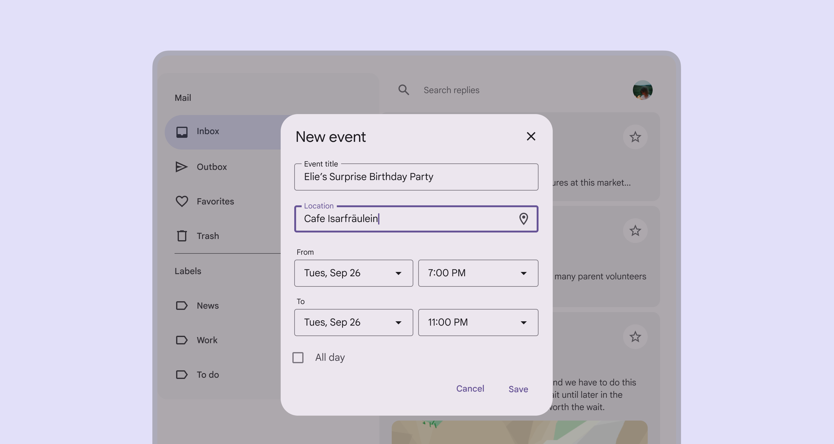
Tablet UI with desne text field as part of event creation form.
A form with dense text fields

Avoid applying density by default ​

Don't apply density to text fields by default. This lowers their targets below the recommended 48x48 CSS pixels. Instead, give people a way to choose a higher density, like selecting a denser layout or changing the theme.

To ensure this density setting can be easily reverted when it's active, keep all the targets to change it at a minimum of 48x48 CSS pixels each.

Pager
Previous pageText fields: Specs
Next pageText fields: Accessibility

Released under the Apache 2.0 or CC BY 4.0

Copyright © 2018-Present Google

https://m3.material.io/components/text-fields/guidelines

Released under the Apache 2.0 or CC BY 4.0

Copyright © 2018-Present Google