

Spacing: Tokens
Spacing is the distance around and between component and layout elements
TIP
The spacing system tokens are only used on Jetpack Compose.
System spacing tokens
| Token | Value |
|---|---|
| Space 0 | 0 |
| Space 25 | 2dp |
| Space 50 | 4dp |
| Space 75 | 6dp |
| Space 100 | 8dp |
| Space 125 | 10dp |
| Space 150 | 12dp |
| Space 175 | 14dp |
| Space 200 | 16dp |
| Space 250 | 20dp |
| Space 300 | 24dp |
| Space 400 | 32dp |
| Space 450 | 36dp |
| Space 500 | 40dp |
| Space 600 | 48dp |
| Space 700 | 56dp |
| Space 800 | 64dp |
| Space 900 | 72dp |
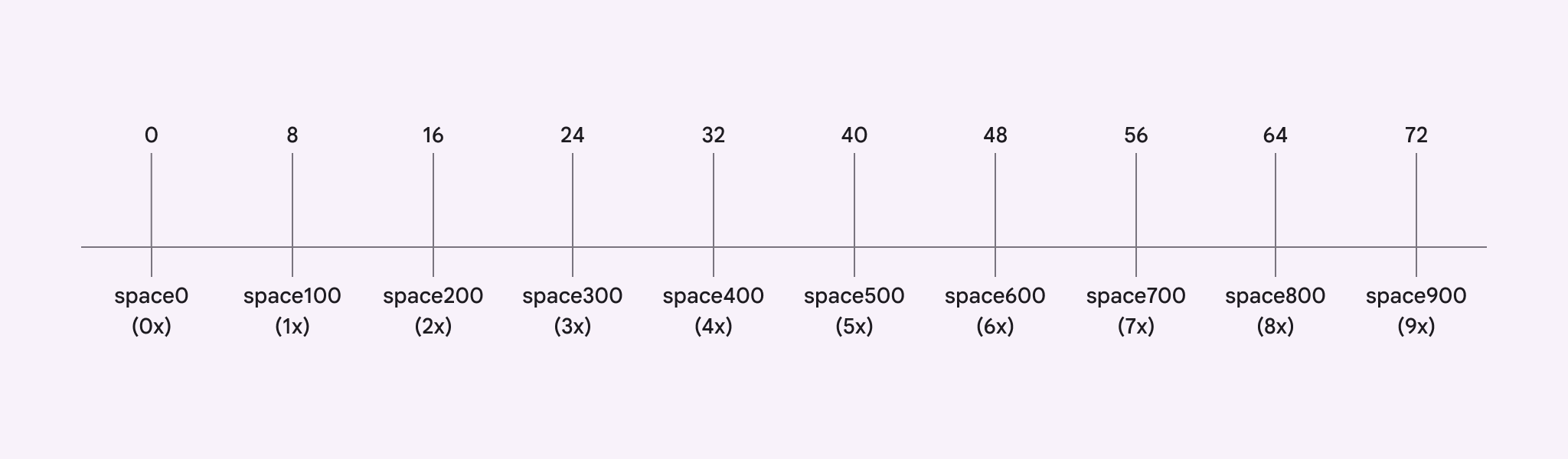
System spacing tokens are a linear range of spacing values recommended by Material. They’re intended to cover the majority of spacing needs within the design system. The base unit of measurement md.sys.measurement.space100 is 8dp. Learn more about design tokens
Nested units
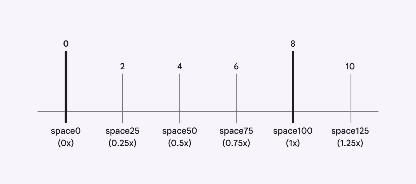
Values other than multiples of 8 are also used in layouts and Material components, like 2dp, 4dp, 6dp, and 10dp. Material only defines the most recommended nested units.
Component spacing
Most Material component spacing attributes will map to system spacing tokens. Spacing logic, like adaptive design or density, should be applied to the component attribute.
Component attributes follow a new naming strategy:
- Going forward, all component spacing attributes will use padding, margin, and gap, and positional language: horizontal, vertical, leading, trailing, top, and bottom
- Example: “Medium button: leading padding”
- Past component spacing tokens use “space” to describe all padding, gaps, and margins, like leading-space, trailing-space, top-space, bottom-space, and between-space.
- Example: “Medium button: leading space”