Skip to content
Material Design 3
Main Navigation
v3
v2
v1

English

简体中文
繁體中文
Español
Français
Русский
Português – Brasil
Deutsch
日本語
한국어
Italiano
Polski
Türkçe
čeština
magyar

English

简体中文
繁體中文
Español
Français
Русский
Português – Brasil
Deutsch
日本語
한국어
Italiano
Polski
Türkçe
čeština
magyar

Appearance

Sidebar Navigation

Foundations

Accessibility

Overview: Principles

Overview: Assistive technology

Designing: Overview

Designing: Color contrast

Designing: Structure

Designing: Flow

Designing: Elements

Writing and text: Best practices

Writing and text: Text truncation

Writing and text: Text resizing

Building for all: User needs

Building for all: Co-design

Content design

Overview

Alt text

Global writing: Overview

Global writing: Word choice

Notifications

Style guide: UX writing best practices

Style guide: Word choice

Style guide: Grammar and punctuation

Customizing Material

Devices

Watches: Overview

Watches: Foundations

Watches: Styles

Watches: Layout

XR

Design: Overview

Design: Interaction

Design: Layout

Design: Accessibility

Components: Overview

Components: App bars

Components: Dialogs

Components: Nav bar

Components: Nav rail

Components: Toolbars

Design tokens: Overview

Design tokens: How to use tokens

Interaction

Gestures

Inputs

Selection

States: Overview

States: State layers

States: Applying states

Layout

Overview: Overview

Overview: Parts of layout

Overview: Adaptive design

Scaffold: Overview

Scaffold: Bars

Scaffold: Rails

Scaffold: Panes

Grids & spacing: Overview

Grids & spacing: Grids

Grids & spacing: Spacing

Grids & spacing: Density

Breakpoints: Overview

Breakpoints: Compact

Breakpoints: Medium

Breakpoints: Expanded

Breakpoints: Large & extra-large

Bidirectionality & RTL

Canonical examples: Overview

Canonical examples: Feed

Canonical examples: List-detail

Canonical examples: Supporting pane

Usability: Overview

Usability: Applying M3 Expressive

Material A-Z

Styles

Color

Color system: Overview

Color system: How the system works

Color roles

Color schemes

Choosing a scheme

Static: Baseline

Static: Custom brand

Dynamic: Choosing a source

Dynamic: User-generated source

Dynamic: Content-based source

Advanced: Overview

Advanced: Apply colors

Advanced: Define new colors

Advanced: Adjust existing colors

Color resources

Elevation: Overview

Elevation: Applying elevation

Elevation: Tokens

Icons: Overview

Icons: Designing icons

Icons: Applying icons

Motion

Motion physics system: How it works

Motion physics system: Specs

Easing and duration: Applying easing and duration

Easing and duration: Tokens & specs

Transitions: Transition patterns

Transitions: Applying transitions

Shape: Overview & principles

Shape: Corner radius scale

Shape: Shape morph

Spacing: Overview

Spacing: Applying spacing

Spacing: Tokens

Typography: Overview

Typography: Fonts

Typography: Type scale & tokens

Typography: Applying type

Typography: Editorial treatments

Components

App bars: Overview

App bars: Specs

App bars: Guidelines

App bars: Accessibility

Badges: Overview

Badges: Specs

Badges: Guidelines

Badges: Accessibility

Buttons

All buttons

Button groups: Overview

Button groups: Specs

Button groups: Guidelines

Button groups: Accessibility

Buttons: Overview

Buttons: Specs

Buttons: Guidelines

Buttons: Accessibility

Extended FABs: Overview

Extended FABs: Specs

Extended FABs: Guidelines

Extended FABs: Accessibility

FAB menu: Overview

FAB menu: Specs

FAB menu: Guidelines

FAB menu: Accessibility

FABs: Overview

FABs: Specs

FABs: Guidelines

FABs: Accessibility

Icon buttons: Overview

Icon buttons: Specs

Icon buttons: Guidelines

Icon buttons: Accessibility

Segmented buttons: Overview

Segmented buttons: Specs

Segmented buttons: Guidelines

Segmented buttons: Accessibility

Split button: Overview

Split button: Specs

Split button: Guidelines

Split button: Accessibility

Cards: Overview

Cards: Specs

Cards: Guidelines

Cards: Accessibility

Carousel: Overview

Carousel: Specs

Carousel: Guidelines

Carousel: Accessibility

Checkbox: Overview

Checkbox: Specs

Checkbox: Guidelines

Checkbox: Accessibility

Chips: Overview

Chips: Specs

Chips: Guidelines

Chips: Accessibility

Date & time pickers

Date pickers: Overview

Date pickers: Specs

Date pickers: Guidelines

Date pickers: Accessibility

Time pickers: Overview

Time pickers: Specs

Time pickers: Guidelines

Time pickers: Accessibility

Dialogs: Overview

Dialogs: Specs

Dialogs: Guidelines

Dialogs: Accessibility

Divider: Overview

Divider: Specs

Divider: Guidelines

Divider: Accessibility

Lists: Overview

Lists: Specs

Lists: Guidelines

Lists: Accessibility

Loading & progress

Loading indicator: Overview

Loading indicator: Specs

Loading indicator: Guidelines

Loading indicator: Accessibility

Progress indicators: Overview

Progress indicators: Specs

Progress indicators: Guidelines

Progress indicators: Accessibility

Menus: Overview

Menus: Specs

Menus: Guidelines

Menus: Accessibility

Navigation

Navigation bar: Overview

Navigation bar: Specs

Navigation bar: Guidelines

Navigation bar: Accessibility

Navigation drawer: Overview

Navigation drawer: Specs

Navigation drawer: Guidelines

Navigation drawer: Accessibility

Navigation rail: Overview

Navigation rail: Specs

Navigation rail: Guidelines

Navigation rail: Accessibility

Radio button: Overview

Radio button: Specs

Radio button: Guidelines

Radio button: Accessibility

Search: Overview

Search: Specs

Search: Guidelines

Search: Accessibility

Sheets

Bottom sheets: Overview

Bottom sheets: Specs

Bottom sheets: Guidelines

Bottom sheets: Accessibility

Side sheets: Overview

Side sheets: Specs

Side sheets: Guidelines

Side sheets: Accessibility

Sliders: Overview

Sliders: Specs

Sliders: Guidelines

Sliders: Accessibility

Snackbar: Overview

Snackbar: Specs

Snackbar: Guidelines

Snackbar: Accessibility

Switch: Overview

Switch: Specs

Switch: Guidelines

Switch: Accessibility

Tabs: Overview

Tabs: Specs

Tabs: Guidelines

Tabs: Accessibility

Text fields: Overview

Text fields: Specs

Text fields: Guidelines

Text fields: Accessibility

Toolbars: Overview

Toolbars: Specs

Toolbars: Guidelines

Toolbars: Accessibility

Tooltips: Overview

Tooltips: Specs

Tooltips: Guidelines

Tooltips: Accessibility

On this page

Alt text ​

Effective alt text describes the meaning and context of images for screen reader users

How to write great alt text ​

Overview

Alternative text (alt text) refers to off-screen text that is used by screen reader accessibility software. Screen readers read out visible content such as paragraph and button text, as well as hidden content, including alt text for icons and headings.

Alt text also displays when an image doesn’t load. It tells people what they need to know about an image if they can’t see it.
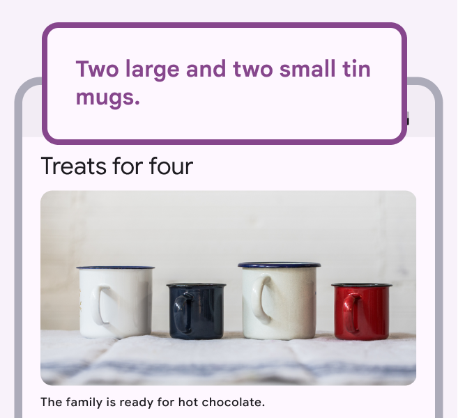
4 tin mugs and appropriate alt text.
Do

Write alt text for images to provide context to screen reader users.

Alt text: Two large and two small tin mugs.
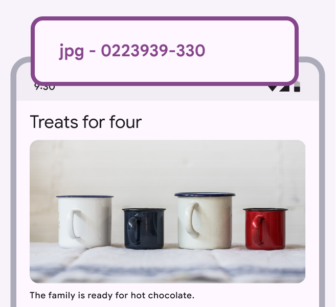
4 tin mugs with file name as alt text.
Don’t

Avoid leaving the automatically generated file number as alt text.

Alt text: jpg - 0223939-330

When to use alt text

If you remove the image from the page and no information is lost, then the image is decorative and doesn’t need alt text or a caption.

An image can be marked decorative using a null alt attribute, such as alt=”” in HTML, which will hide the content from screen reader users.
A bitcoin decorative image in a crypto article.

Images that don’t add information don’t need alt text.

Alt text: “”

Focus on the meaning of the image

Describe the context and overall meaning, rather than focusing on the details. For example, in a shopping app, focus on the item for sale rather than the things around it.

Alt text can also help improve SEO, but its primary purpose should be to make sites usable for all.
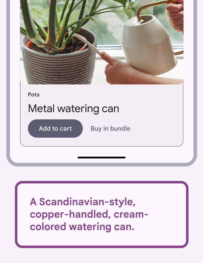
Watering can in a shopping app and good alt text.
Do

Focus on the important part of the image.

Alt text: A Scandinavian-style, copper-handled, cream-colored watering can.
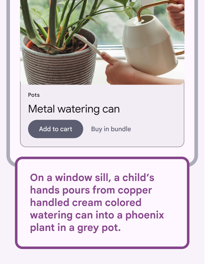
Watering can in a shopping app and overly detailed alt text.
Don’t

Avoid detailed descriptions that don’t contribute to the image’s meaning.

Alt text: On a window sill, a child’s hands pours from copper handled cream colored watering can into a phoenix plant in a grey pot.

Keep it short

The recommended length for alt text is 140 characters.

If alt text is too long, it may be cut off by some screen readers, which is a poor user experience.
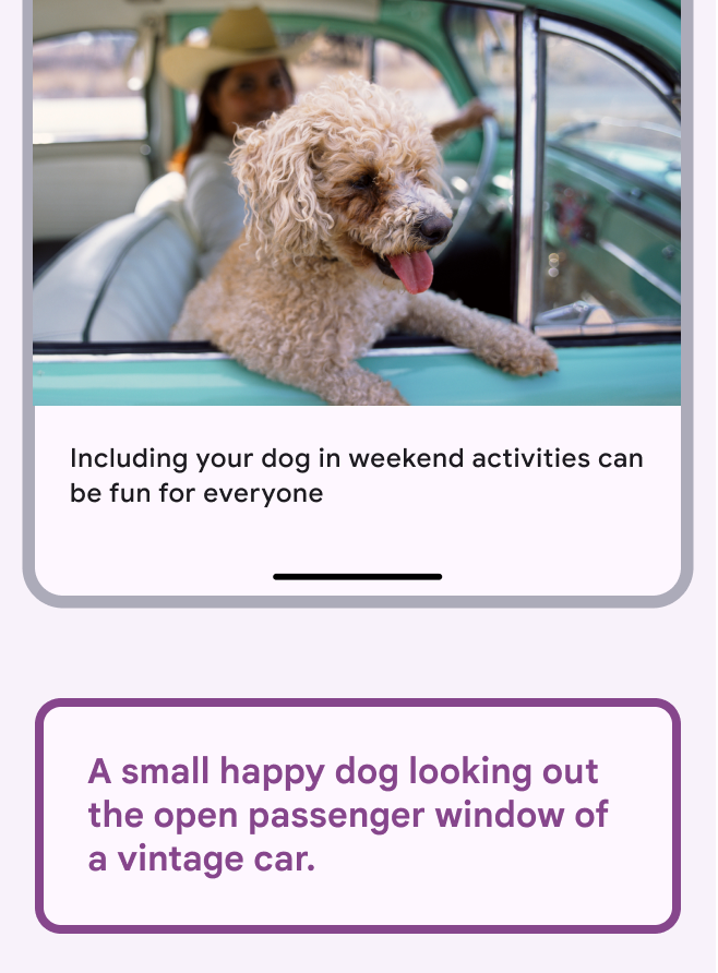
Relates idea of keeping alt text to a max of 140 characters.
Do

Write brief alt text.

Alt text: A small happy dog hanging out the passenger window of a vintage car.
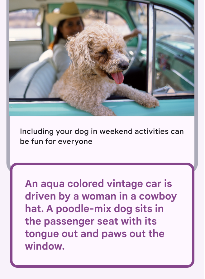
Long alt text can be overwhelming and ineffective.
Don’t

Don’t write more than 140 characters of alt text.

Alt text: An aqua colored vintage car is driven by a woman in a cowboy hat. A poodle-mix dog sits in the passenger seat with its tongue out and paws out the window.

Don’t start alt text with “image of”

Screen readers announce “image” when they come across an image. If your start your alt text with “image of” a screen reader will announce “image, image of.”
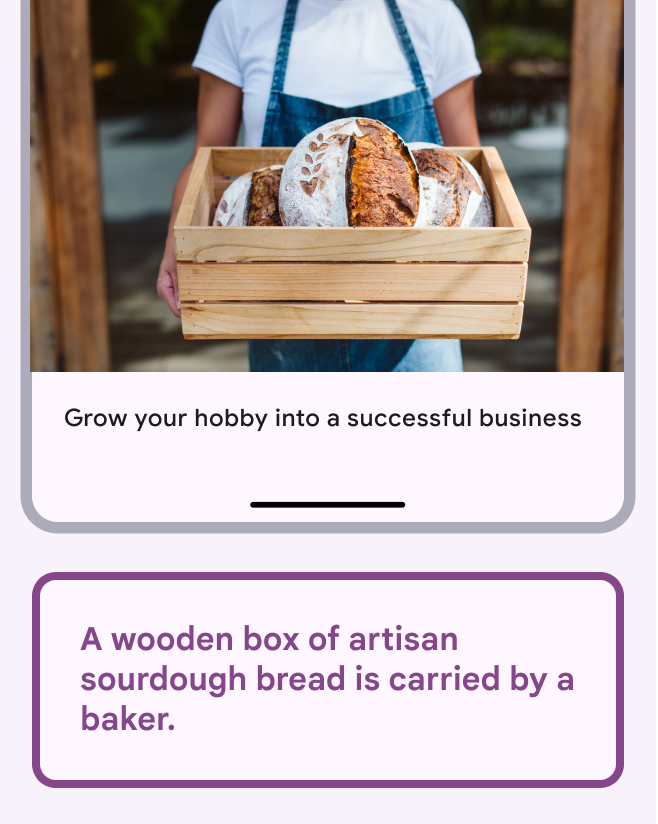
Makes the point of not using “image of” to start alt text.
Do

Describe the image, rather than the format.

Alt text: A wooden box of artisan sourdough bread is carried by a baker.
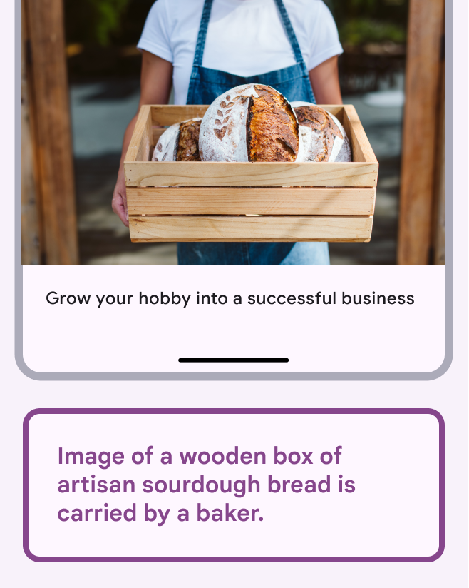
Makes the point that poor alt text starts with “Image of.”
Don’t

Avoid writing “image of." The screen reader will announce it’s an image.

Alt text: Image of a wooden box of artisan sourdough bread is carried by a baker.

Context and nearby text ​

Context matters

Use adjacent text to establish the context and word choices for alt text. Adjacent text includes all of the text near an image, such as body text, captions, and headlines.

Don’t repeat the caption in alt text. It’s against best practices because the user will hear the same text twice, which is a poor experience.

Be consistent in your word choices. For example, don’t use “antique” in a caption and “vintage” in the alt text.
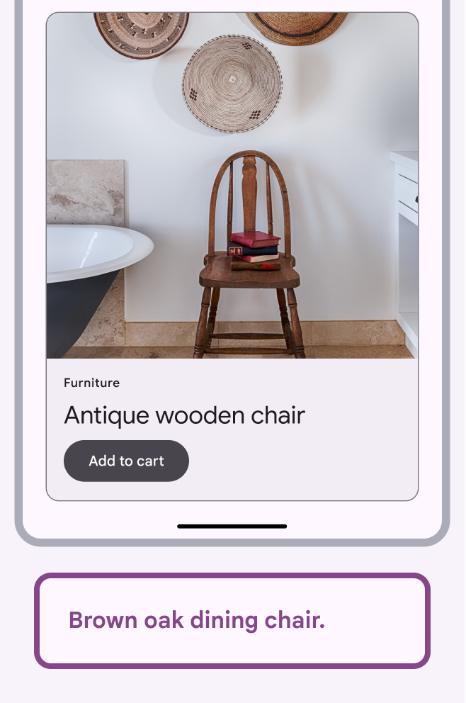
Shopping app with image of a chair in a bathroom.
Do

Alt text should always relate to the context.

Alt text: Brown oak dining chair.

Home decorating blog post heading and caption and image of a wooden chair in bathroom.
Do

Change alt text for an image depending on where it’s used.

Alt text: Books on a wooden chair next to a vintage bathtub.

Alt text is subjective

Alt text is another layer of creative expression and should support the goals and style of its context.

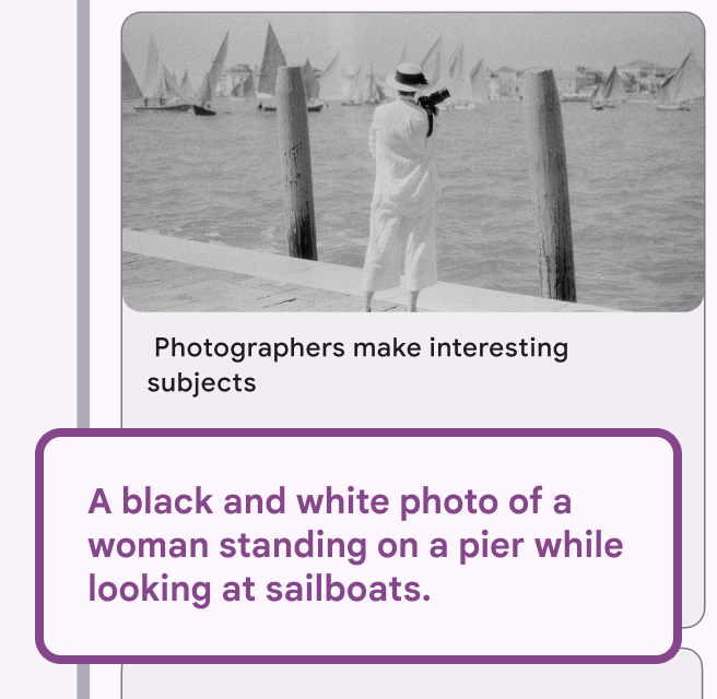
The same image should have different alt text in different settings. Use the information in the app or article and the caption to decide what to emphasize in the alt text.
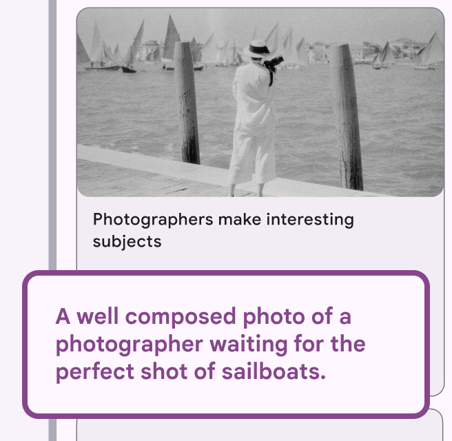
Shows idea of alt text supporting the caption.
Do

Make alt text consistent with the caption.

Alt text: A well composed photo of a photographer waiting for the perfect shot of sailboats.
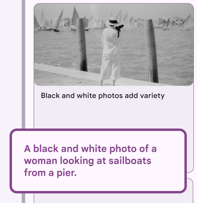
Shows idea of alt text missing key information from the image.
Don’t

Don’t ignore the caption. Information in alt text should correspond to adjacent text.

Alt text: A black and white photo of a woman standing on a pier while looking at sailboats.
Shows idea of alt text focussing on the meaning of the image.
Do

Focus on the meaning of the image.

Alt text: A black and white photo of woman looking at sailboats from a pier.
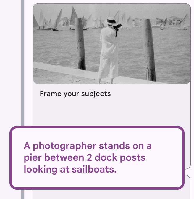
Shows idea of alt text reinforcing the caption theme.
Do

Use alt text to reinforce ideas in the caption.

Alt text: A photographer stands on a pier between 2 dock posts looking at sailboats.

Shows idea of overly detailed alt text.
Don’t

Don’t write alt text with details that aren’t relevant to the context of the image.

Alt text: A black and white photo of a female photographer looking at sailboats while standing between 2 dock posts on a Venetian pier.

Captions should benefit all users

A caption should be useful to someone who can see the image clearly, as well as a screen reader user.

Good captions support the image rather than duplicating its information. A well-written caption makes it easier to write alt text.
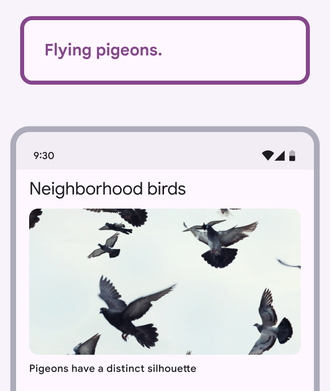
Alt text of “flying pigeons” supports the caption “Pigeons have a distinct silhouette.”
Do

Capture the meaning of the image in a few words.

Alt text: Flying pigeons.
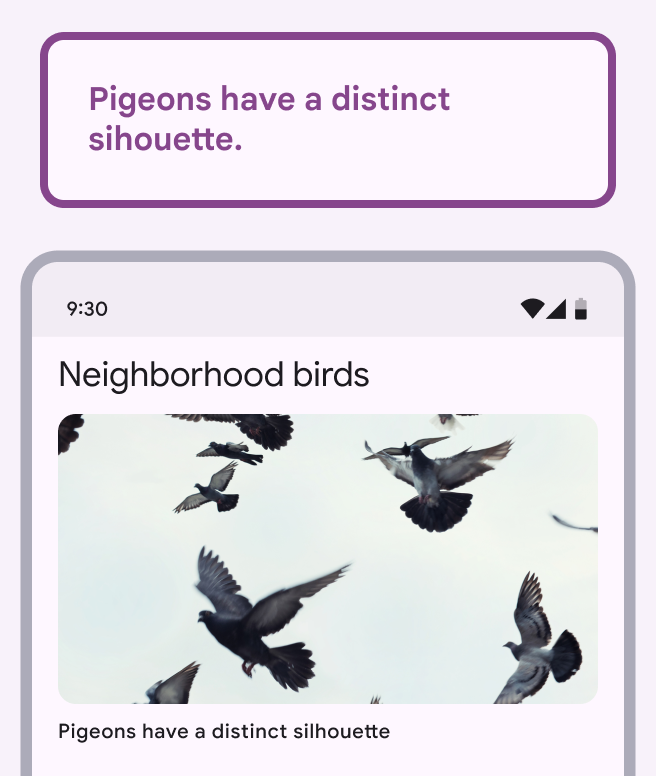
The caption and alt text are both “Pigeons have a distinct silhouette.”
Don’t

Don’t repeat the caption as the alt text.

Alt text: Pigeons have a distinct silhouette.

Types of imagery ​

When to describe the type of image

Occasionally it benefits users to name the type of image. This can include:

  • Chart
  • Infographic
  • Map
  • Graph
  • Screenshot
  • Headshot
  • Diagram
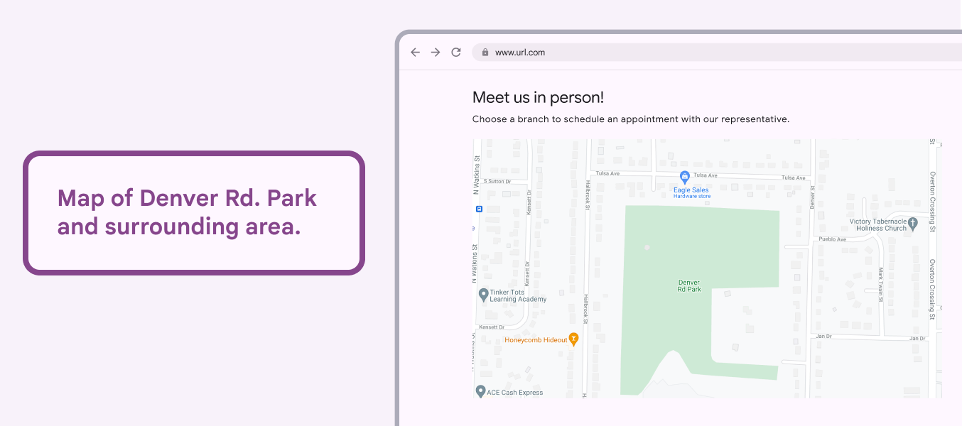
Map with alt text that begins with “map of.”
Caution

Be careful when using alt text that describes the type of image.

Alt text: Map of Denver Rd. Park and surrounding area.

Charts and graphs

Alt text is particularly important for visualizations such as charts and graphs.

Visualizations can either be editorial and meant to support a specific purpose or key takeaway, or more open-ended and used for general data analysis.

Consider the core purpose of the chart or graph, and what information someone would need to use it.

Link to the data that generated the chart or graph, if it’s available.
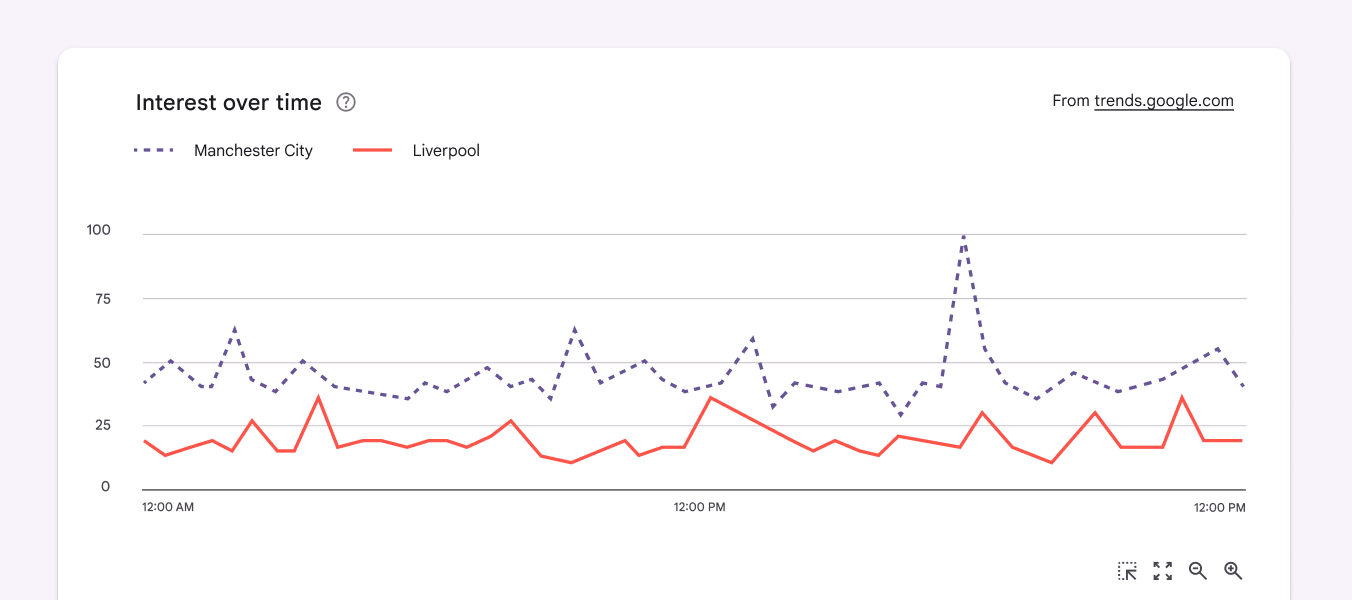
Summary of interest in Manchester City, which is almost double that of Liverpool. Manchester interest peaks at 100 at 6pm. Liverpool peaks at 40 at 3am and 12:30pm.
Summarize the main purpose of the data. Here, the chart involves interest in Manchester City and Liverpool.

When possible, explain the key takeaways and meaning in context, rather than detailing every data point.

A general formula for chart alt text would be: “Summary of [data type] + [reason for showing the chart].”
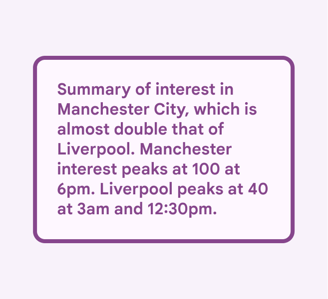
Alt text that summarizes the meaning of the chart.
Do

Capture the meaning of the chart, along with key data points

Alt text: Summary of interest in Manchester City, which is almost double that of Liverpool. Manchester interest peaks at 100 at 6pm. Liverpool peaks at 40 at 3am and 12:30pm.
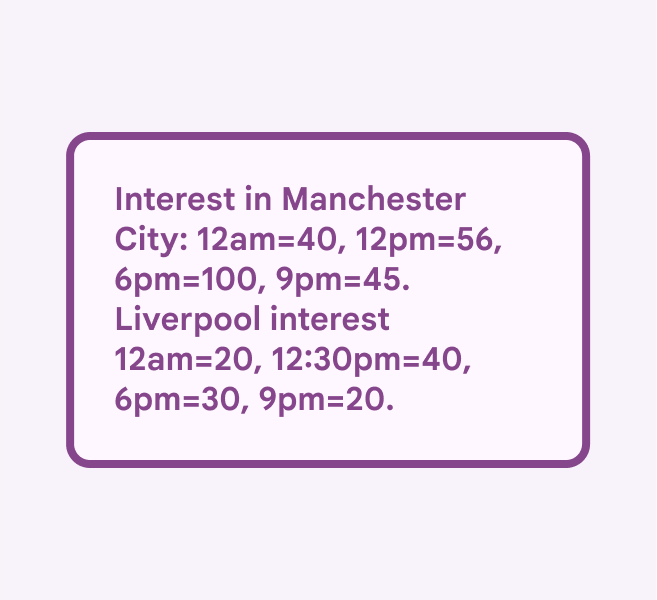
Alt text for a chart that details too many data points.
Don’t

Avoid copying data points

Alt text: Interest in Manchester City: 12am=40, 12pm=56, 6pm=100, 9pm=45. Liverpool interest 12am=20, 12:30pm=40, 6pm=30, 9pm=20.

Charts for editorial use

Charts with an editorial focus are used to support a key takeaway. This takeaway and the main data points confirming it should be the focus of the alt text. To create the alt text, leverage existing content from the body text, labels, and any text in the graph.

For example, a chart from a weekly digest showing highlights of physical activity may have a written summary of the total change in step count. This can be used in the alt text.
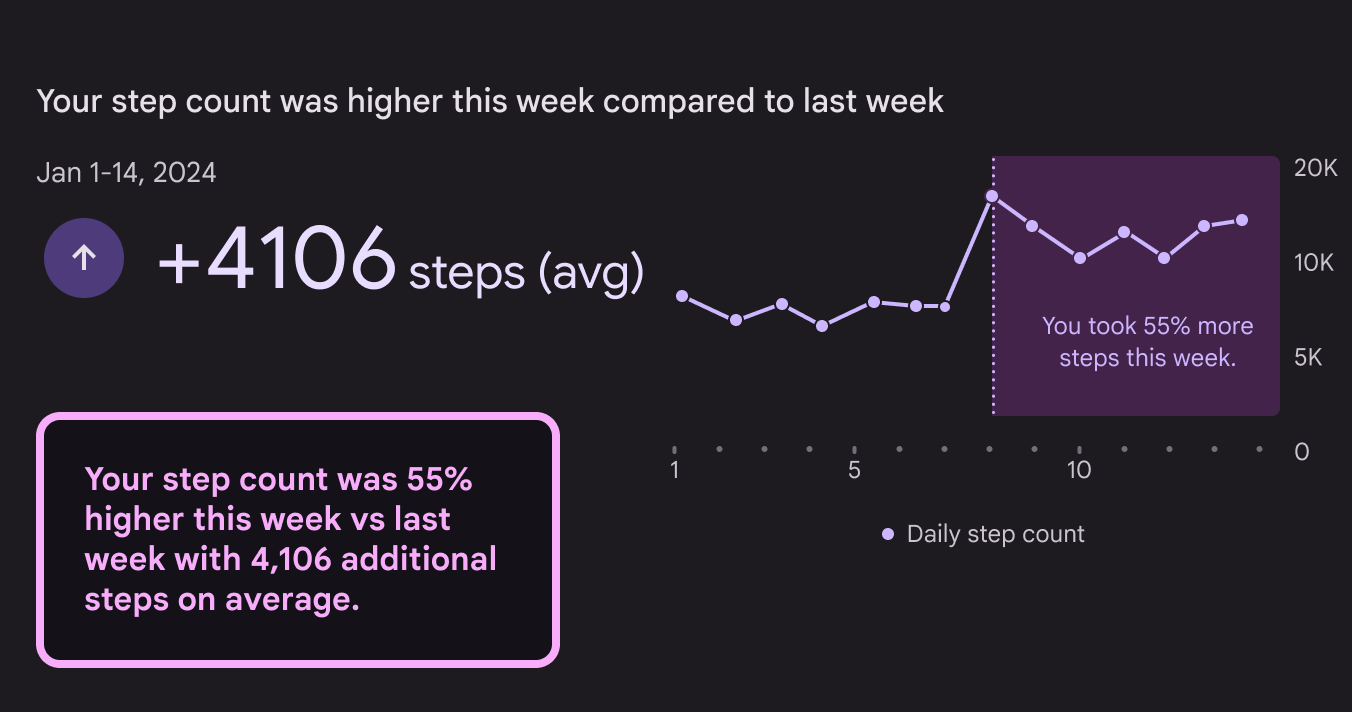
A fitness digest with a takeaway and metric highlighted in sample alt text.
Do

In charts with an editorial focus, highlight the main takeaway and metrics

Alt text: Your step count was 55% higher this week vs last week with 4,106 additional steps on average.

Charts for analysis

Charts for analysis are meant to be reviewed as a whole, and offer pieces of data to be analyzed. They can be dense, appear alongside related charts, and have many takeaways.

For charts that have one or two key takeaways, include these insights in the alt text.

To avoid introducing unintentional bias in charts with many possible takeaways, highlight opportunities for exploration, such as a link to the data’s source. Emphasize key data points or mention that there isn’t a single takeaway.
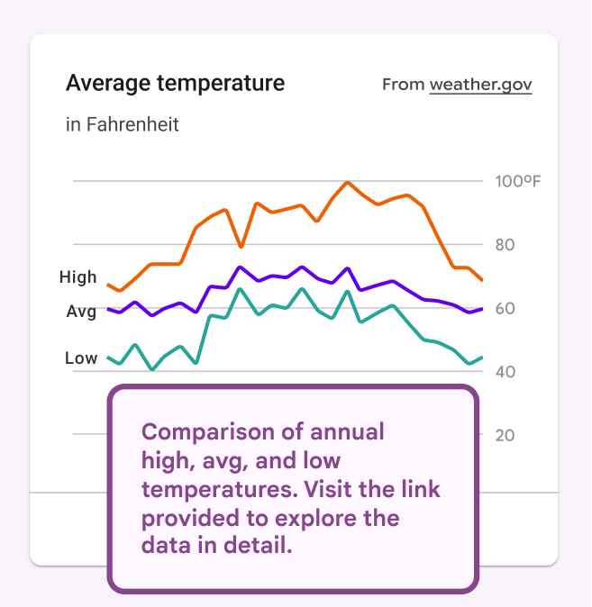
Chart for analysis with alt text that describes general structure and provides link to data.
Do

In charts used for analysis, mention the general structure, and highlight opportunities for more investigation

Alt text: Comparison of annual high, avg, and low temperatures. Visit the link provided to explore the data in detail.
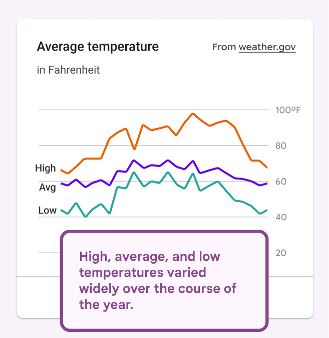
Chart for analysis with alt text that inaccurately summarizes it.
Don’t

Don’t summarize a chart used for analysis

Alt text: High, average, and low temperatures varied widely over the course of the year.

Use interactive charts

To improve the screen reader experience, consider using interactive charts instead of static images, especially for complex visualizations that are used for analysis. For interactive charts, a tooltip can show additional detail for specific data points.

See Top Tips for Data Accessibility for more ways to make these visualizations accessible.
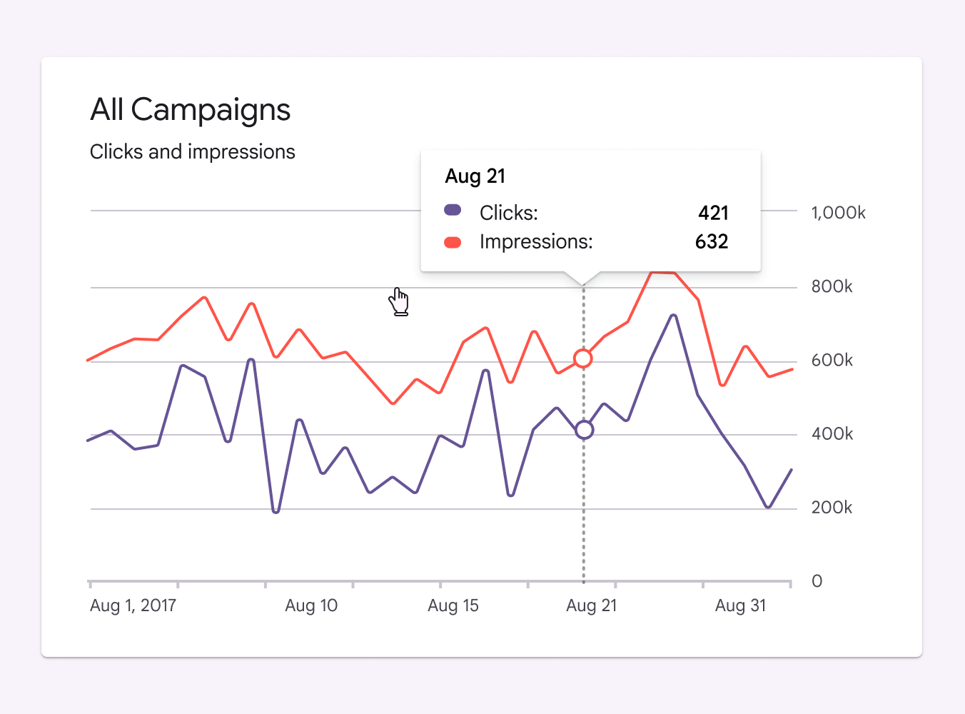
Chart for analysis with alt text that describes general structure and provides link to data.
Use interactive charts for complicated visualizations

Video and motion alt text

As with still images, if the animated information isn’t elsewhere on the screen, then it is informative and needs alt text.

Long-form video content uses video description to narrate the visual elements of a video, so it doesn’t need alt text.

Summarize the action in a video or animation

Alt text on informative GIFs or motion assets should highlight the important points. Think of a heading or title you might give it, and that’s likely your alt text.
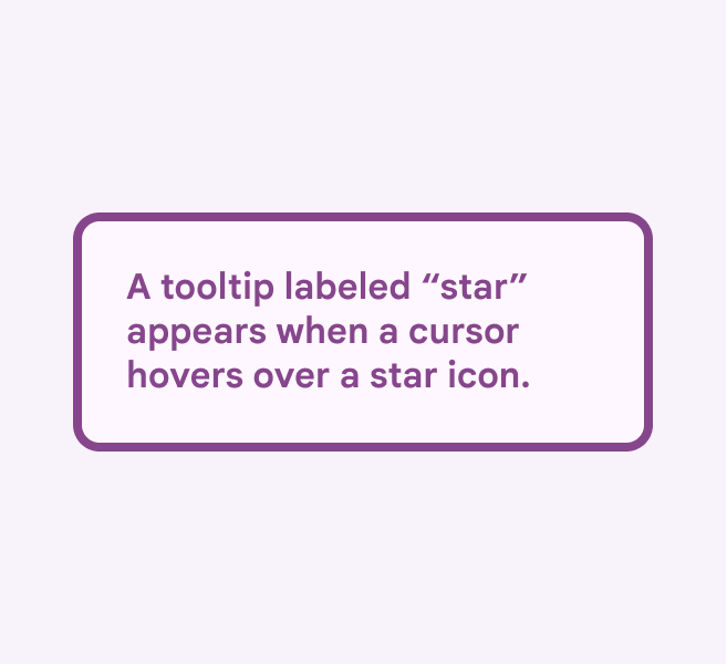
A tooltip labeled “star” appears when a cursor hovers over a star icon.
Do

Write alt text that summarizes the motion asset.

Alt text: A tooltip labeled “star” appears when a cursor hovers over a star icon.
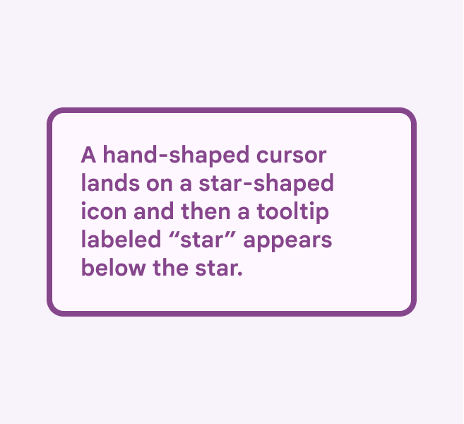
A hand-shaped cursor lands on a star-shaped icon and a tooltip appears below the star.
Don’t

Don’t write about every aspect of the motion.

Alt text: A hand-shaped cursor lands on a star-shaped icon and then a tooltip labeled “star” appears below the star.

Pager
Previous pageOverview
Next pageGlobal writing: Overview

Released under the Apache 2.0 or CC BY 4.0

Copyright © 2018-Present Google

https://m3.material.io/foundations/content-design/alt-text

Released under the Apache 2.0 or CC BY 4.0

Copyright © 2018-Present Google