Skip to content
Material Design 3
Main Navigation
v3
v2
v1

English

简体中文
繁體中文
Español
Français
Русский
Português – Brasil
Deutsch
日本語
한국어
Italiano
Polski
Türkçe
čeština
magyar

English

简体中文
繁體中文
Español
Français
Русский
Português – Brasil
Deutsch
日本語
한국어
Italiano
Polski
Türkçe
čeština
magyar

Appearance

Sidebar Navigation

Foundations

Accessibility

Overview: Principles

Overview: Assistive technology

Designing: Overview

Designing: Color contrast

Designing: Structure

Designing: Flow

Designing: Elements

Writing and text: Best practices

Writing and text: Text truncation

Writing and text: Text resizing

Building for all: User needs

Building for all: Co-design

Content design

Overview

Alt text

Global writing: Overview

Global writing: Word choice

Notifications

Style guide: UX writing best practices

Style guide: Word choice

Style guide: Grammar and punctuation

Customizing Material

Devices

Watches: Overview

Watches: Foundations

Watches: Styles

Watches: Layout

XR

Design: Overview

Design: Interaction

Design: Layout

Design: Accessibility

Components: Overview

Components: App bars

Components: Dialogs

Components: Nav bar

Components: Nav rail

Components: Toolbars

Design tokens: Overview

Design tokens: How to use tokens

Interaction

Gestures

Inputs

Selection

States: Overview

States: State layers

States: Applying states

Layout

Overview: Overview

Overview: Parts of layout

Overview: Adaptive design

Scaffold: Overview

Scaffold: Bars

Scaffold: Rails

Scaffold: Panes

Grids & spacing: Overview

Grids & spacing: Grids

Grids & spacing: Spacing

Grids & spacing: Density

Breakpoints: Overview

Breakpoints: Compact

Breakpoints: Medium

Breakpoints: Expanded

Breakpoints: Large & extra-large

Bidirectionality & RTL

Canonical examples: Overview

Canonical examples: Feed

Canonical examples: List-detail

Canonical examples: Supporting pane

Usability: Overview

Usability: Applying M3 Expressive

Material A-Z

Styles

Color

Color system: Overview

Color system: How the system works

Color roles

Color schemes

Choosing a scheme

Static: Baseline

Static: Custom brand

Dynamic: Choosing a source

Dynamic: User-generated source

Dynamic: Content-based source

Advanced: Overview

Advanced: Apply colors

Advanced: Define new colors

Advanced: Adjust existing colors

Color resources

Elevation: Overview

Elevation: Applying elevation

Elevation: Tokens

Icons: Overview

Icons: Designing icons

Icons: Applying icons

Motion

Motion physics system: How it works

Motion physics system: Specs

Easing and duration: Applying easing and duration

Easing and duration: Tokens & specs

Transitions: Transition patterns

Transitions: Applying transitions

Shape: Overview & principles

Shape: Corner radius scale

Shape: Shape morph

Spacing: Overview

Spacing: Applying spacing

Spacing: Tokens

Typography: Overview

Typography: Fonts

Typography: Type scale & tokens

Typography: Applying type

Typography: Editorial treatments

Components

App bars: Overview

App bars: Specs

App bars: Guidelines

App bars: Accessibility

Badges: Overview

Badges: Specs

Badges: Guidelines

Badges: Accessibility

Buttons

All buttons

Button groups: Overview

Button groups: Specs

Button groups: Guidelines

Button groups: Accessibility

Buttons: Overview

Buttons: Specs

Buttons: Guidelines

Buttons: Accessibility

Extended FABs: Overview

Extended FABs: Specs

Extended FABs: Guidelines

Extended FABs: Accessibility

FAB menu: Overview

FAB menu: Specs

FAB menu: Guidelines

FAB menu: Accessibility

FABs: Overview

FABs: Specs

FABs: Guidelines

FABs: Accessibility

Icon buttons: Overview

Icon buttons: Specs

Icon buttons: Guidelines

Icon buttons: Accessibility

Segmented buttons: Overview

Segmented buttons: Specs

Segmented buttons: Guidelines

Segmented buttons: Accessibility

Split button: Overview

Split button: Specs

Split button: Guidelines

Split button: Accessibility

Cards: Overview

Cards: Specs

Cards: Guidelines

Cards: Accessibility

Carousel: Overview

Carousel: Specs

Carousel: Guidelines

Carousel: Accessibility

Checkbox: Overview

Checkbox: Specs

Checkbox: Guidelines

Checkbox: Accessibility

Chips: Overview

Chips: Specs

Chips: Guidelines

Chips: Accessibility

Date & time pickers

Date pickers: Overview

Date pickers: Specs

Date pickers: Guidelines

Date pickers: Accessibility

Time pickers: Overview

Time pickers: Specs

Time pickers: Guidelines

Time pickers: Accessibility

Dialogs: Overview

Dialogs: Specs

Dialogs: Guidelines

Dialogs: Accessibility

Divider: Overview

Divider: Specs

Divider: Guidelines

Divider: Accessibility

Lists: Overview

Lists: Specs

Lists: Guidelines

Lists: Accessibility

Loading & progress

Loading indicator: Overview

Loading indicator: Specs

Loading indicator: Guidelines

Loading indicator: Accessibility

Progress indicators: Overview

Progress indicators: Specs

Progress indicators: Guidelines

Progress indicators: Accessibility

Menus: Overview

Menus: Specs

Menus: Guidelines

Menus: Accessibility

Navigation

Navigation bar: Overview

Navigation bar: Specs

Navigation bar: Guidelines

Navigation bar: Accessibility

Navigation drawer: Overview

Navigation drawer: Specs

Navigation drawer: Guidelines

Navigation drawer: Accessibility

Navigation rail: Overview

Navigation rail: Specs

Navigation rail: Guidelines

Navigation rail: Accessibility

Radio button: Overview

Radio button: Specs

Radio button: Guidelines

Radio button: Accessibility

Search: Overview

Search: Specs

Search: Guidelines

Search: Accessibility

Sheets

Bottom sheets: Overview

Bottom sheets: Specs

Bottom sheets: Guidelines

Bottom sheets: Accessibility

Side sheets: Overview

Side sheets: Specs

Side sheets: Guidelines

Side sheets: Accessibility

Sliders: Overview

Sliders: Specs

Sliders: Guidelines

Sliders: Accessibility

Snackbar: Overview

Snackbar: Specs

Snackbar: Guidelines

Snackbar: Accessibility

Switch: Overview

Switch: Specs

Switch: Guidelines

Switch: Accessibility

Tabs: Overview

Tabs: Specs

Tabs: Guidelines

Tabs: Accessibility

Text fields: Overview

Text fields: Specs

Text fields: Guidelines

Text fields: Accessibility

Toolbars: Overview

Toolbars: Specs

Toolbars: Guidelines

Toolbars: Accessibility

Tooltips: Overview

Tooltips: Specs

Tooltips: Guidelines

Tooltips: Accessibility

On this page

Tooltips: Guidelines ​

Tooltips display brief labels or messages
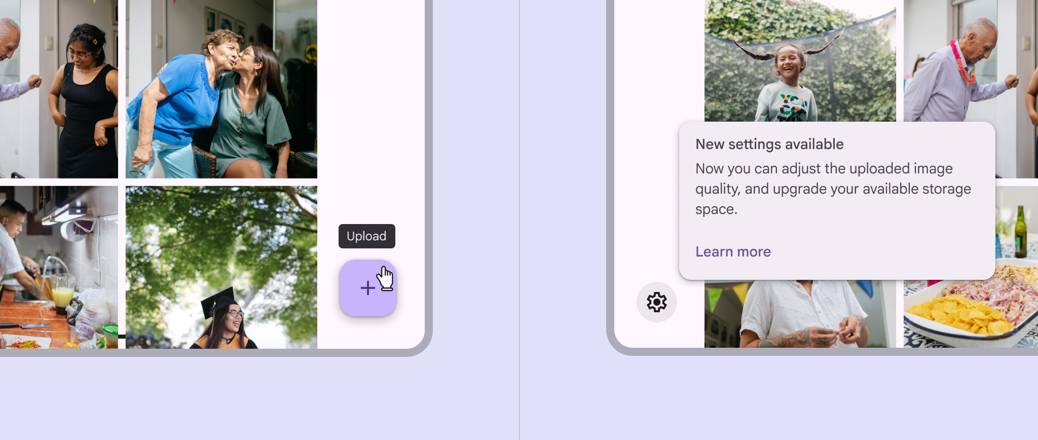

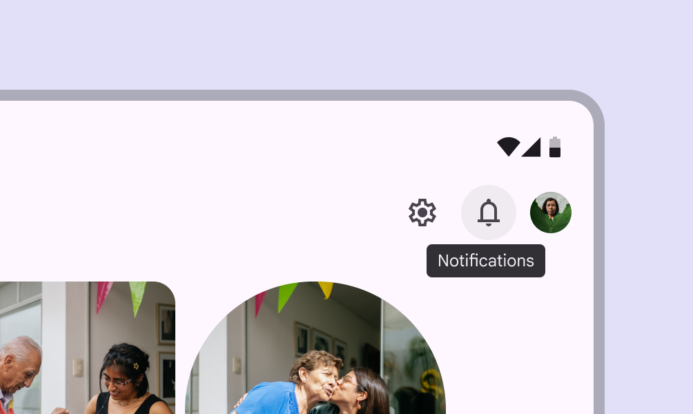
A plain tooltip labeling a button, and a rich tooltip announcing new settings available.
Plain and rich tooltips serve different purposes

Usage ​

A tooltip provides additional context for a UI element.

Plain tooltips
Plain tooltips briefly describe a UI element. They're best used for labelling UI elements with no text, like icon-only buttonsButtons let people take action and make choices with one tap.More on buttons and fields.

Rich tooltips
Rich tooltips provide additional context about a UI element. They can optionally contain a subhead, buttons, and hyperlinks.

Rich tooltips are best used for longer text like definitions or explanations.
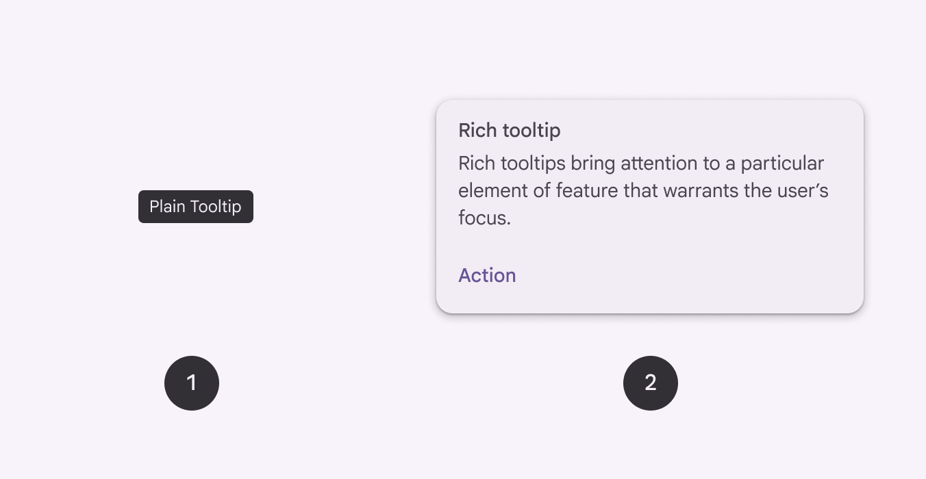
2 variants of tooltips.
  1. Plain tooltip
  2. Rich tooltip
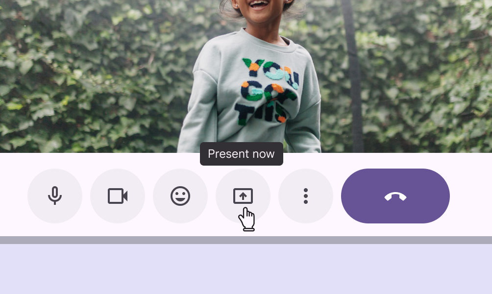
Plain tooltip labeling an icon-only button in Google Meet as "Present now".
Do Use plain tooltips to label icon-only buttons
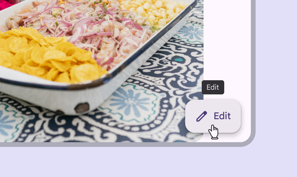
Button with an icon and label text saying "Edit". It has a plain tooltip on hover that also says "Edit".
Don't Plain tooltips aren't needed when the UI element already has label text
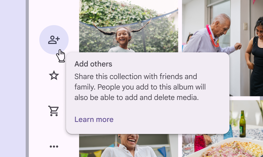
Rich tooltip describing a new button for adding people. It has a subhead, description, and a button to learn more.
Do Use rich tooltips to provide extra information and actions about a UI element or new feature
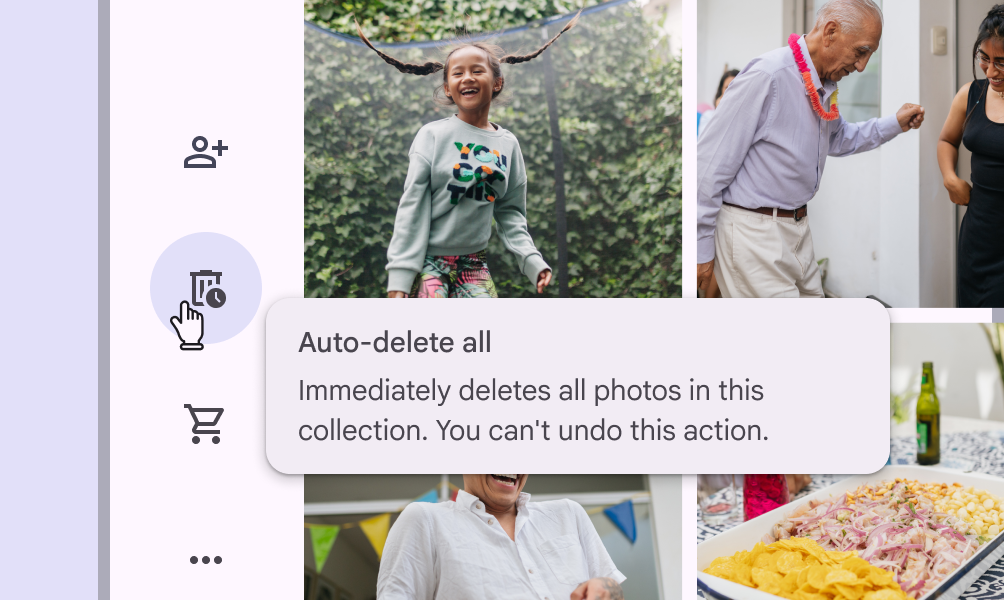
Rich tooltip explaining that an action is destructive and permanently deletes files.
Don't Don't hide critical information within tooltips as it’s easy to miss. Use an interruptive dialog instead.

Anatomy ​

Plain tooltip ​


2 elements of a plain tooltip.
  1. Container
  2. Supporting text

Supporting text ​

Plain tooltip for an icon-only button shaped like a gear. The tooltip text is "Settings".
Do Briefly describe a UI element
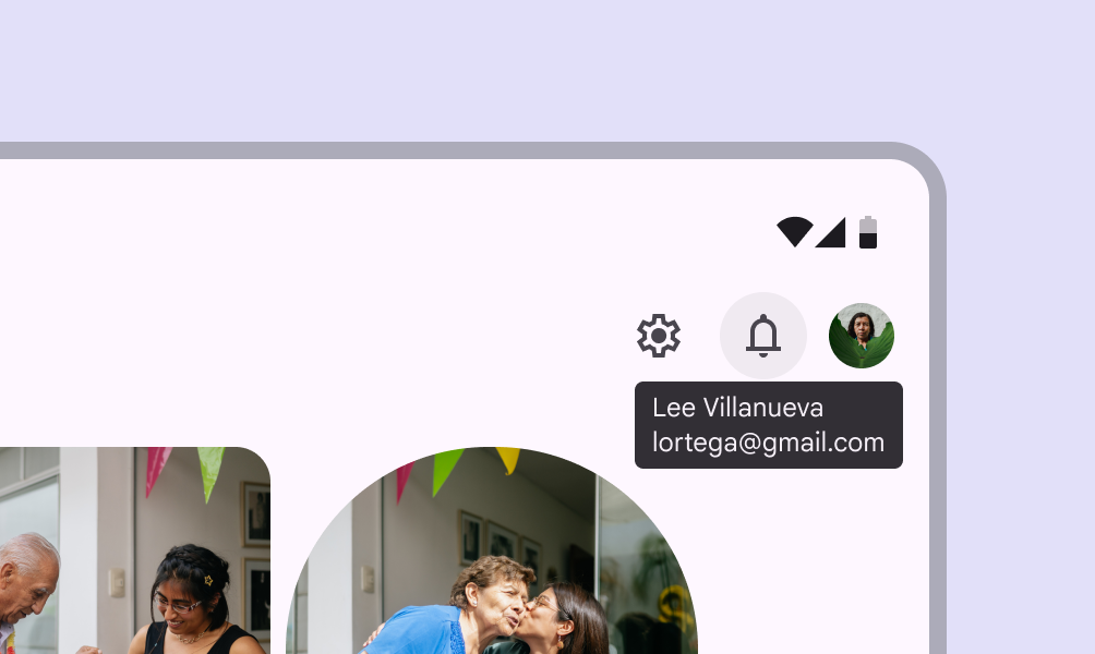
Plain tooltip for the account switcher. The supporting text includes the user's name and email address on new lines.
Caution Avoid wrapping text to multiple lines or including many pieces of information

Rich tooltip ​


4 elements of a rich tooltip.
  1. Subhead (optional)
  2. Container
  3. Supporting text
  4. Text button (optional)

Subhead (optional)

Keep subheads brief, ideally to one line. They should summarize or describe the message of the rich tooltipRich tooltips provide additional context about a UI element. They can optionally contain a subhead, buttons, and hyperlinks..

Subheads are important to include when the rich tooltip appears automatically, like when the page loads.
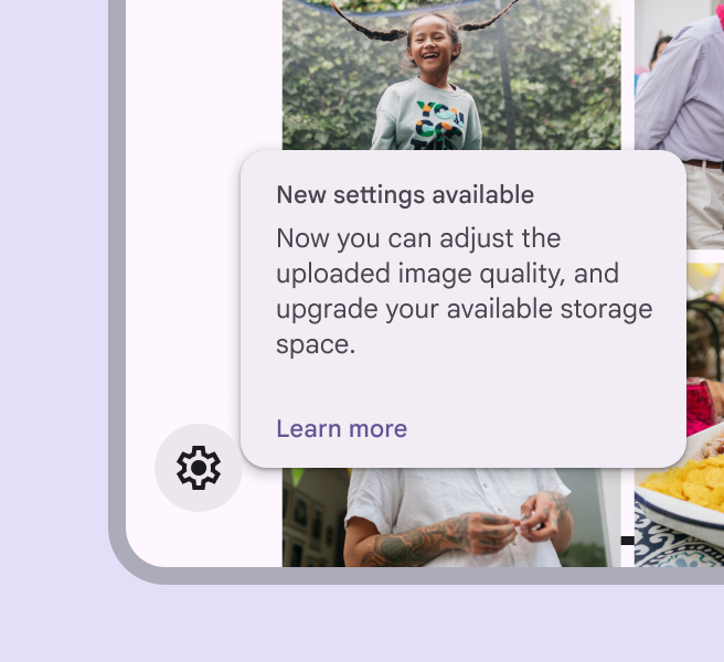
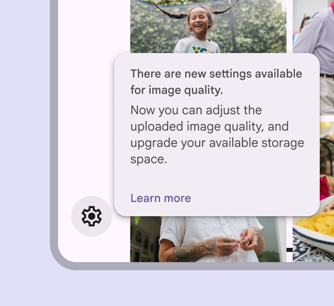
Rich tooltip with a brief subhead, supporting text, and a text button.
Do Summarize the message in a few words
Rich tooltip with a subhead wrapping to multiple lines.
Don't Avoid wrapping to more than one line

Text buttons (optional)

Rich tooltips can have up to two text buttonsButtons let people take action and make choices with one tap.More on buttons. These should be brief and relevant to the message in the supporting text.

Keep buttons short so they can be side by side. Avoid stacking them when possible.
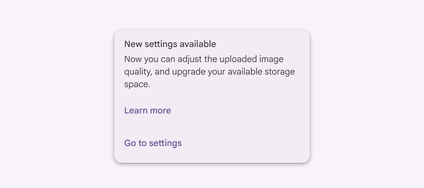
Rich tooltip with 2 buttons stacked on each other.
Caution Avoid stacking buttons

Placement ​

Plain tooltips

By default, plain tooltips are positioned directly above the parent element.

  • If there's a visual boundary, like a button, the distance is 4dp
  • If there's no visual boundary, like with text baselines, the distance is 8dp

If the element is in an app barApp bars contain page navigation and information at the top of a screen.More on app bars, the plain tooltip appears below the element at the same distance.

Plain tooltip appearing 4dp below a button with a clear visual boundary.
Plain tooltip with a 4dp distance between the target and tooltip

Rich tooltips

By default, rich tooltips are positioned to the bottom right of the parent element. They adjust position to avoid going off screen. Tooltips shouldn't cover the parent element.

Dynamic positioning
The position of the tooltip adjusts in increments of 8dp to avoid going off-screen.

Desktop placement
On desktop, tooltips may appear centered below the parent element and remain visible while moving within the target region.
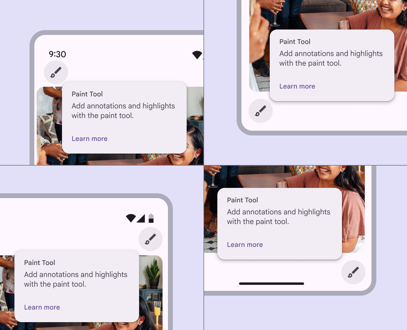
A rich tooltip in 4 different corners. It changes position to remain fully on screen.
Four different rich tooltip locations based on dynamic positioning

Behavior ​

To show a tooltip, hoverA hover state communicates when a user has placed a cursor above an interactive element.More on hover state on the parent element on desktop, or tap and hold the element on mobile. Persistent rich tooltipsRich tooltips provide additional context about a UI element. They can optionally contain a subhead, buttons, and hyperlinks. only appear when clicked or tapped.

Transient by default

Both plainPlain tooltips briefly describe a UI element. They're often used for labelling UI elements with no text, like icon-only buttons and fields. and rich tooltips disappear 1.5 seconds after navigating away from the target region.

Triggering a new tooltip immediately closes any other open tooltip.
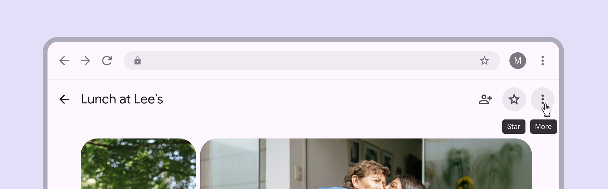
Tooltips disappear after a 1.5 second delay when no other element is hovered
2 buttons both showing plain tooltips at once.
Don't Only display one tooltip at a time

Persistent rich tooltips

Persistent rich tooltips appear when either:

  • The parent element is clicked
  • The page loads and a new feature is being explained

Persistent rich tooltips remain active even when leaving the target region. They only disappear once a person interacts with another UI element. Hovering doesn't trigger the tooltip.

When appearing on page load, the tooltip can introduce and explain new features on various parent elements.

Avoid using persistent rich tooltips on icon buttons.
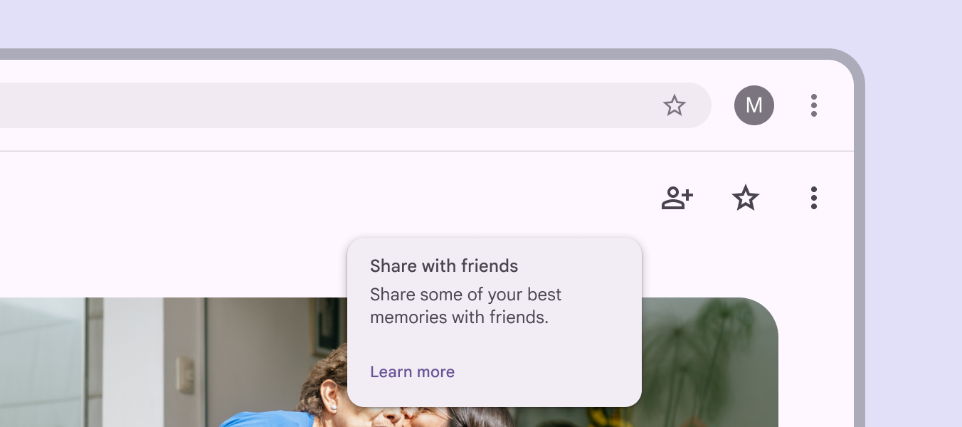
Persistent rich tooltip about a new sharing feature in the Photos app. The button says "Learn more.”
Don't Don’t use a persistent rich tooltip on icon buttons
Pager
Previous pageTooltips: Specs
Next pageTooltips: Accessibility

Released under the Apache 2.0 or CC BY 4.0

Copyright © 2018-Present Google

https://m3.material.io/components/tooltips/guidelines

Released under the Apache 2.0 or CC BY 4.0

Copyright © 2018-Present Google